Transform Data into Dynamic 3D Pie Charts: The Visual Revolution
Discover how I've explored the evolution from flat data to immersive 3D visualizations, and how modern AI tools are revolutionizing the way we create and share data stories.
Beyond Flat Data Visualization
I've witnessed a remarkable transformation in how we present data over the past decade. The journey from simple 2D pie charts to dynamic, interactive 3D visualizations represents more than just a technological advancement—it's a fundamental shift in how we engage with information.

Why does 3D visualization matter so much for complex data interpretation? I've found that the added depth dimension creates a more memorable and engaging experience for audiences. When presenting quarterly reports or demographic data, the visual impact of a well-crafted 3D pie chart can make the difference between passive viewing and active understanding.
The PageOn.ai Revolution: What excites me most about PageOn.ai's approach is how it transforms abstract percentages into immersive visual experiences through AI-powered creation. Instead of wrestling with manual input and limited customization options, I can now describe what I want in natural language and watch it materialize.
Traditional chart makers have always frustrated me with their rigid workflows—endless manual data entry, limited customization options, and static outputs that fail to capture the dynamic nature of modern data. PageOn.ai changes this paradigm entirely, offering a conversational approach that feels as natural as describing your vision to a skilled designer.
Understanding 3D Pie Charts: Depth That Makes a Difference
Let me break down the core components that make 3D pie charts so effective. Beyond the basic slices we're familiar with, 3D charts introduce depth dimension, perspective angles, and interactive elements that transform static data into engaging visual narratives.
3D Pie Chart Architecture
flowchart TD
                        A[3D Pie Chart] --> B[Visual Components]
                        A --> C[Interactive Features]
                        A --> D[Data Layers]

                        B --> B1[Slices]
                        B --> B2[Depth Dimension]
                        B --> B3[Perspective Angles]
                        B --> B4[Color Gradients]

                        C --> C1[Hover Effects]
                        C --> C2[Click to Explode]
                        C --> C3[Rotation Controls]
                        C --> C4[Zoom Features]

                        D --> D1[Primary Data]
                        D --> D2[Labels]
                        D --> D3[Legends]
                        D --> D4[Tooltips]
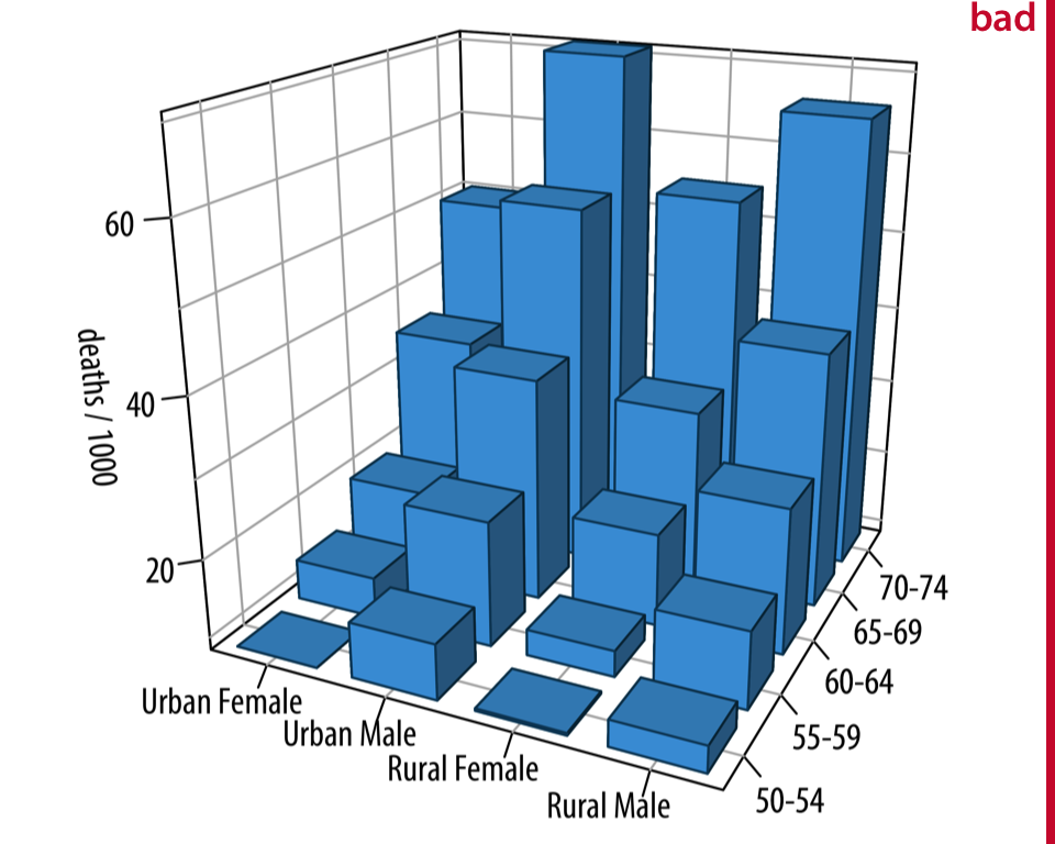
When to Choose 3D Over 2D
Through my experience, I've identified specific scenarios where 3D pie charts truly shine:
- Population Demographics: When showing distribution across multiple regions or age groups
- Financial Reporting: For quarterly revenue breakdowns where emphasis on specific segments matters
- Resource Allocation: When visualizing budget distribution or time management across projects
- Market Share Analysis: To highlight competitive positioning with dramatic visual impact
Common 3D Variations Explored
I've worked with numerous 3D chart variations, each serving unique purposes. Exploded charts draw attention to specific segments, donut charts create a modern aesthetic with their hollow centers, and multilevel representations showcase hierarchical data relationships. For a deeper dive into choosing between pie and donut formats, I recommend exploring pie vs donut charts comparisons.
Visual Perception Considerations
Balancing aesthetic appeal with data accuracy requires careful consideration. I've learned that while 3D effects can enhance engagement, excessive depth or rotation can distort perception. The key is finding that sweet spot where visual impact meets informational integrity.
The PageOn.ai Advantage: Conversational Chart Creation
Vibe Creation: From Voice to Visual
What truly sets PageOn.ai apart is its revolutionary Vibe Creation feature. I can simply describe what I want in natural language—no coding, no complex interfaces, just pure creative expression. The natural language processing understands context, intent, and even subtle preferences.
Example Prompts That Work Like Magic:
- "Create a 3D pie chart showing quarterly sales with Q4 exploded for emphasis"
- "Make a donut chart with gradient colors representing market share data"
- "Generate an interactive pie chart for budget allocation with hover tooltips"
- "Design a multilevel pie chart showing department expenses with brand colors"
Real-time adjustments through conversational commands make refinement effortless. I can say "make the blue slice larger" or "add percentage labels inside each segment" and watch the changes happen instantly. This stands in stark contrast to traditional tools that require navigating through endless menus and manual data re-entry.
AI Blocks: Building Charts Like Digital LEGOs

PageOn.ai's AI Blocks feature has transformed how I approach chart creation. Think of it as having a set of intelligent building blocks that understand data relationships and visual harmony. I can drag and drop components, combine multiple data sets into comprehensive visual stories, and dynamically resize elements without breaking proportions.
The beauty lies in the seamless integration with other data visualization charts. I can start with a 3D pie chart and effortlessly add bar graphs, line charts, or heat maps to create complete presentation decks that tell cohesive data stories.
Technical Deep Dive: Creating Professional 3D Pie Charts
Data Input and Processing
I've experimented with various input methods, and PageOn.ai's flexibility continues to impress me. Whether I'm uploading CSV files, speaking commands, or typing descriptions, the system understands and processes data with remarkable accuracy.
Data Processing Capabilities
Automatic Calculations
- Percentage calculations from raw numbers
- Slice proportioning based on values
- Automatic total validation
- Smart rounding for clean displays
Precision Control
- Whole numbers to 6 decimal places
- Scientific notation support
- Custom formatting options
- Real-time validation and correction
Advanced Customization Features
The level of control I have over every aspect of my 3D pie charts with PageOn.ai rivals professional design software. From 3D depth and rotation controls (adjustable from 0-360 degrees) to sophisticated color palette selection, every detail can be fine-tuned to perfection.
Label positioning offers multiple options—inside slices for clean aesthetics, outside with elegant connectors for clarity, or traditional legend placement for formal presentations. Interactive elements like hover effects, click-to-explode slices, and animated transitions bring charts to life. By leveraging AI chart generators capabilities, much of this customization happens automatically based on best practices.
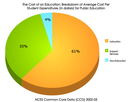
Real-World Applications and Case Studies
Business Intelligence and Reporting
In my work with various businesses, I've seen 3D pie charts transform dry quarterly reports into engaging visual narratives. One particularly effective application involved creating exploded revenue breakdowns where the highest-performing quarter literally "popped out" from the chart, immediately drawing stakeholder attention to success stories.
Electronics Sector Sales Distribution
Case Study: Market Share Visualization
A technology startup I worked with used PageOn.ai to create interactive 3D pie charts for investor presentations. The ability to drill down into each market segment with animated transitions helped them secure funding by making complex market data instantly understandable.
Educational and Research Contexts
Educational institutions have embraced 3D pie charts for making demographic data more accessible. I recently helped a university visualize their student body composition across six different parameters—the resulting multilevel 3D chart became a centerpiece of their diversity report.
Scientific research particularly benefits from precision controls. When displaying survey results with confidence intervals or experimental data with specific decimal requirements, PageOn.ai's accuracy ensures data integrity. The integration with comparison chart creation tools allows researchers to present multiple datasets side by side for comprehensive analysis.
PageOn.ai's Deep Search Integration: Beyond Basic Charts
One of PageOn.ai's most powerful features that I've come to rely on is its Deep Search integration. This goes far beyond simple chart creation—it's about creating complete visual narratives with contextual intelligence.
Automatic Asset Discovery
The system automatically finds relevant backgrounds, icons, and supporting graphics that enhance your charts. When I create a chart about renewable energy, it suggests appropriate green-themed elements and sustainability icons without me having to search.
Multi-Platform Data Integration
I can pull data from multiple sources simultaneously—Google Sheets, Excel files, databases, or APIs. The system harmonizes different data formats and ensures consistency across all visualizations.
Deep Search Integration Workflow
flowchart LR
                        A[User Input] --> B[Deep Search Engine]
                        B --> C[Data Sources]
                        B --> D[Visual Assets]
                        B --> E[Context Analysis]

                        C --> F[APIs]
                        C --> G[Databases]
                        C --> H[Files]

                        D --> I[Icons]
                        D --> J[Backgrounds]
                        D --> K[Templates]

                        E --> L[Industry Standards]
                        E --> M[Best Practices]
                        E --> N[User Preferences]

                        F --> O[Unified Output]
                        G --> O
                        H --> O
                        I --> O
                        J --> O
                        K --> O
                        L --> O
                        M --> O
                        N --> O

                        O --> P[3D Pie Chart]
Real-time data updates mean my charts stay current without manual intervention. When connected to live data sources, the visualizations automatically reflect changes, making them perfect for dashboards and monitoring systems. This connection to the comprehensive ai pie chart generators ecosystem ensures I'm always using the latest features and capabilities.
Optimization for Different Platforms and Formats
Export and Distribution Options
Flexibility in output formats has been crucial for my diverse projects. PageOn.ai delivers high-resolution downloads in PNG, JPEG, SVG, and PDF formats, each optimized for specific use cases. The transparent background option for PNGs has been particularly valuable for seamless integration into existing designs.
Format Selection Guide
| Format | Best For | Key Advantage |
|---|---|---|
| PNG | Web, Presentations | Transparency support |
| SVG | Scalable graphics | Infinite scaling |
| Print, Documents | Universal compatibility | |
| JPEG | Email, Social media | Smallest file size |
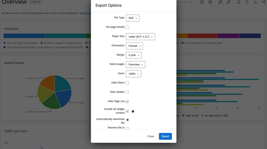
The embed code generation feature has revolutionized how I share interactive charts. Without any coding knowledge, I can generate embed codes that maintain full interactivity when placed on websites or blogs. The responsive sizing ensures charts look perfect whether viewed on desktop, tablet, or mobile devices.
Cross-Platform Compatibility
Integration with presentation software has been seamless. I regularly export charts directly into PowerPoint and Google Slides, where they maintain their quality and can be further animated using native presentation tools. Social media optimization automatically adjusts dimensions and formats for different platforms—LinkedIn, Twitter, Instagram—each getting the perfect version.
Print-ready outputs with CMYK color management ensure that what I see on screen translates perfectly to physical media. Interactive web versions maintain all functionality, from hover effects to drill-down capabilities, making them ideal for digital reports and online dashboards.
Best Practices and Professional Tips
Design Principles for Effective 3D Pie Charts
Through years of creating data visualizations, I've developed a set of principles that consistently produce effective 3D pie charts. The most important rule: limit your slices to seven or fewer. Beyond this number, the chart becomes cluttered and loses its impact.
Optimal Slice Distribution Example
Color Psychology Guidelines
- Use warm colors for positive metrics
- Apply cool colors for neutral data
- Reserve red for warnings or alerts
- Maintain consistent color meanings
- Consider cultural color associations
Typography Best Practices
- Sans-serif fonts for digital displays
- Minimum 12pt for labels
- Bold for emphasis, not all caps
- Consistent font family throughout
- High contrast for readability
Common Pitfalls and Solutions
I've learned to avoid perspective distortion that can misrepresent data. While 3D effects add visual appeal, excessive depth or extreme viewing angles can make accurate comparison difficult. The solution? Keep the 3D effect subtle—enough to add dimension without compromising data integrity.
Accessibility Considerations
Always ensure your charts are accessible to colorblind viewers. I use patterns or textures in addition to colors, provide clear labels, and test visualizations with colorblind simulators. Mobile responsiveness is equally critical—charts must be readable and interactive on smaller screens without losing functionality.
The Agentic Approach: PageOn.ai's Intelligent Workflow
What truly fascinates me about PageOn.ai is its Plan-Search-Act methodology. This isn't just automation—it's intelligent assistance that understands context beyond raw numbers. When I input data, the system doesn't just create a chart; it analyzes patterns, suggests optimal visualizations, and even recommends complementary data that might enhance the story.
Intelligent Workflow Process
flowchart TD
                        A[User Intent] --> B{Plan Phase}
                        B --> C[Analyze Data]
                        B --> D[Identify Patterns]
                        B --> E[Determine Goals]

                        C --> F{Search Phase}
                        D --> F
                        E --> F

                        F --> G[Find Best Practices]
                        F --> H[Gather Resources]
                        F --> I[Check Standards]

                        G --> J{Act Phase}
                        H --> J
                        I --> J

                        J --> K[Generate Chart]
                        J --> L[Apply Styling]
                        J --> M[Add Interactivity]

                        K --> N[Intelligent Output]
                        L --> N
                        M --> N

                        N --> O[Continuous Learning]
                        O -.-> B
The AI understands context in remarkable ways. When I'm creating a financial report, it automatically suggests conservative color schemes and formal layouts. For marketing presentations, it offers vibrant, engaging designs with animation suggestions. This predictive formatting based on industry standards and user preferences saves hours of manual adjustment.
Evolution from Static to Conversational
We've moved beyond static generators to true conversational creation partners. PageOn.ai learns from each interaction, remembering my preferences and suggesting improvements based on successful past projects. It's like having a skilled data visualization expert who knows my style and continuously helps me improve.
The Future of Data Visualization
As I reflect on my journey with 3D pie chart creation, PageOn.ai's role in democratizing professional chart creation stands out as truly revolutionary. We've shifted from requiring technical expertise to enabling pure creative expression in data visualization. The barriers that once separated ideas from implementation have dissolved.
The combination of AI blocks and vibe creation has transformed my workflow efficiency dramatically. What used to take hours of meticulous work in traditional software now happens in minutes through natural conversation. More importantly, the quality hasn't been compromised—if anything, it's improved through intelligent suggestions and automatic optimization.
Key Takeaways
- Conversational Creation: Describe what you want in natural language and watch it materialize
- Intelligent Assistance: AI that understands context and suggests improvements
- Seamless Integration: Works with existing tools and workflows
- Professional Quality: Output that rivals expensive design software
- Continuous Evolution: A platform that learns and improves with each use
The future of data visualization isn't just about prettier charts—it's about making data storytelling accessible to everyone. PageOn.ai has shown me that when we remove technical barriers, creativity flourishes, and data truly comes to life.
Transform Your Visual Expressions with PageOn.ai
Ready to experience the difference of conversational chart creation? Join thousands of professionals who've revolutionized their data visualization workflow with PageOn.ai's intelligent tools. Start your free trial today and discover how AI-powered creation can transform your data into compelling visual stories.
Start Creating with PageOn.ai TodayYou Might Also Like
Stock Photos in Presentations: Bringing Vibrancy and Depth to Visual Storytelling
Discover how to transform your presentations with strategic stock photography. Learn selection techniques, design integration, and visual consistency to create compelling visual narratives.
Balancing Unity and Variety in Digital Product Design: Creating Harmonious User Experiences
Discover how to achieve the perfect balance between unity and variety in digital product design to create visually appealing, engaging user experiences that drive product success.
The Creative Edge: Harnessing Templates and Icons for Impactful Visual Design
Discover how to leverage the power of templates and icons in design to boost creativity, not restrict it. Learn best practices for iconic communication and template customization.
Building Consistent Design Systems for Enhanced Learning Experiences: A Visual Framework
Discover how to create cohesive educational design systems that improve learning outcomes through visual consistency, reduced cognitive load, and systematic approaches to educational content delivery.