Visualizing Excel Chart Enhancement: From Data Points to Clear Insights
Master the Art of Adding Horizontal Lines to Transform Your Excel Charts
I've spent countless hours perfecting Excel charts, and I can tell you that adding strategic horizontal lines is one of the most powerful yet underutilized techniques for creating impactful data visualizations. Whether you're tracking sales targets, displaying averages, or setting performance benchmarks, these reference lines transform basic charts into sophisticated analytical tools that tell compelling data stories.
The Power of Strategic Line Addition
When I first started working with Excel charts, I often struggled to make my data tell a clear story. Then I discovered the transformative power of horizontal reference lines. These simple additions can instantly clarify whether performance meets targets, where averages fall, and how current values compare to benchmarks.
Common Scenarios for Reference Lines:
- Sales targets and quotas
- Average performance indicators
- Industry benchmarks
- Control limits and thresholds
- Break-even points
What excites me most is how modern tools like PageOn.ai's AI Blocks can structure these complex chart concepts into digestible visual elements. We've evolved from manual chart creation to intelligent visual composition, where AI helps us identify the most effective ways to present our data.

Core Methods for Adding Horizontal Lines to Excel Charts
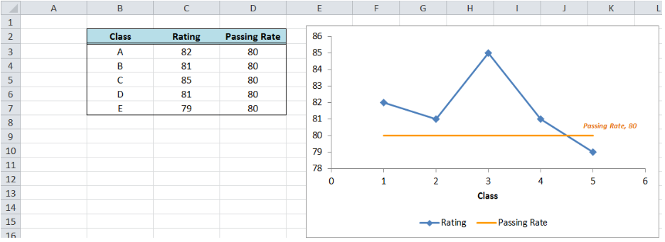
Method A: The Combination Chart Approach
I find this method to be the most straightforward for beginners. You create a secondary data series containing your target value and then combine it with your existing chart. Here's my step-by-step approach:
- Add a new column to your data with the target value repeated for each data point
- Select your entire data range including the new column
- Insert a combination chart (available in Excel 2013+)
- Change the target series to a line chart type
- Format the line to your preference
Sales Performance with Target Line
PageOn.ai's Deep Search feature can automatically find relevant benchmark data from industry sources, saving hours of manual research. I've used this to quickly identify competitive benchmarks and integrate them into my visualizations.
Method B: XY Scatter Series Integration
This advanced method gives you precise control over line positioning. I use it when I need lines that extend exactly to chart edges or when working with non-standard chart types.
Understanding Coordinate Systems:
- Column/Bar Charts: X-axis uses category numbers (1, 2, 3...)
- Line Charts: Similar to column charts but may need adjustment
- Scatter Charts: Both axes use actual numeric values
Chart Coordinate System Visualization
graph LR
                                A[Data Point] --> B[X Coordinate]
                                A --> C[Y Coordinate]
                                B --> D[Category Position]
                                C --> E[Value on Axis]
                                D --> F[0.5 to N+0.5]
                                E --> G[Actual Data Value]
                                style A fill:#FF8000
                                style F fill:#42A5F5
                                style G fill:#66BB6A
Method C: Secondary Axis Manipulation
I discovered this clever technique when I needed a horizontal line at zero on a secondary axis. It involves adding an invisible secondary horizontal axis and setting its crossing point.
Steps for Secondary Axis Method:
- Add a secondary horizontal axis to your chart
- Format the secondary vertical axis
- Set "Horizontal axis crosses at" to your desired value
- Hide the secondary horizontal axis labels and tick marks
- Format the axis line as your reference line
Chart-Specific Implementation Strategies
Column and Bar Charts
Working with bar charts in Excel requires special attention to axis positioning. I've learned that the "lazy" horizontal line approach (where the line doesn't extend fully) often looks unprofessional, so I always opt for full-extension methods.
❌ Common Mistake:
Using a simple line series that starts and ends at column centers, leaving gaps at chart edges.
✅ Best Practice:
Adjusting axis position to "On Tick Marks" or using XY scatter series with calculated endpoints.
For dynamic target lines that update automatically, I create a formula-driven approach. This is particularly useful when working with horizontal bar charts where targets may change quarterly.
Line and Area Charts
Line charts present unique opportunities for reference lines. I often combine them with area charts to show performance zones. The key is maintaining visual clarity while adding meaningful context.
Trend Analysis with Multiple Reference Lines
Scatter Plots and Specialized Charts
Scatter plots offer the most flexibility for adding reference lines. Since both axes use numeric values, I can precisely position lines using coordinate pairs. This is invaluable for statistical analysis and correlation studies.
Advanced Customization Techniques
Visual Enhancement Options
Line Styling:
- • Solid, dashed, or dotted patterns
- • Variable line weights (1-5 pts)
- • Custom colors matching brand guidelines
- • Gradient effects for modern aesthetics
Smart Labels:
- • Endpoint data labels
- • Floating text annotations
- • Dynamic value displays
- • Icon integration for visual cues
Dynamic & Interactive Features
I've developed several formula-based approaches for self-updating reference lines:
=AVERAGE(DataRange)
=PERCENTILE(DataRange, 0.75)
=INDEX(Targets, MATCH(TODAY(), Dates, 1))
These formulas ensure your reference lines always reflect current data without manual updates.
PageOn.ai's intelligent design system can prototype different visual styles quickly, helping you find the perfect balance between aesthetics and functionality. I particularly appreciate how it suggests complementary color schemes that maintain accessibility standards.
Professional Applications and Use Cases
Business Intelligence Dashboards
In my experience building executive dashboards, reference lines are essential for instant performance assessment. I integrate multiple visualization techniques to create comprehensive data visualization in Excel that tells a complete story.
Key Dashboard Elements:
Sales Targets
Monthly, quarterly, and annual benchmarks
Performance Metrics
KPI thresholds and warning levels
Budget Variance
Acceptable ranges and limits
Scientific and Technical Visualization
Technical data often requires precise reference lines for control limits, tolerances, and baselines. I've worked with engineering teams to create data visualization charts that clearly communicate complex specifications.
Statistical Process Control Chart
Financial and Investment Analysis
Financial charts benefit immensely from reference lines showing break-even points, moving averages, and risk thresholds. I combine these with line graphs to visualize trends and create comprehensive investment analysis tools.
Troubleshooting Common Challenges
Technical Issues and Solutions
Problem: Lines not extending to chart edges
Solution: Change axis position from "Between Tick Marks" to "On Tick Marks" or use XY scatter series with calculated endpoints (0.5 to n+0.5).
Problem: Reference lines appearing behind data
Solution: Adjust series order in Select Data dialog, or use secondary axis method for guaranteed foreground placement.
Problem: Dynamic lines not updating
Solution: Verify formula references, ensure automatic calculation is enabled, and check for circular references.
Design and Clarity Considerations
I've learned that less is often more when it comes to reference lines. Too many can create visual clutter that obscures rather than clarifies your data. Here's my approach to maintaining clarity:
- ✓ Limit to 3-4 reference lines maximum per chart
- ✓ Use visual hierarchy: thicker lines for primary targets
- ✓ Apply consistent color coding across dashboard
- ✓ Include clear labels or legend entries
- ✓ Consider transparency for overlapping elements
PageOn.ai's diagnostic capabilities can help identify problem areas in complex visualizations, suggesting improvements for both technical accuracy and visual appeal.
Integration with Modern Workflows
Automation and Efficiency
I've developed several automation strategies that save hours of repetitive work:
Template Creation
Build reusable chart templates with pre-configured reference lines for common scenarios.
Macro Recording
Record VBA macros for complex line additions that require multiple steps.
Power Query Integration
Connect to dynamic data sources that automatically update reference values.
Cross-Platform Considerations
Ensuring compatibility across different Excel versions and platforms requires careful planning:
| Platform | Capability |
|---|---|
| Excel 365 | Full support |
| Excel 2016-2019 | Full support |
| Excel Online | Limited features |
| Excel Mobile | View only |
| Excel 2013 | Manual methods |
PageOn.ai's Agentic capabilities can automate entire visualization workflows, from data processing to final chart generation, ensuring consistency across all platforms.
Best Practices and Professional Tips
Strategic Line Placement
After years of creating data visualizations, I've developed these guidelines for effective line placement:
- • Use horizontal lines for targets and thresholds
- • Apply vertical lines for time-based events
- • Combine both for quadrant analysis
- • Layer multiple lines with visual hierarchy
- • Consider data density when choosing line styles
Documentation and Communication
Clear documentation ensures your visualizations remain understandable:
Chart Legends
Explain what each reference line represents
Annotation Systems
Add contextual notes for complex charts
Style Guides
Maintain consistency across all visualizations
Decision Flow for Reference Line Selection
flowchart TD
                        A[Need Reference Line?] --> B{What Type of Data?}
                        B --> C[Time Series]
                        B --> D[Categories]
                        B --> E[Continuous]

                        C --> F[Moving Average]
                        C --> G[Trend Line]

                        D --> H[Target Line]
                        D --> I[Benchmark]

                        E --> J[Control Limits]
                        E --> K[Threshold]

                        F --> L[Dynamic Formula]
                        G --> L
                        H --> M[Static Value]
                        I --> M
                        J --> L
                        K --> M

                        L --> N[Implementation]
                        M --> N

                        style A fill:#FF8000
                        style N fill:#41C5AE
Future-Proofing Your Excel Visualizations
As Excel continues to evolve, I'm excited about the emerging capabilities that will transform how we add and manage reference lines. Dynamic arrays, new chart types, and AI-powered features are already changing the landscape.
Emerging Trends I'm Watching:
- • AI-suggested reference lines based on data patterns
- • Real-time collaboration on chart design
- • Automated anomaly detection with visual markers
- • Interactive reference lines users can adjust
- • Cloud-based benchmark databases
- • Voice-commanded chart modifications
Building flexible templates that adapt to changing needs is crucial. I recommend creating modular chart components that can be easily updated as new features become available. PageOn.ai's evolving features complement this approach perfectly, offering next-generation visual creation capabilities that integrate seamlessly with traditional Excel workflows.
Mastering the Art of Enhanced Excel Charts
Throughout this guide, I've shared the techniques that have transformed my approach to Excel data visualization. Adding horizontal lines might seem like a simple enhancement, but when done strategically, it elevates your charts from basic data displays to powerful analytical tools.
Key Takeaways for Immediate Implementation:
- 1. Choose the right method based on your chart type and Excel version
- 2. Always extend lines to chart edges for professional appearance
- 3. Use dynamic formulas for self-updating reference lines
- 4. Maintain visual hierarchy with appropriate line styles and weights
- 5. Document your reference lines clearly for user understanding
The intersection of technical skill and visual storytelling is where true data communication excellence lies. Every reference line you add should serve a purpose, guiding your audience to insights they might otherwise miss.
As you continue your journey in data visualization, remember that tools like PageOn.ai are here to amplify your capabilities. By transforming the journey from raw data to polished insights through intelligent visual composition, we're not just creating charts – we're crafting visual narratives that drive decisions and inspire action.
Transform Your Visual Expressions with PageOn.ai
Ready to take your data visualization to the next level? PageOn.ai's intelligent design system helps you create stunning, professional charts that communicate complex ideas with clarity and impact.
Start Creating with PageOn.ai TodayYou Might Also Like
Unlocking Innovation: How Democratized Development Tools Break Technical Barriers
Discover how democratized development tools are reshaping technical landscapes by breaking down barriers, enabling non-technical users to create sophisticated applications without coding expertise.
The Strategic Color Palette: Mastering Color Theory for Brand Recognition
Discover the fundamentals of color theory for effective brand communication. Learn how strategic color choices impact brand recognition, emotional response, and consumer decisions.
Transform Excel Data into Professional Presentations in Minutes | PageOn.ai
Learn how to quickly convert Excel data into stunning professional presentations using AI tools. Save hours of work and create impactful data visualizations in minutes.
Step-by-Step MCP Server Configuration for Free PowerPoint Presentations | PageOn.ai
Learn how to set up and configure an MCP server for creating free PowerPoint presentations using AI assistants like ChatGPT and Claude with this comprehensive guide.