Mastering Mixed-Chart Magic: Building Line-Enhanced Bar Charts in Excel
I've discovered that combining bar charts with line graphs creates incredibly powerful data stories. Let me share my comprehensive guide to mastering Excel's combo chart capabilities, from basic overlays to professional multi-axis visualizations.
Understanding the Power of Combined Visualizations
When I first started working with Excel charts, I quickly realized that single chart types often couldn't tell the complete story my data was trying to convey. That's when I discovered the magic of combining bar charts with line graphs – a technique that has transformed how I present complex data relationships.

The beauty of overlaying lines on bar charts lies in their ability to show two different perspectives simultaneously. I've found this particularly powerful when comparing actual performance against targets, displaying averages alongside individual values, or showing trends that complement categorical data. With PageOn.ai's AI Blocks, I can structure these complex data relationships even before diving into Excel, ensuring my visualizations tell a coherent story.
Common Scenarios Where Dual-Axis Charts Excel
- Sales volume (bars) vs. revenue targets (line)
- Monthly performance (bars) vs. moving average (line)
- Product units sold (bars) vs. price trends (line)
- Department costs (bars) vs. budget benchmark (line)
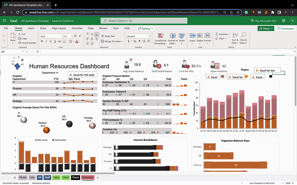
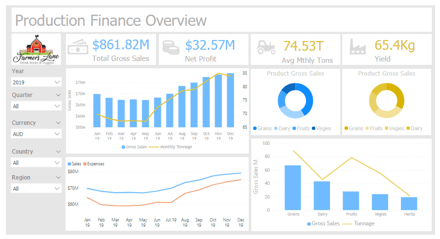
Example: Sales Performance vs. Target
Core Methods for Adding Lines to Bar Charts
The Quick Combo Chart Approach (Excel 2013+)
I've found that the fastest way to create a combination chart in modern Excel versions is through the built-in Combo Chart feature. This method has saved me countless hours compared to the manual approaches I used in older versions.
Quick Combo Chart Creation Process
                    flowchart TD
                        A[Select Data Range] --> B[Insert Tab]
                        B --> C[Recommended Charts]
                        C --> D[All Charts Tab]
                        D --> E[Choose Combo]
                        E --> F[Select Column-Line Template]
                        F --> G[Customize Series Types]
                        G --> H[Apply Secondary Axis if Needed]
                        H --> I[Final Combo Chart]

                        style A fill:#FF8000,stroke:#333,stroke-width:2px
                        style I fill:#66BB6A,stroke:#333,stroke-width:2px
Step-by-Step Instructions:
- Prepare your data: Arrange your data in columns with headers
- Select all data: Include both the bar and line data series
- Insert > Recommended Charts: Excel will suggest appropriate combinations
- Choose Combo chart: Select "Clustered Column - Line" template
- Customize: Adjust which series appears as bars vs. lines

Converting Existing Bar Chart Elements
Sometimes I already have a bar chart in Excel that I've spent time formatting, and I don't want to start over. In these cases, I convert one of the existing data series to a line chart directly.
Method 1: Right-Click Approach
- Right-click the data series to convert
- Select "Change Series Chart Type"
- Choose "Line" from the options
- Apply and adjust formatting
Method 2: Design Tab Method
- Select the chart
- Click Chart Design tab
- Choose "Change Chart Type"
- Select Combo and customize
When working with complex visualizations, I often use PageOn.ai's Vibe Creation feature to prototype different chart combinations before implementing them in Excel. This helps me visualize the final result and ensure the combination effectively communicates my data story.
Advanced Techniques for Professional Results
Implementing Secondary Axes
One of the most powerful techniques I've mastered is using secondary axes. This is essential when your data series have vastly different scales – for instance, when comparing units sold (in hundreds) with revenue (in millions).
Dual-Axis Visualization Example
Pro Tips for Secondary Axes
- Always label both axes clearly to avoid confusion
- Use contrasting colors for different axis data
- Consider whether the scales make visual sense together
- Add a legend that clearly indicates which axis each series uses
Customizing Line Appearance and Behavior
I've discovered that the default line appearance rarely tells the complete story. Through extensive experimentation, I've developed a toolkit of customization techniques that make my charts more informative and visually appealing.

Marker Options
- • Horizontal bars for targets
- • Circles for data points
- • Custom shapes for emphasis
Line Styles
- • Solid for primary data
- • Dashed for projections
- • Dotted for benchmarks
Visual Extensions
- • Extend to chart edges
- • Add data labels
- • Include annotations
When creating style guides for my organization's charts, I use PageOn.ai's AI Blocks to document and share these customization standards, ensuring consistency across all our data visualizations.
Real-World Applications and Best Practices
Common Business Scenarios
Throughout my career, I've applied combo charts to countless business situations. Each scenario requires a slightly different approach to effectively communicate insights.
Business Application Framework
                    graph LR
                        A[Business Data] --> B{Analysis Type}
                        B --> C[Performance vs Target]
                        B --> D[Trend Analysis]
                        B --> E[Benchmark Comparison]
                        B --> F[Multi-Metric Dashboard]

                        C --> G[Sales vs Goals]
                        C --> H[Budget vs Actual]

                        D --> I[Moving Averages]
                        D --> J[Seasonal Patterns]

                        E --> K[Industry Standards]
                        E --> L[Historical Baselines]

                        F --> M[KPI Scorecards]
                        F --> N[Executive Dashboards]

                        style A fill:#FF8000,stroke:#333,stroke-width:2px
                        style B fill:#42A5F5,stroke:#333,stroke-width:2px
Sales Performance vs. Targets
This is perhaps the most common application I encounter. By displaying actual sales as bars and targets as a line, stakeholders can instantly identify periods of over- and under-performance. The visual contrast makes it easy to spot trends and patterns that might be missed in a table of numbers.
I often enhance these charts by color-coding the bars based on performance – green for above target, red for below. This additional visual cue makes the chart even more intuitive for quick decision-making.
Data Preparation Strategies
The foundation of any great combo chart is well-structured data. I've learned that spending time on data preparation saves hours of frustration later.
Essential Data Structure
| Month | Sales | Target | Average |
|---|---|---|---|
| Jan | $45,000 | $50,000 | $48,500 |
| Feb | $52,000 | $50,000 | $48,500 |
Key Formulas I Use
- AVERAGE: =AVERAGE(B2:B13)
- Moving Average: =AVERAGE(B2:B4)
- Percentage of Target: =B2/C2*100
- Year-over-Year: =(B14-B2)/B2*100
For complex data preparation workflows, I leverage PageOn.ai's Agentic content expression to create visual guides that my team can follow, ensuring consistency in how we structure data for visualization across different projects.
Enhancing Visual Communication
Professional Finishing Touches
The difference between a good chart and a great one often lies in the details. I've developed a checklist of finishing touches that elevate my visualizations from functional to professional.
My Professional Chart Checklist
- Clear, descriptive title
- Labeled axes with units
- Strategic data labels
- Consistent color scheme
- Appropriate gridlines
- Legend positioning
- Source attribution
- Date/version stamp
Avoiding Common Pitfalls
Through years of creating combo charts, I've encountered (and learned from) numerous pitfalls. Here are the most common mistakes I see and how to avoid them.
❌ Scale Mismatches
When secondary axis scales don't align logically, viewers can draw incorrect conclusions. Always ensure your scales make intuitive sense together.
❌ Overcrowding
Too many data series make charts unreadable. I limit myself to 2-3 series maximum for clarity.
❌ Poor Color Choices
Colors that don't contrast or aren't colorblind-friendly limit accessibility. I always test my charts in grayscale.
To avoid these pitfalls consistently, I use PageOn.ai to prototype and test different visualization approaches before committing to a final design. This iterative process helps me identify potential issues early.
Alternative Visualization Approaches
When to Consider Different Chart Types
While combo charts are powerful, they're not always the best choice. I've learned to evaluate each data story to determine the most effective visualization approach.
Visualization Type Effectiveness
Consider Horizontal Bar Charts When:
- Category names are long
- Ranking is more important than trends
- You have many categories to display
- Mobile viewing is primary
Use Line Graphs to Visualize Trends When:
- Time series is the primary focus
- Multiple trends need comparison
- Continuous data is being displayed
- Forecasting is required
Excel Version Considerations
Not everyone has access to the latest Excel version, so I've learned to adapt my techniques based on what's available. Understanding bar charts vs histograms and other chart type distinctions becomes even more important when working with older versions.
Version-Specific Features
| Excel Version | Combo Chart Support | Workaround Needed |
|---|---|---|
| Excel 2010 | Manual only | Yes - Multiple steps |
| Excel 2013+ | Built-in templates | No |
| Excel Online | Limited | Sometimes |
Optimizing for Different Audiences
Executive Dashboards
When creating visualizations for executives, I've learned that less is definitely more. The focus should be on immediate insight rather than detailed analysis.
Executive Dashboard Principles
- Highlight exceptions: Use color to draw attention to outliers
- Minimize text: Let the visuals tell the story
- Focus on trends: Show direction more than exact values
- Include context: Add benchmark lines for quick assessment
- Mobile-first: Ensure readability on tablets and phones
Technical Reports
For technical audiences, I take the opposite approach. These viewers want all the details, precise values, and the ability to verify calculations.
Technical Elements to Include
- Detailed axis labels with units
- Error bars and confidence intervals
- Data tables below charts
- Statistical significance markers
- Methodology notes
Documentation Requirements
- Data sources and collection dates
- Calculation formulas used
- Assumptions and limitations
- Version control information
- Related analysis references
I use PageOn.ai's structured content blocks to build interactive documentation that accompanies my technical charts, allowing viewers to drill down into the methodology and data sources as needed.
Troubleshooting and Tips
Over the years, I've encountered virtually every combo chart problem imaginable. Here are solutions to the most common issues that can save you hours of frustration.
Common Issues Resolution Flow
                    flowchart TD
                        A[Chart Issue] --> B{Issue Type}

                        B --> C[Data Alignment]
                        C --> C1[Check data ranges]
                        C --> C2[Verify categories match]
                        C --> C3[Remove blank cells]

                        B --> D[Axis Scaling]
                        D --> D1[Add secondary axis]
                        D --> D2[Adjust min/max values]
                        D --> D3[Change axis type]

                        B --> E[Visual Problems]
                        E --> E1[Adjust transparency]
                        E --> E2[Change chart order]
                        E --> E3[Modify colors]

                        B --> F[Dynamic Data]
                        F --> F1[Use named ranges]
                        F --> F2[Create tables]
                        F --> F3[Add OFFSET formulas]

                        style A fill:#FF8000,stroke:#333,stroke-width:2px
                        style B fill:#DC143C,stroke:#333,stroke-width:2px
🔧 Misaligned Data Points
Problem: Line doesn't align with bar centers
Solution: Ensure both series use the same category axis. Check for hidden rows or filtered data that might be affecting alignment.
🔧 Axis Scaling Issues
Problem: One series appears flat due to scale differences
Solution: Implement a secondary axis or normalize your data to percentages for better comparison.
🔧 Dynamic Range Updates
Problem: Chart doesn't update when new data is added
Solution: Convert your data range to an Excel Table (Ctrl+T) or use dynamic named ranges with OFFSET function.
Pro Tips for Data Visualization in Excel
Performance Optimization
- Limit data points to what's visible
- Use data aggregation for large datasets
- Disable automatic calculation during setup
- Consider pivot charts for complex data
Maintenance Best Practices
- Document all custom formulas
- Create templates for recurring reports
- Use consistent naming conventions
- Keep a change log for complex charts
For complex troubleshooting scenarios, I create visual guides using PageOn.ai's step-by-step visualization capabilities. These guides help my team quickly resolve issues without needing to escalate to me every time.
Transform Your Visual Expressions with PageOn.ai
Ready to take your data visualization to the next level? PageOn.ai empowers you to create stunning, interactive visual stories that go beyond traditional Excel charts. Our AI-powered platform helps you transform complex data relationships into clear, compelling narratives that drive decision-making.
Start Creating with PageOn.ai TodayBringing It All Together
Mastering the art of combining line graphs with bar charts in Excel has transformed how I communicate data insights. From simple average lines to complex multi-axis dashboards, these techniques have become essential tools in my data visualization toolkit.
Remember, the goal isn't just to create visually appealing charts – it's to tell compelling data stories that drive action. Whether you're presenting to executives, preparing technical reports, or analyzing trends for your team, the right combination of bars and lines can make complex relationships instantly understandable.
As you apply these techniques, consider how tools like PageOn.ai can amplify your visualization capabilities. While Excel provides the foundation for data analysis, modern AI-powered platforms can help you create more dynamic, interactive, and insightful visual expressions that truly engage your audience.
Key Takeaways
- Combo charts effectively show relationships between different data types
- Secondary axes are essential when scales differ significantly
- Professional finishing touches make the difference between good and great
- Choose the right visualization based on your audience and message
- Modern tools like PageOn.ai can enhance and streamline your visualization workflow
Start experimenting with these techniques today, and watch as your data stories become more compelling, your insights more actionable, and your presentations more impactful. The journey from basic charts to professional visualizations is one of continuous learning and refinement – embrace it, and let your data truly shine.
You Might Also Like
Crafting Indonesia's Story: Visual Narratives That Captivate Global Audiences
Discover how to create compelling visual narratives about Indonesia that engage global audiences. Learn strategies for showcasing Indonesia's cultural diversity, geography, and economic potential.
Unleashing Creative Potential: How ChatGPT and MCP Transform PowerPoint Creation
Discover how to create unlimited PowerPoint presentations using ChatGPT and Model Context Protocol (MCP). Learn step-by-step techniques, prompt engineering, and advanced features for AI-powered slides.
Revolutionizing Presentations: How AI-Generated Visuals Transform Slide Design
Discover how AI-generated visuals are transforming presentation design, saving hours of effort while creating stunning slides that engage audiences and communicate ideas effectively.
Revolutionizing Market Entry Presentations with ChatGPT and Gamma - Strategic Impact Guide
Learn how to leverage ChatGPT and Gamma to create compelling market entry presentations in under 90 minutes. Discover advanced prompting techniques and visual strategies for impactful pitches.