Master Excel Charts: Transform Complex Data with Dynamic Vertical Lines
Unlock Professional Chart Enhancement Techniques
When I first encountered the challenge of adding vertical lines to Excel charts, I discovered it's one of those features that seems simple but requires creative problem-solving. Today, I'm sharing the comprehensive techniques I've mastered over years of creating professional data visualizations, from basic manual approaches to sophisticated dynamic solutions that will transform how you present data.
Why Vertical Lines Matter in Excel Charts
I've spent countless hours wrestling with Excel charts, and one of the most frequent requests I receive is: "How do I add a vertical line to mark this important point?" Whether you're highlighting the transition from actual to forecast data, marking project milestones, or indicating benchmark references, vertical lines are essential for effective data storytelling.
The challenge is that Excel doesn't offer a simple "Add Vertical Line" button. Instead, we need to employ creative workarounds that range from quick manual solutions to sophisticated dynamic approaches. Through my experience creating data visualization charts, I've discovered that the method you choose depends on your specific needs and how often you'll need to update the chart.
Common Scenarios Requiring Vertical Markers
- Separating historical data from projections in financial reports
- Marking the current date in project timelines
- Indicating target achievement points in sales dashboards
- Highlighting intervention points in scientific experiments
- Delineating fiscal periods in business analytics
Before diving into Excel, I often use PageOn.ai's visual structuring capabilities to conceptualize my chart designs. This preliminary planning helps me determine which vertical line technique will work best for my specific data visualization needs. The ability to quickly sketch out ideas and test different approaches visually saves hours of trial and error in Excel.
Understanding the Technical Foundation
To successfully add vertical lines to Excel charts, I first need to explain the underlying architecture that makes these techniques possible. Understanding these concepts will help you troubleshoot issues and adapt the methods to your specific needs.
Excel Chart Architecture
flowchart TD
                        A[Excel Chart] --> B[Primary Axis]
                        A --> C[Secondary Axis]
                        B --> D[Data Series 1]
                        B --> E[Data Series 2]
                        C --> F[Vertical Line Series]
                        F --> G[X Coordinates]
                        F --> H[Y Coordinates]
                        G --> I[Position on Timeline]
                        H --> J[0 to Max Height]

                        style A fill:#FF8000,stroke:#333,stroke-width:2px
                        style F fill:#66BB6A,stroke:#333,stroke-width:2px
Key Components for Vertical Line Implementation
X-Axis Positioning
The X coordinate determines where your vertical line appears on the horizontal axis. For date-based charts, this might be a specific date; for category charts, it's the position number.
Y-Axis Spanning
The Y coordinates typically range from 0 to your chart's maximum value, ensuring the line spans the full height of your visualization.
The combo chart approach is particularly powerful because it allows us to mix different chart types within a single visualization. By combining your main data series (as bars or lines) with a scatter plot series for the vertical line, we can achieve precise positioning without disrupting the primary data display.
I recommend using PageOn.ai's AI Blocks feature to map out your data structure visually before implementation. This helps identify potential issues with data alignment and ensures your vertical line coordinates will integrate seamlessly with your existing chart data.
Method 1: The Error Bar Technique for Scatter Plots
The error bar technique is my go-to method when working with scatter plots. It's elegant, requires minimal data manipulation, and produces clean, professional-looking results. Let me walk you through the complete process I've refined over years of creating data visualization in Excel.
Data Preparation Strategy
Essential Formulas for Dynamic Positioning
# For average line position:
=AVERAGE(B2:B10)  # X coordinate
=AVERAGE(C2:C10)  # Y coordinate

# For specific date matching:
=MATCH("Sep-2024", A2:A13, 0)

# For maximum value detection:
=MAXIFS(A:A, B:B, "<>")
Step-by-Step Implementation
- Create your scatter plot: Select your data and insert a scatter chart from the Insert tab.
- Prepare vertical line data: In separate cells, enter the X and Y coordinates for your line position.
- Add the new series: Right-click the chart, select "Select Data," and add your coordinate pair as a new series.
- Convert to error bars: Select the new data point and add Percentage error bars from the Chart Elements menu.
- Configure error bars: Set vertical error bars to 100% in both directions, horizontal to 0%.
- Format the line: Adjust color, width, and dash pattern to match your design requirements.

Pro Tip: Troubleshooting Alignment Issues
If your vertical line doesn't align properly, check that your X-axis is set to a continuous scale rather than categorical. For date-based axes, ensure your dates are formatted as actual date values, not text strings.
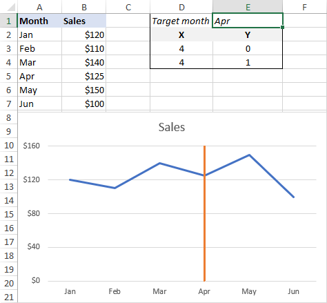
Method 2: Combo Chart Approach for Bar and Line Charts
When working with bar charts or line graphs, the combo chart approach is my preferred solution. This method offers incredible flexibility and works reliably across different Excel versions. I've used this technique countless times when creating bar charts in Excel that require precise vertical markers.
Building the Foundation
Data Structure for Combo Chart Method
Helper Column Setup
| Column | Purpose | Formula Example |
|---|---|---|
| X Values | Position on horizontal axis | =MATCH("Sep", $A$2:$A$13, 0) |
| Y Values (Row 1) | Bottom of line | 0 |
| Y Values (Row 2) | Top of line | 1 |
Chart Type Transformation Process
- Create your base chart: Build your standard bar or line chart with primary data.
- Add helper data: Copy helper column values and paste into the chart.
- Change series type: Right-click the new series and select "Change Series Chart Type."
- Select scatter plot: Choose "Scatter with Straight Lines" for the vertical line series.
- Update coordinates: Edit the series to use proper X and Y value ranges.
- Adjust secondary axis: Set maximum bound to 1.0 for proper scaling.
- Hide axis labels: Remove secondary axis visibility for cleaner presentation.
- Optimize gap width: Set to 500% for thinnest possible line appearance.
This method integrates beautifully with horizontal bar charts as well, though you'll need to swap the X and Y coordinate logic to create horizontal reference lines instead.
Advanced Dynamic Solutions
Static vertical lines work well for one-time reports, but I often need interactive solutions that update automatically or respond to user input. These advanced techniques have saved me countless hours when creating recurring dashboards and interactive presentations.
Interactive Vertical Lines with Form Controls
Creating User-Controlled Positioning
By combining scroll bars with dynamic formulas, I can create charts where users control the vertical line position in real-time. This approach is perfect for "what-if" analysis and interactive presentations.
# Link scroll bar to cell E1
# Then use in formulas:
X_Position: =$E$1
Y_Bottom: =0
Y_Top: =MAX($B$2:$B$13)

# For date-based positioning:
=INDEX($A$2:$A$13, $E$1, 1)
VBA Automation for Complex Scenarios
When I need to add multiple vertical lines or create highly customized solutions, VBA becomes invaluable. Here's a basic framework I use for programmatic line creation:
Sub AddVerticalLine()
    Dim cht As Chart
    Dim ser As Series

    Set cht = ActiveSheet.ChartObjects("Chart 1").Chart

    ' Add new series for vertical line
    Set ser = cht.SeriesCollection.NewSeries

    With ser
        .Name = "Current Month"
        .XValues = Array(9, 9)  ' September position
        .Values = Array(0, 100)
        .ChartType = xlXYScatterLines
        .Format.Line.DashStyle = msoLineDash
        .Format.Line.ForeColor.RGB = RGB(255, 0, 0)
        .Format.Line.Weight = 2
    End With
End Sub
These dynamic solutions integrate seamlessly with line graphs to visualize trends, allowing you to highlight specific trend changes or inflection points automatically as your data updates.
Professional Formatting and Design Considerations
After years of presenting data to executives and stakeholders, I've learned that the visual presentation of vertical lines is just as important as their technical implementation. The right formatting can transform a basic chart into a compelling visual story.
Visual Hierarchy and Clarity
Line Style Decision Framework
flowchart LR
                        A[Line Purpose] --> B{Primary or Secondary?}
                        B -->|Primary| C[Solid Line]
                        B -->|Secondary| D[Dashed/Dotted]

                        C --> E[Bold Width 2-3pt]
                        D --> F[Thin Width 1-1.5pt]

                        E --> G[High Contrast Color]
                        F --> H[Subtle Color]

                        G --> I[Red/Orange for Alerts]
                        G --> J[Blue/Green for Info]
                        H --> K[Gray for Reference]

                        style A fill:#FF8000,stroke:#333,stroke-width:2px
                        style G fill:#e74c3c,stroke:#333,stroke-width:2px
                        style H fill:#95a5a6,stroke:#333,stroke-width:2px
Color Psychology in Business Charts
Red Lines
Use for critical thresholds, deadlines, or warning indicators. Creates urgency and draws immediate attention.
Blue Lines
Ideal for targets, benchmarks, or informational markers. Conveys stability and professionalism.
Green Lines
Perfect for positive milestones, achievement points, or growth indicators. Suggests success and progress.
Gray Lines
Best for subtle references, historical markers, or secondary information. Doesn't compete with primary data.
Labeling and Annotation Strategies
Effective labeling transforms vertical lines from mysterious markers into meaningful insights. I always follow these principles:
- Position labels at the top of vertical lines for maximum visibility
- Use concise, action-oriented text (e.g., "Target Achieved" not just "Target")
- Include relevant values when space permits (e.g., "Q3 Start: $2.5M")
- Apply consistent formatting across all markers in multi-line charts
- Consider using callout boxes for detailed explanations
I often use PageOn.ai's Deep Search feature to find inspiring chart examples from leading publications and adapt their annotation styles to my Excel visualizations. This cross-pollination of design ideas has significantly improved my chart aesthetics.
Common Use Cases and Industry Applications
Through my consulting work across various industries, I've implemented vertical lines in countless scenarios. Let me share the most impactful applications I've encountered and the specific techniques that work best for each.
Financial and Business Analytics
Quarterly Revenue with Forecast Transition
Key Financial Applications
- Budget vs. Actual: Mark the current period to show progress
- Investment Milestones: Indicate funding rounds or major expenditures
- Market Events: Highlight external factors affecting performance
- Regulatory Deadlines: Show compliance dates and reporting periods
- Seasonal Markers: Delineate peak and off-peak business cycles
Scientific and Technical Visualizations
In scientific contexts, vertical lines often represent critical experimental conditions or measurement points. I've found these applications particularly valuable:
| Field | Application | Best Technique |
|---|---|---|
| Clinical Research | Treatment intervention points | Error bar method with annotations |
| Manufacturing | Process change indicators | Combo chart with color coding |
| Environmental | Seasonal transitions | Multiple lines with gradient fills |
| Quality Control | Specification limits | Static lines with conditional formatting |
Troubleshooting Common Challenges
Over the years, I've encountered virtually every issue possible when adding vertical lines to Excel charts. Here are the solutions to the most common problems that can save you hours of frustration.
Technical Issues and Solutions
Problem: Vertical line appears in wrong position
Solution: Check that your X-axis is set to the correct type:
- For dates: Ensure axis type is "Date axis" not "Text axis"
- For categories: Use position numbers (1, 2, 3) not category names
- Verify data series order matches your expectation
Problem: Line doesn't span full chart height
Solution: Adjust your Y-axis scaling:
- Set secondary axis maximum to 1.0 for normalized scaling
- Use MAX() function to dynamically find chart maximum
- Check for hidden data series affecting axis range
Problem: Multiple lines interfere with each other
Solution: Implement proper layering:
- Use series order to control which elements appear on top
- Apply transparency to overlapping elements
- Consider using different line styles for distinction
Cross-Version Compatibility

Excel's charting capabilities have evolved significantly across versions. Here's what I've learned about maintaining compatibility:
| Excel Version | Best Method | Limitations |
|---|---|---|
| Excel 2010-2013 | Error bar technique | Limited combo chart options |
| Excel 2016-2019 | Combo chart approach | Full functionality available |
| Microsoft 365 | Dynamic arrays + combo | May not work in older versions |
| Excel Online | Basic scatter plot method | No VBA support |
Optimization for Recurring Reports
Creating vertical lines once is manageable, but when you need to update charts monthly or weekly, efficiency becomes crucial. I've developed these optimization strategies to streamline the process for recurring reports.
Building Reusable Templates
Dynamic Formula Framework
# Define named ranges for flexibility:
CurrentPeriod = OFFSET(DateRange,COUNTA(ActualData)-1,0,1,1)
LinePosition = MATCH(CurrentPeriod,DateRange,0)
MaxValue = MAX(ActualData,ForecastData)

# Use in vertical line coordinates:
X_Coord = LinePosition
Y_Bottom = 0
Y_Top = MaxValue * 1.05  # 5% buffer for visibility
By using named ranges and dynamic formulas, I can update my entire dashboard by simply pasting new data into designated areas. The vertical lines automatically adjust to the correct positions without any manual intervention.
Automation Strategies
Power Query Integration
Connect directly to data sources and automatically refresh vertical line positions based on the latest data timestamps.
Macro-Enabled Templates
Create one-click solutions that update all charts in a workbook, including vertical line positions and labels.
I often use PageOn.ai's Vibe Creation feature to plan template structures before building them in Excel. This visual planning phase helps identify all the dynamic elements needed and ensures the template will be flexible enough for future requirements.
Beyond Excel: Modern Alternatives and Integration
While Excel remains the corporate standard, I've explored numerous alternatives that handle vertical lines more elegantly. Understanding when to use Excel versus other tools has been crucial for my productivity.
When to Consider Other Tools
Tool Selection Decision Tree
flowchart TD
                        A[Need Vertical Lines in Charts] --> B{Frequency of Updates?}
                        B -->|One-time| C[Excel Manual Method]
                        B -->|Recurring| D{Technical Skill Level?}

                        D -->|Basic| E[Excel Templates]
                        D -->|Advanced| F{Data Volume?}

                        F -->|Small| G[Excel VBA]
                        F -->|Large| H{Budget Available?}

                        H -->|Yes| I[Power BI/Tableau]
                        H -->|No| J[Python/R]

                        C --> K[Error Bar or Combo Method]
                        E --> L[Dynamic Formulas]
                        G --> M[Automated Macros]
                        I --> N[Native Line Features]
                        J --> O[Open Source Libraries]

                        style A fill:#FF8000,stroke:#333,stroke-width:2px
                        style I fill:#42A5F5,stroke:#333,stroke-width:2px
                        style J fill:#66BB6A,stroke:#333,stroke-width:2px
Presentation and Sharing Best Practices
When preparing Excel charts with vertical lines for presentations, I follow these guidelines to ensure professional results:
- PowerPoint Integration: Copy as picture to preserve line positioning
- PDF Export: Print to PDF rather than save as PDF for better quality
- Web Sharing: Consider static images for consistent rendering
- Team Collaboration: Document your vertical line method in chart notes
- Version Control: Save templates with clear naming conventions
Alternative Visualization Approach
Sometimes, switching to horizontal bar charts eliminates the need for vertical lines entirely. By rotating your perspective, time periods become horizontal positions where adding reference lines is more straightforward in Excel.
Transform Your Visual Expressions with PageOn.ai
Ready to take your data visualization skills to the next level? PageOn.ai empowers you to create stunning visual narratives that go beyond traditional Excel charts. Our AI-powered platform helps you conceptualize, design, and share compelling data stories that resonate with your audience.
Start Creating with PageOn.ai TodayMastering the Art of Excel Chart Enhancement
Through this comprehensive guide, I've shared the techniques that have transformed my Excel charting capabilities over the years. Adding vertical lines might seem like a small detail, but it's these precise enhancements that elevate good visualizations to great ones.
Key Takeaways
- Choose the error bar method for scatter plots when precision matters
- Use the combo chart approach for bar and line charts requiring multiple markers
- Implement dynamic solutions for recurring reports to save time
- Consider VBA automation for complex, multi-chart workbooks
- Always prioritize visual clarity and professional formatting
- Document your methods for team collaboration and future updates
Remember, the best vertical line technique depends on your specific context: the chart type, update frequency, audience, and technical constraints. I encourage you to experiment with these methods and adapt them to your unique needs.
As data visualization continues to evolve, tools like PageOn.ai are making it easier to plan and execute complex visual narratives. By combining Excel's analytical power with modern visual planning tools, we can create data stories that not only inform but inspire action. The journey from data to insight to impact has never been more accessible.
You Might Also Like
Perfecting Slide Flow: Adjusting Transition Speeds for Professional Presentations
Master the art of slide transition speeds for professional presentations. Learn optimal timing techniques, avoid common pitfalls, and create engaging presentation flow that captivates your audience.
Advanced Shape Effects for Professional Slide Design | Transform Your Presentations
Discover professional slide design techniques using advanced shape effects. Learn strategic implementation, customization, and optimization to create stunning presentations that engage audiences.
Revolutionizing Slides: The Power of AI Presentation Tools | PageOn.ai
Discover how AI presentation tools are transforming slide creation, saving hours of work while enhancing design quality. Learn how PageOn.ai can help visualize your ideas instantly.
Mastering Your First AI-Powered PowerPoint Automation Workflow | Complete Guide
Learn how to set up your first PowerPoint automation workflow with AI tools. Step-by-step guide covering Power Automate, Microsoft Copilot, and advanced techniques for efficient presentations.