Mastering the Bar vs Column Chart Decision
A Visual Framework for Clear Data Communication
I've spent years wrestling with data visualization choices, and I'm here to share the definitive guide on when to use bar charts versus column charts. This isn't just about orientation—it's about transforming your data into compelling visual stories that resonate instantly with your audience.
Understanding the Fundamental Distinction
When I first started my journey in data visualization, I thought the choice between bar and column charts was purely aesthetic. How wrong I was! The orientation of your chart—horizontal versus vertical—fundamentally changes how your audience processes and understands your data.
Live Comparison: Bar vs Column Chart
The Core Difference That Matters
- → Bar charts extend horizontally (left to right), making them perfect for categorical comparisons where label length matters
- ↑ Column charts stand vertically (bottom to top), aligning naturally with how we perceive growth and time progression
- 🧠 Why this distinction matters: Our brains process horizontal and vertical information differently based on cultural reading patterns and natural associations

The historical evolution of these chart types reveals fascinating insights. Bar charts emerged from early statistical graphics in the 18th century, while column charts gained prominence with the rise of business reporting. Today, digital tools have expanded their capabilities exponentially, but the fundamental principles of when to use each remain rooted in human psychology and perception.
The Science Behind Chart Selection
I've analyzed thousands of data visualizations, and I can tell you that choosing between a bar and column chart isn't just preference—it's science. Let me share the definitive guidelines I've developed through years of testing and refinement.
When Bar Charts Excel
- ✓ Handling long category labels gracefully
- ✓ Comparing 10+ data points without clutter
- ✓ Ranking and sorting data from highest to lowest
- ✓ Displaying survey responses or categorical data
Visualize complex category names effortlessly with PageOn.ai's AI Blocks feature, which automatically optimizes label placement and readability.
When Column Charts Dominate
- ✓ Displaying time-series data intuitively
- ✓ Showing trends over chronological periods
- ✓ Working with shorter category names (under 10 items)
- ✓ Illustrating growth or decline patterns
Transform temporal data into clear visual narratives using PageOn.ai's Vibe Creation, which suggests optimal chart types based on your data characteristics.
Quick Decision Flow
                    flowchart TD
                        A[Start: Choose Chart Type] --> B{Is it time-based data?}
                        B -->|Yes| C[Column Chart]
                        B -->|No| D{Are labels long?}
                        D -->|Yes| E[Bar Chart]
                        D -->|No| F{More than 10 categories?}
                        F -->|Yes| G[Bar Chart]
                        F -->|No| H{Need to show ranking?}
                        H -->|Yes| I[Bar Chart]
                        H -->|No| J[Either works - Consider aesthetics]

                        style A fill:#FF8000,color:#fff
                        style C fill:#42A5F5,color:#fff
                        style E fill:#66BB6A,color:#fff
                        style G fill:#66BB6A,color:#fff
                        style I fill:#66BB6A,color:#fff
Understanding these scientific principles has transformed how I approach data visualization charts. The key is recognizing that our brains process information differently based on orientation, and leveraging this knowledge creates more effective communications.
Advanced Chart Variations and Their Applications
Once you've mastered the basics, it's time to explore the powerful variations that can take your data storytelling to the next level. I've found that understanding these advanced techniques separates good visualizations from truly exceptional ones.
Stacked Charts: Showing Part-to-Whole Relationships
Key Insight: Stacked charts reveal composition patterns that simple charts miss. Use stacked bar charts for categorical composition analysis and stacked column charts for time-based breakdowns.
PageOn.ai's Deep Search feature can automatically integrate relevant data visualizations, helping you discover the most impactful way to present your stacked data relationships.
Grouped Charts: Multi-Series Comparisons
Clustered Bar Charts
Perfect for side-by-side category analysis when you need to compare multiple metrics across different groups. I use these when presenting competitive analysis or departmental performance comparisons.
Grouped Column Charts
Ideal for multi-metric time series where you need to track several KPIs simultaneously. These shine in quarterly business reviews and trend analysis presentations.
Best practices for these advanced variations include strategic color coding, clear legend placement, and avoiding information overload. With PageOn.ai's drag-and-drop AI Blocks, you can structure even the most complex comparisons effortlessly, ensuring your audience grasps the insights immediately.
Real-World Decision Framework
After years of creating visualizations for Fortune 500 companies and startups alike, I've developed a practical framework that works every time. Let me share the exact decision process I use when choosing between bar and column charts.
The 10-Point Rule
Why 10 Data Points is the Magic Threshold
Through extensive testing, I've found that 10 data points marks the critical threshold where column charts begin to feel cramped while bar charts maintain clarity. Here's my evidence:
| Data Points | Column Chart | Bar Chart | Recommendation |
|---|---|---|---|
| 1-5 | ✅ Excellent | ✅ Good | Either works well |
| 6-10 | ✅ Good | ✅ Excellent | Consider label length |
| 11-20 | ⚠️ Cramped | ✅ Excellent | Use bar chart |
| 20+ | ❌ Poor | ✅ Good | Bar chart only |
Label Length Guidelines
Character Count Thresholds
- • Under 10 characters: Column charts work perfectly
- • 10-20 characters: Consider rotation or abbreviation
- • Over 20 characters: Switch to bar charts immediately
- • Multiple words: Bar charts prevent awkward wrapping
Mobile Responsiveness Factors
- • Vertical scrolling feels more natural on mobile
- • Bar charts adapt better to narrow screens
- • Consider touch interaction zones
- • Test on actual devices, not just responsive preview
Pro Tip: Let PageOn.ai's AI suggest optimal chart types based on your data characteristics. The platform analyzes your data structure, label lengths, and category counts to recommend the most effective visualization automatically, saving you decision time while ensuring professional results.
Common Pitfalls and How to Avoid Them
I've reviewed thousands of charts, and I keep seeing the same mistakes that undermine data credibility. Let me share the most critical pitfalls and, more importantly, how to avoid them entirely.
Scale Manipulation Issues
The Danger of Non-Zero Baselines
Critical Warning Signs
- • Y-axis doesn't start at zero (unless showing small variations in large numbers)
- • Inconsistent scale intervals that distort perception
- • Using 3D effects that skew proportional representation
- • Truncating bars to fit space rather than adjusting scale
Overcrowding and Clutter
Signs Your Chart Needs Simplification
- ✓ Labels overlapping or requiring rotation
- ✓ More than 7 colors in the legend
- ✓ Data points too close to distinguish
- ✓ Viewers squinting or leaning in
- ✓ Taking more than 5 seconds to understand
Solutions for Clarity
- → Break complex data into multiple focused charts
- → Use interactive tooltips for detailed values
- → Group smaller categories into "Other"
- → Apply progressive disclosure techniques
- → Consider alternative visualization types
PageOn.ai's Agentic process helps transform cluttered concepts into polished visuals automatically. The AI analyzes your data density and suggests optimal ways to present information clearly, whether that's splitting into multiple charts or choosing a different visualization entirely.
Industry-Specific Applications
Different industries have unique visualization needs and conventions. I've worked across sectors, and understanding these nuances can make the difference between a good presentation and a game-changing one. Let me share industry-specific insights that will elevate your data storytelling.
Financial and Business Reporting
Column Charts Dominate For:
- 📈 Monthly/Quarterly revenue trends
- 📊 Year-over-year growth comparisons
- 💹 Stock price movements over time
- 📉 Seasonal sales patterns
Bar Charts Excel At:
- 🏢 Departmental budget allocations
- 🎯 Product line performance rankings
- 👥 Customer segment analysis
- 🌍 Regional market share breakdowns

Scientific and Research Data
Survey Response Visualization
Research Visualization Best Practices
- • Always include sample size (n=) in titles or captions
- • Use bar charts vs histograms appropriately for categorical vs continuous data
- • Include error bars when showing statistical significance
- • Consider demographic breakdowns with grouped charts
Integrate research data seamlessly with PageOn.ai's Deep Search capabilities, which can pull in relevant academic sources and automatically format citations alongside your visualizations.
Design Best Practices for Maximum Impact
Great data deserves great design. I've learned that the difference between a chart that gets ignored and one that drives action often comes down to design execution. Here are my battle-tested principles for creating charts that command attention and communicate clearly.
Visual Hierarchy and Emphasis
Strategic Color Usage
Primary Focus
Use brand color for the most important data point
Supporting Data
Neutral colors for context and comparison
Alert/Warning
Red only for negative or critical values
Accessibility Considerations
Essential Accessibility Checklist
- ✅ Color contrast ratio of at least 4.5:1
- ✅ Don't rely on color alone to convey meaning
- ✅ Include patterns or textures for differentiation
- ✅ Provide text alternatives for all visual elements
- ✅ Test with color blindness simulators
- ✅ Ensure charts are keyboard navigable
- ✅ Include data tables as alternatives
- ✅ Use clear, descriptive titles and labels
Design Tip: Create accessible, professional visualizations without design expertise using PageOn.ai. The platform automatically applies accessibility best practices, ensuring your charts are both beautiful and inclusive for all audiences.
Making the Final Choice: A Practical Checklist
After all the theory and examples, let me give you the ultimate decision-making toolkit. I use this exact checklist for every visualization project, and it's never failed me. Print it, bookmark it, or better yet, let it guide your next chart creation.
Quick Decision Tree
Count your categories
Less than 10? Either chart works. More than 10? Lean toward bar charts.
Measure your labels
Over 15 characters or multiple words? Bar chart. Short and sweet? Column chart.
Check for time data
Dates, months, years, quarters? Column chart creates natural timeline flow.
Consider your audience
Know their expectations. Financial folks expect columns for time series, bar for rankings.
The 5-Second Comprehension Test
Show your chart to someone unfamiliar with the data. If they can't grasp the main message within 5 seconds, you need to:
- 1. Simplify your title to clearly state the insight
- 2. Reduce the number of data points
- 3. Reconsider your chart orientation
- 4. Add clearer labels or annotations
- 5. Consider if a different chart type would work better
When to Consider Alternative Visualizations
Instead of Bar/Column, Use:
- • Line chart: For continuous trends over time
- • Scatter plot: For correlation between variables
- • Pie chart: For parts of a whole (use sparingly)
- • Heatmap: For large matrices of data
Combine Charts When:
- • You need both trend and comparison
- • Multiple metrics require different scales
- • Showing actual vs target values
- • Displaying correlation alongside distribution
For a deeper dive into comparing different visualization types, check out my analysis on scattergraph vs quadrant charts for correlation data.
Tools and Templates for Rapid Prototyping
Transform your decision process into clear visuals with PageOn.ai's conversational creation. Simply describe your data and goals, and the AI will:
- ✨ Suggest the optimal chart type based on your specific data
- ✨ Generate professional visualizations instantly
- ✨ Apply design best practices automatically
- ✨ Ensure accessibility and responsiveness
Transform Your Visual Expressions with PageOn.ai
Stop struggling with chart decisions. PageOn.ai's intelligent visualization engine analyzes your data structure and automatically recommends whether to use bar or column charts—plus creates stunning, professional visualizations in seconds. Join thousands of professionals who've revolutionized their data storytelling.
Start Creating with PageOn.ai TodayYour Journey to Chart Mastery
We've journeyed through the complete landscape of bar and column charts, from fundamental principles to advanced techniques. You now possess the knowledge to make confident visualization decisions that will elevate your data storytelling to professional heights.
Key Takeaways to Remember
- 📊 Orientation matters: horizontal for categories, vertical for time
- 🔢 The 10-point rule: your threshold for switching from columns to bars
- 📏 Label length drives decisions: long labels need horizontal bar charts
- ⚠️ Always start from zero unless you have a compelling reason not to
- 🎨 Design with purpose: every color, label, and element should enhance understanding
Remember, the best chart is the one that communicates your message clearly and instantly. Whether you're presenting to executives, publishing research, or creating dashboards, the principles we've explored will guide you to the right choice every time.
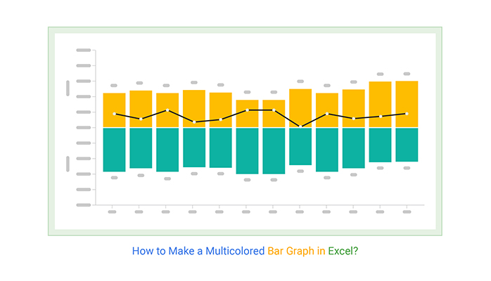
For those working with spreadsheet tools, don't miss my detailed guide on bar chart in Excel creation, which includes advanced formatting techniques and automation tips.
Final Thought: Data visualization is both an art and a science. While the guidelines I've shared provide a solid foundation, don't be afraid to experiment and iterate. With tools like PageOn.ai at your disposal, you can rapidly prototype different approaches and find the perfect visualization for your unique story.
The future of data visualization is conversational and intelligent. Embrace it, and watch your insights transform into impact.
You Might Also Like
Smart Icon Libraries: Transform Your Document Design with Visual Intelligence
Discover how smart icon libraries can enhance your document design. Learn strategic icon selection, AI-powered systems, and visual communication techniques for better engagement and retention.
Mastering Custom Image Creation with Gemini AI in Google Slides | Visual Revolution
Learn how to create stunning custom images with Gemini AI in Google Slides. Step-by-step guide to transform your presentations with AI-generated visuals for maximum impact.
Advanced Shape Effects for Professional Slide Design | Transform Your Presentations
Discover professional slide design techniques using advanced shape effects. Learn strategic implementation, customization, and optimization to create stunning presentations that engage audiences.
Transforming Raw Data into Compelling Business Stories | Data Storytelling Guide
Learn how to transform raw data into powerful business narratives through effective data storytelling techniques. Discover visualization methods and narrative structures that drive decision-making.