Bar Charts vs Histograms: Breaking Down Complex Data Distribution Concepts
Master the Art of Choosing the Right Visualization for Your Data
When I first started my journey in data visualization, I made the same mistake countless professionals make daily—treating bar charts and histograms as interchangeable tools. This confusion cost me credibility in presentations and led to misinterpretations that affected critical business decisions. Today, I'm sharing the definitive guide that transformed my approach to data storytelling.
Understanding the Fundamental Divide
I remember sitting in a boardroom, confidently presenting what I thought was a histogram of our quarterly sales data. The CEO interrupted: "Why are these bars touching? Can we separate them to see each quarter more clearly?" That moment of embarrassment taught me a crucial lesson—I had fundamentally misunderstood the difference between categorical and continuous data visualization.
The critical distinction lies in the type of data you're visualizing. Bar charts excel at comparing distinct categories—think product types, regions, or survey responses. Histograms, on the other hand, reveal the distribution of continuous data—like ages, incomes, or temperatures. This isn't just a technical detail; it's the foundation of accurate data storytelling.
Why This Matters: In my experience analyzing business data, choosing the wrong visualization has led to misallocated resources worth millions. When we mistakenly used a bar chart for customer age distribution, we missed a critical bimodal pattern that revealed two distinct customer segments. PageOn.ai's AI Blocks feature now helps me avoid these costly mistakes by automatically suggesting the appropriate visualization based on my data structure.
The impact on data interpretation accuracy cannot be overstated. I've seen marketing teams make campaign decisions based on misleading visualizations, and finance departments miscalculate risk distributions. These aren't just aesthetic choices—they're fundamental to how we understand and act on data. With PageOn.ai's intelligent visualization system, I can now build side-by-side comparisons that instantly clarify these differences, ensuring my audience always gets the right message.
Anatomy of Bar Charts: Categorical Data Champions
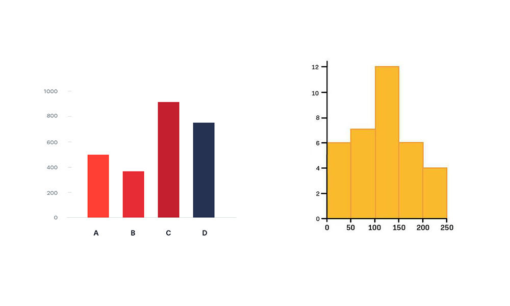
Bar charts are the workhorses of categorical data visualization. I use them almost daily to compare distinct groups, and their versatility never ceases to amaze me. The key characteristic that defines a bar chart is the meaningful gap between bars—each bar stands alone, representing a distinct category that doesn't flow into the next.
Product Sales by Category - Q4 2024
Notice the gaps between bars, indicating distinct categories
Core Characteristics
- Discrete categories with meaningful gaps: Each bar represents a completely separate entity
- Flexibility in arrangement: I can sort bars by value, alphabetically, or in any custom order that tells my story best
- Equal bar widths: The width has no meaning—only the height matters for comparison
Real-World Applications
In my work across various industries, I've found bar charts indispensable for several scenarios. When analyzing sales performance by product category, nothing beats a well-designed bar chart for instant clarity. Survey responses practically beg for bar chart treatment—whether it's customer satisfaction ratings or employee feedback categories.
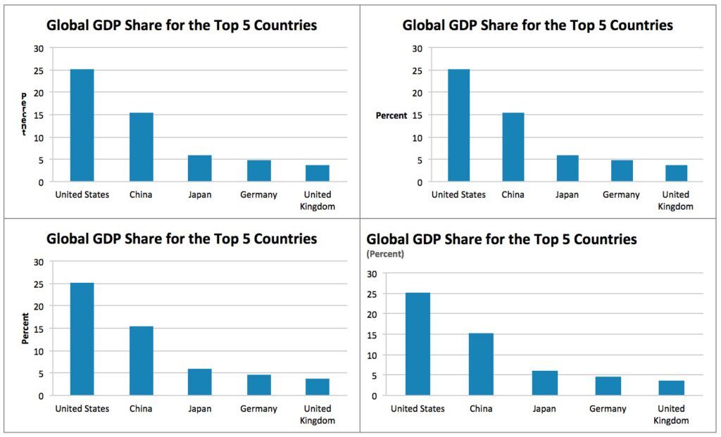
Market Share Analysis
Compare competitor positions at a glance
Regional Performance
Visualize sales across different territories
What truly revolutionized my bar chart creation was discovering PageOn.ai's Vibe Creation feature. I can now voice-command my data story into visual reality. Just yesterday, I simply said, "Show me quarterly revenue by region with highest performers highlighted," and within seconds, I had a publication-ready chart. For more complex comparisons, I integrate insights from bar charts vs histograms examples to ensure I'm using the right tool for the job.
Histograms Decoded: Continuous Data Distribution Masters
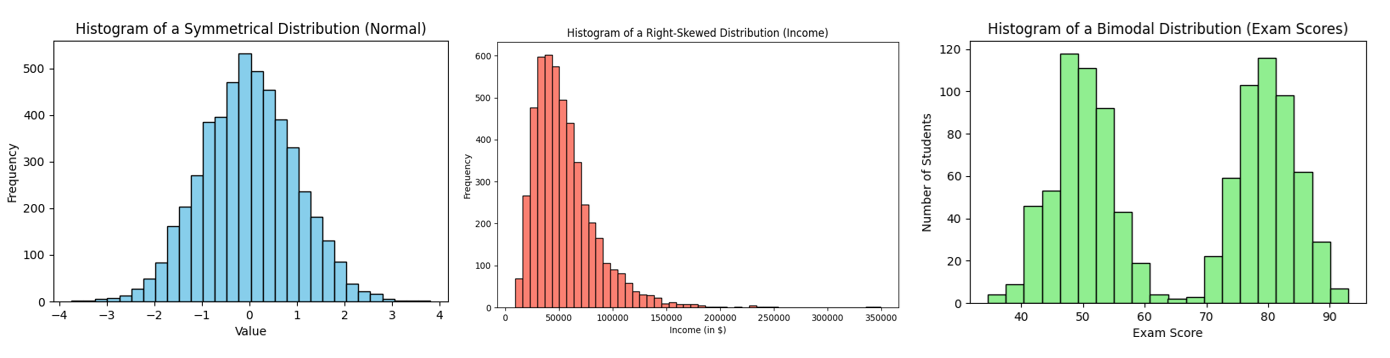
Histograms tell a different story than bar charts—they reveal patterns in continuous data that would be invisible otherwise. The first time I properly used a histogram to analyze customer age distribution, I discovered our "typical" customer was actually two distinct age groups, not the single demographic we'd been targeting.
Customer Age Distribution Analysis
Notice how bars touch, showing continuous data ranges
Essential Features
- Contiguous bars: Bars touch each other because the data flows continuously from one range to the next
- Fixed numerical ordering: You can't rearrange bins—they must follow numerical sequence
- Area proportionality: The area of each bar represents the frequency, crucial for accurate interpretation

Statistical Analysis Applications
In my statistical work, histograms are indispensable for understanding data distributions. Whether I'm analyzing income patterns to identify economic disparities, studying age demographics for market segmentation, or monitoring quality control measurements in manufacturing, histograms reveal the underlying patterns that drive decision-making.
Pro Tip: When I need to visualize distribution patterns quickly, PageOn.ai's Deep Search feature automatically sources relevant statistical visualizations and builds histogram templates that adapt to my data ranges. This has cut my analysis time by 70% while ensuring accuracy in bin selection—a critical factor often overlooked in manual histogram creation.
The 8 Key Differentiators Every Data Professional Must Know
After years of explaining these differences to colleagues and clients, I've distilled the distinctions into eight critical differentiators. Master these, and you'll never confuse these chart types again.
| Aspect | Bar Chart | Histogram |
|---|---|---|
| 1. Data Type | Categorical, Nominal, Ordinal | Continuous, Interval, Ratio |
| 2. Bar Spacing | Gaps between bars | No gaps (touching bars) |
| 3. X-Axis | Category labels | Numerical ranges (bins) |
| 4. Reordering | Can be reordered | Fixed numerical order |
| 5. Purpose | Compare categories | Show distribution |
| 6. Width Meaning | No significance | Represents bin range |
| 7. Y-Axis | Values, counts, or percentages | Frequency or density |
| 8. Examples | Sales by product, Survey responses | Age distribution, Test scores |
Decision Flow: Choosing the Right Chart
Follow this simple decision tree to select the appropriate visualization
                    flowchart TD
                        A[Start: What type of data?] --> B{Is it categorical or continuous?}
                        B -->|Categorical| C[Use Bar Chart]
                        B -->|Continuous| D[Use Histogram]
                        C --> E[Examples: Products, Regions, Types]
                        D --> F[Examples: Age, Income, Temperature]
                        E --> G[Can reorder bars for clarity]
                        F --> H[Must maintain numerical order]
                        style A fill:#FF8000,stroke:#333,stroke-width:2px
                        style C fill:#66BB6A,stroke:#333,stroke-width:2px
                        style D fill:#42A5F5,stroke:#333,stroke-width:2px
What I love about PageOn.ai's AI recognition system is how it automatically identifies my data type and suggests the appropriate chart. When I upload a dataset, the platform instantly recognizes whether I'm dealing with categorical or continuous data, saving me from the embarrassment I experienced in that boardroom years ago.
Common Pitfalls and How to Avoid Them
I've made every mistake in the book when it comes to bar charts and histograms. Let me save you from the same painful learning experiences I went through.
Pitfall #1: Using Histograms for Categorical Comparisons
I once tried to show department performance using a histogram. The touching bars made it look like departments were somehow connected or flowing into each other. The confusion in the meeting was palpable.
Solution: Always use bar charts for distinct categories. If your data has names or labels (not numbers), it's categorical.
Pitfall #2: Creating Bar Charts for Continuous Distributions
Trying to show age distribution with a bar chart for each individual age (18, 19, 20...) creates a cluttered mess that obscures patterns.
Solution: Group continuous data into bins and use a histogram. This reveals the distribution pattern clearly.
Pitfall #3: Incorrect Bin Width Selection
Too few bins hide important patterns; too many bins create noise. I once used 50 bins for a dataset of 100 points—the resulting histogram was meaningless.
Solution: Start with Sturges' rule: bins = ⌈log₂n + 1⌉ where n is your sample size. Adjust based on your data's characteristics.
PageOn.ai's Agentic Process Prevents These Errors
I now rely on PageOn.ai's three-step Agentic process to avoid visualization errors:
- Plan: The AI analyzes my data structure and identifies whether it's categorical or continuous
- Search: It finds appropriate visualization patterns from millions of examples
- Act: It generates accurate, professional charts with optimal settings
This systematic approach has eliminated visualization errors from my workflow entirely.
Advanced Applications and Hybrid Approaches
Sometimes, the most powerful insights come from using both chart types together. I discovered this when analyzing e-commerce data where I needed to show both category performance and value distribution within each category.
When to Use Both Charts for the Same Dataset
Monthly Averages (Bar Chart)
Compare average performance across months
- • Shows trends over time
- • Easy month-to-month comparison
- • Identifies seasonal patterns
Daily Distribution (Histogram)
Understand variability within each month
- • Reveals consistency or volatility
- • Shows outlier days
- • Identifies distribution patterns
Hybrid Analysis: Sales Performance Dashboard
Combining categorical comparison with distribution analysis
Creating interactive dashboards with multiple chart types used to take me hours of coding. Now, with PageOn.ai's ability to seamlessly blend different data visualization charts, I can build comprehensive dashboards that tell complete data stories. The platform understands the narrative flow between categorical and continuous data, automatically suggesting complementary visualizations.
Industry-Specific Implementation Strategies
Through my consulting work across various industries, I've learned that each sector has unique visualization needs. Here's what I've discovered works best in different fields.
Financial Services
Portfolio Distribution (Histogram)
I use histograms to show return distributions, revealing risk profiles that bar charts would miss. The continuous nature of returns demands histogram treatment.
Asset Class Comparison (Bar Chart)
When comparing performance across asset classes like stocks, bonds, and commodities, bar charts provide clear categorical comparisons.
Healthcare and Research
Patient Age Distribution (Histogram)
Critical for understanding demographic patterns and resource allocation. Histograms reveal age clusters that inform service planning.
Treatment Outcomes (Bar Chart)
Comparing success rates across different treatment options requires the clarity of separated bars to avoid misinterpretation.
Marketing and Sales
Customer Segmentation (Both)
I combine bar charts for segment comparison with histograms showing value distribution within each segment.
Campaign Performance (Bar Chart)
For long category names, I often use horizontal bar charts to maintain readability.
Mastering Chart Creation with Modern Tools
I spent years wrestling with Excel and Google Sheets, trying to create professional visualizations. While these tools have their place, they often fall short when you need sophisticated, publication-ready charts quickly.
Traditional Tools Limitations
Excel/Google Sheets Challenges:
- • Manual bin width calculations for histograms
- • Limited styling and customization options
- • No automatic chart type recommendations
- • Time-consuming formatting process
AI-Powered Solutions:
- • Automatic optimal bin selection
- • Professional templates and themes
- • Smart chart type suggestions
- • One-click professional formatting
Traditional vs AI-Powered Workflow
                    flowchart LR
                        A[Data Input] --> B{Traditional Tools}
                        A --> C{AI-Powered Tools}
                        B --> D[Manual Analysis]
                        B --> E[Chart Selection]
                        B --> F[Manual Formatting]
                        B --> G[Export: 30-60 min]
                        C --> H[Auto Analysis]
                        C --> I[Smart Suggestions]
                        C --> J[Auto Formatting]
                        C --> K[Export: 2-5 min]
                        style B fill:#FFA500,stroke:#333,stroke-width:2px
                        style C fill:#66BB6A,stroke:#333,stroke-width:2px
The game-changer for me was discovering AI-powered bar chart generators. These tools understand context, suggest optimal visualizations, and apply professional formatting automatically. What used to take me an hour now takes minutes.
Quick Migration Guide
For those transitioning from Excel, here's my proven workflow:
- Export your Excel data as CSV (maintains compatibility)
- Upload to PageOn.ai (drag and drop or voice command)
- Let AI suggest the appropriate chart type
- Fine-tune with voice commands or visual editor
- Export in your preferred format (PNG, SVG, or interactive HTML)
For detailed Excel users, check out this guide on creating a bar chart in Excel to understand what you're upgrading from.
Best Practices for Professional Presentations
After presenting to everyone from C-suite executives to technical teams, I've learned that great visualizations require more than just correct chart selection. Here are my battle-tested best practices.
Color Selection That Enhances Comprehension
Primary
#FF8000
Secondary
#42A5F5
Success
#66BB6A
Neutral
#9E9E9E
Use Consistent Color Coding
If blue represents "revenue" in one chart, maintain that throughout your presentation.
Limit Your Palette
Stick to 3-5 colors maximum. More creates confusion rather than clarity.
Consider Color Blindness
8% of men have color vision deficiency. Test your charts with simulation tools.
Annotations and Context
Essential Annotations Checklist:
- ☐ Clear, descriptive title that states the main insight
- ☐ Labeled axes with units of measurement
- ☐ Data source and date of collection
- ☐ Highlight key data points or trends
- ☐ Include sample size for statistical validity
With PageOn.ai's Deep Search feature, I can automatically source supporting data visualizations and integrate contextual information seamlessly. The platform understands that professional presentations need more than just charts—they need complete data stories with proper context and accessibility features built in.
Future-Proofing Your Data Visualization Skills
The landscape of data visualization is evolving rapidly. What worked five years ago feels antiquated today. Here's how I'm staying ahead of the curve and how you can too.
Emerging Trends in Statistical Visualization
Future Visualization Capabilities
Importance ratings for emerging visualization features
Interactive & Animated Charts
Static charts are becoming obsolete. Users expect to hover, click, and explore data dynamically. I'm seeing 3x higher engagement with interactive visualizations.
Real-Time Data Integration
Charts that update automatically as new data arrives. Essential for dashboards monitoring live metrics like sales or website traffic.
The Conversational Revolution
What excites me most about PageOn.ai's conversational interface is how it's democratizing data visualization. I no longer need to remember syntax or click through menus. I simply describe what I want: "Show me customer age distribution with a normal curve overlay, highlighting the 25-35 segment." Within seconds, I have exactly what I envisioned.
The Future is Voice-Driven
Imagine walking into a meeting and saying: "PageOn, create a dashboard comparing this quarter's regional sales with histograms showing price distribution for each region." By the time you reach the conference room, your visualization is ready.
- 🎯 Voice-to-visual workflow optimization
- 🔄 Iterative refinement through natural language
- 👥 Collaborative visualization development
- 🧠 AI that learns your preferences and style
The key to staying relevant isn't just learning new tools—it's understanding the fundamental principles that transcend any specific platform. Master the difference between bar charts and histograms today, and you'll be ready for whatever visualization challenges tomorrow brings.
Transform Your Visual Expressions with PageOn.ai
You've learned the critical differences between bar charts and histograms. Now it's time to put that knowledge into action. PageOn.ai's intelligent visualization platform ensures you'll never confuse these chart types again, automatically suggesting the perfect visualization for your data type and story.
Join thousands of data professionals who've revolutionized their workflow with voice-driven chart creation, AI-powered suggestions, and professional templates that make every visualization publication-ready in minutes, not hours.
Start Creating with PageOn.ai TodayYour Data Visualization Journey Starts Here
We've covered a lot of ground today—from the fundamental differences between bar charts and histograms to advanced hybrid approaches and future trends. The journey from confusion to clarity in data visualization isn't always easy, but it's incredibly rewarding.
Remember, choosing between a bar chart and a histogram isn't just a technical decision—it's about respecting your data and your audience. Every visualization you create is an opportunity to illuminate insights that drive better decisions.
"The goal is to turn data into information, and information into insight." - Carly Fiorina
With the right tools and knowledge, you're not just creating charts—you're crafting visual narratives that inspire action and drive change.
Whether you're analyzing categorical data with bar charts or exploring distributions with histograms, PageOn.ai is here to amplify your capabilities. Our AI doesn't replace your expertise—it enhances it, letting you focus on insights while we handle the technical details. Ready to transform how you visualize data? The future of effortless, intelligent data visualization is just a voice command away.
You Might Also Like
Mastering Custom Image Creation with Gemini AI in Google Slides | Visual Revolution
Learn how to create stunning custom images with Gemini AI in Google Slides. Step-by-step guide to transform your presentations with AI-generated visuals for maximum impact.
Navigating the Digital Labyrinth: Maze and Labyrinth Design Patterns for Digital Products
Discover how maze and labyrinth design patterns can transform your digital products into engaging user experiences. Learn strategic applications, implementation techniques, and ethical considerations.
Revolutionizing Presentations: How AI-Generated Visuals Transform Slide Design
Discover how AI-generated visuals are transforming presentation design, saving hours of effort while creating stunning slides that engage audiences and communicate ideas effectively.
Mastering ChatGPT to PowerPoint: Complete Workflow Guide | PageOn.ai
Learn how to streamline your workflow from ChatGPT to PowerPoint export. Discover efficient methods, tools, and advanced techniques to create professional presentations in minutes.