Transforming Bar Graph Data into Visual Stories
Beyond Traditional Bar Graph Creation with AI-Powered Design
In my journey through data visualization, I've discovered that the evolution from static Excel charts to dynamic infographic elements represents more than just a technological shift—it's a fundamental reimagining of how we communicate with data. Today's presentations demand more than basic visualizations; they require compelling visual narratives that capture attention and drive understanding.
Understanding Bar Graph Infographics in Modern Communication
When I first started creating data visualizations, I thought a bar graph was just a bar graph. How wrong I was! The bar graph infographic represents a revolutionary fusion where data meets design, transforming mundane statistics into compelling visual stories that resonate with audiences.
Key Differences from Traditional Charts
- • Icon Integration: Vehicle-themed charts, product icons, and visual metaphors make data instantly recognizable
- • 3D & Isometric Designs: Enhanced depth and engagement through modern visualization techniques
- • Progress & Radial Formats: Specialized designs for specific data narratives and KPI tracking
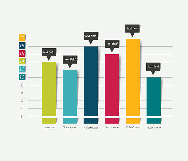
Traditional vs. Infographic-Style Bar Charts
Compare the visual impact of different bar chart styles:
From sales reports to social media content, I've seen bar graph infographics transform how organizations communicate across every industry. The key is understanding that we're not just displaying numbers—we're crafting experiences that make data memorable and actionable.
The Challenge of Creating Impactful Bar Graph Infographics
I remember spending hours in Adobe Illustrator, painstakingly aligning icons with bar charts, only to realize the data had changed and I needed to start over. The technical barriers in traditional design software create a significant bottleneck in our ability to communicate effectively with data.
Common Creation Challenges
The traditional workflow creates multiple pain points:
flowchart TD
                        A[Raw Data] --> B[Software Selection]
                        B --> C{Technical Skills?}
                        C -->|Yes| D[Hours of Manual Design]
                        C -->|No| E[Basic Charts Only]
                        D --> F[Icon Integration]
                        F --> G[Alignment Issues]
                        G --> H[Data Updates]
                        H --> I[Start Over]
                        E --> J[Low Engagement]
                        I --> K[Missed Deadlines]
                        J --> K
                        K --> L[Ineffective Communication]

                        style A fill:#FEE2E2
                        style L fill:#FEE2E2
                        style D fill:#FED7AA
                        style E fill:#FED7AA
Technical Barriers
- • Complex learning curves for professional tools
- • Time-consuming manual icon integration
- • Difficulty maintaining consistent styles
- • Limited animation capabilities
Data Interpretation Issues
- • Selecting appropriate chart types
- • Avoiding misleading scale distortions
- • Balancing aesthetics with accuracy
- • Ensuring accessibility compliance
These challenges don't just waste time—they limit our ability to tell compelling data stories. That's why I was thrilled to discover how AI-powered bar chart generators are revolutionizing the creation process.
PageOn.ai's Approach: Conversation-Driven Visualization
What if I told you that creating professional bar graph infographics could be as simple as having a conversation? With PageOn.ai's revolutionary approach, I've discovered that transforming fuzzy data concepts into clear visual narratives is now possible through natural language interactions.
Vibe Creation for Data Storytelling
Voice Command Example:
"Create a vibrant bar chart showing quarterly sales growth with car icons for our automotive division"
PageOn.ai Interprets:
- ✓ Quarterly time series data
- ✓ Growth-oriented visualization
- ✓ Automotive theme with vehicle icons
- ✓ Professional yet engaging style
AI Blocks: Building Bar Graphs Like LEGOs
The modular approach of PageOn.ai's AI Blocks has transformed how I create data visualization charts. It's like having a smart assistant that understands both design principles and data storytelling.
Drag & Drop
Combine chart elements intuitively
Real-time Preview
See changes instantly as you build
Smart Integration
Automatic icon and label matching
For projects requiring horizontal bar charts with lengthy labels, PageOn.ai automatically suggests the optimal orientation, ensuring your data remains readable and impactful.
Advanced Bar Graph Infographic Techniques
Through my exploration of PageOn.ai's capabilities, I've discovered techniques that would have taken years to master in traditional software. Let me share the game-changing features that have revolutionized my approach to data visualization.
Icon Integration and Visual Metaphors
The automatic matching of data categories with relevant icons has been a revelation. When I input vehicle sales data, PageOn.ai intelligently suggests car icons, automatically sizing and positioning them to create stacked representations that visualize quantity without overwhelming the viewer.
Icon-Enhanced Sales Visualization
Interactive and Animated Elements
Adding tooltips and hover effects transforms static data into an exploration experience. I've created scrollable designs that reveal data progressively, perfect for storytelling in presentations. The Match and Move animations bring life to otherwise static information.
Animation Options:
- • Fade-in sequences for dramatic reveals
- • Grow animations for emphasis
- • Slide transitions between data sets
- • Hover tooltips with detailed insights
Multi-format Adaptability
Whether I'm creating content for Instagram stories, LinkedIn posts, or boardroom presentations, PageOn.ai automatically optimizes the bar graph format. The responsive design considerations ensure perfect display across all devices, with export options for both static PDFs and interactive web embeds.

Practical Applications and Use Cases
In my work across various industries, I've witnessed firsthand how bar graph infographics transform communication. Let me share some compelling applications that demonstrate the versatility of these visual tools.
Business and Marketing Excellence
Sales Performance Dashboards
I've created dynamic dashboards using progress bar charts that update in real-time, showing sales teams exactly where they stand against targets. The visual impact of seeing bars fill up as goals are met creates powerful motivation.
Competitor Analysis
Grouped bar visualizations make market share comparisons instantly clear. By placing competitor data side-by-side, stakeholders can quickly identify opportunities and threats in the marketplace.
For comprehensive reporting, I integrate these visualizations with infographic data visualizations to create reports that tell complete stories, not just present numbers.
Multi-Dimensional Performance Analysis
Combining bar graphs with other visualization types for comprehensive insights:
Editorial and Content Creation
- 📊 Shareable social media graphics with viral potential
- 📝 Data-driven blog post visuals that boost engagement
- 🎨 Infographic posters for events and conferences
Educational and Nonprofit Impact
- 🎓 Student performance tracking with engaging formats
- 💝 Fundraising progress visualization with themed graphics
- 📈 Impact reporting with before/after comparisons
Best Practices for Bar Graph Infographic Design
Through years of creating data visualizations, I've learned that the difference between good and great bar graph infographics lies in the details. Here are the essential practices I follow to ensure every visualization delivers maximum impact.
Color Scheme Selection
Monochromatic
Best for single data series
Analogous
Creates harmony and flow
Categorical
Distinct separation of data
✓ Do's
- • Start Y-axis at zero for accurate representation
- • Use consistent spacing between bars
- • Include clear, descriptive labels
- • Ensure sufficient contrast for accessibility
- • Add data values for precision
- • Test on multiple screen sizes
✗ Don'ts
- • Avoid 3D effects that distort perception
- • Don't use too many colors (max 5-7)
- • Skip decorative elements that obscure data
- • Never manipulate scales to exaggerate
- • Don't overcrowd with excessive categories
- • Avoid low-contrast color combinations
WCAG 2.2 Accessibility Compliance
Ensuring accessibility isn't just about compliance—it's about reaching every member of your audience. I always verify:
Visual Requirements:
- • Color contrast ratio of at least 4.5:1
- • Alternative text for all visual elements
- • Pattern fills for colorblind users
Interactive Features:
- • Keyboard navigation support
- • Screen reader compatibility
- • Focus indicators for interactive elements
By leveraging AI-powered bar chart generators, many of these best practices are automatically implemented, saving time while ensuring professional results.
Integration with Existing Workflows
One of my biggest concerns when adopting new tools is workflow disruption. I'm pleased to share that PageOn.ai seamlessly integrates with existing processes, enhancing rather than replacing familiar workflows.
Data Import and Management
flowchart LR
                            A[Excel/CSV] --> B[PageOn.ai]
                            C[Google Sheets] --> B
                            D[JSON Feed] --> B
                            B --> E[Auto-Sync]
                            E --> F[Real-time Updates]
                            F --> G[Live Dashboard]

                            style B fill:#FF8000,color:#fff
                            style G fill:#34D399,color:#fff
Seamless Data Connection
Moving from bar chart in Excel to PageOn.ai is remarkably smooth. I simply connect my spreadsheets, and the platform automatically recognizes data structures, suggesting optimal visualization formats.
- ✓ Direct Excel and CSV import with automatic formatting
- ✓ Google Sheets integration for collaborative workflows
- ✓ Real-time synchronization for live dashboards
- ✓ Support for multiple data series and categories
Deep Search for Asset Enhancement

The Deep Search feature has revolutionized how I enhance visualizations. Instead of spending hours searching for the perfect icon or image, PageOn.ai automatically finds relevant assets based on my data context.
Brand Assets
Integrate company logos and colors
Stock Images
Access royalty-free libraries
Smart Matching
AI-powered asset recommendations
Team Collaboration Features
Working with teams across different departments, I've found the collaboration features invaluable:
- → Real-time co-editing capabilities
- → Version control and history tracking
- → Comment and feedback systems
- → Template sharing across teams
Future of Bar Graph Infographics
As I look ahead, the convergence of AI, real-time data, and immersive technologies promises to transform bar graph infographics in ways we're just beginning to imagine. Let me share the trends that excite me most about the future of data visualization.
Adoption Timeline of Emerging Visualization Trends
Expected mainstream adoption rates for new technologies:
🤖 AI-Driven Innovation
The AI revolution in data visualization goes beyond automation. I'm seeing systems that understand context, suggest optimal chart types based on data patterns, and even predict which visualizations will resonate most with specific audiences.
- • Automatic insight extraction
- • Predictive visualization recommendations
- • Natural language chart creation
🔄 Real-Time Interactivity
Live data feeds transforming static reports into dynamic dashboards excites me. Imagine bar graphs that update as you watch, reflecting market changes, social media trends, or operational metrics in real-time.
- • Live data streaming integration
- • Interactive storytelling features
- • Collaborative annotation systems
Emerging Visualization Formats
Radial and Circular Bar Charts
Perfect for cyclical data and creating visually striking dashboards
Hybrid Visualizations
Combining bar graphs with bubble charts, heat maps, and network diagrams
Scrollytelling Formats
Progressive revelation of data as users scroll through content
The integration of these technologies with platforms like PageOn.ai means we're not just creating charts—we're crafting experiences that transform how people understand and interact with data.
Getting Started with PageOn.ai
Ready to transform your data into compelling visual stories? Let me walk you through the simple steps to create your first bar graph infographic with PageOn.ai.
Start with Your Data or Idea
Whether you have a spreadsheet ready or just a concept in mind, PageOn.ai meets you where you are. Simply describe what you want to visualize or upload your data file.
Let AI Guide Your Design
Use natural language to describe your vision: "Create a vibrant bar chart showing quarterly growth with icons." PageOn.ai interprets your intent and suggests optimal layouts.
Customize with AI Blocks
Drag and drop elements to perfect your design. Add icons, adjust colors, include annotations—all while seeing real-time previews of your changes.
Export and Share
Download in multiple formats, embed in presentations, or share interactive versions online. Your bar graph infographic is ready to make an impact across any platform.
Tips for Excel Users
If you're transitioning from creating a bar chart in Excel, you'll find PageOn.ai refreshingly intuitive:
- • Import your Excel files directly—no reformatting needed
- • Familiar chart types with enhanced visual options
- • Automatic data validation and error checking
- • One-click conversion to infographic style
Pro Tips for Success
Start Simple:
Begin with basic charts and gradually add complexity as you become comfortable with the tools.
Use Templates:
Leverage pre-built designs to accelerate your workflow and maintain consistency.
Collaborate Early:
Invite team members to provide feedback during the design process, not after.
Test Interactivity:
Preview how your visualizations work on different devices before finalizing.
Empowering Visual Communication
As I reflect on my journey from struggling with complex design software to effortlessly creating stunning bar graph infographics, I'm amazed by how far we've come. The democratization of professional data visualization through tools like PageOn.ai isn't just about making pretty charts—it's about empowering every individual to become a data storyteller.
The Transformation Is Real
I've witnessed firsthand how PageOn.ai transforms anyone—regardless of design experience—into a confident creator of professional visualizations. The intuitive, AI-assisted design tools remove technical barriers while maintaining the sophistication needed for boardroom presentations.
The future of intuitive, AI-assisted design tools is here, and it's more accessible than ever. Whether you're creating horizontal bar charts for lengthy category names or complex infographic data visualizations for annual reports, the power to communicate effectively through data is now in your hands.
Ready to Transform Your Data Stories?
Join thousands of professionals who are already creating impactful bar graph infographics with PageOn.ai. Your data has a story to tell—let's help you tell it beautifully.
Start Creating with PageOn.ai TodayTransform Your Visual Expressions with PageOn.ai
Experience the future of data visualization where AI meets creativity. Create stunning bar graph infographics that captivate audiences and drive understanding—no design experience required.
Start Creating with PageOn.ai TodayYou Might Also Like
Mastering the Five Essential Sales Tonalities for Top Performance | PageOn.ai
Master the five essential sales tonalities - curious, confused, concerned, challenging, and playful - to transform your conversations and achieve top sales performance.
Mastering PowerPoint's Grid System: Build Professional Consistent Layouts
Learn how to leverage PowerPoint's grid system to create visually harmonious presentations with consistent layouts, proper alignment, and professional design that improves audience retention.
Enhancing Audience Experience with Strategic Audio Integration | Create Immersive Brand Connections
Discover how strategic audio integration creates immersive brand connections across podcasts, streaming platforms, and smart speakers. Learn frameworks and techniques to transform your marketing.
Transforming Presentation Creation: How AI Tools Are Revolutionizing Professional Slides
Discover how AI-powered tools are transforming professional slide creation with automated content generation, intelligent design, and data visualization capabilities.