Breaking Down Complex Data: How Bar of Pie Charts Transform Information into Clear Visual Stories
Master the Art of Hierarchical Data Visualization
When I first encountered a dataset with wildly different scales—major categories dominating while crucial details hid in tiny slices—I discovered the elegant solution of bar of pie charts. Let me show you how this powerful hybrid visualization can transform your complex data into compelling visual narratives.
When Standard Charts Fall Short
I've spent years wrestling with data visualization challenges, and one scenario consistently stumps even experienced analysts: presenting data where a few major categories dominate while numerous smaller—but important—segments get lost in the visual noise. This is where the bar of pie chart becomes our secret weapon.
Think about analyzing company expenses where salaries might represent 60% of the budget, but you need to show how the remaining 40% breaks down across 15 different categories. A standard pie chart would create unreadable slivers, while a simple bar chart loses the part-to-whole relationship. The bar of pie chart elegantly solves this by combining both approaches.
Real-world scenarios where bar of pie charts excel: Financial breakdowns with detailed subcategories, market analysis showing competitor details, survey results with demographic breakdowns, and operational metrics requiring granular visibility.
When I integrate PageOn.ai's AI Blocks into my workflow, the platform automatically identifies these hierarchical patterns in my datasets and suggests the bar of pie format when appropriate. This intelligent structuring saves hours of manual data preparation and ensures I'm using the most effective visualization for my specific data story.
The Anatomy of Bar of Pie Charts: Understanding the Dual Structure
Let me break down the genius of this chart type. At its core, a bar of pie chart consists of two interconnected visualizations that work in harmony to tell a complete data story.
Chart Component Relationship
                    flowchart LR
                        A[Complete Dataset] --> B[Primary Pie Chart]
                        B --> C[Major Categories]
                        B --> D[Consolidated "Other" Slice]
                        D -.-> E[Secondary Bar Chart]
                        E --> F[Detail Category 1]
                        E --> G[Detail Category 2]
                        E --> H[Detail Category 3]
                        E --> I[Detail Category N]

                        style A fill:#FF8000,stroke:#333,stroke-width:2px
                        style D fill:#42A5F5,stroke:#333,stroke-width:2px
                        style E fill:#66BB6A,stroke:#333,stroke-width:2px
Primary Pie Chart: Capturing the Big Picture
The main pie represents your overall proportions, showing major categories in their full context. I typically display the largest 3-5 categories individually, then strategically group smaller segments into an "other" category. This maintains visual clarity while preserving the complete picture.
Secondary Bar Chart: Revealing Hidden Details
Here's where the magic happens. That consolidated "other" slice explodes into a detailed bar chart, giving each small category the visual space it deserves. Visual connector lines maintain the relationship, ensuring viewers understand that these bars represent a breakdown of the single pie slice.
Mathematical Foundation: The sum of all bar values must exactly equal the value of the extracted pie slice. This mathematical integrity is crucial for maintaining data accuracy and viewer trust.
When I use PageOn.ai's Deep Search feature, it automatically identifies related data points across multiple sources, ensuring my secondary breakdown includes all relevant subcategories while maintaining perfect mathematical alignment with the primary visualization.
Creating Effective Bar of Pie Charts: A Step-by-Step Approach
Data Preparation and Structure
The foundation of any great visualization is well-organized data. For bar of pie charts, I've learned that hierarchical structuring is essential. Start by listing all categories with their values, then determine your threshold for secondary breakdown.
Optimal Data Structure Example:
| Category | Value | Display Type |
|---|---|---|
| Sales | $450,000 | Primary Pie |
| Marketing | $200,000 | Primary Pie |
| Operations | $150,000 | Primary Pie |
| IT Support | $50,000 | Secondary Bar |
| Legal | $30,000 | Secondary Bar |
| Other | $20,000 | Secondary Bar |
Excel Implementation Techniques
In Excel, creating a bar of pie chart is surprisingly straightforward once you know where to look. Navigate to Insert → Charts → Pie Chart dropdown, and select "Bar of Pie" from the options. The real power comes in the customization.
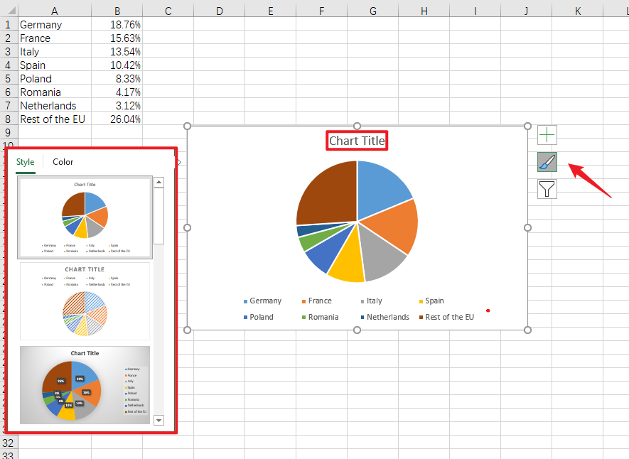
Pro Tip: Right-click your chart and select "Format Data Series" to access advanced options. The "Split Series By" setting is crucial—choose between Position (last N values), Value (below threshold), Percentage (below X%), or Custom selection.
Advanced Customization with Python
For programmatic control, I often turn to Python's matplotlib library. Here's a powerful approach using ConnectionPatch to link the chart elements:
import matplotlib.pyplot as plt
from matplotlib.patches import ConnectionPatch
import numpy as np

# Create figure with two subplots
fig, (ax1, ax2) = plt.subplots(1, 2, figsize=(12, 6))

# Pie chart data
sizes = [35, 25, 20, 20]
labels = ['Sales', 'Marketing', 'Operations', 'Other']
colors = ['#FF8000', '#42A5F5', '#66BB6A', '#FFA726']

# Create pie chart
wedges, texts, autotexts = ax1.pie(sizes, labels=labels,
                                    colors=colors, autopct='%1.1f%%')

# Bar chart for 'Other' breakdown
other_categories = ['IT', 'Legal', 'Admin', 'Misc']
other_values = [8, 6, 4, 2]

# Create bar chart
ax2.barh(other_categories, other_values, color='#FFA726')
ax2.set_xlabel('Percentage')
ax2.set_title('Other Categories Breakdown')

# Add connection lines
# (Implementation details for ConnectionPatch)

plt.tight_layout()
plt.show()
Using PageOn.ai's Vibe Creation feature, I can simply describe my data visualization needs in natural language, and the platform generates the appropriate chart structure automatically, eliminating the need for complex coding while maintaining professional quality.
Design Best Practices and Visual Optimization
When to Choose Bar of Pie Over Alternatives
Through years of creating data visualizations, I've developed a decision framework for choosing the right chart type. Bar of pie charts shine when you have 5-10 total categories with 2-4 dominating the visual space.
Chart Selection Decision Tree
When comparing with standard pie vs donut charts, bar of pie charts offer superior detail visibility. While horizontal bar charts excel at direct comparisons, they lack the intuitive part-to-whole relationship that pie elements provide.
Visual Design Principles
✅ Do's
- • Limit secondary breakdown to 2-5 categories
- • Use consistent color schemes
- • Include clear connector lines
- • Add percentage labels for context
- • Maintain visual hierarchy
❌ Don'ts
- • Avoid 3D effects that distort perception
- • Don't overcrowd with too many categories
- • Skip exploding multiple pie slices
- • Avoid similar colors for different segments
- • Don't forget data value labels
I've found that PageOn.ai's Agentic processes excel at automatically optimizing these design elements. The platform analyzes your data patterns and applies professional design principles, ensuring your visualizations are both beautiful and effective without manual tweaking.
Real-World Applications and Case Studies
Business and Financial Analysis
In my consulting work, I've successfully deployed bar of pie charts for numerous financial scenarios. One memorable project involved visualizing a multinational corporation's revenue streams across 15 countries, where three markets dominated but stakeholders needed visibility into emerging markets.
Case Study: Sales Distribution Analysis
Challenge: Visualize $10M in sales across 20 product categories where top 3 represented 75% of revenue.
Solution: Bar of pie chart showing top 3 categories in pie, remaining 17 in detailed bar breakdown.
Result: Executive team could see both strategic overview and tactical details in one view, leading to better resource allocation decisions.
Survey and Research Data
Survey responses often follow a power law distribution—a few common answers dominate while numerous edge cases provide crucial insights. I recently analyzed customer satisfaction data where "Very Satisfied" and "Satisfied" comprised 70% of responses, but the remaining 30% contained 8 different concern categories that needed individual attention.
By incorporating PageOn.ai's Deep Search capabilities, I can automatically pull in related survey data from multiple time periods, creating dynamic bar of pie charts that show both current distributions and historical trends in the secondary breakdown.
Operational Metrics
Website Traffic Source Breakdown
This visualization approach has proven invaluable for tracking support ticket distributions, manufacturing defect categories, and system performance metrics where both macro trends and micro details matter equally.
Common Pitfalls and How to Avoid Them
Data Selection Mistakes
The most frequent error I see is over-complicating the secondary breakdown. When you include more than 5-6 categories in the bar chart, you lose the clarity advantage this visualization provides. Remember: the goal is to make small values readable, not to display every possible data point.
Warning: Choosing inappropriate threshold values can misrepresent your data. If you set the threshold too high, important categories appear in the pie when they should be in the bar. Too low, and you defeat the purpose of the breakdown.
Visual Design Errors
Poor color contrast between related segments confuses viewers about which bar categories correspond to the extracted pie slice. I always use variations of the same base color for the secondary breakdown—if the "Other" slice is orange, the bars should be different shades of orange.
Cluttered labels and annotations destroy readability. This is where PageOn.ai's AI Blocks shine—they automatically optimize layout and visual hierarchy, ensuring every element has breathing room while maintaining informational density.
Alternative Visualization Approaches
While bar of pie charts solve many visualization challenges, they're not always the optimal choice. Let me share when to consider alternatives based on your specific data characteristics and audience needs.
Pie of Pie Charts
When your secondary data maintains the same proportional relationship as the primary, consider pie of pie charts. Instead of a bar chart, you get a second pie chart showing the breakdown. This works well when you want to maintain the circular aesthetic throughout your visualization.
Sunburst Charts for Multi-Level Hierarchies
Hierarchical Data Visualization Options
                    graph TD
                        A[Data Complexity] --> B{Hierarchy Levels}
                        B -->|2 Levels| C[Bar of Pie Chart]
                        B -->|3+ Levels| D[Sunburst Chart]
                        B -->|Many Categories| E[Treemap]
                        B -->|Time Series| F[Stacked Area Chart]

                        style A fill:#FF8000,stroke:#333,stroke-width:2px
                        style C fill:#42A5F5,stroke:#333,stroke-width:2px
                        style D fill:#66BB6A,stroke:#333,stroke-width:2px
For deeper hierarchical structures, sunburst charts provide multiple concentric rings, each representing a level of detail. However, they become harder to read as complexity increases.
Interactive Dashboards
Sometimes the best solution isn't a static chart but an interactive dashboard. Users can click on pie slices to drill down into details, maintaining context while exploring data at their own pace. This approach works particularly well for web-based reporting systems.
Understanding the distinction between bar charts vs histograms also helps in choosing the right visualization for your data distribution needs.
Tools and Technologies Beyond Excel
Modern Visualization Platforms
While Excel remains the go-to tool for many analysts, modern platforms offer enhanced capabilities for creating bar of pie charts. Power BI provides dynamic filtering where clicking the secondary bar highlights corresponding data throughout your report. Tableau's drill-down capabilities let users explore multiple hierarchy levels seamlessly.
Power BI
Native support with custom visuals marketplace for enhanced bar of pie options
Tableau
Requires creative workarounds but offers superior interactivity
Google Sheets
Limited native support; requires add-ons or custom scripts
For rapid prototyping, I've been exploring AI pie chart generators that can automatically create complex visualizations from natural language descriptions.
Programming Libraries
// D3.js implementation for interactive bar of pie
const svg = d3.select("#chart")
    .append("svg")
    .attr("width", width)
    .attr("height", height);

// Create pie chart
const pie = d3.pie()
    .value(d => d.value)
    .sort(null);

const arc = d3.arc()
    .innerRadius(0)
    .outerRadius(radius);

// Add interactivity
slices.on("click", function(event, d) {
    if (d.data.label === "Other") {
        showBarBreakdown(d.data.breakdown);
    }
});
Whether using Python's plotly for interactive web visualizations, R's ggplot2 for publication-quality graphics, or JavaScript's D3.js for custom web implementations, each tool offers unique advantages. PageOn.ai bridges these technical requirements by transforming code-based visualizations into presentation-ready graphics without requiring programming expertise.
Transform Your Visual Expressions with PageOn.ai
Ready to create stunning bar of pie charts and other complex visualizations without the technical hassle? PageOn.ai's intelligent visualization platform turns your data into compelling visual stories with just a few clicks. Our AI-powered tools understand your data's structure and automatically suggest the most effective visualization approach.
Start Creating with PageOn.ai TodayMastering the Art of Detailed Data Storytelling
Throughout my journey with data visualization, I've learned that bar of pie charts represent more than just a chart type—they embody a philosophy of respecting both the forest and the trees in our data. By combining the intuitive whole-part relationship of pie charts with the detailed clarity of bar charts, we create visualizations that serve multiple audience needs simultaneously.
Key Takeaways
- ✓ Use bar of pie charts when you have 5-10 categories with uneven distribution
- ✓ Limit secondary breakdown to 2-5 categories for optimal clarity
- ✓ Maintain visual consistency between pie and bar sections
- ✓ Choose threshold methods (position, value, percentage) based on your data story
- ✓ Consider alternatives like sunburst or treemaps for deeper hierarchies
The future of hierarchical data visualization lies in intelligent, adaptive systems that understand context and automatically optimize for clarity. Tools like PageOn.ai exemplify this trend, embodying the principle of "Turn Fuzzy Thought into Clear Visuals" by handling the technical complexity while we focus on the story our data needs to tell.
As data complexity continues to grow, mastering specialized visualization techniques like bar of pie charts becomes increasingly valuable. Whether you're presenting to executives, analyzing research data, or exploring operational metrics, this powerful hybrid chart type deserves a place in your visualization toolkit.
I encourage you to experiment with bar of pie charts in your next project. Start with a simple dataset, apply the principles we've discussed, and watch as previously hidden insights emerge from your data. Remember, the goal isn't just to display numbers—it's to transform information into understanding, and understanding into action.
You Might Also Like
Stock Photos in Presentations: Bringing Vibrancy and Depth to Visual Storytelling
Discover how to transform your presentations with strategic stock photography. Learn selection techniques, design integration, and visual consistency to create compelling visual narratives.
Transforming Presentation Creation: How AI Tools Are Revolutionizing Professional Slides
Discover how AI-powered tools are transforming professional slide creation with automated content generation, intelligent design, and data visualization capabilities.
Mastering Element Alignment for Professional Learning Layouts | Visual Design Guide
Learn how to create visually engaging professional learning materials through strategic element alignment techniques that enhance information retention and learner engagement.
Mastering Object Animations: Transform Static Slides into Engaging Visual Stories
Learn how to enhance your presentations with dynamic object animations. Discover techniques for entrance effects, motion paths, interactive elements, and more for PowerPoint and Google Slides.