Inspiring Visual Design Websites: A Curated Guide for Creative Excellence
Navigating the evolving landscape of visual design to discover platforms that inspire and elevate your creative work
Understanding the Visual Design Website Landscape
I've witnessed the remarkable evolution of visual design websites over the past decade. What once started as static portfolios showcasing a designer's work has transformed into immersive digital experiences that engage visitors on multiple sensory levels. Today's best visual design websites don't just display work—they become the work themselves.

Award-winning websites are continually raising the bar for creativity and user engagement. They seamlessly blend aesthetic excellence with technical innovation, creating experiences that feel both intuitive and surprising. These sites don't just look good—they make visitors feel something, whether that's delight, curiosity, or even a sense of wonder.
When examining exceptional visual design, I've found several core elements that consistently stand out:
Core Elements of Exceptional Visual Design
When working with complex design concepts, I've found that visual communication design tools are essential for translating ideas into clear representations. PageOn.ai excels at this translation process, helping designers articulate their vision through intuitive visualization tools that bridge the gap between concept and execution.
Award-Winning Design Platforms to Fuel Your Inspiration
Awwwards: The Professional Benchmark
Awwwards has established itself as the gold standard for recognizing excellence in web design. When I explore their Site of the Month winners, I'm consistently impressed by the innovative approaches these sites take to push the boundaries of what's possible on the web.

One recent standout example is Unseen Studio, which earned Site of the Month honors in February 2023. Their site masterfully blends motion design with intuitive navigation, creating an experience that feels both artistic and functional. What makes Awwwards particularly valuable is their sophisticated search functionality, which allows you to filter inspiration by specific criteria:
flowchart TD
    A[Awwwards Search] --> B[Design Style]
    A --> C[Technology]
    A --> D[Industry]
    A --> E[Color]
    B --> B1[Minimalist]
    B --> B2[Experimental]
    B --> B3[Illustrative]
    C --> C1[WebGL]
    C --> C2[React]
    C --> C3[Three.js]
    D --> D1[Agency]
    D --> D2[E-commerce]
    D --> D3[Portfolio]
    E --> E1[Monochromatic]
    E --> E2[Vibrant]
    E --> E3[Dark Mode]
Dribbble: The Designer's Community
Dribbble offers a different kind of inspiration through its community-driven approach. I've found their daily inspiration features particularly valuable for maintaining a consistent flow of creative input. The platform's strength lies in its diversity—you'll find everything from app interfaces to branding concepts to illustration work.
Engaging with the designer community on Dribbble has helped me expand my visual communication design vocabulary significantly. I often discover new techniques or approaches that I wouldn't have considered otherwise. When I find inspiring concepts on Dribbble, I use PageOn.ai to quickly visualize and iterate on these ideas, transforming static inspiration into dynamic design explorations.
CSS Design Awards: Technical Excellence in Visual Design
CSS Design Awards focuses on the technical excellence behind beautiful visual design. Recent Website of the Day winners like /nk.studio, Faint Film, and Naya Studio demonstrate how technical prowess can elevate visual design to new heights.
Understanding the judging criteria used by CSS Design Awards provides valuable insight into what makes these sites exceptional:
CSS Design Awards Judging Criteria
These award-winning sites consistently push the boundaries of what's possible in web design, combining cutting-edge technologies with thoughtful user experiences. By studying these examples, I've gained insights into how technical excellence can be leveraged to create more impactful visual designs.
Emerging Visual Design Trends Worth Implementing
Organic Matter and Visual Storytelling
I've noticed a significant shift toward incorporating organic elements into digital spaces. This trend represents a desire to bring warmth and humanity to the often cold digital realm. Top designers are finding innovative ways to blend natural textures, fluid shapes, and organic motion into their websites.
Case studies of websites effectively using organic design elements reveal that this approach isn't just aesthetic—it creates a more emotional connection with users. For example, several award-winning portfolio sites use subtle organic motion and natural color palettes to create a sense of calm and authenticity.
When implementing organic design elements in my own work, I've found PageOn.ai's Deep Search functionality invaluable for finding and integrating organic visual assets. The tool's ability to understand the context and emotional quality I'm seeking saves countless hours that would otherwise be spent hunting for the perfect organic elements.
The "Visual Smiles" Approach
The "Visual Smiles" trend represents a deliberate move toward more playful, emotion-driven design elements. In a world often dominated by serious, corporate aesthetics, this approach stands out by creating genuinely memorable experiences through delight and surprise.
I've seen websites effectively using quirky illustrations, unexpected animations, and warm color palettes to create experiences that feel distinctly human. These elements don't just make sites more visually appealing—they create emotional connections that keep users engaged and coming back.
Creating these playful elements efficiently has become much easier with PageOn.ai's conversational design approach. Rather than struggling to describe exactly what I want to a traditional design tool, I can simply have a conversation about the feeling I'm trying to create, and PageOn.ai helps translate that into visual elements that capture the right emotional tone.
Vivid Glow and Bold Color Strategies
The Vivid Glow trend represents a bold approach to color that refuses to blend into the background. What makes this trend particularly interesting is that it's not about chaotic color combinations—it's about intentional, thoughtful use of vibrant colors to create impact.
When analyzing award-winning websites using this approach, I've observed how they balance bold visual choices with usability concerns. The key is using vibrant colors strategically—to highlight important elements, create visual hierarchy, or express brand personality—while ensuring the overall experience remains cohesive and accessible.
Color Harmony in Vivid Design
Using visual AI tools like PageOn.ai has transformed how I experiment with different color combinations and visual hierarchies. The ability to quickly generate multiple variations of a design with different color schemes allows me to find the perfect balance between boldness and harmony without getting lost in endless manual adjustments.
Lesser-Known but Powerful Design Inspiration Sources
Specialized Design Communities
Beyond the well-known platforms, I've discovered incredible value in more specialized design communities. Platforms like Behance, AIGA Eye On Design, and InspirationGrid offer unique perspectives that often diverge from mainstream trends.

What makes these platforms particularly valuable is their focus on specific design niches or their curatorial approach. For instance, AIGA Eye On Design offers thoughtful editorial content alongside visual inspiration, providing context that helps me understand the thinking behind exceptional design work.
flowchart TD
    A[Specialized Design Communities] --> B[Behance]
    A --> C[AIGA Eye On Design]
    A --> D[InspirationGrid]
    A --> E[Directory of Illustration]

    B --> B1[Creative Fields]
    B1 --> B1a[Graphic Design]
    B1 --> B1b[Photography]
    B1 --> B1c[UI/UX]

    C --> C1[Editorial Content]
    C1 --> C1a[Design Criticism]
    C1 --> C1b[Designer Interviews]
    C1 --> C1c[Design History]

    D --> D1[Curated Categories]
    D1 --> D1a[Typography]
    D1 --> D1b[Packaging]
    D1 --> D1c[Web Design]

    E --> E1[Illustration Styles]
    E1 --> E1a[Editorial]
    E1 --> E1b[Conceptual]
    E1 --> E1c[Character Design]
When drawing inspiration from multiple sources, I've found PageOn.ai incredibly helpful for organizing and structuring these diverse inputs. The platform allows me to create visual maps of inspiration that connect related concepts across different platforms, helping me identify patterns and opportunities I might otherwise miss.
Brand-Specific Excellence
Some of the most inspiring visual design work comes from commercial websites that perfectly translate brand identity into compelling digital experiences. Sites like Audemars Piguet and WealthSimple demonstrate how brand values can inform every aspect of visual design.

What makes these brand websites particularly noteworthy is how they balance distinctive visual identity with excellent user experience. For example, Audemars Piguet's site uses immersive scrolling experiences and visually striking elements while maintaining clarity and usability—a difficult balance to achieve.
Creating similar brand-aligned visual systems has become more accessible with PageOn.ai's AI Blocks feature. This tool allows me to define core visual components that reflect brand values and then systematically apply them across different design elements, ensuring consistency while maintaining creative flexibility.
Cross-Disciplinary Inspiration Sources
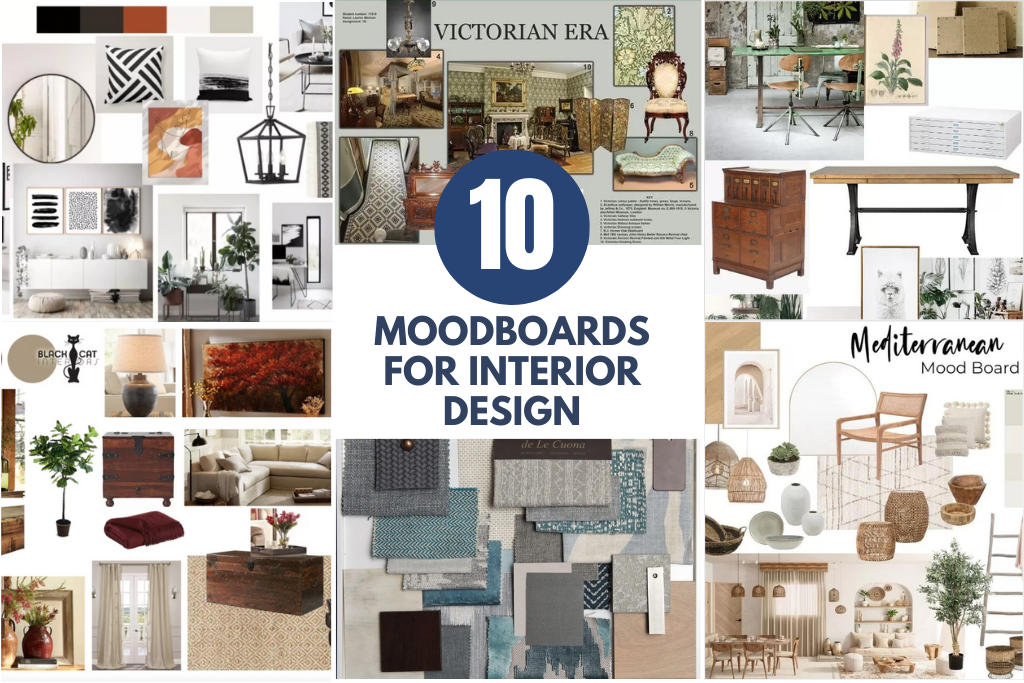
Some of my most innovative design solutions have come from looking beyond traditional design resources. Platforms like Pinterest have proven invaluable for creating mood boards and developing concepts that draw from diverse creative fields.
I've found particular value in exploring adjacent creative fields like photography, illustration, and motion design. These disciplines often approach visual problems from different angles, providing fresh perspectives that can be adapted to web design contexts.
When working with diverse visual references, PageOn.ai has been instrumental in helping me seamlessly integrate these influences into cohesive designs. The platform's ability to understand visual relationships between seemingly disparate elements helps me create unexpected but harmonious combinations that feel both fresh and intentional.
Practical Application: From Inspiration to Implementation
Analyzing What Makes Award-Winners Effective
To move from admiration to application, I've found it essential to deconstruct what makes award-winning websites so effective. Sites like Hyer and "Hall of Zero Limits" offer valuable lessons that can be applied regardless of budget or team size.
When analyzing these sites, I look beyond surface aesthetics to understand the underlying principles and techniques. For example, Hyer's striking imagery creates immediate impact, but its effectiveness comes from thoughtful composition, strategic use of contrast, and careful integration with the site's overall narrative.
Before implementing complex design systems inspired by these award winners, I use PageOn.ai to visualize and test different approaches. This allows me to identify potential challenges and refine my concepts before investing significant development resources.
Creating Design Systems Based on Inspiration
Translating inspiration into practical design components requires a systematic approach. I've developed methods for breaking down inspiring websites into reusable elements that can be adapted to different projects.

Building consistent visual languages across different platforms requires careful attention to how design elements translate across contexts. What works on a desktop website might need significant adaptation for mobile experiences or print materials.
flowchart TD
    A[Inspiration Source] --> B[Design Audit]
    B --> C[Component Identification]
    C --> D[Pattern Library Creation]
    D --> E[Design System Documentation]

    B --> B1[Visual Elements]
    B --> B2[Interaction Patterns]
    B --> B3[Content Structure]

    C --> C1[Atomic Elements]
    C --> C2[Molecules]
    C --> C3[Organisms]

    D --> D1[Color System]
    D --> D2[Typography System]
    D --> D3[Spacing System]
    D --> D4[Component Rules]

    E --> E1[Implementation Guidelines]
    E --> E2[Usage Examples]
    E --> E3[Accessibility Standards]
PageOn.ai's AI Blocks feature has revolutionized how I approach this process. It allows me to rapidly prototype design systems based on inspiration, creating modular components that can be easily adapted and recombined. This significantly accelerates the journey from inspiration to implementation.
Measuring the Impact of Visual Design Choices
Beyond aesthetic considerations, effective visual design must deliver measurable results. I use various tools and metrics to evaluate how design decisions impact user behavior and business outcomes.
Design Impact Metrics
Balancing aesthetic excellence with functional requirements is an ongoing challenge. I've found that the most successful designs achieve both—creating visually stunning experiences that also perform exceptionally well in terms of usability and conversion metrics.
PageOn.ai has become an essential tool in my iterative design process. Its ability to quickly generate multiple visual approaches allows me to test different concepts and gather feedback before committing to a final direction. This reduces the risk of investing in visually impressive designs that don't deliver on functional requirements.
Beyond Aesthetics: The Strategic Value of Visual Design
How Exceptional Visual Design Drives Business Outcomes
I've seen firsthand how exceptional visual design directly impacts business results. Case studies consistently show that investment in visual design excellence delivers measurable ROI through increased engagement, higher conversion rates, and stronger brand perception.
The connection between visual design quality and user trust is particularly significant. When users encounter a beautifully designed website with attention to detail, they subconsciously attribute those same qualities to the brand itself—assuming similar care and excellence in the company's products or services.
Communicating this value to stakeholders can be challenging, especially when design decisions seem subjective. I've found that PageOn.ai's visualization capabilities help bridge this gap by clearly illustrating how design choices connect to business goals and user needs. These visualizations make abstract design concepts concrete and accessible to non-designers.
Accessibility and Inclusivity in Visual Design
The best award-winning websites demonstrate that visual impact and accessibility are not mutually exclusive. I've studied how these sites balance creative expression with inclusive design principles to ensure their experiences work for diverse audiences.
Best practices for creating accessible designs include maintaining sufficient color contrast, providing text alternatives for visual content, ensuring keyboard navigability, and designing with screen readers in mind. These considerations should be integrated from the beginning of the design process rather than treated as afterthoughts.
PageOn.ai has become an invaluable tool for checking and visualizing accessibility considerations in my designs. The platform helps me identify potential issues early in the process and suggests adjustments that maintain visual impact while improving accessibility.
Future-Proofing Your Visual Design Approach
As I look toward the future of visual design, I'm particularly interested in how emerging technologies like AR, VR, and AI will reshape our approach. These technologies aren't just adding new platforms for design—they're fundamentally changing how users interact with digital experiences.

Building adaptable design systems that can evolve with technological changes requires a focus on foundational principles rather than specific implementations. I strive to create design systems with clear hierarchies, strong information architecture, and flexible components that can translate across different contexts and technologies.
PageOn.ai's agentic capabilities have been particularly helpful in this regard. The platform's ability to understand design intent rather than just specific instructions allows me to experiment with how my designs might adapt to new technologies and contexts. This forward-looking approach helps ensure that my work remains relevant as digital experiences continue to evolve.
Transform Your Visual Expressions with PageOn.ai
As we've explored the best visual design websites and the principles that make them exceptional, I've highlighted how PageOn.ai can streamline and enhance your creative process. Whether you're analyzing award-winning designs, creating mood boards from diverse inspiration sources, or building comprehensive design systems, PageOn.ai provides the tools to transform your insights into clear visual expressions.
The platform's unique combination of visual AI tools and intuitive design features empowers you to bridge the gap between inspiration and implementation, making it easier than ever to create designs that are both visually stunning and strategically effective.
In my experience, staying ahead of design trends while maintaining a focus on fundamental principles is the key to creating visual designs with lasting impact. By combining inspiration from the best visual design websites with powerful tools like PageOn.ai, you can create experiences that not only look beautiful but also deliver meaningful results for your users and your business.
I encourage you to explore the websites and platforms we've discussed, analyze what makes them effective, and consider how you might apply those insights to your own projects. With the right approach and tools, exceptional visual design is within reach for creators at every level.
You Might Also Like
From Boardroom to Brilliance: Master Real Story Techniques for Corporate Speakers
Discover powerful real story techniques for corporate speakers that increase memorability by 22x. Learn authentic storytelling methods, visualization strategies, and delivery techniques for business impact.
Transform Any Content into Professional Slides: The Ultimate Conversion Guide
Learn expert techniques for converting documents, presentations, and visual content into professional slides with this comprehensive guide to content format transformation.
The Art of Instant Connection: Crafting Opening Strategies That Captivate Any Audience
Discover powerful opening strategies that create instant audience connection. Learn visual storytelling, interactive techniques, and data visualization methods to captivate any audience from the start.
Transforming Value Propositions into Visual Clarity: A Modern Approach | PageOn.ai
Discover how to create crystal clear audience value propositions through visual expression. Learn techniques, frameworks, and tools to transform complex ideas into compelling visual narratives.