Biology Infographics: Transforming Complex Science into Visual Clarity
Bridging the Gap Between Microscopic Complexity and Human Understanding
When I first encountered the intricate world of cellular biology, I was overwhelmed by the sheer complexity of life at the microscopic level. Today, I'm excited to share how biology infographics have revolutionized the way we communicate scientific concepts, making the invisible visible and the complex comprehensible. Through innovative visual storytelling, we're transforming how students, researchers, and the public engage with biological sciences.
The Challenge of Communicating Biological Complexity
In my years of studying and teaching biology, I've consistently faced one fundamental challenge: how do we make the invisible world of cells, molecules, and biological processes tangible for learners? Biology presents unique visualization challenges that set it apart from other scientific disciplines.
Why Biology Visualization is Uniquely Challenging
- Abstract cellular processes occur at scales invisible to the naked eye
- Multi-layered systems span from molecules to entire ecosystems
- Dynamic processes unfold across vastly different timescales
- Complex interactions between multiple biological components
Traditional biology education has long relied on text-heavy textbooks that can overwhelm students with information. Static diagrams, while helpful, often fail to capture the dynamic nature of biological processes. I've seen firsthand how students struggle to connect theoretical concepts to real-world applications when limited to these conventional teaching tools.
The Critical Need for Visual Transformation
The transformation of biological sciences through visualization isn't just about making pretty pictures – it's about making invisible processes visible and comprehensible. We're bridging the gap between expert knowledge and public understanding, enabling everyone from students to researchers to grasp complex biological concepts more effectively.
To achieve this transformation, modern tools like PageOn.ai's AI-powered Vibe Creation feature allow us to convert complex biological concepts into clear, engaging visuals that resonate with diverse audiences. This technology empowers educators and researchers to communicate their findings more effectively than ever before.
Essential Components of Effective Biology Infographics
Creating effective biology infographics requires a delicate balance between scientific accuracy and visual accessibility. Through my experience, I've identified key components that make biological visualizations both informative and engaging.
Visual Hierarchy in Biological Infographics
The following diagram illustrates how different elements work together in a biological infographic:
flowchart TD
                        A[Scientific Accuracy] --> B[Visual Hierarchy]
                        B --> C[Color Coding Systems]
                        B --> D[Scale Representations]
                        C --> E[Different Biological Elements]
                        D --> F[Molecular to Organism Level]
                        E --> G[Clear Visual Communication]
                        F --> G
                        G --> H[Effective Biology Infographic]
Core Visual Elements
- • Process diagrams for metabolic pathways
- • Comparison charts for species and structures
- • Timeline visualizations for evolution
- • Anatomical illustrations with labels
Data Integration Strategies
- • Statistical representations of genetic variations
- • Population dynamics visualizations
- • Research findings presentations
- • Experimental results displays
Understanding what makes an infographic effective is crucial for biological communication. The integration of infographic data visualizations in biology allows us to present complex research findings in ways that are both scientifically rigorous and visually compelling.
Pro Tip: When creating biological infographics, I always structure information using a systematic approach. PageOn.ai's AI Blocks system has been invaluable for organizing biological information effortlessly, ensuring that complex hierarchies and relationships are clearly represented without overwhelming the viewer.
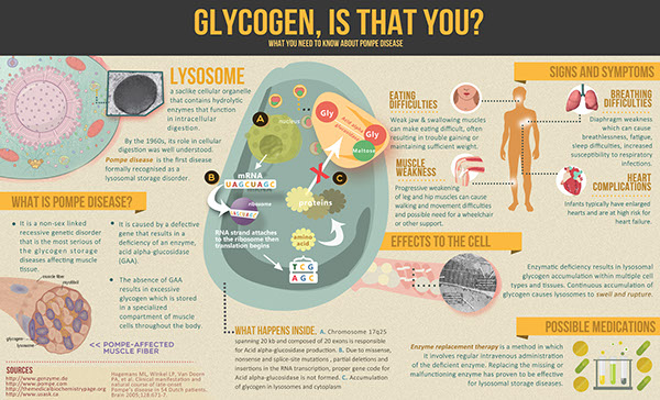
Popular Biology Infographic Categories and Applications
Throughout my career, I've created and utilized biology infographics across various categories, each serving unique educational and communication purposes. Let me share the most impactful applications I've encountered.
Distribution of Biology Infographic Applications
This chart shows the relative frequency of different biology infographic types in educational materials:
Educational Biology Infographics
- • Cell structure and organelle functions
- • Human anatomy and body systems
- • Plant biology and photosynthesis
- • DNA structure and inheritance
Medical and Health Visualizations
Medical infographics serve a crucial role in public health communication. I've seen how effectively designed visualizations can explain disease mechanisms, vaccination processes, and immune system responses to both medical professionals and patients.
- Disease pathogen life cycles
- Nutritional and metabolic pathways
- Treatment procedures and protocols
Environmental and Ecological Infographics
Environmental biology infographics help communicate critical conservation messages. From food chains to climate change impacts on biodiversity, these visuals make complex ecological relationships understandable to diverse audiences. With PageOn.ai's Deep Search capability, I can quickly access relevant biological visuals and data to enhance these environmental narratives.

Design Principles for Biology Infographics
Visual Consistency and Scientific Standards
In my experience creating biological visualizations, maintaining scientific accuracy while ensuring visual appeal is paramount. I've learned that certain design principles are non-negotiable when it comes to biological infographics.
| Design Element | Scientific Requirement | Visual Implementation |
|---|---|---|
| Anatomical Accuracy | Precise proportions and relationships | Scale indicators and reference measurements |
| Color Schemes | Standardized biological conventions | Consistent palette with legend |
| Labeling | Proper scientific nomenclature | Clear typography with hierarchy |
| Symbols | Standard scientific notation | Universally recognized icons |
Accessibility and Engagement Strategies
Creating accessible biology infographics means walking a fine line between simplification and accuracy. I've developed strategies that help maintain scientific integrity while ensuring broad accessibility.
Creating Engaging Biological Narratives
flowchart LR
                        A[Complex Concept] --> B[Visual Metaphor]
                        B --> C[Simplified Representation]
                        C --> D[Interactive Elements]
                        D --> E[Engaged Learning]
                        E --> F[Better Retention]
                        F --> G[Deeper Understanding]
Applying professional infographic design principles is crucial for creating biology visualizations that resonate with viewers. I've found that PageOn.ai automatically applies these principles, ensuring that scientific content maintains both accuracy and visual appeal without requiring extensive design expertise.

Creating Biology Infographics for Different Audiences
One of the most valuable lessons I've learned is that effective biological communication requires tailoring visualizations to specific audiences. Each group has unique needs, prior knowledge, and learning objectives that must be considered.
Audience-Specific Design Requirements
Academic & Research
- • Detailed molecular diagrams
- • Technical annotations
- • Research methodology flowcharts
- • Statistical analysis displays
K-12 Education
- • Age-appropriate complexity
- • Engaging visual metaphors
- • Interactive elements
- • Clear learning objectives
Public Health
- • Simplified guidelines
- • Vaccination schedules
- • Health recommendations
- • Conservation messaging
When developing biology lesson plans for high school, I've found that incorporating well-designed infographics significantly improves student engagement and comprehension. The key is finding the right balance between scientific rigor and accessibility.
Adaptation Strategy: I've discovered that using PageOn.ai's conversational AI guidance helps me quickly adapt content for different audiences. The system understands the nuances of each audience type and suggests appropriate complexity levels, visual styles, and engagement strategies automatically.
Advanced Techniques and Digital Innovation
The future of biology visualization is incredibly exciting. I'm witnessing a revolution in how we represent biological concepts through cutting-edge digital technologies that were unimaginable just a decade ago.
Evolution of Biology Visualization Technologies
flowchart TD
                        A[Static Diagrams] --> B[Digital Illustrations]
                        B --> C[Interactive Graphics]
                        C --> D[3D Models]
                        D --> E["Animation & Motion"]
                        E --> F[AR/VR Experiences]
                        F --> G[AI-Generated Visuals]
                        G --> H[Personalized Medical Infographics]
Motion & Animation Concepts
Incorporating motion brings biological processes to life in ways static images never could:
- • Cellular processes in real-time
- • Evolutionary changes visualization
- • Physiological responses demonstration
- • Molecular interactions simulation
Modern Data Integration
Integration with data visualizations tools enables:
- • Real-time research data display
- • Interactive 3D biological structures
- • Augmented reality education apps
- • Virtual laboratory experiences
Adoption Rate of Emerging Technologies in Biology Education
Innovation in Practice: I'm particularly excited about how PageOn.ai's Agentic AI transforms biological concepts into polished visual narratives. This technology understands the context of biological information and automatically generates appropriate visualizations, making advanced infographic creation accessible to educators and researchers without extensive design training.
Practical Implementation and Best Practices
After years of creating biology infographics, I've developed a systematic approach that ensures both scientific accuracy and visual impact. Let me share my step-by-step process and the lessons I've learned along the way.
Biology Infographic Creation Workflow
flowchart LR
                        A["Research & Fact-Check"] --> B[Define Audience]
                        B --> C[Sketch Concepts]
                        C --> D[Select Visualization Type]
                        D --> E[Create Initial Design]
                        E --> F[Scientific Review]
                        F --> G{Accurate?}
                        G -->|Yes| H[Refine for Clarity]
                        G -->|No| E
                        H --> I[Test with Audience]
                        I --> J[Final Polish]
                        J --> K["Publish & Monitor"]
Step-by-Step Creation Process
Research and Fact-Checking
Verify all biological information from peer-reviewed sources
Concept Development
Sketch initial layouts and determine information hierarchy
Visualization Selection
Choose appropriate chart types, diagrams, and illustrations
Refinement and Testing
Iterate based on feedback and ensure clarity
Common Pitfalls to Avoid
- ❌ Oversimplification losing essential information
- ❌ Visual clutter obscuring key concepts
- ❌ Inaccurate representations misleading viewers
- ❌ Inconsistent scale or proportions
- ❌ Poor color choices reducing accessibility
Measuring Effectiveness
- ✓ Student comprehension improvements
- ✓ Engagement metrics for digital content
- ✓ Feedback from educators and peers
- ✓ Time-to-understanding measurements
- ✓ Retention rate assessments
Success Metrics Dashboard
In my experience, tracking these key metrics helps evaluate infographic effectiveness:
Workflow Optimization: I've significantly streamlined my biology infographic creation process using PageOn.ai's intuitive workflow. What used to take days of design work can now be accomplished in hours, allowing me to focus more on scientific accuracy and educational value rather than technical design challenges.
Transform Your Visual Expressions with PageOn.ai
Ready to revolutionize how you communicate biological concepts? Join thousands of educators, researchers, and science communicators who are already creating stunning biology infographics with PageOn.ai's powerful visualization tools.
Start Creating with PageOn.ai TodayYou Might Also Like
Building Powerful Real-World AI Applications with PostgreSQL and Claude | PageOn.ai
Learn how to build sophisticated AI applications by integrating PostgreSQL and Claude AI. Discover architecture patterns, implementation techniques, and optimization strategies for production use.
Revolutionizing Slide Deck Creation: How AI Tools Transform Presentation Workflows
Discover how AI-driven tools are transforming slide deck creation, saving time, enhancing visual communication, and streamlining collaborative workflows for more impactful presentations.
Typography Evolution: From Cave Paintings to Digital Fonts | Visual Journey
Explore typography's rich evolution from ancient cave paintings to modern digital fonts. Discover how visual communication has transformed across centuries and shaped design.
Mastering Your Inner Landscape: Building Personal Power Through Boundaries and Self-Awareness
Discover how to build personal power through effective boundary-setting and self-awareness. Learn practical visualization techniques to transform your relationships and achieve authentic growth.