From Blank Canvas to Data Story: Mastering Pie Chart Creation and Visualization
Understanding the Foundation of Pie Charts
I've discovered that creating effective pie charts starts with understanding their fundamental purpose: transforming raw numbers into visual stories that instantly communicate proportions and relationships. Whether you're starting with a blank template or leveraging AI-powered tools, the journey from empty circle to insightful visualization is both an art and a science.
Understanding the Foundation of Pie Charts
I believe pie charts are essential tools in our data visualization arsenal because they tap into our intuitive understanding of parts and wholes. When I look at a well-designed pie chart, my brain instantly processes the relative sizes of each segment without needing to decode complex numerical relationships. This psychological advantage makes pie charts particularly powerful for communicating proportional data to diverse audiences.
The circular format of pie charts leverages our natural ability to perceive angles and areas, making them ideal for showing how individual components contribute to a total. However, I've learned that choosing between pie vs donut charts depends on whether you need to display single-level or multi-level categorical data. Similarly, when precise value comparisons are more important than showing parts of a whole, horizontal bar charts might serve your purpose better.
Decision Flow: Choosing the Right Chart Type
Follow this decision tree to determine if a pie chart is right for your data:
flowchart TD
                        A[Start: I have data to visualize] --> B{Is it parts of a whole?}
                        B -->|Yes| C{How many categories?}
                        B -->|No| D[Consider Bar/Line Charts]
                        C -->|2-7| E[Pie Chart Ideal]
                        C -->|8-12| F[Consider Donut Chart]
                        C -->|>12| G[Use Bar Chart Instead]
                        E --> H[Add Clear Labels]
                        F --> I[Use Legend for Clarity]
                        G --> J[Group Small Categories]

                        style E fill:#FF8000,color:#fff
                        style F fill:#42A5F5,color:#fff
                        style G fill:#66BB6A,color:#fff
One common misconception I encounter is that pie charts can effectively display any type of data. In reality, they work best when showing 2-7 categories that sum to 100%. Beyond this range, the human eye struggles to accurately compare slice sizes, especially when dealing with similar proportions or very small segments.
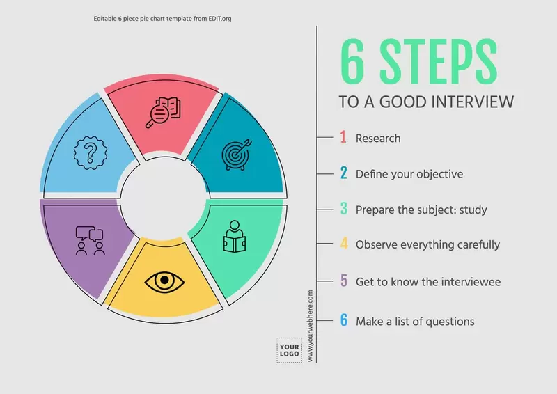
The Anatomy of an Effective Blank Pie Chart Template
When I create a blank pie chart template, I always start with understanding its essential components. The industry standard 6-inch circumference provides optimal visibility while remaining manageable for both print and digital formats. This size allows for clear labeling without overcrowding, whether you're dividing the circle into 2 simple halves or creating a complex 30-segment visualization.
Mathematical Principles for Accurate Divisions
I've found that understanding the mathematics behind pie chart divisions is crucial for creating accurate representations. Each percentage point equals 3.6 degrees of the circle (360° ÷ 100 = 3.6°). This means a 25% segment spans exactly 90 degrees, while a 15% portion requires a 54-degree angle. When drawing divisions manually, I use a protractor to ensure precision, marking angles from the center point outward.
Common Pie Chart Divisions and Their Angles
Design Considerations for Maximum Clarity
Color selection in pie charts isn't just about aesthetics—it's about communication. I follow a strategic approach: using high contrast between adjacent segments, maintaining consistency across related charts, and ensuring accessibility for color-blind viewers. When working with more than 7 segments, I've learned that direct labeling becomes essential, as legends force viewers to constantly shift their attention between the chart and the key.
Traditional Methods: Hand-Drawing and Printable Templates
I still appreciate the value of traditional hand-drawn pie charts, especially in educational settings. There's something powerful about physically creating these visualizations that helps students understand the mathematical relationships involved. Printable templates with pre-divided sections (ranging from 2 to 30 divisions) provide an excellent starting point for classroom activities and quick sketches during brainstorming sessions.
Step-by-Step Manual Creation Process
When I teach students to create pie charts manually, I emphasize precision and planning. First, we start with a compass to draw a perfect circle. Then, using a ruler, we mark the center point clearly. The protractor becomes our most important tool, measuring exact angles for each segment. I always recommend starting from the 12 o'clock position and working clockwise, as this creates a natural reading flow for viewers.
Essential Tools for Manual Pie Chart Creation
- Compass for drawing perfect circles (6-inch diameter recommended)
- Protractor for measuring precise angles
- Ruler for creating straight division lines
- Colored pencils or markers for segment differentiation
- Calculator for converting percentages to degrees
Practical Applications in Education
I've seen remarkable success using pie charts to teach fractions and percentages. One particularly effective exercise involves having students survey their classmates about favorite subjects, then create pie charts to visualize the results. This hands-on approach helps them understand that each person represents a fraction of the whole class, making abstract mathematical concepts tangible and relevant.
Research projects become more engaging when students collect and visualize their own data. Whether they're analyzing reading habits, tracking time spent on different activities, or investigating environmental issues in their community, creating pie charts by hand reinforces both mathematical skills and data literacy. The physical act of dividing the circle helps students internalize proportional relationships in ways that digital tools alone cannot achieve.
Digital Evolution: Modern Pie Chart Creation Tools
Web-Based Generators and Their Capabilities
The digital revolution has transformed how I create pie charts. Modern web-based generators offer capabilities that would have seemed magical just a decade ago. CSV upload functionality means I can import hundreds of data points instantly, while Excel-like editing interfaces make real-time modifications intuitive. What truly impresses me is the automatic percentage calculation feature—no more manual math errors or tedious recalculations when data changes.
Feature Evolution: Traditional vs. Digital Tools
Advanced features have completely transformed my workflow. Precision controls that allow decimal places from 1 to 0.000001 ensure scientific accuracy when needed. The ability to add prefixes and postfixes—like currency symbols or measurement units—provides essential context without cluttering the visualization. Most importantly, high-resolution export options with transparent backgrounds mean my charts integrate seamlessly into any presentation or report.
Professional Design Platforms
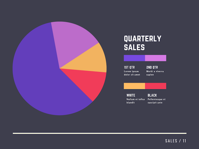
Adobe Express has revolutionized my approach to creating professional pie charts. The AI-powered generation from text prompts feels like having a design assistant who understands exactly what I need. I simply describe my vision—"create a pie chart showing quarterly sales distribution with warm colors"—and watch as the platform generates multiple options instantly.
Brand consistency tools have become indispensable for my corporate presentations. With saved brand colors, logos, and fonts, every chart I create automatically aligns with our visual identity. The collaborative editing features mean my team can provide feedback and make adjustments in real-time, eliminating the endless email chains that used to slow down our workflow.
Revolutionizing Pie Charts with PageOn.ai's Visual Intelligence
Transforming Raw Data into Visual Narratives
PageOn.ai's "Vibe Creation" feature has fundamentally changed how I approach pie chart design. Instead of wrestling with traditional software interfaces, I now engage in natural conversations with the AI. I can say, "Create a pie chart showing our market share across five regions, emphasizing the Asian market growth," and the system not only generates the chart but also suggests optimal color schemes and automatically adds relevant annotations.
PageOn.ai's Intelligent Visualization Workflow
See how PageOn.ai transforms your ideas into professional visualizations:
flowchart LR
                        A[Voice/Text Input] --> B[AI Understanding]
                        B --> C[Data Interpretation]
                        C --> D[Visual Generation]
                        D --> E[Smart Optimization]
                        E --> F[Final Visualization]

                        B --> G[Context Analysis]
                        G --> H[Color Selection]
                        G --> I[Label Generation]
                        G --> J[Layout Design]

                        H --> E
                        I --> E
                        J --> E

                        F --> K[Real-time Collaboration]
                        F --> L[Export Options]
                        F --> M[Version Control]

                        style A fill:#FF8000,color:#fff
                        style F fill:#66BB6A,color:#fff
                        style K fill:#42A5F5,color:#fff
The AI's ability to interpret data context amazes me. When I input sales figures, it automatically recognizes seasonal patterns and suggests highlighting them. It intelligently groups small segments to prevent chart clutter and recommends alternative visualizations when pie charts aren't optimal. This level of intelligence transforms chart creation from a technical task into a creative collaboration.
Building Complex Data Stories with AI Blocks
PageOn.ai's AI Blocks feature has revolutionized how I combine pie charts with other visual elements. Using drag-and-drop functionality, I can create comprehensive dashboards that tell complete data stories. When analyzing data visualization charts options, I often combine pie charts with trend lines, comparison bars, and contextual imagery to provide multiple perspectives on the same dataset.
PageOn.ai's Unique Advantages
- Natural language chart creation through voice or text commands
- Automatic data interpretation and optimal division selection
- Smart color palette suggestions based on data context
- Real-time collaboration with version control
- Seamless integration with other visualization types
- AI-generated insights and annotations
Deep Search Integration for Context-Rich Charts
What sets PageOn.ai apart is its Deep Search capability. When I create a pie chart showing market share, the system automatically finds relevant industry benchmarks, historical data, and comparative statistics. It suggests adding these as contextual overlays or companion visualizations, transforming a simple pie chart into a comprehensive analytical tool. The AI even identifies patterns I might have missed, highlighting correlations and trends that add depth to my presentations.
Best Practices and Advanced Techniques
Through years of creating pie charts, I've developed a systematic approach to data preparation that ensures optimal visualization. Before even selecting a chart type, I clean and organize my data, removing duplicates and standardizing categories. When dealing with many small segments, I group anything under 5% into an "Other" category to maintain visual clarity while preserving data integrity.
| Aspect | Common Mistake | Best Practice |
|---|---|---|
| Number of Segments | Including 15+ tiny slices | Limit to 7 segments, group small values |
| Color Selection | Using similar shades | High contrast between adjacent segments |
| Labeling | Cluttered overlapping labels | Use callout lines or legends strategically |
| 3D Effects | Adding unnecessary 3D | Keep it flat for accurate perception |
| Starting Position | Random arrangement | Start at 12 o'clock, largest segment first |
Accessibility Considerations
I've learned that creating accessible pie charts isn't just about compliance—it's about ensuring everyone can understand my data. I always use color-blind friendly palettes, avoiding problematic combinations like red-green. Each segment gets a unique pattern or texture in addition to color, and I provide comprehensive alternative text descriptions that convey both the data and the key insights.

Integration with broader presentations requires maintaining visual consistency. I create a master template with defined colors, fonts, and styling that I apply across all charts in a project. Animation effects, when used sparingly, can guide viewers through complex data stories—I particularly like using sequential reveals to build understanding step by step.
Future of Pie Chart Creation and AI Innovation
The future of pie chart visualization excites me tremendously. We're moving beyond static 2D representations into interactive, immersive experiences. 3D pie charts that users can rotate and explore, real-time data streaming that updates visualizations instantly, and AR/VR applications that let viewers step inside their data—these aren't science fiction anymore, they're emerging realities.
Evolution Timeline: Pie Chart Innovation
Tracking the transformation from static to intelligent visualizations:
timeline
                        title Pie Chart Evolution Timeline

                        Traditional Era : Hand-drawn charts
                                       : Physical templates
                                       : Manual calculations

                        Digital Revolution : Spreadsheet software
                                          : Online generators
                                          : Template libraries

                        AI Integration : Natural language creation
                                      : Automated insights
                                      : Smart recommendations

                        Future Vision : AR/VR visualization
                                     : Real-time streaming
                                     : Predictive analytics
AI is fundamentally reshaping how we approach chart creation. Tools like ai pie chart generators now suggest the most appropriate visualization type based on your data characteristics. They automatically generate compelling narratives around your numbers and even predict future trends based on historical patterns. Natural language modifications mean I can simply say "make the growth segment more prominent" and watch the chart adapt instantly.
PageOn.ai's Agentic Approach
PageOn.ai's Plan-Search-Act methodology represents the next evolution in intelligent visualization. The system doesn't just respond to commands—it actively plans the best approach to visualize your data, searches for relevant context and supporting information, then acts to create comprehensive visual stories. This agentic behavior means the AI learns from every interaction, continuously improving its recommendations and becoming more attuned to your specific visualization style and needs.
Emerging Capabilities to Watch
- Voice-controlled chart modifications in real-time presentations
- AI-powered data storytelling with automated narrative generation
- Predictive visualization suggesting future data patterns
- Cross-platform synchronization for seamless workflow
- Personalized learning algorithms adapting to user preferences
- Collaborative AI assistants for team-based visualization projects
The convergence of AI, machine learning, and visualization technology promises a future where creating effective pie charts becomes as natural as having a conversation. PageOn.ai is at the forefront of this revolution, transforming how we think about data presentation and making professional-quality visualizations accessible to everyone, regardless of technical expertise.
Transform Your Visual Expressions with PageOn.ai
Ready to move beyond blank templates and static charts? PageOn.ai empowers you to create stunning, intelligent visualizations through natural conversation. Transform your data into compelling visual stories that engage, inform, and inspire your audience.
Start Creating with PageOn.ai TodayYou Might Also Like
Optimizing Websites for AI Agent Interaction: The Ultimate Guide
Learn how to prepare your website for AI agents and assistants. Discover technical foundations, content optimization strategies, and task completion enhancements for the AI revolution.
The Art of Text Contrast: Transform Audience Engagement With Visual Hierarchy
Discover how strategic text contrast can guide audience attention, enhance information retention, and create more engaging content across presentations, videos, and marketing materials.
Mastering Element Alignment for Professional Learning Layouts | Visual Design Guide
Learn how to create visually engaging professional learning materials through strategic element alignment techniques that enhance information retention and learner engagement.
Engaging Your Audience: Crafting Interactive and Visually Captivating Slides
Discover how to transform static presentations into interactive visual experiences that captivate audiences through strategic design, interactive elements, and data visualization techniques.