From Spreadsheet Chaos to Visual Clarity: Mastering Excel Pie Charts
Breaking Down the Pie Chart Fundamentals
I've spent countless hours transforming raw data into meaningful visual stories, and I can tell you that pie charts remain one of the most powerful tools in our visualization arsenal. While experts debate their effectiveness, I've found that when used correctly, pie charts can instantly communicate proportions and relationships that would take paragraphs to explain. Let me guide you through everything I've learned about creating compelling pie charts in Excel.
Breaking Down the Pie Chart Fundamentals
When I first started working with data visualization, I quickly learned that pie charts are like the Swiss Army knife of visual communication - incredibly useful when applied correctly, but often misused. Let me share what I've discovered about when and how to use these circular representations effectively.
Understanding Pie Chart Components
Here's how I visualize the anatomy of an effective pie chart:
flowchart TD
                        A[Pie Chart Components] --> B[Data Series]
                        A --> C[Visual Elements]
                        A --> D["Labels & Legend"]

                        B --> B1[Single Series Only]
                        B --> B2[Positive Values]
                        B --> B3[7-9 Categories Max]

                        C --> C1[Slice Proportions]
                        C --> C2[Color Coding]
                        C --> C3[Explosion Effects]

                        D --> D1[Percentages]
                        D --> D2[Category Names]
                        D --> D3[Data Values]

                        style A fill:#FF8000,stroke:#333,stroke-width:2px
                        style B fill:#42A5F5,stroke:#333,stroke-width:2px
                        style C fill:#66BB6A,stroke:#333,stroke-width:2px
                        style D fill:#FFA726,stroke:#333,stroke-width:2px
Common Use Cases That Shine
Through my experience, I've found pie charts excel in specific scenarios. Budget breakdowns are perhaps the most intuitive application - when I need to show how a total budget is distributed across departments, nothing beats a well-crafted pie chart. Survey results and demographic distributions also benefit tremendously from this format, as do sales figures broken down by region or product category.

Key Limitations to Consider
I've learned the hard way that pie charts have their limitations. Our eyes struggle to accurately compare angles between slices - this is why data visualization experts often critique them. When I have more than nine categories, the chart becomes cluttered and confusing. They're also not suitable for showing trends over time or multiple data series. In these cases, I turn to AI pie chart generators or explore alternative visualizations through PageOn.ai's AI Blocks feature, which helps identify the most effective chart type for my specific data story.
Setting Up Your Data Foundation
I can't stress enough how crucial proper data preparation is. I've seen countless pie charts fail simply because the underlying data wasn't structured correctly. Let me walk you through my proven approach to setting up data that Excel will love.
Structuring Data for Success
The golden rule I follow is simple: organize your data in one column for values or one row format. I always include category labels in the first column or row - these become your legend entries. Every value must be positive (Excel won't plot negative slices), and I meticulously remove any empty rows or columns that could disrupt chart generation.
My Data Preparation Checklist
- Sort values from largest to smallest for visual hierarchy
- Group categories under 5% into an "Other" category
- Verify all calculations are accurate
- Convert to percentages if representing proportions
- Remove any blank cells or rows
When working with complex datasets, I've found that leveraging PageOn.ai's Deep Search capabilities can automatically find and incorporate benchmark data for context. This feature has saved me hours of manual research, especially when I need to pull in industry standards or comparative metrics to enhance my pie chart's story.
Step-by-Step Chart Creation Process
After years of creating pie charts in Excel, I've refined my process to be both efficient and foolproof. Let me guide you through the exact steps I take, from initial insertion to choosing the perfect chart type for your data.
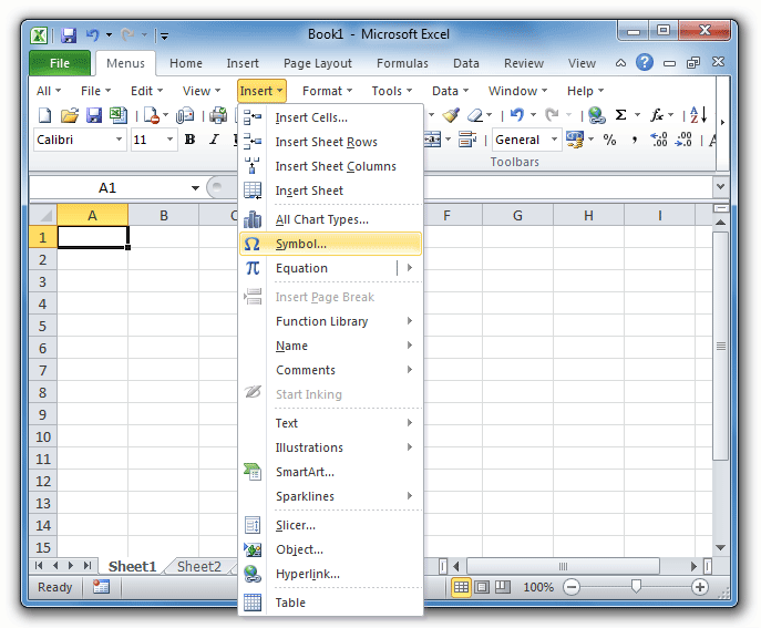
Initial Chart Insertion
I start by selecting my prepared data range, including both labels and values. Then I navigate to the Insert tab, find the Charts group, and click the Pie Chart icon. Excel presents several options, and I choose based on my specific needs:
Pie Chart Type Selection Guide
Here's how different pie chart types compare in Excel:
Alternative Creation Methods
Sometimes I prefer to create an empty chart first, then add data via Chart Tools. This approach gives me more control, especially when working with data from multiple sheets. I can also import data using consolidation features, which is incredibly useful for creating bar charts in Excel or when I need to compare different visualization types. For dynamic presentations, I often transform static charts into interactive visuals using PageOn.ai's Vibe Creation feature.
Essential Customization Techniques
The difference between a basic pie chart and a professional visualization lies in the details. I've spent years perfecting my customization approach, and I'm excited to share the techniques that consistently deliver impressive results.
Adding and Formatting Data Labels
My first step is always clicking the Chart Elements button (that little + icon) and checking Data Labels. The positioning is crucial - I typically choose 'Inside End' for a clean look, though 'Outside End' works better for smaller slices. When deciding between pie vs donut charts, I consider how labels will display on each format.
Pro Tip: Label Display Options
I've found the most effective label configuration includes:
- Category names for direct slice identification
- Percentages for proportion display (my go-to choice)
- Data callouts for cleaner, more professional presentation
- White text on dark slices for optimal readability
Visual Enhancement Strategies
Color selection can make or break your pie chart. I modify colors through Chart Styles or by selecting individual slices - this granular control is essential when I need specific brand colors. For emphasis, I use the explosion technique sparingly: pulling out a single slice by 10-15% draws attention without looking gimmicky.
Customization Workflow
My systematic approach to pie chart customization:
flowchart LR
                        A[Base Chart] --> B[Add Labels]
                        B --> C[Adjust Colors]
                        C --> D[Apply Effects]
                        D --> E[Final Polish]

                        B --> B1[Position]
                        B --> B2[Content]
                        C --> C1[Theme]
                        C --> C2[Individual]
                        D --> D1[Explosion]
                        D --> D2[Rotation]
                        E --> E1[Title]
                        E --> E2[Legend]

                        style A fill:#FF8000,stroke:#333,stroke-width:2px
                        style E fill:#66BB6A,stroke:#333,stroke-width:2px
For complex visualizations, I often use PageOn.ai's AI Blocks to create complementary charts alongside my pie chart. This approach provides multiple perspectives on the same data, ensuring my audience gets the complete picture.
Advanced Formatting and Polish
Taking your pie chart from good to exceptional requires mastering the advanced formatting options. I've discovered that these finishing touches often make the difference between a chart that's merely informative and one that's truly memorable.
Professional Design Elements
I access the Format Data Series pane to apply subtle shadow, glow, and soft edge effects. The key is restraint - I use these sparingly to add depth without overwhelming the data. My chart titles are always descriptive and meaningful, never generic. When I've added data labels directly to the chart, I remove the legend to eliminate redundancy and create a cleaner look.

Dynamic and Interactive Features
For presentations that need to adapt to changing data, I create PivotTable-based pie charts. These automatically sort by size and update when the underlying data changes. I've also learned to link charts to external data sources for real-time updates - a game-changer for dashboard creation. When working with data visualization in Excel, combining multiple chart types creates comprehensive dashboards that tell complete stories.
Transform Static Charts into Interactive Experiences
When Excel's capabilities reach their limits, I transform static charts into interactive presentations using PageOn.ai's Agentic capabilities. This allows me to create visualizations that respond to user input, update in real-time, and provide deeper insights through interactive exploration.
Best Practices and Common Pitfalls
Through trial and error (and plenty of client feedback), I've compiled a comprehensive list of do's and don'ts that will save you from the mistakes I made early in my career.
✓ Do's for Effective Pie Charts
- • Sort slices by size for logical flow
- • Use contrasting colors for adjacent slices
- • Label directly on chart to eliminate legend lookup
- • Gray out or group minor categories
- • Maintain consistent formatting across related charts
- • Rotate chart to position key data prominently
✗ Don'ts to Avoid
- • Including more than 9 categories
- • Using excessive 3-D effects
- • Plotting negative values or multiple series
- • Creating pie charts for time-series data
- • Relying solely on color for differentiation
- • Ignoring accessibility considerations
Alternative Visualization Options
When pie charts fail to communicate effectively, I turn to alternatives. Bar charts excel at comparing multiple categories, while column charts work better for time-based comparisons. Treemaps handle hierarchical data beautifully. I often explore data visualization charts options through PageOn.ai's Deep Search feature, which helps identify the most effective chart type for my specific data story.
When to Choose Alternative Charts
Decision matrix for chart type selection:
Troubleshooting and Optimization
Even with years of experience, I still encounter challenges when creating pie charts. Here are the solutions I've developed for the most common issues, along with optimization strategies for handling complex datasets.
Common Issues and Solutions
Chart Not Displaying Correctly
I always verify that my data selection includes headers. This simple check solves 90% of display issues.
Percentages Not Adding to 100%
I check for hidden rows or calculation errors. Sometimes rounding can cause minor discrepancies - I use Excel's ROUND function to ensure precision.
Labels Overlapping
I adjust label position or use leader lines. For crowded charts, data callouts provide the cleanest solution.
Colors Not Distinct Enough
I manually assign contrasting colors, ensuring accessibility for color-blind viewers by using patterns or textures when needed.
Performance Optimization for Large Datasets
When dealing with extensive data, I limit displayed categories to top performers and use data aggregation before chart creation. For truly complex scenarios, I consider alternative visualizations entirely. The key is maintaining clarity without sacrificing important information.
Exporting and Sharing Considerations
I save charts as images for presentations, ensuring consistent formatting across different devices. For dynamic reports, I link to PowerPoint for automatic updates. PDF export maintains formatting integrity for distribution. When I need enhanced engagement, I transform static charts into interactive web visualizations with PageOn.ai, allowing viewers to explore the data themselves.
My Final Optimization Tip
The most powerful optimization I've discovered isn't technical - it's asking myself whether a pie chart is truly the best choice for my data. Sometimes the bravest decision is choosing a different visualization entirely. This critical thinking, combined with tools like PageOn.ai's visualization recommendations, ensures my charts always serve their intended purpose: clear, impactful communication.
Transform Your Visual Expressions with PageOn.ai
Ready to take your data visualization beyond Excel's limitations? PageOn.ai empowers you to create stunning, interactive visual stories that captivate your audience. From AI-powered chart recommendations to dynamic, responsive visualizations, discover how our platform can revolutionize the way you present data.
Start Creating with PageOn.ai TodayYou Might Also Like
The AI Code Revolution: How Y Combinator Startups Are Building With LLM-Generated Software
Explore how 25% of Y Combinator startups are using AI to write 95% of their code, transforming startup economics and enabling unprecedented growth rates in Silicon Valley's top accelerator.
Google Gemini Evolution: From Basic to Advanced Reasoning Models | Visual Timeline
Explore the complete visual evolution timeline of Google Gemini AI, from its foundation to revolutionary reasoning capabilities. See how Gemini transformed from basic to advanced models.
Strategic Contrast in E-Learning: Creating Visual Impact That Enhances Learning Outcomes
Discover how to leverage strategic contrast in e-learning design to reduce cognitive load, improve retention, and create visually impactful learning experiences that drive better outcomes.
Achieving Visual Harmony: The Art of Scale and Proportion in Interface Design
Master the principles of scale and proportion in interface design to create visually balanced, harmonious user experiences that reduce cognitive load and enhance usability.