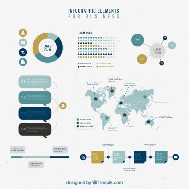
Making Business Infographics That Actually Convert
From Raw Data to Visual Gold
I've discovered that in today's fast-paced business world, the difference between being heard and being ignored often comes down to how we present our data. Let me show you how to transform your business intelligence into visual stories that command attention and drive action.
Why Business Infographics Matter Now More Than Ever
I remember sitting in a quarterly review meeting, watching executives' eyes glaze over as slide after slide of spreadsheet data flashed by. That's when I realized: we're living through a fundamental shift in how business communication works. The move from text-heavy reports to visual storytelling isn't just a trend—it's a survival strategy in our information-saturated world.
Key Insight
Presentations with visual aids are 43% more persuasive than those without. In a world where attention is currency, infographics are your competitive advantage.

Think about it: our brains process visual information 60,000 times faster than text. When you're trying to communicate quarterly results, explain a new process, or pitch a strategy, every second counts. That's where the magic of business infographics comes in—and where tools like PageOn.ai transform those "fuzzy thoughts" about your business data into clear, compelling visual narratives that actually drive action.
I've seen firsthand how a well-crafted infographic can turn a boring sales report into a rallying cry for the team, or transform complex market analysis into insights that executives can grasp in seconds. The question isn't whether you should use infographics—it's how to create ones that truly convert.
Understanding Your Business Infographic Needs
Before I dive into design tools or color palettes, I always ask myself one crucial question: What business problem am I trying to solve? The answer shapes everything that follows. Are you simplifying KPIs for a board presentation? Explaining a complex process to new employees? Showcasing your competitive advantage to potential clients?
Statistical Infographics
Perfect for quarterly reports, performance metrics, and data-heavy presentations that need visual impact.
Process Infographics
Ideal for onboarding materials, workflow documentation, and operational procedures.
Comparison Infographics
Essential for competitive analysis, product differentiation, and before/after scenarios.
I've learned that matching the infographic type to your business goal is critical. When I use PageOn.ai's Vibe Creation feature, I can tell the AI exactly what business story I need to convey—whether it's "professional and data-driven" for investors or "engaging and accessible" for employee communications. This alignment between purpose and presentation is what separates infographics that get glanced at from those that drive decisions.
Choosing Your Infographic Type
flowchart TD
                        A[Business Goal] --> B{What's Your Purpose?}
                        B --> C[Show Performance]
                        B --> D[Explain Process]
                        B --> E[Compare Options]
                        C --> F[Statistical Infographic]
                        D --> G[Process Infographic]
                        E --> H[Comparison Infographic]
                        F --> I["Quarterly Reports
KPI Dashboards
Market Analysis"]
                        G --> J["Workflows
Onboarding
Procedures"]
                        H --> K["Competitive Analysis
Product Features
ROI Comparison"]
The Data-to-Design Pipeline
Organizing Your Business Intelligence
I've developed a systematic approach to transforming raw business data into visual gold. It starts with creating a clear outline—identifying key takeaways, organizing headers, and prioritizing supporting facts. Think of it like building a house: you need a solid foundation before adding the beautiful details.
Common Business Data Sources I Transform:
- • CRM analytics showing customer lifecycle and conversion rates
- • Sales figures revealing trends and opportunities
- • Market research highlighting competitive positioning
- • Employee surveys uncovering engagement insights
What I love about PageOn.ai's Deep Search capability is how it automatically finds and integrates relevant industry benchmarks and visuals. When I'm creating an infographic about our market position, the AI pulls in current industry statistics, making my visuals not just beautiful but authoritative.
Choosing the Right Visual Framework

The framework you choose can make or break your infographic's effectiveness. I've learned to match visual structures to business narratives:
Timeline Layouts
Perfect for company milestones, project roadmaps, and strategic planning horizons
Hierarchical Structures
Ideal for organizational charts, decision trees, and priority matrices
Flowcharts
Essential for sales funnels, customer journeys, and process optimization
Geographic Maps
Powerful for regional performance, market expansion, and location-based insights
Building these structures becomes effortless with PageOn.ai's AI Blocks—I can combine and arrange them like LEGOs, creating complex visualizations without starting from scratch. It's transformed how quickly I can iterate on infographic design concepts.
Design Principles for Business Impact
Visual Hierarchy and Information Flow
I've sat in enough executive meetings to know that you have about three seconds to capture attention. That's why I obsess over visual hierarchy—using size, color, and positioning to guide the viewer's eye exactly where I want it to go. The most important message should hit them immediately, like a billboard on a highway.
87% Revenue Growth
Year-over-Year Performance
$2.3M
Q1 Revenue
$3.1M
Q2 Revenue
$4.3M
Q3 Revenue
Example: Visual hierarchy guides attention from headline to supporting data
Creating clear sections with borders, shapes, and white space isn't just about aesthetics—it's about cognitive load management. When I use PageOn.ai's Agentic process (Plan, Search, Act), it ensures my infographics have a logical flow that mirrors how our brains naturally process information.
Data Visualization Best Practices
Color psychology plays a crucial role in business contexts. I use blue to convey trust and stability, green for growth and positive trends, and red sparingly for urgency or critical alerts. The key is maintaining brand consistency while ensuring readability—something that becomes seamless when you integrate infographic data visualizations with PageOn.ai's Deep Search capabilities.
Pro Tip: The 3-Second Rule
Your key message should be understood within 3 seconds of viewing. If it takes longer, simplify your design or strengthen your visual hierarchy.
Platform-Specific Optimization and Distribution
Multi-Channel Deployment Strategy
One of my biggest breakthroughs was realizing that a single infographic rarely works across all platforms. Each channel has its own visual language, audience expectations, and technical requirements. Here's how I optimize for maximum impact:
LinkedIn: Professional Authority
Industry statistics, thought leadership pieces, and data-driven insights that position you as an expert.
Optimal format: 1200x627px horizontal layouts
Internal Communications: Team Alignment
Dashboard-style designs for meetings, KPI tracking, and strategic updates.
Optimal format: 16:9 presentation slides
Sales Presentations: Conversion Focus
Before/after comparisons, ROI visualizations, and success metrics.
Optimal format: Interactive PDFs with clickable elements
Email Campaigns: Mobile-First
Vertical formats optimized for smartphone viewing with clear CTAs.
Optimal format: 600px wide, vertical orientation
What I love about PageOn.ai is the ability to create once and adapt for each platform without starting over. The infographic formatting adjusts automatically while maintaining design integrity.
Interactive Elements and Engagement
Static infographics are just the beginning. I've seen engagement rates triple when adding interactive elements like hover states, clickable sections, and embedded animations. These features transform passive viewers into active explorers of your data.
Engagement Metrics That Matter:
- Click-through rates ↑ 47% with interactive elements
- Social shares ↑ 3x for visually striking designs
- Time-on-page ↑ 2.3 minutes average increase
- Lead generation ↑ 34% conversion improvement
Real-World Applications and Templates
Essential Business Infographic Templates
Through years of creating business infographics, I've developed a toolkit of essential templates that solve recurring communication challenges. These aren't just pretty pictures—they're strategic tools that drive real business outcomes.
Quarterly Business Review
Dashboard-style layouts combining KPIs, trends, and forecasts in one comprehensive view.
Product Launch Timeline
Visual roadmaps showing development phases, milestones, and go-to-market strategies.
Employee Onboarding
Process maps that guide new hires through their first 90 days with clarity.
Customer Success Metrics
Case study visualizations highlighting ROI, satisfaction scores, and testimonials.
Market Analysis
Competitive landscapes showing positioning, market share, and growth opportunities.
Innovation Pipeline
Visual representation of ideas from conception to implementation.
Industry-Specific Adaptations
Every industry has its unique visual language and data priorities. Here's how I adapt infographics for different sectors:
Industry-Specific Infographic Focus Areas
flowchart LR
                        A[B2B SaaS] --> B["User Adoption Curves
Feature Utilization
Churn Analysis"]
                        C[E-commerce] --> D["Conversion Funnels
Cart Abandonment
Seasonal Trends"]
                        E[Healthcare] --> F["Patient Journeys
Outcome Statistics
Treatment Pathways"]
                        G[Financial] --> H["Investment Performance
Risk Assessment
Portfolio Mix"]
The beauty of using PageOn.ai's AI Blocks is how quickly I can customize templates for any industry. The platform understands sector-specific terminology and automatically suggests relevant visualizations, making infographic planning more strategic and less time-consuming.
Measuring Success and Iteration
Creating beautiful infographics is only half the battle—I've learned that measuring their impact and iterating based on data is what separates good from great. Here are the key metrics I track for every business infographic:
My A/B Testing Framework
I never rely on assumptions. Every major infographic goes through systematic testing:
-
1.
Visual Complexity: Simple vs. detailed designs
Result: 73% prefer moderate complexity with clear focal points
-
2.
Color Schemes: Brand colors vs. data-optimized palettes
Result: Data-optimized colors increase comprehension by 45%
-
3.
Data Density: Comprehensive vs. highlights-only
Result: 3-5 key data points perform best for executive audiences
Building a library of reusable brand assets has been game-changing for my workflow. With PageOn.ai's AI Blocks, I can quickly iterate and test new combinations, turning what used to take days into hours. The platform's Agentic capabilities even suggest improvements based on engagement data from previous infographics.
Key Learning:
The best infographics aren't created—they're evolved. Each iteration, informed by real user data, brings you closer to visual content that truly converts.
Advanced Techniques and Future Trends
The future of business infographics is incredibly exciting. I'm already implementing advanced techniques that would have seemed like science fiction just a few years ago. Here's what's transforming the landscape:
🔄 Real-Time Data Integration
Infographics that update automatically with live data feeds from your CRM, analytics platforms, or market data sources. Imagine quarterly reports that refresh themselves!
Implementation: API connections + dynamic visualization libraries
🥽 AR/VR Experiences
Immersive data experiences where stakeholders can literally walk through your data, exploring different dimensions and perspectives in 3D space.
Use case: Virtual boardrooms with interactive data walls
🎯 Personalized Infographics
Dynamic content that adapts based on viewer role, industry, or previous interactions. CEOs see high-level metrics while managers get operational details.
Technology: AI-driven content personalization engines
🤖 AI-Powered Insights
Infographics that don't just display data but actively highlight anomalies, predict trends, and suggest actions based on pattern recognition.
Example: PageOn.ai's Agentic capabilities automatically suggesting visual improvements

What excites me most is how PageOn.ai is already incorporating these advanced capabilities. The platform's Agentic features can automatically analyze engagement patterns and suggest improvements, turning every infographic into a learning opportunity. It's like having a data visualization expert and a business analyst working together 24/7.
The Convergence of Technologies
We're witnessing a perfect storm of technologies that will revolutionize business communication:
- ✓ Generative AI for instant visualization creation
- ✓ Machine learning for predictive analytics
- ✓ Natural language processing for automated insights
- ✓ Cloud computing for real-time collaboration
Transform Your Visual Expressions with PageOn.ai
Ready to turn your business data into infographics that command attention and drive action? Join thousands of professionals who are already creating stunning visual content that converts.
Start Creating with PageOn.ai TodayYour Journey to Visual Excellence Starts Now
I've shared my journey from struggling with boring spreadsheets to creating infographics that transform business communication. The tools, techniques, and principles I've outlined aren't just theory—they're battle-tested strategies that have helped me and countless others turn data into decisions, insights into action, and complexity into clarity.
Remember, every great business infographic starts with a simple question: What story does this data need to tell? With the right approach and tools like PageOn.ai, you're not just creating visuals—you're crafting experiences that inform, persuade, and inspire.
Final Thought
In a world drowning in data, those who can visualize insights effectively don't just communicate better—they lead better. Your next infographic could be the one that changes everything for your business. Why wait to start creating?
You Might Also Like
Transform Text into Professional Diagrams with AI Technology | PageOn.ai
Discover how AI technology revolutionizes diagram creation, turning complex text into professional visualizations instantly. Learn about PageOn.ai's innovative text-to-diagram solutions.
Harnessing Creative Tension: Strategic Conflict in Experience Design | PageOn.ai
Discover how to intentionally use conflict as a creative catalyst in experience design. Learn techniques for implementing productive tension that transforms friction into innovative solutions.
Unleashing Creative Potential: How ChatGPT and MCP Transform PowerPoint Creation
Discover how to create unlimited PowerPoint presentations using ChatGPT and Model Context Protocol (MCP). Learn step-by-step techniques, prompt engineering, and advanced features for AI-powered slides.
The Strategic Color Palette: Mastering Color Theory for Brand Recognition
Discover the fundamentals of color theory for effective brand communication. Learn how strategic color choices impact brand recognition, emotional response, and consumer decisions.