Beyond Templates: Transforming Canva's Bar Chart Maker into Dynamic Visual Stories
The Evolution from Static Charts to Intelligent Data Visualization
I've spent countless hours wrestling with chart makers, trying to transform raw data into compelling visual narratives. Today, I'm exploring how modern AI tools are revolutionizing the way we think about data visualization, moving beyond Canva's traditional bar chart templates to create dynamic, intelligent visual stories that adapt and evolve with our needs.
The Evolution of Chart Creation
I remember when creating a bar chart meant hours of manual work in spreadsheet software, painstakingly adjusting every element. The landscape has dramatically shifted from those static templates to dynamic data visualization platforms. Today's tools aren't just about displaying numbers—they're about telling stories that resonate with audiences.
Traditional bar chart makers, while useful, often fall short when we need to convey complex insights or adapt quickly to changing data. I've found that the real challenge isn't creating a chart—it's creating one that truly communicates the narrative hidden within the data.
This is where PageOn.ai's revolutionary approach comes in. Instead of forcing data into predetermined templates, it turns data into conversations. Through its AI Blocks technology, I can describe what I want to visualize in natural language, and the system creates intelligent visual representations that adapt to my specific needs.
The modern visualization landscape is rapidly evolving, with tools that understand context, suggest optimal representations, and even predict what insights you're trying to highlight. PageOn.ai exemplifies this shift by offering voice-to-visual creation capabilities that transform how we think about data presentation.
Understanding Canva's Bar Chart Ecosystem
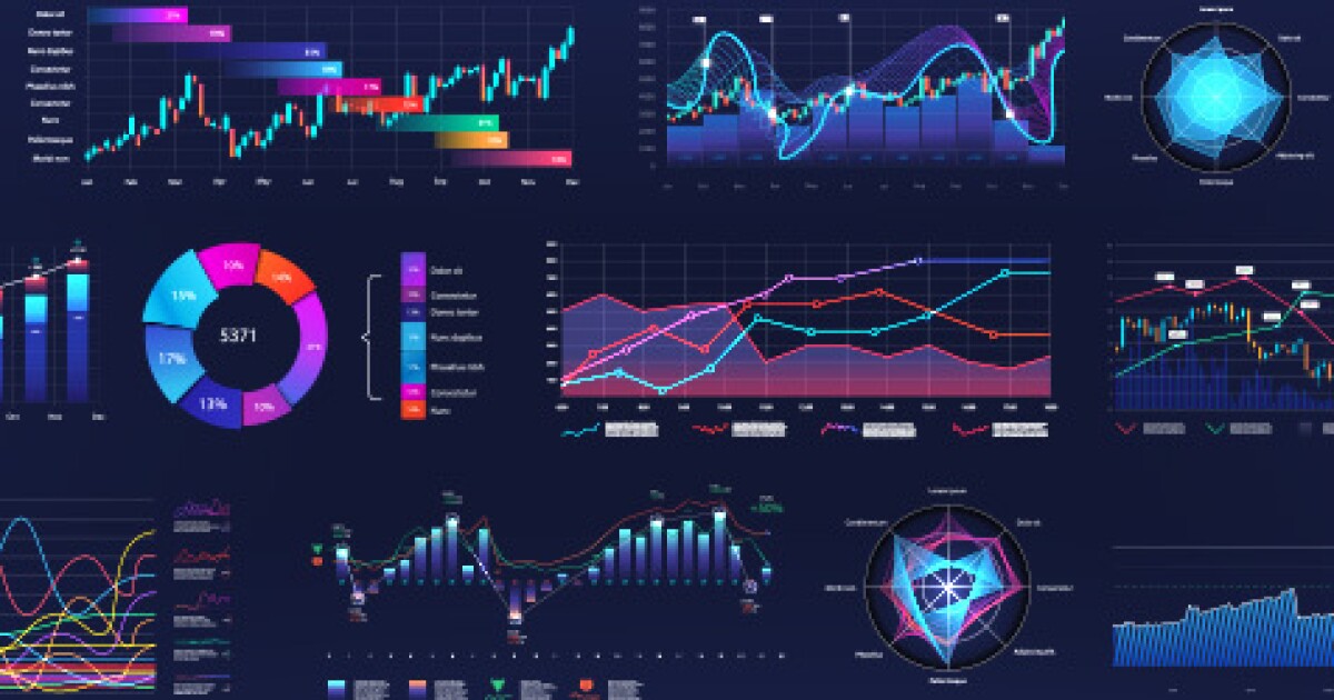
Canva's bar chart maker has become a go-to solution for many creators, offering over 20 chart types and an extensive template library. I've used it countless times for quick presentations and social media graphics. The drag-and-drop interface makes it accessible to anyone, regardless of technical expertise.
Canva Chart Types Usage Distribution
Common chart types used in Canva based on my experience and observations:
The manual process in Canva involves several steps: data input through their table interface, customization of colors and fonts, and finally exporting to various formats. While straightforward, I've found this workflow can become time-consuming when dealing with multiple charts or frequent updates.
Common use cases I've encountered include creating charts for business presentations, annual reports, and social media infographics. However, limitations become apparent when handling complex data relationships or requiring real-time updates. The static nature of these charts means any data change requires manual recreation of the entire visualization.
The Data-to-Visual Pipeline Challenge
Traditional Workflow Bottlenecks
I've experienced firsthand the frustrations of traditional data visualization workflows. Manual data entry remains a significant bottleneck—copying and pasting values, ensuring formatting consistency, and double-checking for errors. Even with CSV uploads or Google Sheets integration, the process feels disconnected from the creative flow.
Traditional vs. AI-Powered Workflow
Comparing the steps involved in creating data visualizations:
                    flowchart LR
                        A[Raw Data] --> B[Manual Entry]
                        B --> C[Format Data]
                        C --> D[Choose Template]
                        D --> E[Customize Design]
                        E --> F[Export Chart]

                        G[Raw Data] --> H[Describe Intent]
                        H --> I[AI Processing]
                        I --> J[Dynamic Visualization]

                        style A fill:#FFE0B2
                        style B fill:#FFCCBC
                        style C fill:#FFCCBC
                        style D fill:#FFCCBC
                        style E fill:#FFCCBC
                        style F fill:#FFB74D

                        style G fill:#C8E6C9
                        style H fill:#A5D6A7
                        style I fill:#81C784
                        style J fill:#66BB6A
The time-consuming nature of customization for each chart iteration becomes particularly evident when creating multiple visualizations for a report. I often find myself repeating the same styling choices, adjusting colors to match brand guidelines, and ensuring consistency across all charts.
Where PageOn.ai Transforms the Process
PageOn.ai's approach fundamentally changes how I think about data visualization. Through voice-to-visual creation, I can simply describe the story I want to tell with my data. The AI Blocks technology automatically structures the data, understanding relationships and hierarchies without explicit formatting.
What truly sets it apart is the Deep Search capability, which can pull in relevant data from multiple sources in real-time. The dynamic chart generation adapts to my narrative needs, suggesting the most appropriate visualization types based on the data patterns and the story I'm trying to tell. This intelligent approach eliminates the disconnect between data analysis and visual creation.
Key Transformation: Instead of forcing data into predetermined templates, PageOn.ai's conversational interface allows me to express what insights I want to highlight, and the system creates visualizations that best communicate those insights—adapting in real-time as the narrative evolves.
Comparative Analysis: Static Templates vs. Intelligent Visualization
| Aspect | Template-Based (Canva) | AI-Driven (PageOn.ai) |
|---|---|---|
| Layout Structure | Pre-designed layouts with fixed structures | Context-aware generation based on data patterns |
| Customization | Manual adjustment of colors, fonts, spacing | Automatic styling based on narrative intent |
| Chart Types | Limited to predefined types (stacked, grouped, proportional) | Dynamic selection of optimal visualization types |
| Data Updates | Static output requiring manual updates | Real-time updates reflecting data changes |
My experience with template-based approaches like Canva has shown they excel in speed for simple visualizations. When I need a quick bar chart for a presentation, the pre-designed templates provide a solid starting point. However, the limitations become apparent when dealing with complex data relationships or when the visualization needs to evolve with changing requirements.
The AI-driven approach of PageOn.ai has fundamentally changed my workflow. Through integration with AI-powered bar chart generators, the platform understands not just the data, but the context and purpose of the visualization. This intelligent processing means I spend less time on mechanical tasks and more time on strategic thinking about how to best communicate insights.

Advanced Visualization Techniques
Beyond Basic Bar Charts
I've discovered that effective data visualization often requires going beyond simple bar charts. Creating multi-dimensional visualizations with layered data can reveal insights that single-axis charts miss. For instance, implementing horizontal bar charts significantly improves readability when dealing with long category names or when comparing many items.
Multi-Dimensional Data Visualization
Combining different chart types for comprehensive insights:
Combining bar charts with other data visualization charts types creates richer narratives. I often overlay trend lines on bar charts to show both absolute values and directional movement, or use grouped bars with scatter plots to highlight correlations.
Leveraging PageOn.ai's Unique Features
PageOn.ai's Vibe Creation feature has transformed how I approach visual design. Instead of manually selecting colors and styles, I describe the mood I want to convey—professional, playful, or dramatic—and the system automatically establishes the appropriate visual tone. This ensures consistency across all visualizations while saving considerable time.
The AI Blocks technology allows me to combine multiple data sources seamlessly. I can pull sales data from one source, market research from another, and customer feedback from a third, all integrated into a cohesive visual narrative. The Deep Search capability finds and integrates relevant visual assets automatically, enriching the presentation without manual hunting for appropriate images or icons.
Pro Tip: Using PageOn.ai's Agentic processes, I can create narrative-driven presentations where each chart builds upon the previous one, creating a compelling story arc that guides viewers through complex data relationships naturally.
Practical Implementation Strategies
Data Preparation and Structure
I've learned that successful visualization starts with well-organized data. Before creating any chart, I ensure my data follows best practices: clear column headers, consistent formatting, and logical grouping. When converting Excel data using techniques from bar chart in excel workflows, I maintain the structure while optimizing for AI interpretation.
Data Preparation Workflow
My systematic approach to preparing data for visualization:
                    flowchart TD
                        A[Raw Data Collection] --> B{Data Quality Check}
                        B -->|Clean| C[Remove Duplicates]
                        B -->|Valid| D[Structure Data]
                        C --> D
                        D --> E[Define Categories]
                        E --> F[Set Value Ranges]
                        F --> G[Create Metadata]
                        G --> H[Ready for Visualization]

                        style A fill:#E1F5FE
                        style H fill:#66BB6A
Building reusable data templates has become a cornerstone of my workflow. I create standardized formats for recurring reports, which can be quickly populated with new data while maintaining consistency. This approach works particularly well with PageOn.ai's AI Blocks, which can recognize and adapt these templates automatically.
Visual Storytelling Framework
Crafting compelling narratives around statistical data requires more than just displaying numbers. I focus on creating a journey for the viewer, starting with context, building through evidence, and concluding with actionable insights. PageOn.ai's conversation-based creation allows me to describe this narrative naturally, and the system translates it into appropriate visual elements.
Implementing visual hierarchy through AI-suggested layouts has dramatically improved the clarity of my presentations. The system understands which data points deserve emphasis and automatically adjusts sizing, positioning, and color intensity to guide the viewer's attention. This creates cohesive visual systems across multiple charts without manual coordination.
Integration with Modern Workflows
Collaborative Creation
Real-time team collaboration on data visualizations has transformed how my team works together. Instead of passing static files back and forth, we can now iterate on visualizations simultaneously. PageOn.ai's conversational interface means team members can suggest changes in natural language, making collaboration accessible to non-technical stakeholders.
Version control and iteration management have become seamless. I can track changes, revert to previous versions, and maintain multiple branches of the same visualization for different audiences. The feedback integration through conversational interfaces means comments and suggestions are immediately actionable, not just notes on the side.
Automation and Efficiency
Setting up automated chart generation workflows has revolutionized my reporting process. By connecting to live data sources, my visualizations update continuously without manual intervention. Using AI chart generators for batch processing, I can create dozens of customized charts in the time it used to take to make one.
My Automation Setup
- Daily data sync from multiple sources at 6 AM
- Automatic chart regeneration based on updated data
- AI-powered anomaly detection highlighting significant changes
- Automated distribution to stakeholders with personalized insights
- Template systems using PageOn.ai's AI Blocks for consistency
The ability to create template systems with PageOn.ai's AI Blocks has been particularly powerful. I've built a library of reusable components that maintain brand consistency while adapting to different data types and contexts. This modular approach means new visualizations can be assembled quickly while maintaining professional quality.
Case Studies and Real-World Applications
Business Intelligence Dashboards
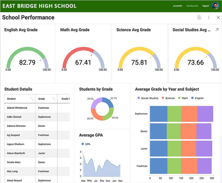
I recently transformed our monthly sales performance tracking from a tedious manual process to an intelligent, self-updating system. Using PageOn.ai's capabilities, I created dashboards that not only display current metrics but also highlight trends, anomalies, and predictive insights automatically.
Regional Sales Performance Dashboard
Interactive visualization showing quarterly performance across regions:
Market share analysis across regions became significantly more insightful when I started using multi-dimensional visualizations. Customer engagement metrics, previously buried in spreadsheets, now tell clear stories about user behavior patterns and preferences.
Educational and Research Applications
In academic settings, I've used these tools to present research data in ways that engage both experts and general audiences. Survey results visualization has become particularly effective, with interactive elements that allow viewers to explore data at their own pace.
Creating interactive learning materials has opened new possibilities for education. Students can manipulate data visualizations to understand statistical concepts, while researchers can present complex findings in accessible formats. The ability to adapt visualizations based on audience expertise level has been invaluable.
Future of Chart Creation: AI-Powered Intelligence
Emerging Trends
Natural language chart creation and modification is rapidly becoming the standard. I can now describe complex visualizations in plain English, and AI systems understand not just what I want to display, but why. Predictive visualization suggestions based on data patterns save hours of experimentation, automatically recommending the most effective chart types for specific datasets.
Evolution of Data Visualization Technology
The progression from manual to intelligent visualization systems:
                    flowchart LR
                        A[Manual Charts
1990s] --> B[Template-Based
2000s]
                        B --> C[Interactive
2010s]
                        C --> D[AI-Assisted
2020s]
                        D --> E[Fully Autonomous
Future]

                        style A fill:#FFE0B2
                        style B fill:#FFCC80
                        style C fill:#FFB74D
                        style D fill:#FF8000
                        style E fill:#FF6F00
Cross-platform synchronization and real-time collaboration are breaking down silos between teams. Integration with augmented reality presentations is opening entirely new dimensions for data visualization, allowing viewers to literally walk through data landscapes.
PageOn.ai's Vision
PageOn.ai is eliminating the gap between thought and visualization. I can now go from idea to polished presentation in minutes rather than hours. The platform's vision of creating self-updating, context-aware visual systems means my dashboards evolve with my data and audience needs.
Building intelligent visual narratives that adapt to audiences represents a paradigm shift. The same data can be presented differently to executives, analysts, and customers, with the system understanding what each group needs to see. This democratization of professional data visualization capabilities means anyone can create compelling visual stories, regardless of technical expertise.
Looking Ahead: The future of data visualization isn't just about prettier charts—it's about intelligent systems that understand context, anticipate needs, and create visual experiences that truly communicate insights. PageOn.ai exemplifies this future, where AI doesn't replace human creativity but amplifies it exponentially.
Choosing the Right Tool for Your Vision
After extensive experience with both traditional and AI-powered visualization tools, I've learned that the choice depends on your specific needs. Template-based solutions like Canva excel when you need quick, simple charts with minimal customization. They're perfect for social media graphics, basic presentations, and situations where standard visualizations suffice.
However, when dealing with complex data relationships, requiring real-time updates, or needing to tell sophisticated data stories, AI-powered tools like PageOn.ai become invaluable. The ability to describe what you want to achieve and have the system create appropriate visualizations transforms the entire workflow from mechanical production to creative exploration.
Tool Selection Decision Matrix
Evaluating when to use different visualization approaches:
The importance of matching tool capabilities to project requirements cannot be overstated. I've seen projects fail not because of bad data or poor design skills, but because the wrong tool was chosen for the task. Future-proofing your data visualization strategy means investing in tools that can grow with your needs, adapt to new data sources, and evolve with technological advances.

My Recommendation
Start with your end goal in mind. If you're creating one-off visualizations for immediate use, traditional tools work well. But if you're building a data-driven culture, need scalable solutions, or want to push the boundaries of what's possible with data visualization, investing in AI-powered platforms like PageOn.ai will transform not just your charts, but your entire approach to data communication.
The future belongs to those who can turn data into stories, and stories into action. Choose tools that amplify your ability to do just that.
Transform Your Visual Expressions with PageOn.ai
Ready to move beyond static templates? Experience the power of AI-driven visualization that understands your data story and brings it to life with intelligent, adaptive charts that evolve with your needs.
Start Creating with PageOn.ai TodayYou Might Also Like
Step-by-Step MCP Server Configuration for Free PowerPoint Presentations | PageOn.ai
Learn how to set up and configure an MCP server for creating free PowerPoint presentations using AI assistants like ChatGPT and Claude with this comprehensive guide.
Crafting Emotionally Resonant Digital Experiences: AI-Powered Vibe Design
Explore how AI-powered vibe design is transforming digital interfaces from functional to emotionally resonant experiences. Learn techniques for creating interfaces that connect with users on a deeper level.
Transforming Presentations: Strategic Use of Color and Imagery for Maximum Visual Impact
Discover how to leverage colors and images in your slides to create visually stunning presentations that engage audiences and enhance information retention.
The Critical Human Element: Mastering AI Tool Selection for Impactful Presentations
Discover how to leverage human judgment when selecting AI presentation tools. Learn to balance automation with creativity for truly impactful, connection-driven presentations.