Transform Data Into Visual Stories: Building Compelling Infographics Beyond Canva's Templates
Master the Art of Infographic Creation with Modern Tools and AI-Powered Design
I've discovered that creating stunning infographics has evolved from complex design software to accessible platforms like Canva, with its 1M+ templates and drag-and-drop simplicity. But here's the challenge I face daily: how do we stand out when everyone uses the same templates? Let me share my journey through the world of infographic design and show you how innovative tools are revolutionizing visual storytelling.
The Evolution of Infographic Creation
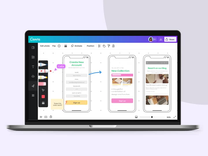
I remember when creating infographics meant wrestling with complex design software for hours. Today, the landscape has completely transformed. With Canva offering over 1 million templates and intuitive drag-and-drop interfaces, what once took months now takes minutes. As one enthusiastic user noted in a tutorial I watched, "The fact that we can create this infographic in Canva this easy, it's insane!"
But here's the challenge I've encountered: when everyone has access to the same templates, how do we create something truly unique? The answer lies in understanding both the power and limitations of template-based design, and knowing when to leverage more innovative approaches.
The shift from professional-only tools to democratized design platforms has opened incredible opportunities, but it's also created a new challenge: standing out in a sea of similar-looking content.
Understanding Modern Infographic Design Fundamentals
Through my experience creating countless infographics, I've learned that effective visual communication relies on several core components. High-quality graphics paired with current, relevant data form the foundation, but the magic happens in the execution.
Key Elements of Effective Infographics
Common Pitfalls I've Observed
- Over-reliance on pre-made layouts that limit creative expression
- Difficulty in truly customizing data visualizations to match brand identity
- The template trap: when your infographic looks identical to hundreds of others
- Overcrowding designs with too much information
I've found that the key to avoiding these pitfalls is understanding when templates serve us well and when we need more flexible solutions. This awareness has guided my approach to creating infographics that truly resonate with audiences.
The Template Approach: Canva's Method Decoded
How Canva Structures Infographic Creation
I've spent considerable time mastering Canva's 5-step process, and I'll walk you through exactly how it works. The platform makes infographic creation remarkably accessible through template selection, data upload, customization, proofing, and export.
flowchart LR
                        A[Select Template] --> B[Upload Data]
                        B --> C[Customize Design]
                        C --> D["Proof & Review"]
                        D --> E["Export & Share"]
                        style A fill:#FF8000,stroke:#333,stroke-width:2px
                        style E fill:#4CAF50,stroke:#333,stroke-width:2px
What impresses me most about Canva is the extensive library - over 20 chart types and millions of design elements. Users can leverage everything from bar graphs to pictograms, with customizable colors and styles that move beyond traditional spreadsheet visuals.
Real User Experience
"You can literally search in here... maybe you want to search for food and you can do food ones, there's healthy ones, there's pizza ones... The fact that we can create this infographic in Canva this easy, it's insane!"
- From a popular Canva tutorial with over 244,000 views
Customization Limitations and Workarounds
Through trial and error, I've discovered several workarounds for Canva's limitations. When templates lock certain color palettes, the "Edit Image" function becomes your best friend. I've also learned to export designs with transparent backgrounds for maximum versatility - a trick that's saved me countless hours when repurposing infographics across different platforms.
One particularly useful feature I rely on is Magic Switch, which automatically resizes designs for different platforms. However, I've found that even with these tools, there are times when template-based approaches simply can't achieve the unique vision I have in mind.
Breaking Free: The Conversational Design Revolution
PageOn.ai's Vibe Creation Approach
I've recently discovered a game-changing approach to infographic creation that feels like having a design conversation rather than wrestling with software. PageOn.ai's Vibe Creation transforms fuzzy data concepts into clear visual narratives through natural dialogue. Instead of hunting through templates, I simply describe what I want to communicate.
Traditional Approach
- • Browse through hundreds of templates
- • Force data into preset layouts
- • Manual color and font adjustments
- • Limited by template structure
Conversational Approach
- • Describe your vision in words
- • AI understands context and intent
- • Dynamic layout generation
- • Unlimited creative possibilities
Building Infographics Like LEGOs with AI Blocks
What fascinates me about PageOn.ai's AI Blocks feature is how it breaks down complex visualizations into modular components. I can build custom data visualizations without preset limitations, assembling visual elements like LEGO blocks while maintaining complete creative control.
The real breakthrough comes from real-time iteration based on verbal feedback. I can say things like "make the data points more prominent" or "add a timeline at the bottom," and watch my infographic evolve instantly. This conversational approach has fundamentally changed how I think about design - it's no longer about what the software allows, but about what I want to communicate.
Advanced Data Visualization Techniques
Complex Data Sets Made Simple
I've learned that visualizing multi-layered information requires more than basic pie charts and bar graphs. When working with complex datasets, I need tools that can handle intricate relationships and patterns. This is where the difference between static templates and dynamic visualization becomes crystal clear.
Data Complexity Handling Comparison
For instance, when I need to create interactive slides on Canva, I often hit limitations with engagement features. PageOn.ai's approach allows me to build truly dynamic presentations where data points connect and tell a story, rather than just displaying static information.
Industry-Specific Applications
Education
Student PSA templates, learning materials, and educational workflows that adapt to different learning styles.
Business
Chronology timelines, process workflows, and performance metrics that update automatically.
Marketing
Social media-ready formats and campaign metrics that tell compelling brand stories.
Healthcare
Medical data visualization and chronic illness awareness infographics with accuracy and clarity.
The Power of AI-Enhanced Design Tools
Comparing AI Features
I've extensively tested both the Canva AI Image Generator and PageOn.ai's Agentic approach. While Canva's Magic Studio offers impressive tools like Magic Edit, Magic Eraser, and Magic Write, I've found that PageOn.ai's Plan, Search, Act methodology provides a more comprehensive solution for complex infographic creation.
| Feature | Canva Magic Studio | PageOn.ai |
|---|---|---|
| Image Generation | Template-based modifications | Context-aware creation |
| Data Integration | Manual input | Deep Search automation |
| Collaboration | Real-time editing | Conversational iteration |
| Learning Curve | Moderate | Minimal |
Workflow Optimization
The time savings I've experienced are remarkable. What traditionally took months with professional software, then minutes with templates, can now be accomplished in seconds to minutes through conversational AI. The Canva AI Presentation Maker has certainly streamlined the process, but PageOn.ai's approach eliminates the learning curve entirely.
Creating Platform-Optimized Infographics
Social Media Specifications
Through years of creating content for various platforms, I've learned that each social media channel has its own optimal dimensions and requirements. Here's my go-to reference guide:
flowchart TD
                        A[Platform Selection] --> B{Choose Platform}
                        B --> C["Instagram
1080x1350"]
                        B --> D["Facebook
1200x628"]
                        B --> E["LinkedIn
1104x736"]
                        B --> F["Blog Posts
663x2000"]
                        C --> G[Square/Portrait]
                        D --> H[Landscape]
                        E --> I[Professional]
                        F --> J[Long-form]
                        style A fill:#FF8000,stroke:#333,stroke-width:2px
                        style C fill:#E91E63,stroke:#333,stroke-width:2px
                        style D fill:#1877F2,stroke:#333,stroke-width:2px
                        style E fill:#0077B5,stroke:#333,stroke-width:2px
                        style F fill:#4CAF50,stroke:#333,stroke-width:2px
Multi-Platform Distribution Strategy
I've developed a systematic approach for multi-platform content distribution. Using the Canva AI Presentation Maker for slide decks works well, but I often need to convert Canva to PowerPoint for corporate presentations. PageOn.ai's unified approach eliminates these conversion steps entirely.
Pro Tip: Cross-Platform Consistency
I maintain brand consistency by creating a master infographic at the highest resolution, then adapting it for each platform. This ensures my message remains cohesive while optimizing for each channel's unique requirements.
Best Practices for Data-Driven Storytelling
Audience-Centric Design
I've learned that understanding what matters to your viewers is paramount. It's not just about presenting data; it's about creating a narrative that resonates. Here are my key principles for audience-centric infographic design:
Know Your Audience's Pain Points
Address specific challenges your viewers face with relevant data solutions.
Choose Appropriate Visualization Types
Match your data presentation method to your audience's familiarity and preferences.
Create Compelling Calls-to-Action
Guide viewers toward meaningful next steps after consuming your infographic.
Maintain Brand Consistency
Ensure your infographics align with your overall brand identity and messaging.
Technical Excellence
Technical Quality Factors
I always ensure my infographics meet technical standards: proper resolution for print vs. digital, sufficient color contrast for accessibility, clear typography hierarchy, and appropriate file formats (PNG for transparency, JPG for photos, PDF for print).
Future of Infographic Design: Beyond Static Images
Emerging Trends
I'm witnessing an exciting evolution in infographic design. The future isn't just about static images anymore - it's about interactive, animated, and AI-generated narratives that adapt to viewer engagement in real-time.

Current State
- • Static templates
- • Manual data input
- • Fixed layouts
- • One-size-fits-all approach
Future Vision
- • Dynamic, interactive visuals
- • Real-time data integration
- • AI-adaptive layouts
- • Personalized viewer experiences
PageOn.ai's Vision Advantage
What excites me most about PageOn.ai's approach is the shift from "how to use software" to "what to communicate." By democratizing professional design through natural language, we're no longer limited by our technical skills but only by our imagination.
The Competitive Edge
Creating unique, dynamically-generated visuals that don't look template-based gives us a significant advantage in capturing audience attention and conveying our message effectively.
Practical Implementation Guide
Transitioning from Template-Based Design
I've developed a strategic approach for transitioning from template-based design to more dynamic creation methods. Here's my roadmap for making this shift:
flowchart LR
                        A[Identify Limitations] --> B[Gradual Adoption]
                        B --> C[Build Custom Library]
                        C --> D[Measure Engagement]
                        D --> E[Optimize Workflow]
                        style A fill:#FF8000,stroke:#333,stroke-width:2px
                        style C fill:#4CAF50,stroke:#333,stroke-width:2px
                        style E fill:#2196F3,stroke:#333,stroke-width:2px
Maximizing Both Approaches
I've learned that it's not about choosing one tool over another - it's about using the right tool for the right job. Here's my decision framework:
| Scenario | Best Tool | Why |
|---|---|---|
| Quick social media post | Canva Templates | Speed and convenience |
| Complex data story | PageOn.ai | Dynamic visualization needs |
| Brand-specific design | PageOn.ai | Unique, non-template look |
| Team collaboration | Both | Depends on team skills |
Cost-Benefit Analysis
Canva Pro: $14/month - Great for template-based designs and team collaboration
PageOn.ai: Investment in creative freedom and unique visual storytelling that sets you apart
Transform Your Visual Expressions with PageOn.ai
Ready to break free from template limitations? Experience the power of conversational design and create infographics that truly represent your unique vision. Join thousands who are already transforming their data into compelling visual stories.
Start Creating with PageOn.ai TodayThe Future is Conversational
As I reflect on my journey from manual design to template assistance to AI conversation, I'm convinced that "Creation is Conversation" represents the next paradigm in design. We're witnessing a fundamental shift in how we approach visual communication.
The evolution isn't just about making design easier - it's about empowering non-designers like myself to create professional infographics that rival agency-quality work. When we remove the technical barriers, we unlock creativity and enable focus on what truly matters: the message we want to convey.
Key Takeaways
- • Templates democratized design, but they also created uniformity
- • Conversational AI represents the next evolution in creative tools
- • The competitive advantage lies in unique, dynamically-created visuals
- • The future belongs to those who can communicate ideas, not just operate software
Whether you're creating your first infographic or your thousandth, remember that the best tool is the one that helps you tell your story most effectively. As we move forward, I'm excited to see how conversational design continues to transform the way we visualize and share information.
You Might Also Like
Mastering Image Cropping and Alignment: Creating Visual Harmony in Your Designs
Learn essential techniques for image cropping and alignment to create visually harmonious designs. Discover aspect ratios, composition strategies, and alignment principles for professional results.
Creating Emotional Journeys Through Strategic Path Design | Transforming Experiences
Discover how strategic path design creates powerful emotional journeys that transform ordinary experiences into memorable stories. Learn practical frameworks and visualization techniques.
Mastering Your Inner Landscape: Building Personal Power Through Boundaries and Self-Awareness
Discover how to build personal power through effective boundary-setting and self-awareness. Learn practical visualization techniques to transform your relationships and achieve authentic growth.
Building Powerful Real-World AI Applications with PostgreSQL and Claude | PageOn.ai
Learn how to build sophisticated AI applications by integrating PostgreSQL and Claude AI. Discover architecture patterns, implementation techniques, and optimization strategies for production use.