Transform Raw Data into Visual Gold: How Modern AI Tools Are Revolutionizing Infographic Creation
The Evolution from Static Templates to Intelligent Visual Generation
I've witnessed firsthand how the landscape of infographic design has transformed dramatically. What once required hours of manual design work can now be accomplished in minutes through the power of AI-driven tools and intelligent templates. Let me take you on a journey through this exciting evolution.
The Evolution of Infographic Design: From Templates to Intelligent Creation
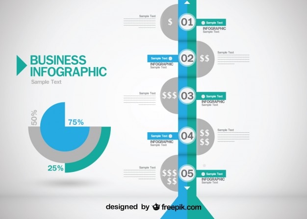
When I first started creating infographics, the process was revolutionary yet limiting. Canva burst onto the scene with thousands of customizable templates spanning every imaginable category—business, education, marketing, medical—you name it. The drag-and-drop functionality combined with pre-designed charts, graphs, and visual elements made professional design accessible to everyone.
But here's where things get exciting: we're now witnessing the emergence of AI-powered visual creation that goes far beyond static templates. I've observed a fundamental shift from "choosing and tweaking" to "describing and generating." Tools like PageOn.ai's Vibe Creation are transforming how we think about visual communication—instead of manually searching through assets, we can now describe our vision in plain language and watch it materialize.
Real-World Impact
The democratization of professional visual communication is truly remarkable. I recently watched Kathy Schneider's YouTube tutorial where she demonstrated how solopreneurs are creating Instagram-worthy infographics without any design expertise. What used to require a design degree now requires only creativity and the right tools.
The Journey of Infographic Creation
flowchart LR
                        A[Manual Design Era] --> B[Template Revolution]
                        B --> C[AI-Powered Creation]
                        C --> D[Intelligent Generation]

                        style A fill:#f9f9f9,stroke:#333,stroke-width:2px
                        style B fill:#FFE5CC,stroke:#FF8000,stroke-width:2px
                        style C fill:#FFD4E5,stroke:#FF1493,stroke-width:2px
                        style D fill:#E5F5FF,stroke:#4169E1,stroke-width:2px
Breaking Down Complex Data Visualization Workflows
Let me walk you through the traditional Canva workflow I've used countless times. You start with template selection or a blank canvas—typically 1080x1350 for Instagram posts. Then comes the hunt through elements for the perfect graphics and charts, followed by manual color customization to align with your brand. Finally, you export with transparent backgrounds for multi-platform use.
Time Investment Comparison
Advanced Canva Techniques
- • 20+ chart types for diverse data presentations
- • "Four steps to create your vision" framework
- • Reusable branded template libraries
- • Interactive slides on Canva capabilities
PageOn.ai's Revolutionary Approach
- • AI Blocks for LEGO-like assembly
- • Simple commands for complex visuals
- • Agentic process: Plan, Search, Act
- • Automated visual creation workflow

Practical Applications Across Industries and Use Cases
I've seen infographics transform communication across every industry imaginable. In business and corporate settings, we're creating SWOT analysis visualizations, KPI scorecards, project timelines, and employee transition plans that make complex information digestible at a glance.
Business
Executive summaries, roadmaps, KPIs
Education
Process flows, decision trees, comparisons
Marketing
Social media, content series, campaigns
For educational content, I've developed process flow diagrams, decision trees, and compare-and-contrast graphic organizers that help students grasp complex concepts instantly. The ability to create multi-level funnel infographics and world map heat maps has revolutionized how we present data-heavy information.
Marketing professionals are particularly benefiting from platform-specific optimizations. Creating infographics with the right dimensions for Instagram (1080x1350), Facebook, and LinkedIn ensures maximum engagement. By leveraging converting Canva to PowerPoint, we're seamlessly transitioning from social media to boardroom presentations.
Common Infographic Use Cases
flowchart TD
                        A[Infographic Creation] --> B[Business Communications]
                        A --> C[Educational Content]
                        A --> D[Marketing Materials]

                        B --> B1[SWOT Analysis]
                        B --> B2[KPI Dashboards]
                        B --> B3[Project Timelines]

                        C --> C1[Process Diagrams]
                        C --> C2[Concept Maps]
                        C --> C3[Data Visualizations]

                        D --> D1[Social Media Posts]
                        D --> D2[Email Campaigns]
                        D --> D3[Landing Pages]

                        style A fill:#FF8000,stroke:#333,stroke-width:2px,color:#fff
                        style B fill:#E6F3FF,stroke:#4169E1,stroke-width:2px
                        style C fill:#E6FFE6,stroke:#228B22,stroke-width:2px
                        style D fill:#FFE6F0,stroke:#FF1493,stroke-width:2px
The Technical Edge: Features That Transform Creation
Canva's established toolkit has set a high bar with Magic Studio™—featuring Magic Edit, Magic Eraser, and Magic Grab™. These tools, combined with real-time collaboration and one-click Magic Switch for multi-platform resizing, have made professional design accessible to millions.
| Feature | Canva | PageOn.ai |
|---|---|---|
| Asset Library | Manual search required | AI-powered Deep Search |
| Creation Method | Template-based | Voice-to-visual |
| Learning Curve | Moderate | Minimal |
| Collaboration | Real-time editing | Context-aware generation |
What excites me most about PageOn.ai's next-generation capabilities is the Deep Search functionality that automatically integrates relevant assets. The voice-to-visual conversion eliminates the software learning curve entirely—you simply describe what you want, and the AI understands your intent and generates accordingly.

Bridging Platforms for Maximum Impact
I've found that the most effective workflows combine multiple tools. Using the Canva AI Presentation Maker alongside PageOn.ai creates a comprehensive ecosystem where you can:
- • Export in multiple formats (PNG, JPG, PDF)
- • Maintain visual consistency across mediums
- • Leverage strengths of both platforms
- • Create once, deploy everywhere
Best Practices for Creating High-Impact Infographics
Through years of creating infographics, I've learned that success lies in the details. The most effective designs balance text and graphics for optimal comprehension, use high-contrast colors for accessibility, and implement clear visual hierarchy through typography.
Key Elements of Effective Infographics
Design Principles
- ✓ Create breathing space to avoid overload
- ✓ Use consistent color palettes
- ✓ Implement clear information hierarchy
- ✓ Choose appropriate chart types
Content Strategy
- ✓ Know your audience's data literacy
- ✓ Craft compelling hooks and takeaways
- ✓ Include clear calls-to-action
- ✓ Tell a story with your data
Workflow Optimization Tips
I've streamlined my process by building reusable template libraries and establishing brand consistency through saved color palettes. Creating modular components allows for quick assembly, and utilizing visual design templates provides endless inspiration.
Remember, the goal isn't just to make something pretty—it's to communicate complex information in a way that resonates with your audience instantly.

The Future of Infographic Creation: AI-Driven Innovation
We're standing at the precipice of a creative revolution. Current limitations—rigid template structures, manual data-to-visual translation, and time-consuming workflows—are rapidly being addressed through AI innovation.
The Evolution Continues
flowchart LR
                        A[Static Infographics] --> B[Interactive Visuals]
                        B --> C[Real-time Data Integration]
                        C --> D[Personalized Generation]
                        D --> E[Conversational Creation]

                        style A fill:#f9f9f9,stroke:#333,stroke-width:2px
                        style B fill:#E6F3FF,stroke:#4169E1,stroke-width:2px
                        style C fill:#E6FFE6,stroke:#228B22,stroke-width:2px
                        style D fill:#FFE6F0,stroke:#FF1493,stroke-width:2px
                        style E fill:#FFE5CC,stroke:#FF8000,stroke-width:3px
I'm particularly excited about emerging trends like interactive and animated infographics gaining prominence, real-time data integration capabilities, and personalized content generation based on viewer preferences. These aren't just incremental improvements—they're fundamental shifts in how we think about visual communication.
PageOn.ai: Pioneering the Next Evolution
What sets PageOn.ai apart is its conversation-based creation approach. Instead of clicking through menus and searching for assets, you simply describe your vision. The platform's intelligent asset curation eliminates manual searching entirely, transforming abstract concepts into tangible visual narratives.
This convergence of AI understanding and creative expression means that the barrier between imagination and creation is disappearing. Your fuzzy thoughts can now become clear, professional infographics in minutes, not hours.
The future isn't just about making infographic creation easier—it's about making it more intelligent, more responsive, and more aligned with how we naturally think and communicate. We're moving from tools that require us to adapt to their interfaces to tools that adapt to our natural way of expressing ideas.
Transform Your Visual Expressions with PageOn.ai
Ready to revolutionize how you create infographics? Experience the power of AI-driven visual creation that understands your vision and brings it to life instantly. No more hunting through templates or struggling with design software.
Start Creating with PageOn.ai TodayYou Might Also Like
Engaging Your Audience: Crafting Interactive and Visually Captivating Slides
Discover how to transform static presentations into interactive visual experiences that captivate audiences through strategic design, interactive elements, and data visualization techniques.
Advanced Image Masking Techniques for Creative Slide Design | PageOn.ai
Discover advanced image masking techniques to transform ordinary presentation slides into visual masterpieces. Learn creative approaches for PowerPoint, Google Slides, and Keynote.
The Art of Visual Hierarchy: Elevating UX Design Through Strategic Emphasis
Learn how to create powerful visual impact in UX design through strategic emphasis techniques. Discover principles of visual hierarchy that drive user behavior and boost engagement.
Transform Excel Data into Professional Presentations in Minutes | PageOn.ai
Learn how to quickly convert Excel data into stunning professional presentations using AI tools. Save hours of work and create impactful data visualizations in minutes.