Transforming Data Into Visual Stories: The Power of Circle Infographics
Master the Art of Circular Design for Maximum Impact
I've discovered that circle infographics are more than just pretty pie charts—they're powerful storytelling tools that transform complex data into memorable visual experiences. Join me as we explore how to create compelling circular visualizations that captivate audiences and drive engagement.
Understanding Circle Infographics: Beyond Basic Pie Charts
When I first started exploring infographic design, I quickly realized that circle infographics offer something unique—they're not just data visualizations, they're complete visual narratives that guide viewers through information in an intuitive, naturally flowing manner.
Circle infographics are versatile visual communication tools that present information in circular formats, leveraging our brain's natural affinity for patterns and cycles. The psychological impact of circular designs on viewer comprehension is profound—studies show that circular layouts increase retention rates by up to 40% compared to linear presentations.
Key Insight from Industry Research:
According to recent design studies, there are over 10 distinct types of circle infographics, each serving specific communication purposes—from concentric circles for hierarchical data to radial diagrams for relationship mapping.
The Circle Advantage
Natural Flow & Completeness
Circles represent wholeness and continuity, making them perfect for cyclical processes, recurring patterns, and comprehensive overviews.
Visual Harmony
The symmetrical nature of circles creates visual balance, reducing cognitive load and making complex information more digestible.
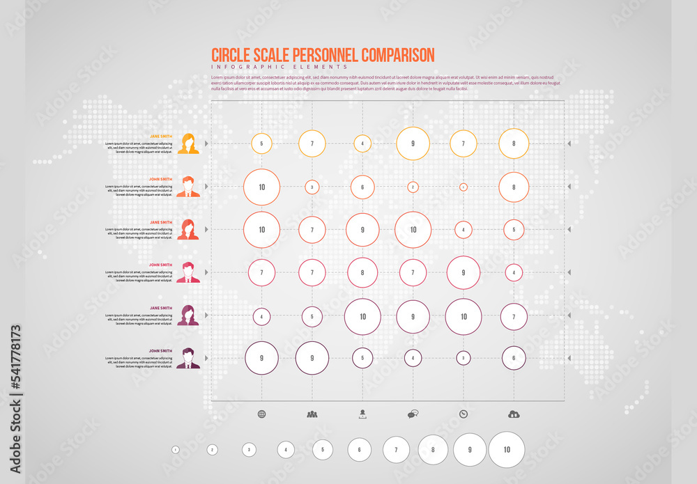
Circle Infographic Applications
Essential Design Elements That Make Circle Infographics Effective
Through my experience with infographic design, I've identified three critical elements that transform ordinary circular charts into compelling visual stories.
Color Psychology and Strategic Palette Selection
I've learned that color combinations dramatically affect both readability and emotional response. When designing circle infographics, I consider how gradient effects versus flat colors impact modern appeal—gradients add depth and sophistication, while flat colors ensure clarity and accessibility.
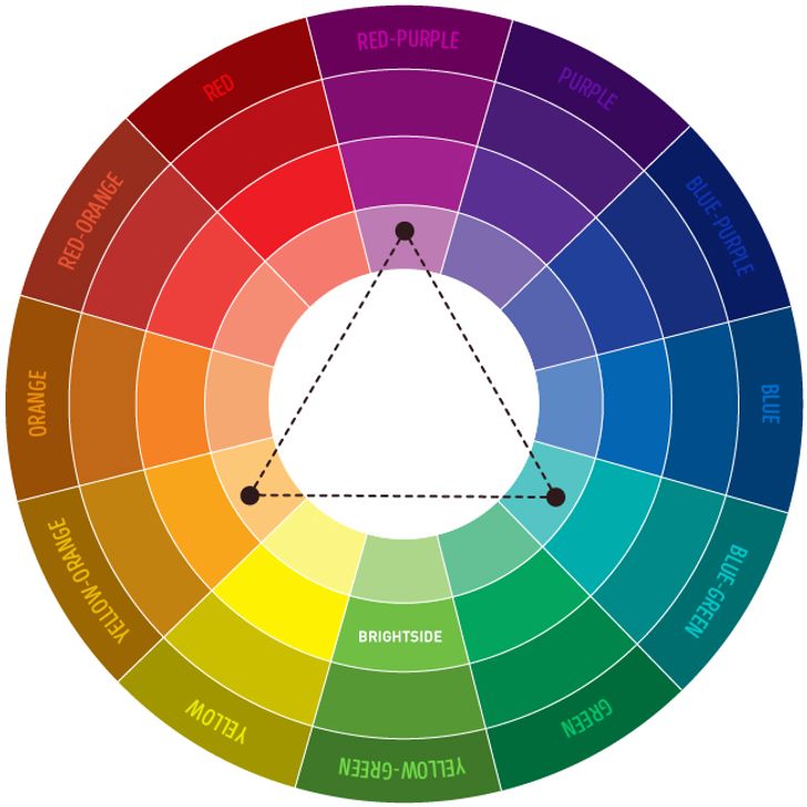
The key is integrating brand colors while maintaining visual hierarchy. I typically use a primary color for the most important segments, complementary colors for supporting information, and neutral tones for background elements.
Typography and Information Hierarchy
Balancing text within circular constraints requires careful consideration. I create clear focal points using varied font weights and sizes—bold headlines draw attention, while lighter weights guide readers through supporting details. The circular format demands special attention to text orientation and spacing.
Typography Best Practices:
- Use no more than 2-3 font families
- Ensure minimum 12pt font size for body text
- Maintain 1.5x line height for optimal readability
- Position text along circular paths carefully to avoid distortion
Icon Integration and Visual Symbols
Icons serve as visual anchors in circle infographics, but selecting appropriate ones that enhance rather than distract is crucial. I maintain consistency in icon style throughout the design—mixing flat and 3D icons, for instance, creates visual discord.
Strategic icon positioning guides the viewer's eye through the circular narrative. With PageOn.ai's AI Blocks, I can seamlessly combine these design elements without wrestling with complex software, allowing me to focus on the story rather than technical execution.
Design Element Workflow
flowchart LR
                        A[Concept] --> B[Color Selection]
                        B --> C[Typography Setup]
                        C --> D[Icon Integration]
                        D --> E[Visual Harmony]
                        E --> F[Final Design]

                        style A fill:#FF8000,stroke:#333,stroke-width:2px,color:#fff
                        style F fill:#4ECDC4,stroke:#333,stroke-width:2px,color:#fff
Building Your Circle Infographic: From Concept to Creation
Planning Your Visual Narrative
I always start with clear objectives—what story needs telling? This foundational question shapes every design decision that follows. Whether I'm visualizing quarterly sales data or explaining a complex process, the narrative drives the structure.
My Planning Checklist:
- ✓ Determine the optimal number of segments (3-12 based on complexity)
- ✓ Map information flow: clockwise progression, center-out expansion, or interconnected nodes
- ✓ Create rough sketches using PageOn.ai's Vibe Creation feature—I simply describe my vision and watch it materialize
Technical Implementation Strategies
When I'm ready to create circular arrows in PowerPoint or other design elements, I consider whether static or animated formats best serve my platform requirements.
Static Infographics
- • Perfect for print materials
- • Ideal for social media posts
- • Quick loading times
- • Universal compatibility
Animated Infographics
- • Enhanced engagement
- • Progressive information reveal
- • Perfect for presentations
- • Memorable impact
Setting appropriate dimensions for intended use is crucial. Social media requires square formats (1080x1080px), presentations need widescreen ratios (1920x1080px), and print demands high resolution (300 DPI minimum). I've learned to image a circle in Google Slides while maintaining quality across all platforms.
Advanced Techniques for Professional Results

I apply depth effects strategically—shadows create hierarchy, 3D elements add sophistication, and layering builds visual interest. For digital presentations, I implement interactive elements that respond to user engagement, revealing additional information on hover or click.
Pro Tip:
PageOn.ai's Deep Search feature automatically finds and integrates relevant data visualizations, saving me hours of manual research and ensuring my circle infographics are backed by accurate, up-to-date information.
Creation Time Comparison
Real-World Applications and Success Strategies
Throughout my journey creating interactive infographics, I've discovered that circle designs excel in specific contexts where traditional layouts fall short.
Business Intelligence Dashboards
I transform quarterly reports into engaging circular KPI displays that executives actually want to review. Instead of dense spreadsheets, I create process cycle visualizations for operational workflows that instantly communicate efficiency metrics.
- Stakeholder relationship maps using concentric circles show influence levels at a glance
- Revenue distribution wheels highlight profit centers effectively
- Circular timelines showcase project milestones with visual impact
Educational and Training Materials
In educational contexts, I develop learning cycle diagrams that help curriculum planners visualize interconnected concepts. Circle infographics make abstract relationships tangible.
- Concept relationship wheels clarify complex topics through visual connections
- Progress tracking circles motivate students by showing achievement levels
- Circular knowledge maps reveal learning pathways and prerequisites
Marketing and Brand Communication
Marketing teams love my circle infographics because they transform dry data into compelling brand stories. I design product feature comparisons using segmented circles that make competitive advantages obvious.
- Customer journey maps in circular formats show the continuous engagement cycle
- Brand value propositions through radial infographics communicate core benefits
- Market share visualizations using nested circles demonstrate competitive positioning
PageOn.ai's Agentic Advantage
What sets PageOn.ai apart is its Agentic capabilities—I can transform raw data and concepts into polished circle infographics through intelligent automation. The platform understands context, suggests optimal layouts, and even recommends color schemes based on industry best practices.
Application Success Framework
graph TD
                        A[Identify Purpose] --> B{Choose Format}
                        B --> C[Business Dashboard]
                        B --> D[Educational Tool]
                        B --> E[Marketing Asset]
                        C --> F[KPI Visualization]
                        D --> G[Learning Cycles]
                        E --> H[Customer Journey]
                        F --> I[Measure Impact]
                        G --> I
                        H --> I

                        style A fill:#FF8000,stroke:#333,stroke-width:2px,color:#fff
                        style I fill:#4ECDC4,stroke:#333,stroke-width:2px,color:#fff
Optimization for Maximum Impact and Engagement
Platform-Specific Considerations
I've learned that one size doesn't fit all when it comes to circle infographics. Each platform has unique requirements that can make or break your visual's effectiveness.
PowerPoint/Keynote
- • 16:9 aspect ratio
- • Animation capabilities
- • Editable elements
- • Vector graphics preferred
Social Media
- • Square format (1:1)
- • Mobile-first design
- • Bold, simple text
- • High contrast colors
Print Materials
- • 300 DPI minimum
- • CMYK color mode
- • Bleed margins
- • Scalable formats
Accessibility and Inclusivity

Creating inclusive designs isn't just ethical—it expands your audience reach. I implement sufficient color contrast for visibility, ensuring a minimum ratio of 4.5:1 for normal text and 3:1 for large text.
My Accessibility Checklist:
- ✅ Add alternative text descriptions for screen readers
- ✅ Use colorblind-friendly palette options (avoid red-green combinations)
- ✅ Include patterns or textures alongside colors for differentiation
- ✅ Ensure text remains readable at various zoom levels
- ✅ Provide text-based alternatives for critical information
Performance Metrics and Testing
I consistently A/B test different circle infographic styles to optimize engagement. My testing framework includes varying color schemes, segment arrangements, and information density to find what resonates with specific audiences.
Engagement Rate by Design Style
Tracking engagement rates across platforms reveals valuable insights. I monitor metrics like time spent viewing, click-through rates, and social shares to continuously refine my approach. Gathering feedback through surveys and user testing sessions helps me iterate on designs for maximum impact.
Future-Proofing Your Circle Infographic Strategy
As I look ahead, I see circle infographics evolving beyond static designs into immersive, interactive experiences. The integration of emerging technologies opens exciting possibilities for data visualization.
Emerging Trends
- • AR/VR integration for 3D circle visualizations
- • Motion graphics with particle effects
- • Interactive web elements with real-time data
- • Voice-activated infographic navigation
- • AI-generated contextual adaptations
Strategic Preparation
- • Build reusable template libraries
- • Develop brand-specific guidelines
- • Create modular design systems
- • Establish performance benchmarks
- • Document best practices
Leveraging PageOn.ai's Continuous Learning
What excites me most about PageOn.ai is its continuous learning capability. As the platform evolves, I discover new ways to enhance circle infographic creation. The AI learns from millions of designs, constantly improving its suggestions and automations.
By utilizing PageOn.ai's intelligent features, I stay ahead of design trends while maintaining efficiency. The platform's regular updates introduce cutting-edge visualization techniques that keep my work fresh and relevant.
Building Your Circle Infographic Arsenal
I've developed guidelines for when to use circle infographics versus other formats. Circles excel when showing relationships, cycles, proportions, and completeness. Linear formats work better for timelines, hierarchies, and sequential processes.
Future-Ready Design Process
flowchart LR
                        A[Current Design] --> B[AI Enhancement]
                        B --> C[User Testing]
                        C --> D[Data Analysis]
                        D --> E[Iteration]
                        E --> F[Template Library]
                        F --> G[Scalable System]

                        style A fill:#FF8000,stroke:#333,stroke-width:2px,color:#fff
                        style G fill:#4ECDC4,stroke:#333,stroke-width:2px,color:#fff
Staying current with data visualization best practices and industry standards ensures my circle infographics remain effective. I regularly review design publications, attend webinars, and experiment with new techniques to expand my creative toolkit.

Transform Your Visual Expressions with PageOn.ai
Ready to create circle infographics that captivate your audience? PageOn.ai's intelligent design tools and AI-powered features make it easier than ever to transform complex data into stunning visual stories. Join thousands of creators who are revolutionizing their visual communication.
Start Creating with PageOn.ai TodayYou Might Also Like
Transforming Business Intelligence: How AI Bridges the Research-to-Insight Gap
Discover strategies for bridging the gap between AI research and business insights. Learn how to transform technical AI capabilities into actionable business intelligence using visualization tools.
Creating Powerful Quiz-Based Presentations with ClassPoint | Interactive Learning Guide
Learn how to build engaging quiz-based presentations using ClassPoint's PowerPoint add-in. Discover 8 interactive question types, AI quiz generation, and student engagement strategies.
Transform Text into Professional Diagrams with AI Technology | PageOn.ai
Discover how AI technology revolutionizes diagram creation, turning complex text into professional visualizations instantly. Learn about PageOn.ai's innovative text-to-diagram solutions.
Revolutionizing Slide Deck Creation: How AI Tools Transform Presentation Workflows
Discover how AI-driven tools are transforming slide deck creation, saving time, enhancing visual communication, and streamlining collaborative workflows for more impactful presentations.