Breaking Through the Climate Communication Barrier
How Visual Storytelling Transforms Abstract Data into Urgent Reality
I've discovered that the way we visualize climate data fundamentally shapes how people perceive and respond to the crisis. Through groundbreaking research and innovative design approaches, we're learning how to make climate change feel as urgent as it truly is.
The Climate Communication Crisis: When Numbers Fail to Move Hearts
I've spent years wrestling with a fundamental challenge in climate communication: why do temperature statistics and emission graphs, despite their scientific accuracy, fail to inspire the urgent action we desperately need? The answer lies not in the data itself, but in how our brains process gradual change.

The Disconnect Between Data and Perception
- • Temperature rise statistics feel abstract and gradual to most people
- • Complex IPCC graphs, while technically accurate, often confuse general audiences
- • The "boiling frog" effect creates widespread apathy as gradual changes appear minor
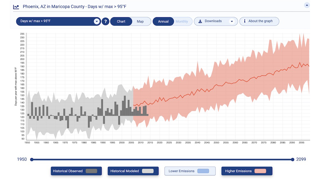
Traditional climate visualizations, I've learned, often fall short because they rely heavily on continuous data streams—temperature curves and emission trajectories that create cognitive overload. What's missing is the emotional resonance that transforms data into action. This is where innovative approaches to infographic design become crucial.
We urgently need new visual approaches that bridge the gap between scientific accuracy and public understanding. By leveraging tools like PageOn.ai's Vibe Creation, we can transform fuzzy climate concepts into clear, actionable insights that move beyond static charts to create dynamic, conversation-driven visual narratives.
The Power of Binary Thinking: Research Reveals a Breakthrough
A groundbreaking study recently published in Nature Human Behaviour has completely changed my understanding of climate communication. The research shows that binary climate data—simple yes/no presentations like "lake froze" versus "lake didn't freeze"—increases perceived impact by an astounding 40% compared to traditional temperature graphs.
Impact of Binary vs. Continuous Data Presentation
Comparing perceived urgency across different visualization methods
How Our Brains Process Change
- • Thresholds feel more significant than gradients
- • Binary changes create an "illusion" of sudden shifts
- • "Something that used to happen no longer does" carries psychological weight
Concrete Examples That Resonate
- • White Christmas: Yes/No vs. temperature graphs
- • Arctic ice: Three snapshots vs. decline curves
- • "Your hometown is X degrees hotter" personalization
This cognitive insight is revolutionary for climate communication. By leveraging PageOn.ai's AI Blocks, we can structure binary comparisons like visual LEGOs, making complex climate data instantly understandable and emotionally impactful. The key is presenting the same underlying trends in ways that align with how our brains naturally process change.
Visual Innovation in Action: Successful Climate Communication Strategies
Simplification Without Sacrificing Accuracy
One of my favorite examples of effective climate visualization is the climate stripes concept. These infographic data visualizations compress a century of temperature data into intuitive color shifts from blue to red. No numbers are needed—the message is unmistakable and immediate.

Effective Climate Visualization Framework
How different visualization approaches connect to audience engagement
flowchart TD
                        A[Climate Data] --> B[Visualization Strategy]
                        B --> C[Simplification]
                        B --> D[Localization]
                        B --> E[Interaction]

                        C --> F[Climate Stripes]
                        C --> G[Binary Indicators]

                        D --> H[Cultural Touchpoints]
                        D --> I[Personal Impact]

                        E --> J[Time-lapse]
                        E --> K[Interactive Maps]

                        F --> L[Immediate Understanding]
                        G --> L
                        H --> M[Emotional Connection]
                        I --> M
                        J --> N[Visual Impact]
                        K --> N

                        L --> O[Increased Engagement]
                        M --> O
                        N --> O
Localization and Personal Connection
Climate Central has mastered the art of connecting climate data to cultural touchpoints. Their football season heat maps and Halloween warming trends make climate change personally relevant. I've found that using PageOn.ai's Agentic process—Plan, Search, Act—allows me to create similarly localized narratives that resonate with specific communities.
Interactive and Immersive Experiences
- Google Earth Timelapse: Makes decades of glacier retreat visible in seconds
- NASA's Climate Time Machine: Engages students with interactive historical data
- Local Impact Visualizers: Show neighborhood-level climate projections
The power of these approaches lies in their ability to make abstract global phenomena feel immediate and local. By using PageOn.ai's Deep Search capabilities, we can integrate similar visual patterns directly into presentations, creating narratives that connect with audiences on both intellectual and emotional levels.
Building Your Climate Visual Toolkit with Modern Tools
Through my experience in climate communication, I've developed a set of essential principles for creating effective visualizations. The key is understanding how to infographic design principles apply specifically to climate data.
Essential Design Principles
- ✓ Choose binary or categorical data when possible
- ✓ Focus on local, relatable impacts
- ✓ Use color and contrast strategically
- ✓ Create clear visual hierarchies
- ✓ Minimize cognitive load
Practical Resources
- • Climate Impact Lab mapping tools
- • EPA climate indicator infographics
- • Understanding Global Change icons
- • NOAA climate data visualizers
- • Berkeley Earth temperature tools
Visualization Effectiveness Metrics
Comparing different approaches across key communication dimensions
Moving from data to action requires connecting visualizations to tangible solutions. I always show renewable energy potential alongside climate impacts and highlight success stories. Using PageOn.ai's AI Blocks, we can transform complex climate data into structured visual stories that inspire hope alongside urgency.

The Psychology of Climate Perception: Overcoming Cognitive Barriers
One of the most insidious challenges in climate communication is what scientists call "shifting baseline syndrome." Each generation accepts as normal the environmental conditions they grow up with, making gradual degradation invisible. I've found that creating compelling then-and-now narratives with PageOn.ai's Vibe Creation can effectively reset these shifted perspectives.
Addressing Cognitive Barriers
Our research reveals three key psychological challenges:
- Temporal Distance: Future impacts feel abstract and far away
- Psychological Numbing: Large numbers lose meaning and emotional impact
- System Complexity: Interconnected causes and effects overwhelm understanding
Emotional Engagement Journey
Moving audiences from awareness to action through visual storytelling
flowchart LR
                        A[Initial Exposure] --> B[Cognitive Processing]
                        B --> C{Emotional Response}
                        C -->|Fear| D[Paralysis]
                        C -->|Empowerment| E[Engagement]
                        D --> F[Disengagement]
                        E --> G[Information Seeking]
                        G --> H[Personal Connection]
                        H --> I[Behavioral Change]
                        I --> J[Sustained Action]

                        style C fill:#FF8000,stroke:#333,stroke-width:2px
                        style E fill:#66BB6A,stroke:#333,stroke-width:2px
                        style J fill:#42A5F5,stroke:#333,stroke-width:2px
Emotional engagement through visual storytelling requires a delicate balance. We must move beyond fear to inspire action, balancing urgency with agency. AI-generated visuals showing possible futures—both dystopian and utopian—can help audiences visualize the stakes and their role in shaping outcomes.
Cultural Considerations
Tailor visuals to different audiences' values and communication preferences
Trust Building
Use transparent, accessible design to establish credibility
Hope Messaging
Balance crisis awareness with solution pathways
Understanding these psychological dimensions allows us to create stunning infographics that not only inform but also motivate. The goal is to make climate change feel both urgent and solvable, personal and collective.
Implementation Strategies: From Insight to Impact
For Educators
I've developed age-appropriate visualization techniques that make climate science accessible at every educational level. Elementary students grasp simple binary concepts like frozen/not frozen, while high schoolers can engage with complex system modeling through visual aids.
Educational Visualization Ladder
- Elementary (K-5): Simple binary concepts, color-coded maps, before/after comparisons
- Middle School (6-8): Interactive maps, local impact visualizations, cause-effect diagrams
- High School (9-12): System modeling, data interpretation, solution pathways
- University: Complex scenario analysis, uncertainty visualization, policy implications

For Policy Makers
Translating scientific consensus into policy narratives requires specific visualization strategies. Threshold visualizations prove particularly effective for regulatory decisions, while probability-over-time graphics communicate risk in ways that support evidence-based policy making. With PageOn.ai's Agentic processes, we can transform dense policy documents into visual briefings that facilitate decision-making.
Policy Communication Effectiveness
Impact of different visualization approaches on policy understanding
For Climate Communicators
Social Media
Simple, shareable infographics with clear calls to action. Focus on single, powerful statistics.
Presentations
Dynamic, data-driven narratives that build understanding progressively.
Reports
Integrated visual summaries that highlight key findings and implications.
Multi-channel visual strategies require different approaches for different platforms. Using PageOn.ai's conversational interface, I can rapidly prototype and iterate visuals, ensuring each piece is optimized for its intended medium and audience. The key is maintaining consistency in core messaging while adapting the visual language to each context.
The Future of Climate Visualization: Technology and Innovation
We're entering an exciting era where emerging technologies are reshaping climate communication. AI-powered visualization generation, virtual reality climate experiences, and real-time data integration are opening new possibilities for making climate change tangible and immediate. Understanding data visualization charts and their evolution is crucial for staying ahead of these trends.
Emerging Climate Visualization Technologies
The convergence of AI, VR, and real-time data in climate communication
flowchart TD
                        A[Current State] --> B[Emerging Technologies]

                        B --> C[AI Generation]
                        B --> D[Virtual Reality]
                        B --> E[Real-time Data]
                        B --> F[Voice/Text to Visual]

                        C --> G[Automated Infographics]
                        C --> H[Personalized Visuals]

                        D --> I[Immersive Experiences]
                        D --> J[Future Scenarios]

                        E --> K[Live Updates]
                        E --> L[Predictive Models]

                        F --> M[PageOn.ai Approach]

                        G --> N[Enhanced Engagement]
                        H --> N
                        I --> N
                        J --> N
                        K --> N
                        L --> N
                        M --> N

                        N --> O[Accelerated Climate Action]

                        style M fill:#FF8000,stroke:#333,stroke-width:3px
                        style O fill:#66BB6A,stroke:#333,stroke-width:2px
Building a Visual Vocabulary for Climate Action
- • Standardizing effective visual metaphors
- • Creating consistent messaging across platforms
- • Developing culturally responsive visual languages
- • Integrating indigenous knowledge systems
- • Adapting to regional communication styles
- • Building universal climate symbols
PageOn.ai's approach—turning voice and text descriptions into polished climate visuals instantly—represents a paradigm shift in how we create and share climate information. This democratization of visualization tools means that educators, activists, and communicators at all levels can create professional-quality climate visuals without extensive design expertise.
Measuring Impact and Iterating
Success in climate visualization requires continuous improvement. I track engagement with different visual approaches, A/B test binary versus continuous presentations, and gather feedback to refine communication strategies. The data consistently shows that simplified, localized, and emotionally resonant visuals drive the most meaningful engagement.
Key Metrics for Success
- • Comprehension rates: How well audiences understand the core message
- • Emotional engagement: Whether visuals inspire concern and hope
- • Behavioral intent: Likelihood of taking climate action
- • Sharing metrics: Viral potential and reach
- • Policy influence: Impact on decision-making processes
Transform Your Climate Communication with PageOn.ai
Ready to create climate visualizations that truly resonate? PageOn.ai empowers you to transform complex climate data into compelling visual narratives that drive understanding and action. Our AI-powered tools make professional visualization accessible to everyone fighting for our planet's future.
Start Creating with PageOn.ai TodayThe Path Forward: Making Climate Change Visible and Actionable
Through my journey in climate communication, I've learned that the way we visualize climate change fundamentally shapes public perception and response. The breakthrough research on binary visualization, combined with emerging technologies and psychological insights, offers us powerful new tools to break through the communication barrier that has long hindered climate action.
We don't need to overcomplicate the message. Often, the most effective visuals are the simplest ones: a lake that no longer freezes, an Arctic boundary that has visibly shrunk, a Christmas without snow. These binary, threshold-based presentations tap into how our brains naturally process change, making the gradual feel sudden and the abstract feel immediate.
As we move forward, the convergence of AI, improved understanding of cognitive science, and innovative visualization techniques promises to revolutionize how we communicate about climate change. Tools like PageOn.ai are democratizing access to professional visualization capabilities, enabling anyone passionate about climate action to create compelling visual narratives.
The climate crisis demands urgent action, and effective visualization is one of our most powerful tools for inspiring that action. By transforming data into stories, numbers into narratives, and statistics into experiences, we can finally make climate change feel as urgent as it truly is. The time for abstract graphs is over—it's time to make climate change visible, visceral, and actionable.
You Might Also Like
Unlocking Innovation: How Democratized Development Tools Break Technical Barriers
Discover how democratized development tools are reshaping technical landscapes by breaking down barriers, enabling non-technical users to create sophisticated applications without coding expertise.
Engaging Your Audience: Crafting Interactive and Visually Captivating Slides
Discover how to transform static presentations into interactive visual experiences that captivate audiences through strategic design, interactive elements, and data visualization techniques.
The Strategic Power of Verbal Pauses: Command Prospect Attention and Drive Action
Master the art of strategic verbal pauses to control prospect focus, create urgency, and drive sales conversions. Learn timing techniques, avoid common pitfalls, and develop your personal strategy.
Mastering Custom Image Creation with Gemini AI in Google Slides | Visual Revolution
Learn how to create stunning custom images with Gemini AI in Google Slides. Step-by-step guide to transform your presentations with AI-generated visuals for maximum impact.