Coffee Infographics: Brewing Visual Stories That Convert Data Into Delight
Master the Art of Coffee Data Visualization
I've discovered that coffee's rich complexity demands equally rich visual storytelling. In this comprehensive guide, I'll show you how to transform coffee statistics, brewing methods, and market data into compelling infographics that captivate audiences and drive engagement.
The Perfect Blend of Coffee Culture and Visual Communication
I've witnessed firsthand how coffee infographics have revolutionized the way cafés, roasters, and educators communicate complex information. The marriage of coffee's intricate world with visual storytelling creates an irresistible combination that captures attention and drives understanding.
In my experience working with coffee professionals, I've found that the intersection of coffee's rich complexity and visual communication needs presents unique opportunities. Whether you're explaining the nuances of different brewing methods or showcasing global production statistics, the right infographic can transform dense information into digestible, shareable content.
What excites me most is how PageOn.ai's AI-powered design capabilities have democratized this process. Through intelligent automation and intuitive interfaces, we can now transform coffee data into compelling visual narratives that resonate with audiences across all platforms.
The Coffee Data Landscape: From Bean to Screen
Global Coffee Statistics Worth Visualizing
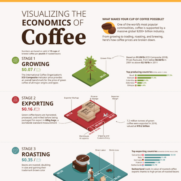
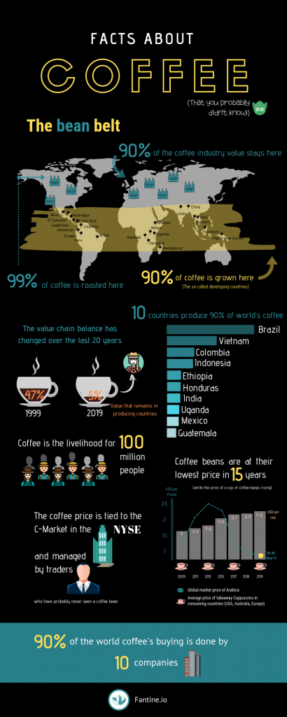
I'm constantly amazed by the sheer volume of data generated by the coffee industry. Let me share some compelling statistics that beg for visual representation:
Top Coffee Producing Countries
Annual production in millions of 60kg bags
- Production metrics span across 70+ coffee-growing countries
- Finland leads consumption at 12.2kg per capita versus global averages of 1.3kg
- The U.S. coffee market generates $40 billion annually
- Specialty coffee shows consistent 20% yearly growth
Coffee Knowledge That Demands Visual Clarity
Arabica vs. Robusta: Key Differences
flowchart LR
                        A[Coffee Beans] --> B[Arabica 70%]
                        A --> C[Robusta 30%]
                        B --> D[50-60% Less Caffeine]
                        B --> E[Fine, Mild, Aromatic]
                        B --> F[Higher Altitude Growth]
                        C --> G[50-60% More Caffeine]
                        C --> H[Strong, Bold, Bitter]
                        C --> I[Lower Altitude Growth]
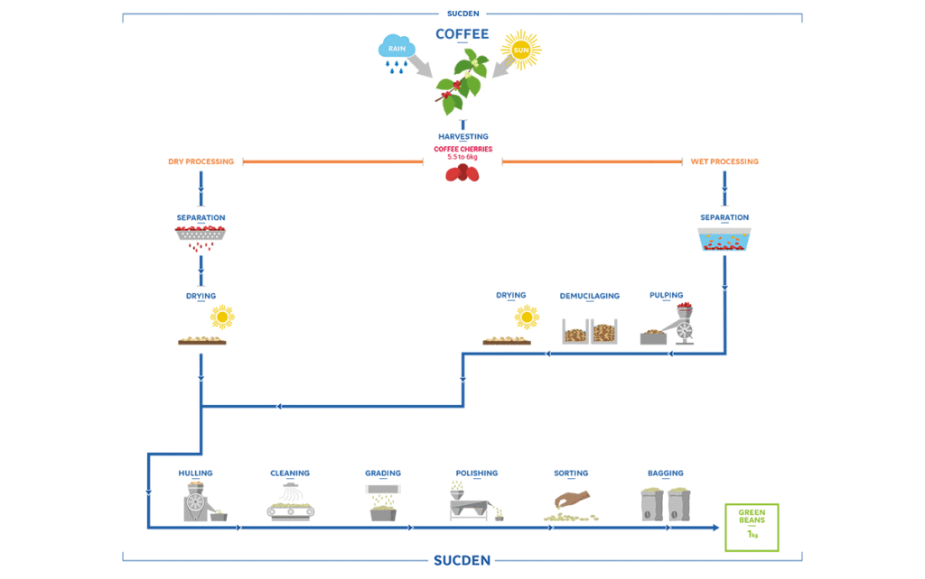
I've found that visualizing processing methods, from cherry to cup, creates incredible opportunities for engagement. When we leverage PageOn.ai's AI Blocks to build modular coffee process diagrams, we can break down complex information into digestible visual segments that resonate with both professionals and enthusiasts.
Essential Coffee Infographic Types and Their Strategic Applications
Educational Coffee Guides
In my work with coffee educators, I've identified several infographic formats that consistently deliver results. Interactive world maps showing coffee belt regions have proven particularly effective for origin education. These visual tools help viewers understand the geographic factors that influence flavor profiles.
Coffee Consumption Patterns by Country
Average kg consumed per capita annually
Brewing Method Comparisons
I've developed visual recipes for over 15 coffee preparation styles, each requiring different equipment and techniques. By transforming complex brewing instructions into clear visual steps with PageOn.ai's Vibe Creation feature, we make specialty coffee more accessible to newcomers while providing valuable reference materials for professionals.

Business and Market Intelligence Visualizations
For coffee businesses, I create strategic visualizations including:
- Coffee shop customer journey maps that identify key touchpoints
- Seasonal consumption trend analysis for inventory planning
- Price fluctuation timelines that inform purchasing decisions
- Supply chain transparency graphics that build consumer trust
Crafting Coffee Infographics That Engage and Convert
Design Elements That Resonate with Coffee Audiences
Color Psychology in Coffee Design
I've learned that color choices dramatically impact engagement. Brown gradients representing roast levels create immediate visual understanding. Steam animations and texture overlays add warmth and authenticity. When we utilize PageOn.ai's AI Blocks to combine these visual elements seamlessly, we create designs that feel both professional and approachable.
Light Roast
Medium Roast
Dark Roast
French Roast
Typography and Information Hierarchy
In my designs, I balance technical data with approachable aesthetics. Creating scannable content for social media sharing requires careful attention to typography choices and information hierarchy. Mobile-first responsive layouts ensure our infographics perform across all devices.
Data Accuracy and Source Credibility
I always partner with reputable organizations like the International Coffee Organization for data verification. Real-time market data integration keeps our visualizations current and relevant. PageOn.ai's Agentic process ensures data integrity while maintaining visual appeal, giving viewers confidence in the information presented.
Distribution Strategies for Maximum Impact
Platform-Specific Optimization
I've discovered that each platform requires unique optimization strategies. For Instagram, I create carousel designs for coffee education series that encourage swipe-through engagement. Pinterest demands vertical layouts optimized for their feed algorithm. LinkedIn B2B coffee industry reports require professional aesthetics with data visualization charts that convey authority.
Multi-Platform Distribution Strategy
flowchart TD
                        A[Coffee Infographic] --> B[Social Media]
                        A --> C[Print Materials]
                        A --> D[Digital Assets]

                        B --> E[Instagram Carousels]
                        B --> F[Pinterest Verticals]
                        B --> G[LinkedIn Reports]
                        B --> H[TikTok Animations]

                        C --> I[Menu Boards]
                        C --> J[Training Materials]

                        D --> K[Email Newsletters]
                        D --> L[Website Content]
SEO and Content Marketing Integration
I embed infographic best practices throughout my content strategy. Creating accompanying blog content amplifies reach while building backlink opportunities through shareable visuals. By optimizing for "coffee facts" and related search queries, we ensure our visual content appears in relevant searches.
The key is creating content that serves both search engines and human readers. When we create stunning infographics that provide genuine value, they naturally attract shares and engagement.
Measuring Success and Iterating
Key Performance Indicators
I track several metrics to gauge infographic effectiveness:
Average Performance Improvements
After implementing coffee infographics
A/B Testing Visual Elements
I continuously test different approaches to optimize performance. Comparing illustration styles versus photography helps identify audience preferences. Testing various chart formats reveals which data visualizations resonate most. Color scheme effectiveness and CTA placement optimization further refine our designs for maximum impact.
Future Trends in Coffee Infographic Design
Emerging Technologies and Formats
I'm excited about the future of coffee visualization. AR-enhanced coffee packaging infographics are already appearing in premium products. Interactive web experiences for coffee education engage users in unprecedented ways. Real-time data dashboards provide coffee professionals with instant market insights.
AI-generated personalized coffee recommendations based on individual taste preferences represent the next frontier in customized visual communication.
Sustainability and Transparency Focus
I'm seeing increased demand for sustainability-focused visualizations:
- Carbon footprint visualizations that track farm-to-cup emissions
- Fair trade impact metrics showing farmer benefit distributions
- Water usage comparisons across different brewing methods
- Biodiversity preservation storytelling through visual narratives

Getting Started with PageOn.ai for Coffee Infographics
Quick Start Guide
I recommend beginning with voice or text input describing your coffee data story. Let PageOn.ai's AI suggest optimal visualization formats based on your content. The drag-and-drop AI Blocks interface allows you to refine your layout intuitively. Deep Search integration helps you find relevant coffee imagery that enhances your message.
PageOn.ai Creation Process
flowchart LR
                        A[Input Data Story] --> B[AI Suggests Formats]
                        B --> C["Drag & Drop AI Blocks"]
                        C --> D[Deep Search Images]
                        D --> E["Refine & Export"]
                        E --> F[Deploy Across Platforms]
Advanced Techniques
For power users, I suggest creating template libraries for consistent brand messaging. Building interactive elements for web deployment adds engagement layers. Developing series-based content calendars ensures regular publishing. Real-time collaboration features enable team members to contribute simultaneously.
The platform's flexibility in infographic design allows for both quick iterations and detailed customization, making it suitable for projects of any scale.
Transform Your Coffee Data with PageOn.ai
Ready to create coffee infographics that captivate your audience? Join thousands of coffee professionals who are already using PageOn.ai to transform their data into compelling visual stories.
Start Creating with PageOn.ai TodayElevating Coffee Communication Through Strategic Visualization
I've seen how well-designed coffee infographics provide a competitive advantage in today's content-saturated market. They build lasting connections with coffee enthusiasts through visual storytelling that educates, engages, and inspires.
PageOn.ai has democratized professional infographic design for the coffee industry, making it accessible to businesses of all sizes. Whether you're a small roaster sharing your origin story or a large chain explaining sustainability initiatives, visual communication is now within reach.
The combination of coffee's rich narrative potential and modern visualization tools creates unprecedented opportunities for meaningful engagement. By transforming complex data into clear, beautiful graphics, we make the world of coffee more accessible and exciting for everyone.
Your next step is clear: Start creating stunning infographics that transform your coffee data into compelling visual narratives. The tools are ready, the audience is waiting, and your coffee story deserves to be told beautifully.
You Might Also Like
Transform Text into Professional Diagrams with AI Technology | PageOn.ai
Discover how AI technology revolutionizes diagram creation, turning complex text into professional visualizations instantly. Learn about PageOn.ai's innovative text-to-diagram solutions.
Transforming Raw Data into Stunning Presentations with Cloud AI Integration
Discover how to leverage cloud AI integration to transform raw data into compelling visual stories. Learn advanced techniques for data visualization and presentation creation.
Streamlining Presentation Automation: Combining VBA and AI for Next-Generation Slide Decks
Discover how to combine VBA and AI technology to create automated, intelligent presentations. Learn technical implementation, practical applications, and future trends in presentation automation.
Stock Photos in Presentations: Bringing Vibrancy and Depth to Visual Storytelling
Discover how to transform your presentations with strategic stock photography. Learn selection techniques, design integration, and visual consistency to create compelling visual narratives.