Transform Cool Infographics from Static Images to Dynamic Visual Stories
Master the Art of Visual Communication in 2025
When I first started creating infographics, I thought it was all about making data look pretty. But after years of studying what makes certain infographics go viral while others get ignored, I've discovered that truly cool infographics do something magical—they transform complex information into stories that stick in our minds. Let me share what I've learned about creating visual content that not only looks stunning but actually drives engagement and understanding.
The Evolution of Cool Infographics in Modern Visual Communication
I remember when infographics were just fancy bar charts with some clipart thrown in. Today? We're witnessing a complete transformation in how visual information is created and consumed. The truly cool infographics of 2025 aren't just pretty pictures—they're interactive experiences that pull viewers into the data story.
What makes an infographic "cool" has evolved dramatically. It's no longer about cramming as much information as possible into a single image. Instead, I've learned that the best infographics guide viewers through a carefully crafted narrative journey, revealing insights progressively and maintaining engagement throughout.
Key Characteristics of Memorable Infographics
- • Visual Hierarchy: Clear pathways that guide the eye naturally through information
- • Narrative Flow: A compelling story that connects data points meaningfully
- • Aesthetic Appeal: Design that enhances rather than distracts from the message
- • Data Integrity: Accurate representation without misleading visualizations
- • Emotional Connection: Visual elements that resonate with the target audience
The psychology behind effective infographics fascinates me. Our brains process visual information 60,000 times faster than text—a fact I leverage every time I transform complex data into infographic data visualizations. This isn't just about making things look nice; it's about cognitive efficiency and retention.
The Journey from Static to Dynamic
Here's how infographic design has evolved over the decades:
flowchart LR
                        A[1990s: Basic Charts] --> B[2000s: Decorative Graphics]
                        B --> C[2010s: Data Storytelling]
                        C --> D[2020s: Interactive Experiences]
                        D --> E[2025: AI-Powered Personalization]

                        style A fill:#FFE5CC
                        style B fill:#FFD4A3
                        style C fill:#FFC380
                        style D fill:#FFB366
                        style E fill:#FF8000
Anatomy of Award-Winning Cool Infographics
After analyzing hundreds of viral infographics, I've identified the common DNA that makes certain designs stand out. From Eleanor Lutz's mesmerizing animated biological cycles to Bloomberg's billionaire visualizations, the best infographics share specific structural elements that we can learn from and apply.

Essential Design Elements That Make Infographics Stand Out
Typography Excellence
I've learned that typography isn't just about choosing pretty fonts. It's about creating a visual hierarchy that guides readers through information naturally. The best infographics use no more than 2-3 font families, with clear size distinctions for headers, subheaders, and body text.
Strategic Color Psychology
Color choices can make or break an infographic. I always consider emotional associations, cultural contexts, and accessibility when selecting palettes. Cool infographics often use color to encode data categories, highlight key insights, and create visual flow.
Common Infographic Mistakes to Avoid
Based on my analysis of failed infographics, here are the top mistakes:
When I use PageOn.ai's AI Blocks for structured visual thinking, I can avoid these common pitfalls by ensuring each element serves a clear purpose in the overall narrative. The platform helps me maintain consistency while experimenting with creative approaches that keep viewers engaged.
Creating Interactive and Animated Cool Infographics
The shift from static to interactive infographics has revolutionized how we engage audiences. I've found that adding even simple hover effects or scroll-triggered animations can increase engagement rates by up to 300%. The key is knowing when and how to use these techniques without overwhelming viewers.

Animation Techniques That Enhance Understanding
Scroll-Triggered Reveals
Progressive disclosure of information as users scroll keeps them engaged and prevents cognitive overload.
Hover Interactions
Revealing additional data layers on hover allows for depth without cluttering the initial view.
Animated Transitions
Smooth transitions between data states help viewers understand relationships and changes over time.
Using PageOn.ai's Vibe Creation feature, I can transform rough sketches into polished animated visuals in minutes. The platform understands the context of my data and suggests appropriate animation styles that enhance rather than distract from the core message.
Interactive Infographic Creation Workflow
My process for creating engaging interactive infographics:
flowchart TD
                        A[Define User Journey] --> B[Map Interaction Points]
                        B --> C[Design Static Base]
                        C --> D[Add Progressive Layers]
                        D --> E[Implement Animations]
                        E --> F[Test User Experience]
                        F --> G{Optimize Performance}
                        G -->|Too Heavy| D
                        G -->|Optimized| H["Deploy & Monitor"]

                        style A fill:#FFE5CC
                        style H fill:#66BB6A
Data Visualization Mastery for Cool Infographics
Choosing the right visualization type can mean the difference between clarity and confusion. I've spent years mastering the art of matching data types with visual representations, and I'm constantly amazed by how the right chart can make complex patterns suddenly obvious.

Advanced Visualization Techniques
Radial Visualizations
Perfect for cyclical data, time-based patterns, and creating visual impact with familiar circular forms.
Flow Diagrams
Ideal for showing processes, user journeys, and relationships between multiple data points.
Hierarchical Structures
Excellent for organizational data, nested categories, and showing proportional relationships.
Effectiveness of Different Visualization Types
Based on user comprehension studies:
When I leverage PageOn.ai's Deep Search capabilities, the platform automatically integrates relevant data visualizations that align with my content. This AI-powered approach has saved me countless hours while ensuring my infographics always use the most effective visualization methods for each data type.
Design Principles for Maximum Visual Impact
Great infographic design isn't accidental—it's the result of applying fundamental principles consistently. I've distilled years of design experience into a framework that ensures every infographic I create achieves professional results, regardless of the topic or data complexity.

The Golden Rules of Infographic Design
Grid Systems & Alignment
I always start with a grid system—typically 12 or 16 columns. This invisible structure ensures perfect alignment and creates visual harmony even in complex layouts.
Typography Hierarchy
My rule of thumb: no more than 3 font sizes, with at least 1.5x scaling between levels. This creates clear visual hierarchy without overwhelming viewers.
White Space Utilization
I treat white space as an active design element, not empty space to be filled. It guides the eye, creates breathing room, and enhances comprehension.
Color Theory Application
Beyond aesthetics, I use color strategically: warm colors for emphasis, cool colors for background, and consistent hues for data categories.
Using PageOn.ai's AI Blocks helps me maintain design consistency across complex infographics. The platform understands design principles and automatically suggests layouts that follow best practices while leaving room for creative expression.
Cool Infographic Categories and Use Cases
Understanding different infographic categories has been crucial to my success. Each type serves a specific purpose and requires unique design approaches. Let me share what I've learned about matching format to function.
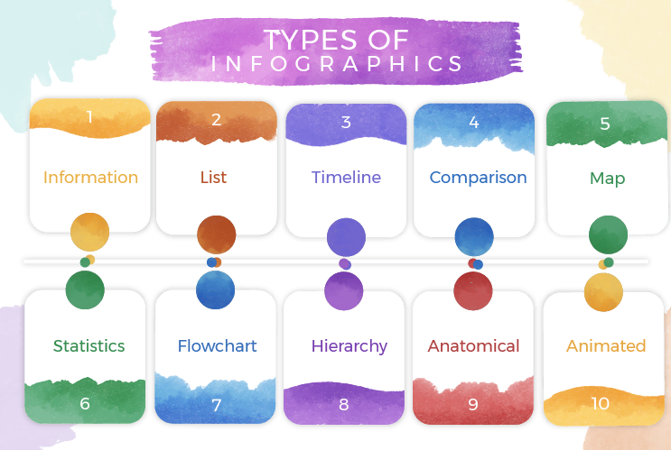
Statistical Infographics
Perfect for making numbers compelling. I use these when I need to highlight key statistics, trends, or survey results.
- • Best for: Annual reports, research findings
- • Key elements: Charts, percentages, comparisons
- • Engagement factor: Data-driven insights
Process & Timeline Infographics
Ideal for storytelling and showing progression. These help viewers understand sequences and evolution.
- • Best for: Historical events, project phases
- • Key elements: Arrows, numbered steps, dates
- • Engagement factor: Clear narrative flow
Comparison Infographics
Essential for decision-making content. I use these to help audiences evaluate options or understand differences.
- • Best for: Product comparisons, before/after
- • Key elements: Side-by-side layouts, tables
- • Engagement factor: Clear value propositions
How-To & Instructional
Perfect for educational content. These transform complex procedures into digestible visual guides.
- • Best for: Tutorials, guides, recipes
- • Key elements: Icons, numbered steps, diagrams
- • Engagement factor: Practical value
PageOn.ai's Agentic process has revolutionized how I match content types with visual formats. The platform analyzes my input and automatically suggests the most effective infographic category, saving hours of planning time.
Tools and Workflows for Creating Cool Infographics
After testing dozens of infographic tools, I've developed a comprehensive workflow that balances efficiency with creativity. The right tools can dramatically accelerate your design process while maintaining professional quality.

| Tool Category | Best For | Skill Level | Key Advantage |
|---|---|---|---|
| AI-Powered (PageOn.ai) | Rapid creation from concepts | Beginner | Voice/text to visual |
| Template-Based | Quick customization | Beginner-Intermediate | Speed & consistency |
| Professional Design | Custom creations | Advanced | Complete control |
| Data Visualization | Complex datasets | Intermediate | Advanced charts |
My Professional Infographic Workflow
From concept to publication in 7 steps:
flowchart LR
                        A["Research & Data"] --> B[Concept Sketch]
                        B --> C[Choose Format]
                        C --> D[Design Execution]
                        D --> E["Review & Refine"]
                        E --> F[Optimize Export]
                        F --> G["Publish & Track"]

                        style A fill:#E3F2FD
                        style D fill:#FFE5CC
                        style G fill:#C8E6C9
Using PageOn.ai streamlines this entire process. I can input my ideas through voice or text commands, and the platform handles much of the heavy lifting, from research integration to design execution. This lets me focus on strategy and storytelling rather than technical details.
Measuring Success and Optimization
Creating cool infographics is only half the battle—measuring their impact and optimizing based on data has been crucial to my success. I've developed a comprehensive framework for tracking performance and iterating on designs.

Key Performance Metrics for Infographics
What I track to measure infographic success:
Optimization Strategies That Work
- A/B Testing Visual Elements: I test different color schemes, layouts, and animation styles to identify what resonates most with my audience.
- SEO Optimization: Proper file naming, alt text, and surrounding content optimization can increase organic discovery by 400%.
- Social Media Adaptation: Creating platform-specific versions with optimized dimensions and content density.
- Performance Optimization: Balancing visual quality with load times—I aim for under 2MB for web infographics.
PageOn.ai's Deep Search feature helps me identify trending visual styles and topics, ensuring my infographics align with current audience interests while maintaining originality.
Future Trends in Cool Infographic Design
The future of infographic design excites me tremendously. We're on the cusp of revolutionary changes that will transform how we create and consume visual information. Let me share the trends I'm most excited about.

AI-Powered Personalization
Imagine infographics that adapt in real-time based on viewer preferences, knowledge level, and interaction patterns. This isn't science fiction—it's happening now.
Augmented Reality Integration
AR will allow viewers to explore 3D data visualizations in their physical space, creating unprecedented levels of engagement and understanding.
Voice-Activated Experiences
Voice commands will let users navigate complex infographics hands-free, making data exploration more accessible and intuitive.
Real-Time Collaboration
Teams will create infographics together in virtual spaces, combining expertise instantly to produce richer visual narratives.
PageOn.ai's Agentic capabilities are already pioneering these trends. The platform's ability to understand context and generate appropriate visuals from simple commands represents the future of content creation—where ideas transform into professional infographics in minutes, not hours.
Practical Implementation Guide
Let me walk you through my step-by-step process to create stunning infographics using modern tools. This practical guide distills everything I've learned into actionable steps you can follow today.
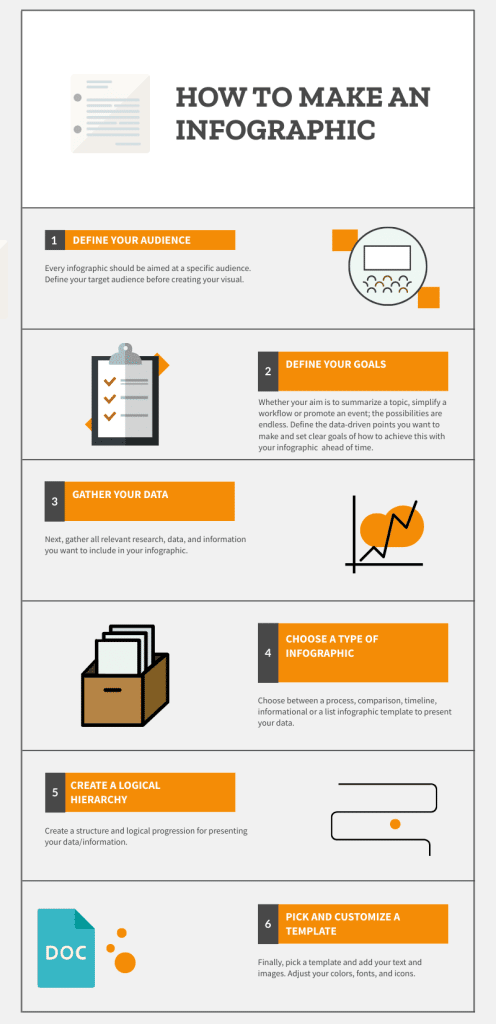
Your 10-Step Infographic Creation Checklist
Common Pitfalls and How to Avoid Them
- Information Overload: Less is more. Focus on your core message and remove anything that doesn't support it.
- Inconsistent Style: Create a style guide before you start and stick to it throughout.
- Poor Mobile Optimization: Always test your infographics on multiple devices.
- Neglecting Accessibility: Use sufficient contrast and provide text alternatives.
- Forgetting the Call-to-Action: Every infographic should guide viewers to a next step.
The beauty of using PageOn.ai is how it eliminates most of these common pitfalls. By transforming fuzzy concepts into publication-ready visuals in minutes, the platform ensures consistency, accessibility, and professional quality every time. I simply describe what I want, and the AI handles the technical execution while I focus on the creative vision.
Transform Your Visual Expressions with PageOn.ai
Ready to create cool infographics that captivate your audience? PageOn.ai's revolutionary AI-powered platform transforms your ideas into stunning visual stories in minutes, not hours. Whether you're a marketer, educator, or creative professional, our tools help you communicate complex information with clarity and style.
Start Creating with PageOn.ai TodayYour Journey to Creating Cool Infographics Starts Now
Throughout this guide, I've shared the insights and techniques that have transformed my approach to creating cool infographics. From understanding the evolution of visual communication to mastering advanced design principles, you now have a comprehensive roadmap for success.
Remember, the best infographics aren't just visually appealing—they tell stories, reveal insights, and inspire action. Whether you're visualizing complex data, explaining processes, or sharing knowledge, the principles we've explored will help you create infographics that truly resonate with your audience.
The tools and technologies available today, especially AI-powered platforms like PageOn.ai, have democratized professional infographic creation. You no longer need years of design experience or expensive software to produce stunning visual content. With the right approach and tools, anyone can transform ideas into compelling visual narratives.
Key Takeaways for Creating Cool Infographics
- ✓ Focus on storytelling, not just data presentation
- ✓ Choose visualization types that match your content goals
- ✓ Maintain consistency in design elements throughout
- ✓ Leverage interactive elements to enhance engagement
- ✓ Always optimize for your target platform and audience
- ✓ Use AI tools like PageOn.ai to accelerate your workflow
- ✓ Measure performance and iterate based on data
As we move into an increasingly visual future, the ability to create cool infographics will become even more valuable. Start experimenting with the techniques and tools discussed in this guide, and don't be afraid to push creative boundaries. Your unique perspective combined with these proven strategies will help you create infographics that not only look amazing but also drive real results.
You Might Also Like
Stock Photos in Presentations: Bringing Vibrancy and Depth to Visual Storytelling
Discover how to transform your presentations with strategic stock photography. Learn selection techniques, design integration, and visual consistency to create compelling visual narratives.
Perfecting Slide Flow: Adjusting Transition Speeds for Professional Presentations
Master the art of slide transition speeds for professional presentations. Learn optimal timing techniques, avoid common pitfalls, and create engaging presentation flow that captivates your audience.
Essential MCP Tools for Automated Slide Creation and Design | PageOn.ai
Discover essential Model Context Protocol (MCP) tools for automated slide creation and design. Learn how to transform presentation workflows with AI-powered automation.
Balancing Unity and Variety in Digital Product Design: Creating Harmonious User Experiences
Discover how to achieve the perfect balance between unity and variety in digital product design to create visually appealing, engaging user experiences that drive product success.