Master Excel Pie Charts: From Basic Creation to Professional Visualization
Transform Your Data Into Compelling Visual Stories
I've spent years working with Excel, and I can tell you that mastering pie charts is one of the most valuable skills you can develop for data presentation. Whether you're presenting budget allocations, market share analysis, or survey results, the ability to create professional pie charts will set your work apart.
Why Pie Charts Matter in Data Presentation
I've discovered through years of creating presentations that pie charts are incredibly powerful when used correctly. They transform abstract percentages into instant visual understanding. When stakeholders see a pie chart, they immediately grasp the proportional relationships in your data - something that tables of numbers simply can't achieve.

The key is knowing when pie charts are the right choice. I use them primarily for showing parts of a whole - budget allocations, market share distributions, or survey response breakdowns. They work best when you have one data series with clear categories that add up to 100%.
Common scenarios where I've found pie charts invaluable include quarterly budget reviews, where executives need to quickly see spending distribution, and customer satisfaction surveys, where the percentage breakdown of responses tells the story at a glance. For more advanced visualization options, I often explore AI pie chart generators to streamline my workflow and discover new presentation styles.
Sample Budget Allocation
Setting Up Your Data Foundation
Before I create any pie chart, I always ensure my data is properly structured. Excel pie charts require a specific format: one column for category labels and another for values. This might seem simple, but I've seen countless charts fail because of poor data preparation.
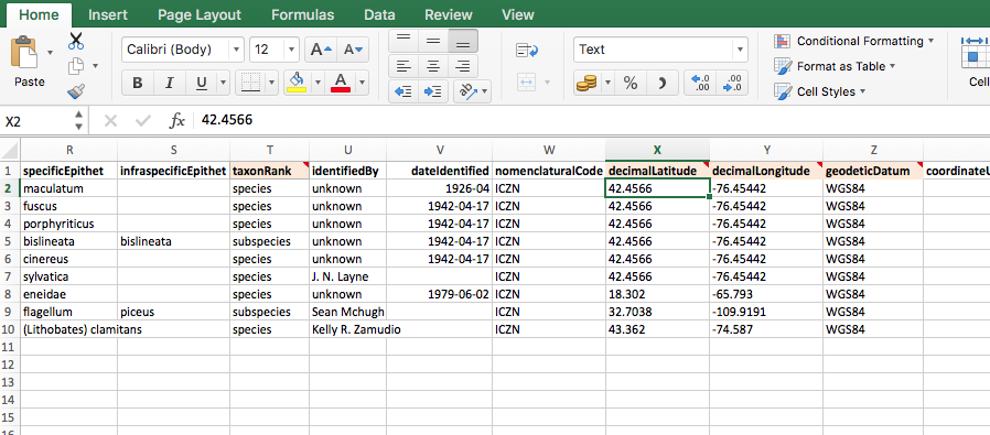
My data cleaning process always includes removing duplicates using Excel's built-in tool (Data tab > Remove Duplicates), handling zero values that can skew visualizations, and using the TRIM function to eliminate extra spaces that might affect chart labels. I typically structure my data with headers in row 1, categories in column A, and values in column B.
Pro Tip: I always create a backup of my raw data before cleaning. This has saved me countless times when I needed to reference original values or when formulas went wrong.
For complex data organization, I've found that using PageOn.ai's AI Blocks helps me structure concepts visually before implementing them in Excel. This pre-visualization step ensures my data tells the right story from the start.
Step-by-Step Pie Chart Creation Process
Basic Chart Insertion
Creating a pie chart in Excel is straightforward once you know the steps. I start by selecting my data range, always including the headers. Then I navigate to the Insert tab and click on the pie chart icon in the Charts group. Excel offers several options - 2D, 3D, and doughnut charts.
Pie Chart Creation Workflow
flowchart TD
                        A[Select Data Range] --> B[Insert Tab]
                        B --> C[Choose Pie Chart Type]
                        C --> D{2D or 3D?}
                        D -->|2D| E[Simple Flat Design]
                        D -->|3D| F[Depth Effect]
                        E --> G[Add Data Labels]
                        F --> G
                        G --> H[Customize Colors]
                        H --> I[Adjust Layout]
                        I --> J[Final Chart]
I typically choose 2D pie charts for professional presentations - they're cleaner and easier to read. 3D charts can look impressive, but they sometimes distort the data perception. Excel's Recommended Charts feature (accessed through Insert > Recommended Charts) often suggests the best option based on your data structure.
Essential Customization Techniques
Once my basic chart is created, I focus on customization. The most important step is adding data labels. I click the chart, then the plus icon that appears, and check "Data Labels." But here's where many people stop - I always go further by right-clicking the labels and selecting "Format Data Labels" to show percentages instead of raw values.

For emphasis, I use the "exploded pie" effect. After selecting the chart, I click on a specific slice twice (not double-click) to select just that slice, then drag it outward. This technique is perfect for highlighting your most important data point. I can also rotate the entire pie using the "Angle of first slice" option in Format Data Series - useful when you want a specific category at the top.
When creating complex customization guides for my team, I use PageOn.ai's Vibe Creation to transform these technical steps into clear visual instructions that anyone can follow.
Advanced Pie Chart Variations and Techniques
Specialized Chart Types
Beyond basic pie charts, Excel offers sophisticated variations I use for specific scenarios. Doughnut charts create a modern look with a hollow center - perfect for displaying KPIs in the middle. Pie of Pie charts are my go-to solution when dealing with many small slices that would otherwise clutter the main chart.
Doughnut Chart
Modern design with space for central metrics or branding
Pie of Pie
Breaks out small slices into a secondary chart for clarity
Bar of Pie
Uses bars instead of a second pie for detailed breakdown
3D Pie
Adds depth for visual impact in presentations
When exploring alternatives, I often reference different data visualization charts to ensure I'm choosing the most effective format for my data story.
Professional Formatting and Design
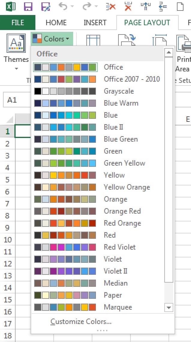
Color selection can make or break your pie chart. I always use contrasting colors - never adjacent shades that blend together. Excel's color themes (Chart Design tab > Change Colors) offer professionally designed palettes, but I often customize them to match corporate branding.
The Format Chart Area panel (double-click the chart background) is where the magic happens. Here I adjust shadows, borders, and 3D effects. For presentations, I set specific dimensions using Size & Properties to ensure consistency across slides. Managing legends is crucial - I position them strategically (usually right or bottom) and sometimes replace them entirely with direct labeling for cleaner visuals.
Data Labels and Percentage Display Mastery
Mastering data labels transforms good pie charts into great ones. I always display percentages rather than raw values - they're more meaningful in the context of parts-to-whole relationships. In Format Data Labels, I check "Percentage" and uncheck "Value" for cleaner presentation.
Label Formatting Best Practices:
- Use "Best Fit" positioning for automatic optimization
- Apply data callouts for small slices (<5%)
- Combine category names with percentages using new line separators
- Maintain consistent font sizes (minimum 10pt for readability)
- Use contrasting colors - white on dark slices, black on light
For custom labels, I use the "Value from Cells" option to pull specific text from my spreadsheet. This is invaluable when you need annotations or when standard labels don't tell the complete story. I set separators to "New Line" for vertical stacking, creating cleaner label layouts.

When preparing charts for executive presentations, I leverage PageOn.ai's Agentic process to ensure my label designs meet professional standards while maintaining clarity and impact.
Best Practices and Common Pitfalls
When to Use (and Not Use) Pie Charts
Through experience, I've learned that pie charts work best with 5-7 categories maximum. More than that, and your chart becomes a confusing rainbow. When I have more categories, I group smaller ones into an "Other" category, typically anything under 5% of the total.
When to Choose Different Chart Types
Understanding pie vs donut charts helps make informed decisions. I choose doughnut charts when I need to display a KPI in the center or when creating dashboard-style reports. For detailed comparisons or when values are similar (like 23% vs 27%), I switch to bar charts in Excel for better precision.
Professional Tips for Impact
To make pie charts that truly impact your audience, I follow these proven strategies: I always highlight the most important slice using the exploded effect, limiting it to one slice only for maximum impact. Data callouts work wonders for cramped labels - they create leader lines that point to small slices, maintaining readability.
✓ Do's
- • Sort slices largest to smallest
- • Use consistent color schemes
- • Include clear titles and sources
- • Test readability at presentation size
✗ Don'ts
- • Use 3D effects unnecessarily
- • Include more than 7 categories
- • Use similar colors for adjacent slices
- • Forget to show percentages
Integration with Modern Workflows
Excel pie charts don't exist in isolation - they're part of larger workflows. I regularly copy charts to PowerPoint presentations (Ctrl+C in Excel, then Paste Special > Picture in PowerPoint for static images, or regular paste for editable charts). For Word documents, I embed charts as objects to maintain the data connection.
Dynamic updates are crucial for recurring reports. I structure my data with named ranges, allowing charts to automatically update when new data is added. This saves hours of manual work each reporting period. For web publishing, I export charts as SVG files (save as picture option) for crisp display at any size.
Combining traditional Excel skills with modern data visualization in Excel best practices creates powerful presentations. I often enhance my charts using PageOn.ai's Deep Search to automatically find and integrate relevant visual assets that complement my data story.
Troubleshooting and Optimization
Even with experience, I encounter challenges. The most common issue is data not displaying correctly. This usually happens when Excel misinterprets headers as data. The fix: ensure your first row contains text labels, not numbers. If numbers are necessary, add an apostrophe before them ('2024) to force text formatting.
Common Issues and Quick Fixes:
- Non-adjacent data: Hold Ctrl while selecting multiple ranges
- Label overlap: Use data callouts or adjust chart size
- Missing categories: Check for hidden rows or filtered data
- Percentage errors: Ensure all values are positive numbers
- Performance issues: Limit data points to under 100 for smooth interaction
For large datasets causing performance issues, I create summary tables using SUMIF or pivot tables, then chart the summarized data. This maintains responsiveness while preserving data integrity. When labels overlap, increasing chart size often solves the problem - I typically work at 150% zoom during creation, then scale down for final presentation.
I've found that using PageOn.ai to transform troubleshooting guides into clear, step-by-step visual instructions helps my team resolve issues independently, saving valuable time and ensuring consistency across our organization's reports.
Transform Your Visual Expressions with PageOn.ai
Ready to take your data visualization beyond traditional Excel charts? PageOn.ai empowers you to create stunning, interactive visual stories that captivate your audience and communicate complex insights with clarity. From AI-powered chart generation to dynamic visual blocks, discover how our platform can revolutionize your data presentation workflow.
Start Creating with PageOn.ai TodayYou Might Also Like
Breaking ChatGPT Premium Limits: Chrome Extension Integration Guide
Discover how to overcome ChatGPT Premium limitations using Chrome extensions. Learn about top extensions, implementation guides, and advanced integration techniques for unrestricted AI assistance.
Mastering Custom Image Creation with Gemini AI in Google Slides | Visual Revolution
Learn how to create stunning custom images with Gemini AI in Google Slides. Step-by-step guide to transform your presentations with AI-generated visuals for maximum impact.
Perfecting Slide Flow: Adjusting Transition Speeds for Professional Presentations
Master the art of slide transition speeds for professional presentations. Learn optimal timing techniques, avoid common pitfalls, and create engaging presentation flow that captivates your audience.
Transforming Raw Data into Compelling Business Stories | Data Storytelling Guide
Learn how to transform raw data into powerful business narratives through effective data storytelling techniques. Discover visualization methods and narrative structures that drive decision-making.