Transform Your Google Sheets Data into Visual Stories with Pie Charts
I've discovered that creating compelling pie charts in Google Sheets isn't just about inserting a chart—it's about crafting visual narratives that make complex data instantly understandable. Let me guide you through the complete process of transforming raw spreadsheet numbers into professional, presentation-ready visualizations.
Why Pie Charts Matter for Data Clarity
I've spent countless hours staring at spreadsheets filled with percentages and proportions, trying to make sense of the relationships between different data points. The challenge we all face is making this spreadsheet data immediately understandable to stakeholders who don't have time to parse through rows of numbers.

Pie charts solve what I call the "percentage paralysis" problem—when numbers alone don't tell the story. When I present budget allocations or market share data, a well-crafted pie chart instantly communicates proportions that would take minutes to explain verbally.
Pro Tip: Before diving into Google Sheets, I often use PageOn.ai's Vibe Creation feature to transform raw data concepts into polished visual narratives. This pre-visualization step helps me identify the most impactful way to present my data before implementation.
Decision Flow: When to Use Pie Charts
flowchart TD
                        A[Have Data to Visualize] --> B{Parts of a Whole?}
                        B -->|Yes| C{5-8 Categories?}
                        B -->|No| D[Use Bar/Line Chart]
                        C -->|Yes| E{Positive Values Only?}
                        C -->|No| F[Consider Donut Chart]
                        E -->|Yes| G[Perfect for Pie Chart!]
                        E -->|No| H[Use Alternative Visualization]
                        F --> I[Modern Aesthetic Choice]
                        G --> J[Create in Google Sheets]
Setting Up Your Data Foundation in Google Sheets
My experience has taught me that the success of any pie chart starts with properly structured data. The essential structure I always follow is simple: categories in column A, values in column B. This straightforward arrangement is what Google Sheets expects and works with best.
Ideal Data Distribution for Pie Charts
Data Cleansing Requirements
- Remove duplicate entries
- Handle negative values (pie charts can't display them)
- Ensure data completeness
- Verify numerical formatting
Common Pitfall to Avoid
I've learned that pie charts fail with too many categories. The ideal range is 5-8 slices. Beyond that, the chart becomes cluttered and loses its effectiveness. For larger datasets, I group smaller categories into an "Other" category.
A quick tip I always share: Use AI pie chart generators to pre-visualize your data structure and identify potential issues before diving into manual creation.
Step-by-Step Pie Chart Creation Process
Basic Chart Generation
Select your data range, including headers. I always include headers as they become the default chart title and legend labels.
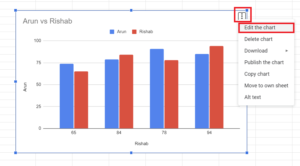
Navigate to Insert → Chart menu. Google Sheets opens the Chart Editor on the right side.
Google Sheets' automatic chart suggestion system usually defaults to a column chart. Don't worry—we'll change this.
In the Chart Editor, select "Pie chart" from the Chart Type dropdown to convert your visualization.
Essential Customization Options
Label Options
- • Percentage labels: Best for showing proportions
- • Value labels: Useful for absolute numbers
- • Category names: Clean, minimal approach
- • None: For simplified visuals with legend
Visual Enhancements
- • Adjust slice colors for brand consistency
- • 3D effects (use sparingly for clarity)
- • Donut charts (pieHole: 0.4-0.6 recommended)
- • Border colors and thickness adjustments
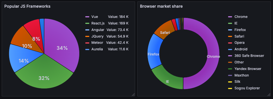
I've found that comparing pie vs donut charts helps determine which style best suits your data story. Donut charts often work better for modern dashboards, while traditional pie charts excel at showing clear proportions.
Advanced Techniques for Professional Presentations
Dynamic Features and Interactivity
Pie Chart Enhancement Options
Key Advanced Features I Use Daily:
- Exploding slices: I use the offset property to highlight key data points—perfect for emphasizing the largest expense category or top-performing region.
- Rotating charts: The pieStartAngle option helps me position labels optimally, especially when dealing with small slices that might overlap.
- Slice visibility thresholds: This automatically groups tiny slices into an "Other" category, maintaining visual clarity.
- Dynamic updates: Using IMPORTRANGE formulas, I create charts that update automatically when source data changes.
Multi-Sheet Data Consolidation
One of my favorite techniques involves consolidating data from multiple sheets to create comprehensive dashboards. Here's my proven workflow:
Multi-Sheet Consolidation Process
flowchart LR
                        A[Sheet 1: Q1 Data] --> D[Master Dashboard]
                        B[Sheet 2: Q2 Data] --> D
                        C[Sheet 3: Q3 Data] --> D
                        D --> E[IMPORTRANGE Formulas]
                        E --> F[Consolidated Pie Chart]
                        F --> G[Auto-Updated Visuals]
When dealing with complex multi-source data, I leverage PageOn.ai's Agentic process to visualize data relationships before building the final charts. This approach helps me identify patterns and connections that might not be immediately obvious in raw spreadsheet form.
Common Challenges and Professional Solutions
Technical Limitations
Mobile Editing Difficulties
Creating and editing pie charts on mobile devices remains challenging. My workaround: I prepare templates on desktop and use mobile only for data updates.
Performance with Large Datasets
Charts with >100 data points become sluggish. Solution: Pre-aggregate data using QUERY functions or pivot tables before charting.
Limited Aesthetic Options
Google Sheets offers basic styling compared to dedicated tools. I often create presentation-ready mockups using PageOn.ai before final implementation.
Data Presentation Best Practices
When NOT to Use Pie Charts
- ❌ Time series data (use line charts)
- ❌ Negative values present
- ❌ Precise comparisons needed
- ❌ More than 8 categories
- ❌ Similar-sized segments
Alternative Visualizations
- ✅ Bar charts for >8 categories
- ✅ Line charts for trends
- ✅ Stacked bars for part-to-whole over time
- ✅ Treemaps for hierarchical data
- ✅ Scatter plots for correlations
For comprehensive visualization options, explore various data visualization charts to find the perfect match for your data story.
Integration and Distribution Strategies
Cross-Platform Implementation
I've developed a systematic approach for integrating Google Sheets pie charts across different platforms. The key is maintaining data connectivity while ensuring visual consistency.
My Distribution Workflow:
- Google Docs/Slides: Paste with "Link to spreadsheet" option for live updates
- Web Publishing: Use "Publish to web" for interactive embeds
- Static Reports: Export as PNG (600 DPI) or PDF for print quality
- Email Distribution: Screenshot with annotations for quick sharing
Distribution Method Effectiveness
Automation and Efficiency Tips
Google Apps Script Automation
I use custom scripts to:
- Auto-generate charts from new data
- Update multiple charts simultaneously
- Email chart snapshots on schedule
- Archive historical chart versions
Template Strategy
My template library includes:
- Monthly budget pie charts
- Sales distribution templates
- Survey response visualizations
- Project resource allocations
For rapid iteration, I test multiple visualization approaches with PageOn.ai before committing to the final format. This saves hours of manual adjustments and ensures the most effective presentation style.
Real-World Applications and Case Studies
Business Intelligence Scenarios
Through my work with various organizations, I've identified key scenarios where pie charts in Google Sheets deliver maximum impact:
Common Business Applications
flowchart TD
                        A[Business Data] --> B[Budget Allocation]
                        A --> C[Market Share Analysis]
                        A --> D[Customer Segmentation]
                        A --> E[Survey Responses]
                        B --> F[Department Spending]
                        C --> G[Competitive Position]
                        D --> H[Demographics]
                        E --> I[Satisfaction Metrics]
Budget Visualization Example
Last quarter, I helped a startup visualize their budget allocation:
- 40% - Product Development
- 25% - Marketing & Sales
- 20% - Operations
- 10% - Customer Support
- 5% - Administrative
The pie chart immediately highlighted their product-focused strategy.
Survey Analysis Success
For a customer satisfaction survey with 500 responses:
- Created segmented pie charts by region
- Highlighted satisfaction score distribution
- Compared year-over-year improvements
- Identified key improvement areas
The visual clarity led to targeted service improvements.
Performance Metrics and KPI Tracking
I've found pie charts particularly effective for these KPI visualizations:
- 📊 Sales by Region: Instantly shows geographic performance distribution
- 🌐 Traffic Sources: Visualizes where website visitors originate
- 👥 Employee Satisfaction: Breaks down survey response categories
- 📈 Resource Allocation: Shows project time/budget distribution
When working with Excel users, I often share techniques from bar chart creation in Excel to help them transition to Google Sheets' similar but distinct approach.
Elevating Your Data Storytelling
After years of creating pie charts in Google Sheets, I've learned that these visualizations are more than just data displays—they're conversation starters that transform numbers into narratives. The key takeaway from my experience is that pie charts work best when they simplify complexity without sacrificing accuracy.
My Essential Principles for Success:
- ✨ Choose wisely: Not every dataset needs a pie chart—select the right visualization for your audience
- 🎯 Keep it simple: 5-8 slices maximum for optimal clarity
- 🎨 Design matters: Consistent colors and clear labels enhance comprehension
- 🔄 Stay dynamic: Use linked data for automatic updates
- 📊 Think beyond: Consider alternative visualizations when pie charts don't fit
The gap between raw data and compelling visual narratives can be significant. That's where tools like PageOn.ai become invaluable, bridging this divide by offering AI-powered visualization suggestions and pre-built templates that accelerate the creative process.
For those looking to expand their visualization toolkit, exploring data visualization in Excel provides complementary techniques that enhance your overall data presentation skills.
Next Steps: I encourage you to experiment with hybrid approaches that combine manual chart creation in Google Sheets with AI-assisted design tools. Start with a simple dataset, create your basic pie chart, then explore how PageOn.ai can transform it into a professional-grade visualization that tells a more compelling story.
Remember, the most effective data visualizations are those that resonate with your audience. Whether you're presenting to executives, teaching students, or sharing insights with colleagues, the principles and techniques I've shared here will help you create pie charts that not only inform but inspire action.
Transform Your Visual Expressions with PageOn.ai
Ready to take your data visualizations beyond basic pie charts? PageOn.ai empowers you to create stunning, interactive visual stories that captivate your audience and communicate complex insights with unprecedented clarity.
Start Creating with PageOn.ai TodayYou Might Also Like
Streamlining Presentation Automation: Combining VBA and AI for Next-Generation Slide Decks
Discover how to combine VBA and AI technology to create automated, intelligent presentations. Learn technical implementation, practical applications, and future trends in presentation automation.
Mastering ChatGPT to PowerPoint: Complete Workflow Guide | PageOn.ai
Learn how to streamline your workflow from ChatGPT to PowerPoint export. Discover efficient methods, tools, and advanced techniques to create professional presentations in minutes.
The Strategic GIF Guide: Creating Memorable Moments in Professional Presentations
Discover how to effectively use GIFs in professional presentations to create visual impact, enhance audience engagement, and communicate complex concepts more memorably.
Stock Photos in Presentations: Bringing Vibrancy and Depth to Visual Storytelling
Discover how to transform your presentations with strategic stock photography. Learn selection techniques, design integration, and visual consistency to create compelling visual narratives.