Transforming Data Visualization Infographics into Visual Stories That Speak
Master the art of turning complex datasets into digestible visual narratives that captivate, inform, and inspire action.
The Power of Visual Data Narratives
In my journey through the evolving landscape of data communication, I've witnessed firsthand how the convergence of data visualization and infographic design has revolutionized modern storytelling. We're no longer confined to presenting raw numbers in spreadsheets—we're crafting visual narratives that breathe life into data.
The fundamental challenge we face is transforming complex datasets into digestible visual stories that resonate with our audiences. I've found that the most successful approach involves understanding that data visualization isn't just about making things look pretty—it's about making information accessible, memorable, and actionable.

PageOn.ai's philosophy of "Turn Fuzzy Thought into Clear Visuals" perfectly encapsulates what we're trying to achieve. When I work with abstract data concepts, I need tools that can transform these nebulous ideas into concrete understanding. This journey from raw numbers to compelling infographic narratives is what separates good data presentation from truly impactful visual communication.
Key Insight:
The best data visualizations don't just show information—they tell stories that inspire action and drive decision-making. By combining analytical rigor with creative design, we can create visual narratives that speak to both the mind and the heart.
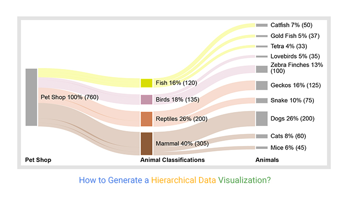
Understanding the Data Visualization-Infographic Spectrum
When I first started creating data visualizations, I often confused pure data visualizations with comprehensive infographics. Through experience, I've learned that understanding this spectrum is crucial for effective communication. Let me share what I've discovered about these distinct yet interconnected approaches.
The Visualization Spectrum: From Simple to Complex
Pure data visualizations focus on single-purpose charts that excel at presenting specific datasets clearly. In contrast, comprehensive infographics weave multiple visualizations together with narrative elements, illustrations, and contextual information. I've found that knowing when to use infographic data visualizations versus standalone charts can make or break your communication effectiveness.
Data Visualizations
- • Focus on specific datasets
- • Often interactive and dynamic
- • Minimal design elements
- • Quick to generate
- • Best for analysis
Infographics
- • Tell complete stories
- • Usually static images
- • Rich design and graphics
- • Time-intensive creation
- • Best for communication
What excites me most about modern tools like PageOn.ai is how they leverage AI Blocks to combine multiple visualization types like building with LEGOs. This modular approach allows us to construct complex infographics by assembling individual visualization components, making the creation process both efficient and flexible.
Core Techniques for Effective Data Visualization in Infographics
Choosing the Right Visualization Method
Through years of trial and error, I've learned that matching data types with appropriate chart formats is absolutely critical. Each visualization method has its strengths, and choosing the wrong one can obscure rather than illuminate your insights.
Data Type to Visualization Matching Process
flowchart TD
                        A[Identify Data Type] --> B{What are you showing?}
                        B --> C[Comparison]
                        B --> D[Composition]
                        B --> E[Distribution]
                        B --> F[Relationship]
                        B --> G[Trend]

                        C --> H[Bar Chart]
                        D --> I[Pie Chart]
                        E --> J[Histogram]
                        F --> K[Scatter Plot]
                        G --> L[Line Chart]

                        H --> M[Apply Design Principles]
                        I --> M
                        J --> M
                        K --> M
                        L --> M

                        M --> N[Create Visualization]
I always refer back to Cleveland and McGill's accuracy hierarchy when designing visualizations. Position and length are interpreted most accurately by viewers, while area and color can be more challenging. This scientific approach ensures that my data visualization charts communicate precisely what I intend.
Design Principles for Maximum Impact
Color theory plays a crucial role in my visualization design process. I've learned to limit my palettes while ensuring accessibility—typically using no more than 5-7 colors in a single infographic. This constraint forces me to be intentional about every design choice.
Pro Tip:
When creating visual hierarchies, I use PageOn.ai's Vibe Creation feature to transform voice or text descriptions into structured visual layouts. This AI-powered approach helps me quickly iterate through design options while maintaining consistency across complex multi-chart infographics.
Color Strategy
Limit palette, ensure contrast, consider accessibility
Information Density
Balance detail with clarity, avoid overwhelming viewers
Visual Flow
Guide the eye naturally through data stories
Building Compelling Data-Driven Infographics
The Storytelling Framework
When I create infographics, I always structure them with a clear narrative arc—beginning, middle, and end. This storytelling approach transforms dry statistics into engaging narratives that resonate with audiences on both intellectual and emotional levels.
Infographic Engagement Elements
I incorporate data visualizations as supporting evidence for key insights, never as standalone elements. Each chart or graph should advance the story, providing proof points that strengthen the overall narrative. The magic happens when we blend quantitative data with qualitative context—this combination creates emotional resonance that drives action.
Layout Strategies for Different Formats
Over the years, I've developed specific layout strategies for different distribution channels. Each format requires a unique approach to maximize engagement and comprehension.
Vertical Long-Form (Social Media)
I design these for mobile-first consumption, optimizing for thumb-scrolling behavior. The narrative unfolds progressively, with each screen revealing new insights that build upon previous information. This format works brilliantly for Instagram Stories, Pinterest, and LinkedIn posts.
Composite Grid Layouts
When presenting multiple related datasets, I arrange visualizations in grid patterns that allow for easy comparison. This approach works well for dashboards and reports where viewers need to see relationships between different metrics simultaneously.
Singular Focus Design
For high-impact communication, I create designs centered around one powerful visualization. These work exceptionally well for presentations, posters, and situations where you have seconds to capture attention and convey a message.
What I love about PageOn.ai's Agentic process (Plan, Search, Act) is how it mirrors my own creative workflow. The AI helps transform my initial intent into polished visuals by planning the structure, searching for relevant data and assets, then acting to create the final design—all while maintaining consistency with my brand guidelines.
Advanced Techniques and Best Practices
Avoiding Common Pitfalls
Throughout my career, I've seen countless visualizations fail due to common mistakes. Let me share the pitfalls I've learned to avoid and how to create visualizations that truly communicate effectively.
⚠️ Common Visualization Mistakes to Avoid
- • The Pie Chart Problem: Using pie charts with more than 6 categories makes comparison nearly impossible
- • Variable Overload: Including too many data series creates visual chaos rather than clarity
- • Misleading Scales: Manipulating axis ranges to exaggerate or minimize differences
- • Color Confusion: Using colors that conflict with cultural conventions (red for positive, green for negative)
- • Missing Context: Presenting data without benchmarks or reference points
I've found that the key to avoiding these pitfalls is maintaining a ruthless focus on clarity. Every element should serve a purpose—if it doesn't enhance understanding, it's visual noise that needs to be eliminated. Using PageOn.ai's AI Blocks helps me maintain consistency across complex multi-chart infographics, ensuring that design decisions remain coherent throughout.
Enhancing Accessibility and Understanding
Accessibility isn't just about compliance—it's about ensuring our data visualization reaches and impacts the widest possible audience. I've developed a comprehensive approach to making my infographics universally accessible.
✅ Accessibility Best Practices
- • Direct labeling on data points
- • High contrast ratios (4.5:1 minimum)
- • Pattern alternatives to color coding
- • Comprehensive alt text descriptions
- • Supplemental data tables
🎯 Clarity Enhancements
- • Progressive disclosure of complexity
- • Clear visual hierarchies
- • Intuitive reading patterns
- • Contextual tooltips and callouts
- • Mobile-responsive designs
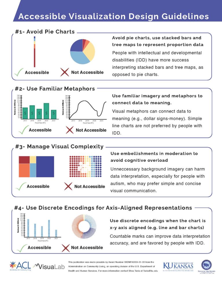
What impresses me most about modern tools is how they can automatically source accessible visual assets. PageOn.ai's Deep Search feature, for instance, helps me find color-blind friendly palettes and ensures my visualizations meet accessibility standards without sacrificing aesthetic appeal.
Real-World Applications and Industry Examples
I've had the privilege of analyzing successful infographic campaigns across various sectors. Each industry brings unique challenges and opportunities for data visualization, and understanding these nuances is crucial for creating impactful visual communications.
Industry Adoption of Data Visualization Infographics
Healthcare Sector
In healthcare, I've seen infographics transform patient education materials. Complex medical procedures, treatment pathways, and health statistics become accessible when visualized properly. During the COVID-19 pandemic, data visualization became critical for public health communication, with infographics helping millions understand transmission rates, vaccination progress, and safety protocols.
Example: Interactive dashboards showing real-time hospital capacity and resource allocation helped administrators make critical decisions during surge periods.
Financial Services
Financial institutions use data visualization to demystify complex market trends and investment strategies. I've worked on projects where interactive infographics helped clients understand portfolio performance, risk assessment, and market volatility in ways that traditional reports never could.
Example: Animated infographics showing 50 years of market cycles helped investors understand long-term investment strategies better than any written report.
Media and Journalism
Media outlets have revolutionized storytelling through data visualization. I've observed how publications like The New York Times and The Guardian use interactive infographics to make complex stories accessible. These visualizations don't just support the narrative—they become the story itself.
Example: Election coverage using real-time data visualizations helped viewers understand voting patterns and demographic shifts as results came in.
What excites me about tools like PageOn.ai is how they democratize this capability, allowing any organization to transform industry-specific data needs into compelling visual narratives without requiring a team of designers and data scientists.
The Creative Edge: Moving Beyond Standard Charts
Interactive and Dynamic Elements
Static visualizations have their place, but I've discovered that incorporating interactive elements can exponentially increase engagement and understanding. When viewers can explore data at their own pace, they develop a deeper connection with the information.
Interactive Visualization Design Flow
flowchart LR
                        A[Static Data] --> B[Add Interactivity]
                        B --> C{User Actions}
                        C --> D[Hover States]
                        C --> E[Click to Filter]
                        C --> F["Zoom & Pan"]
                        C --> G[Time Scrubbing]

                        D --> H[Reveal Details]
                        E --> I[Focus View]
                        F --> J[Explore Data]
                        G --> K[Show Changes]

                        H --> L[Enhanced Understanding]
                        I --> L
                        J --> L
                        K --> L

                        L --> M[User Insights]
I've found that hover states revealing additional context, progressive disclosure through clicking, and animated transitions that show data evolution over time all contribute to a richer user experience. The key is ensuring these interactive elements enhance rather than distract from the core message.

Innovative Visualization Approaches
Breaking free from conventional chart types has opened up exciting possibilities in my work. I've experimented with pictograms that replace abstract bars with meaningful icons, geographic visualizations that overlay data on maps, and metaphorical representations that connect abstract concepts to familiar objects.
Custom Illustrations
Transform data points into visual metaphors that resonate emotionally
Geographic Overlays
Combine location data with statistics for spatial understanding
Animated Narratives
Use motion to reveal data progressively and maintain attention
One of my favorite techniques involves using PageOn.ai's conversational creation feature to iterate designs through natural dialogue. I can describe what I envision—"Show climate change impact using melting ice metaphor"—and the AI helps translate that concept into a compelling visual narrative.
Creative Innovation:
Applying infographic design principles for maximum brand engagement means thinking beyond charts. Consider how your visualization can become a memorable experience that viewers want to share and revisit.
The Future of Data Visualization Infographics
As I reflect on the journey we've taken through the world of data visualization infographics, I'm filled with excitement about what lies ahead. The convergence of AI, design innovation, and data accessibility is creating unprecedented opportunities for visual communication.
Key Principles for Success
🎯 Accuracy First
Never sacrifice data integrity for aesthetic appeal
📖 Tell Stories
Transform numbers into narratives that inspire action
♿ Design for All
Ensure accessibility without compromising beauty
🔄 Iterate Rapidly
Use AI tools to explore multiple design directions quickly
The importance of balancing accuracy with aesthetic appeal cannot be overstated. Beautiful visualizations that mislead are worse than ugly ones that inform. Yet, we don't have to choose—with the right approach and tools, we can achieve both.
What makes me particularly optimistic is how PageOn.ai's integrated approach streamlines the entire creation process. By combining AI-powered design assistance with deep search capabilities and conversational refinement, we can transform fuzzy data thoughts into clear, compelling visual narratives faster than ever before.
Your Journey Starts Now
The world needs more people who can bridge the gap between data and understanding. Whether you're a analyst looking to communicate insights more effectively, a marketer seeking to engage audiences, or an educator aiming to make complex topics accessible, the principles and techniques we've explored provide your foundation.
I encourage you to start experimenting with these concepts immediately. Take a dataset that matters to you—whether it's business metrics, research findings, or personal interests—and challenge yourself to transform it into a visual story that moves people to action.
Remember: Every great infographic starts with a fuzzy thought. The magic happens when we have the tools and knowledge to transform that thought into crystal-clear visual communication that drives understanding and inspires change.
Transform Your Visual Expressions with PageOn.ai
Ready to turn your data into compelling visual stories? PageOn.ai's AI-powered platform makes it effortless to create stunning infographics that captivate audiences and drive decisions. From fuzzy thoughts to clear visuals in minutes.
Start Creating with PageOn.ai TodayYou Might Also Like
Vibe Coding: Transforming Ideas into Working Software Through Natural Language
Discover how vibe coding revolutionizes software development by using natural language to create working code. Learn the mechanics, workflow, and future of this AI-powered approach.
Engaging Your Audience: Crafting Interactive and Visually Captivating Slides
Discover how to transform static presentations into interactive visual experiences that captivate audiences through strategic design, interactive elements, and data visualization techniques.
Mastering Your First AI-Powered PowerPoint Automation Workflow | Complete Guide
Learn how to set up your first PowerPoint automation workflow with AI tools. Step-by-step guide covering Power Automate, Microsoft Copilot, and advanced techniques for efficient presentations.
Harnessing Creative Tension: Strategic Conflict in Experience Design | PageOn.ai
Discover how to intentionally use conflict as a creative catalyst in experience design. Learn techniques for implementing productive tension that transforms friction into innovative solutions.