Donut Charts: Transforming Data into Visual Clarity
Master the art of circular data visualization and discover how PageOn.ai revolutionizes the way we create and understand donut charts
The Power of the Ring
When I first encountered donut charts, I was skeptical. Another variation of the pie chart? But as I dove deeper into data visualization, I discovered that these circular visualizations with their distinctive hollow centers offer something uniquely powerful - a solution to many of the criticisms leveled at traditional pie charts.
Donut Chart vs. Pie Chart: Visual Comparison
See how the hollow center improves readability and allows for additional information display
Traditional Pie Chart
Modern Donut Chart
What makes donut charts truly unique in the data visualization landscape is their ability to de-emphasize area comparison - a common pitfall of pie charts. Instead, viewers naturally focus on arc lengths, which our brains process more accurately. This subtle shift in perception makes a significant difference in how we interpret proportional data.
PageOn.ai Insight: With PageOn.ai's AI Blocks, I can transform raw data into compelling donut visualizations instantly. Simply describe your data structure, and the system generates properly formatted charts with optimal color schemes and labeling - no manual configuration required.
The psychological advantage of donut charts extends beyond mere aesthetics. Research shows that our visual cortex processes arc lengths more accurately than areas, making donut charts particularly effective for comparing proportions. The central void isn't just empty space - it's a strategic design element that can display totals, percentages, or key metrics, maximizing information density without cluttering the visualization.
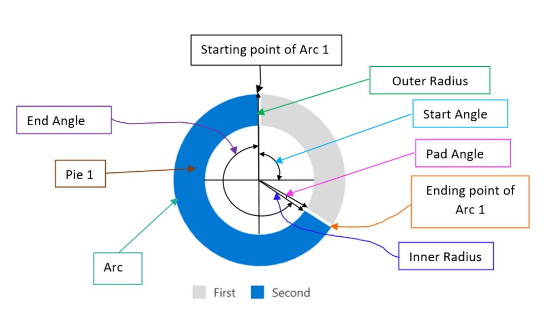
Understanding Donut Chart Architecture
To truly master donut charts, I've learned that understanding their architectural components is essential. Each element serves a specific purpose in conveying information effectively.
Anatomy of a Donut Chart
Understanding the core components and their relationships
flowchart TD
                        A[Donut Chart Components] --> B[Outer Ring]
                        A --> C[Inner Ring/Hole]
                        A --> D[Segments/Cells]
                        A --> E["Labels & Legend"]

                        B --> B1[Defines Total Circumference]
                        B --> B2[Contains All Data Points]

                        C --> C1[Strategic Negative Space]
                        C --> C2[Display Area for Totals]
                        C --> C3[Improves Arc Length Focus]

                        D --> D1[Proportional Sizing]
                        D --> D2[Color Coding]
                        D --> D3[Interactive Elements]

                        E --> E1[Direct Labels]
                        E --> E2[External Legend]
                        E --> E3[Percentage Values]
When comparing donut charts with pie charts, the distinction becomes clear. While pie charts force viewers to compare areas - a task our brains struggle with - donut charts guide the eye to compare arc lengths, a much more intuitive visual comparison. The hole isn't just aesthetic; it fundamentally changes how we perceive and process the data.
The mathematics behind proportional representation in circular formats follows a simple principle: each segment's arc length is proportional to its value relative to the total. If we have a dataset where values sum to 100, a segment representing 25% will occupy exactly 90 degrees (one quarter) of the circle's 360 degrees.
Pro Tip: Leverage PageOn.ai's Deep Search to automatically find and integrate relevant data sets for your donut charts. The system can pull data from multiple sources, normalize it, and present it in a format optimized for circular visualization - all through natural language commands.
Strategic Applications and Best Practices
When Donut Charts Excel
Through my experience with data visualization, I've identified specific scenarios where donut charts truly shine. The key is understanding not just when to use them, but how to maximize their impact.
Ideal Use Cases
- • Parts-to-whole relationships (2-7 categories)
- • Budget allocation visualization
- • Market share comparisons
- • Survey response distributions
- • Portfolio composition
Space-Efficient Design
- • Center displays key metrics
- • Compact dashboard integration
- • Mobile-responsive layouts
- • Multiple charts comparison
- • Nested data representation
Interactive Donut Chart: Sales Distribution
Hover over segments to see detailed information
Creating visual hierarchies with exploded segments adds another dimension to your data storytelling. By pulling out specific segments, you can draw attention to critical data points without overwhelming the viewer. This technique works particularly well when highlighting outliers or areas requiring immediate attention.
PageOn.ai Advantage: Use PageOn.ai's Vibe Creation to describe your data needs in natural language. Simply say "Create a donut chart showing quarterly sales by region with the top performer highlighted," and the system automatically generates a properly formatted chart with the leading segment exploded for emphasis.
Common Pitfalls and Solutions
Even experienced data visualizers can fall into common traps when creating donut charts. Here's what I've learned to avoid:
The "Too Many Slices" Trap
When you exceed 7 categories, donut charts become cluttered and difficult to interpret. Small segments become indistinguishable, and labels overlap, creating visual chaos.
Solution: Group smaller categories into an "Other" segment, or consider using a different chart type like a bar chart for datasets with many categories.
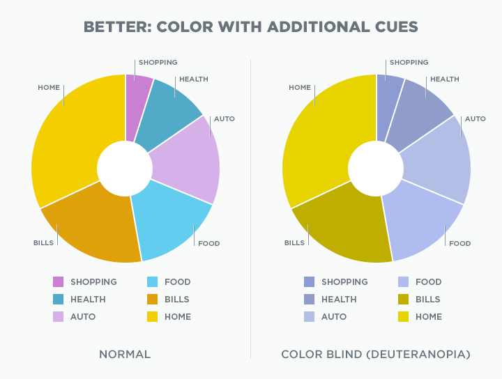
Color psychology and accessibility considerations are crucial in segment design. I always ensure sufficient contrast between adjacent segments and avoid relying solely on color to convey information. Adding patterns or textures can help colorblind users distinguish between segments.
One critical mistake I see repeatedly is attempting to use donut charts for time-series data. The circular format simply doesn't convey temporal progression effectively. For showing changes over time, stick to line charts or area charts that naturally represent chronological flow.
Transform Complex Data: PageOn.ai's Agentic process can automatically analyze your dataset and recommend the most appropriate visualization type. If you try to create a donut chart with time-series data, the system will suggest better alternatives and explain why, helping you avoid common visualization mistakes.
Technical Implementation Across Platforms
Modern Web Technologies
In my journey implementing donut charts across various platforms, I've discovered that choosing the right technology stack is crucial for achieving the desired functionality and performance.
Chart.js Implementation Example
const config = {
  type: 'doughnut',
  data: {
    labels: ['Q1', 'Q2', 'Q3', 'Q4'],
    datasets: [{
      data: [300, 450, 380, 420],
      backgroundColor: ['#FF8000', '#42A5F5', '#66BB6A', '#FFA726'],
      hoverOffset: 4
    }]
  },
  options: {
    cutout: '50%',  // Controls the size of the center hole
    animation: {
      animateRotate: true,
      animateScale: false
    },
    plugins: {
      legend: {
        position: 'bottom'
      }
    }
  }
};
Chart.js offers a straightforward approach with its built-in doughnut chart type. The key is configuring the cutout percentage - typically between 40% and 70% for optimal visual balance. Animation properties can enhance user engagement, but I recommend keeping them subtle to maintain professionalism.
For more advanced customization and interactivity, D3.js provides unparalleled flexibility. While the learning curve is steeper, the ability to create unique, highly interactive visualizations makes it worth the investment for complex projects.
Technology Selection Decision Tree
Choose the right tool for your donut chart implementation
flowchart TD
                        Start[Need a Donut Chart?] --> Simple{Simple or Complex?}

                        Simple --> Static{Static or Interactive?}
                        Static --> Excel[Excel/Google Sheets]
                        Static --> Canva[Canva/Datawrapper]

                        Simple --> Interactive --> ChartJS[Chart.js]
                        Interactive --> Plotly[Plotly.js]

                        Complex --> Custom{Custom Interactions?}
                        Custom --> Yes --> D3[D3.js]
                        Custom --> No --> BI{BI Platform?}

                        BI --> Tableau[Tableau]
                        BI --> PowerBI[Power BI]
                        BI --> Spotfire[Spotfire]
When considering Canvas vs. SVG rendering, I've found that Canvas performs better for large datasets with frequent updates, while SVG excels at providing crisp, scalable graphics with easier DOM manipulation for interactivity. The choice depends on your specific use case and performance requirements.
Simplify with PageOn.ai: Instead of wrestling with multiple chart libraries, integrate various chart types seamlessly with PageOn.ai's AI Blocks system. The platform handles the technical implementation details, allowing you to focus on your data story rather than code syntax.
Business Intelligence Tools
For business users, traditional BI tools offer familiar interfaces for creating donut charts. Excel and Google Sheets provide basic functionality that's sufficient for many use cases. I've found that Excel's formatting options are more extensive, while Google Sheets excels at real-time collaboration.
Tableau
Best for complex data analysis with drill-down capabilities and dashboard integration.
Power BI
Ideal for Microsoft ecosystem integration with strong real-time data connections.
Spotfire
Excellent for predictive analytics and handling large-scale enterprise data.
No-code solutions like Canva and Datawrapper have democratized data visualization, allowing non-technical users to create professional-looking donut charts quickly. These tools excel at rapid prototyping and are perfect for one-off presentations or social media graphics.
The PageOn.ai Advantage: Bypass complex software learning curves entirely with PageOn.ai's conversational interface. Simply describe what you want to visualize, and the system generates publication-ready charts without requiring knowledge of specific tools or programming languages.
Design Excellence and Visual Impact
Creating visually stunning donut charts requires more than just technical implementation - it demands thoughtful design decisions that enhance comprehension and engagement.
Typography and Labeling Strategies
Comparing direct labels vs. legend approaches
Typography plays a crucial role in chart readability. I've found that sans-serif fonts work best for data labels, maintaining clarity even at small sizes. When space permits, direct labeling eliminates the cognitive load of matching colors between the chart and legend. However, for charts with many segments or limited space, a well-designed legend remains the better choice.

Implementing effective color schemes requires balancing aesthetics with functionality. I follow these principles: use a consistent color palette across related charts, ensure sufficient contrast between adjacent segments, and consider cultural color associations for international audiences. Sequential color schemes work well for ordered data, while categorical schemes suit unrelated categories.
Mobile-Responsive Considerations
- ✓ Increase touch target sizes for interactive elements
- ✓ Simplify labels or use abbreviations on small screens
- ✓ Consider switching to horizontal bar charts for mobile when appropriate
- ✓ Ensure minimum font sizes remain readable (12px minimum)
- ✓ Test color contrast on various screen types and brightness levels
Creating cohesive visual narratives often requires combining donut charts with other data visualization charts. I frequently pair donut charts with trend lines to show both current distribution and historical context, or with bar charts to provide detailed breakdowns of specific segments.
Design Automation: Use PageOn.ai to automatically apply design best practices without manual configuration. The platform's AI understands color theory, accessibility requirements, and responsive design principles, ensuring your charts look professional across all devices and contexts.
Real-World Applications and Case Studies
Through my work with various industries, I've seen how donut charts can transform complex data into actionable insights. Let me share some compelling real-world applications that demonstrate their versatility and impact.
Insurance Industry: Policy Distribution Analysis
A major insurance company I worked with needed to visualize their total insured values across different policy classes. The donut chart proved perfect for this application, with the center displaying the total portfolio value while segments showed the proportion of each policy type.
Key Metrics Displayed:
- • Auto Insurance: 35% ($12.7M)
- • Home Insurance: 28% ($10.2M)
- • Life Insurance: 22% ($8.0M)
- • Health Insurance: 15% ($5.5M)
Business Impact:
- • Identified underperforming segments
- • Optimized resource allocation
- • Improved quarterly reporting efficiency
- • Enhanced stakeholder communication
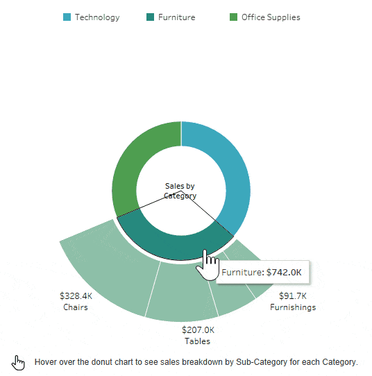
Sales Analytics: Opportunity Tracking Dashboard
Real-time visualization of sales pipeline distribution
In sales analytics, donut charts excel at showing opportunity distribution across pipeline stages. The visualization above demonstrates how quickly sales managers can identify bottlenecks and allocate resources to maximize conversion rates.
Healthcare Data: Patient Demographics
Healthcare providers use donut charts to visualize patient demographics, treatment distributions, and resource allocation. One hospital network I consulted for used nested donut charts to show both patient age groups and their corresponding treatment categories, providing instant insights for capacity planning.
Industry-Specific Solutions: Transform industry-specific data into professional presentations using PageOn.ai's structured visual content generation. The platform understands domain-specific requirements and automatically applies appropriate formatting, labeling conventions, and compliance considerations for your industry.
Advanced Techniques and Future Trends
As data visualization evolves, donut charts are becoming increasingly sophisticated. I'm excited to share some advanced techniques that push the boundaries of what's possible with circular data representation.
Interactive Features Implementation Flow
Modern donut charts go beyond static displays
flowchart LR
                        A[User Interaction] --> B{Event Type}

                        B --> C[Hover]
                        C --> C1[Highlight Segment]
                        C --> C2[Show Tooltip]
                        C --> C3[Display Details]

                        B --> D[Click]
                        D --> D1[Drill Down]
                        D --> D2[Filter Data]
                        D --> D3[Update Related Charts]

                        B --> E[Touch/Swipe]
                        E --> E1[Rotate Chart]
                        E --> E2[Zoom In/Out]
                        E --> E3[Navigate Segments]

                        C3 --> F[Update Display]
                        D3 --> F
                        E3 --> F

                        F --> G[Real-time Updates]
                        G --> H[Dashboard Sync]
Interactive donut charts have revolutionized how users engage with data. Hover states reveal additional context, click events enable drill-down functionality, and touch gestures on mobile devices allow intuitive exploration. I've implemented charts where clicking a segment filters an entire dashboard, creating a seamless analytical experience.
Combining Visualizations for Comprehensive Dashboards
Effective Combinations:
- • Donut + Line Chart: Current state + historical trend
- • Donut + Horizontal Bar Charts: Overview + detailed breakdown
- • Nested Donuts: Hierarchical data representation
- • Donut + Heat Map: Distribution + intensity analysis
Dashboard Design Principles:
- • Maintain visual hierarchy
- • Use consistent color coding
- • Align chart interactions
- • Provide contextual transitions
Accessibility features are no longer optional - they're essential for inclusive design. I ensure all my donut charts include proper ARIA labels, keyboard navigation support, and alternative text descriptions. Screen reader compatibility requires thoughtful implementation, but the result is visualizations that truly serve all users.
The shift from static to dynamic visualization represents the future of data presentation. Real-time donut charts that update as data streams in provide immediate insights for decision-making. I've built dashboards for trading floors where donut charts update every second, showing portfolio distribution changes in real-time.
Future-Ready Visualization: Leverage PageOn.ai's ability to create interactive, LEGO-like visual structures that adapt to your data in real-time. The platform's AI continuously learns from user interactions, suggesting improvements and automatically implementing best practices as they emerge in the field.
Mastering the Art of Circular Data Storytelling
As we conclude this comprehensive exploration of donut charts, I want to emphasize that mastering these visualizations is about more than technical proficiency - it's about understanding when and how to use them to tell compelling data stories.
Key Takeaways for Effective Implementation
Choose donut charts for 2-7 categories when showing parts of a whole - they excel at proportional representation while maintaining visual clarity.
Leverage the center space strategically - display totals, percentages, or key metrics to maximize information density.
Prioritize accessibility and mobile responsiveness - ensure your charts work for all users across all devices.
Consider alternatives when appropriate - complex comparisons often benefit from bar charts or other linear visualizations.
When deciding between donut charts and alternatives, I always consider the data structure, audience, and communication goals. For precise comparisons across many categories, comparison chart creation tools might serve better. For showing trends over time, line charts remain superior. But for showing proportional relationships in an engaging, space-efficient format, donut charts remain unmatched.
The Evolution of Data Visualization
From static reports to AI-driven dynamic presentations
The future of circular data visualization in an AI-driven world is incredibly exciting. We're moving beyond static representations to intelligent systems that understand context, suggest optimal visualizations, and adapt to user needs in real-time. AI pie chart generators and their donut chart counterparts are just the beginning of this transformation.
Transform Your Data Story Today
How PageOn.ai transforms the entire process from "fuzzy thought into clear visuals" - making professional data visualization accessible to everyone:
- ✨ Natural language input - describe what you want to see
- 🎯 Automatic best practice application - no design expertise needed
- 🔄 Real-time adaptation - charts evolve with your data
- 🧩 LEGO-like modularity - combine visualizations effortlessly
- 🚀 From concept to presentation in minutes, not hours
Stop wrestling with complex software. Start creating impactful visualizations that tell your data story clearly and compellingly.
As I reflect on my journey with data visualization, I'm convinced that the democratization of these tools represents a fundamental shift in how we communicate with data. Donut charts, with their elegant simplicity and powerful visual impact, exemplify this transformation. They're not just charts - they're bridges between complex data and human understanding.
Whether you're a seasoned data analyst or just beginning your visualization journey, remember that the goal isn't perfection - it's clarity. Choose the right tool for your message, respect your audience's time and cognitive load, and always strive to make the complex simple. With platforms like PageOn.ai removing technical barriers, we can all become effective data storytellers, transforming insights into action through the power of visual communication.
Transform Your Visual Expressions with PageOn.ai
Stop struggling with complex visualization tools. PageOn.ai's AI-powered platform transforms your data into stunning donut charts and comprehensive visual narratives with simple conversational commands. Join thousands of professionals who've revolutionized their data storytelling.
Start Creating with PageOn.ai TodayYou Might Also Like
The Art of Visual Hierarchy: Elevating UX Design Through Strategic Emphasis
Learn how to create powerful visual impact in UX design through strategic emphasis techniques. Discover principles of visual hierarchy that drive user behavior and boost engagement.
Print vs Digital Design: Navigating Today's Hybrid Market Landscape
Explore the evolving relationship between print and digital design disciplines, with insights on market trends, strategic applications, and essential skills for cross-disciplinary designers.
Transform Text into Professional Diagrams with AI Technology | PageOn.ai
Discover how AI technology revolutionizes diagram creation, turning complex text into professional visualizations instantly. Learn about PageOn.ai's innovative text-to-diagram solutions.
Bringing Google Slides to Life with Dynamic Animations | Complete Guide
Transform static presentations into engaging visual stories with our comprehensive guide to Google Slides animations. Learn essential techniques, advanced storytelling, and practical applications.