Master Excel Donut Charts: From Basic Creation to Advanced Visualization Techniques
Transform Your Data into Compelling Visual Stories
I've spent years perfecting the art of data visualization in Excel, and I'm here to share my comprehensive guide on creating stunning donut charts. Whether you're a financial analyst presenting portfolio allocations or a business professional showcasing market share, this guide will transform how you visualize data.
Understanding the Power of Donut Charts in Excel
When I first discovered donut charts, I was amazed by their elegance and versatility. Unlike their close cousin, the pie chart, donut charts offer a unique advantage: they can display multiple data series in concentric rings, making them perfect for comparing different datasets side by side.
Key Advantages of Donut Charts
- Display multiple data series in a single, compact visualization
- The hollow center provides space for key metrics or labels
- Easier to compare segments across different rings
- More modern and visually appealing than traditional pie charts
I've found that donut charts work exceptionally well when you need to showcase part-to-whole relationships with fewer than seven categories. In my experience working with financial data, they're particularly effective for portfolio allocations, budget breakdowns, and market share analyses.
When to Use Donut Charts
This comparison shows the ideal use cases for donut charts versus other chart types:
Building Your First Donut Chart: Step-by-Step Foundation
Let me walk you through my proven process for creating professional donut charts in Excel. I've refined this approach over hundreds of presentations, and it ensures consistent, high-quality results every time.
Data Preparation Essentials
The foundation of any great donut chart is well-structured data. I always ensure my data is organized in columns with clear headers and that all percentage values add up to 100%. This preparation saves countless hours of troubleshooting later.
| Category | Q1 2024 | Q2 2024 |
|---|---|---|
| Product Sales | 35% | 40% |
| Services | 25% | 30% |
| Licensing | 20% | 15% |
| Other | 20% | 15% |
Chart Creation Workflow
Follow this systematic approach for consistent results:
flowchart TD
                        A[Prepare Data] --> B[Select Data Range]
                        B --> C[Insert Tab]
                        C --> D[Choose Doughnut Chart]
                        D --> E[Format Chart Elements]
                        E --> F[Add Data Labels]
                        F --> G[Customize Colors]
                        G --> H[Adjust Hole Size]
                        H --> I[Final Polish]
When creating data visualization charts, I've learned that the initial formatting is crucial. I typically set the donut hole size between 40-60% for optimal visual balance, though this can vary based on your specific needs.

Advanced Multi-Series Donut Charts and Complex Visualizations
Now, let me share some advanced techniques I've developed for creating truly impressive multi-series donut charts. These methods have helped me win over countless stakeholders in high-stakes presentations.
Layered Data Series
I often create donut charts with multiple rings to compare quarterly performance. The key is using the Select Data Source dialog effectively to add each series as a new ring.
- Add up to 20 data series
- Each ring represents a time period
- Maintain consistent color coding
Professional Formatting
Transform basic charts into presentation-ready visualizations with these formatting techniques I've perfected over the years.
- Apply 3D Bevel effects (Convex)
- Use gradient fills strategically
- Add subtle shadows for depth
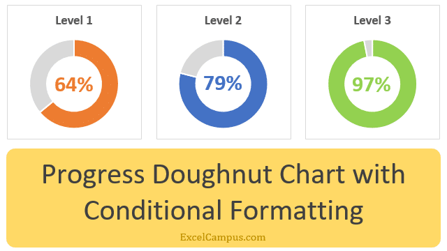
Progress Donut Chart with Conditional Formatting
Interactive visualization showing performance thresholds:
One of my favorite techniques is creating progress donut charts that change color based on performance metrics. I use IF formulas in Excel to dynamically adjust the data series, creating visual alerts when thresholds are crossed. This approach is particularly powerful when combined with data visualization in Excel dashboards.

Transforming Data into Visual Stories with PageOn.ai Integration
Here's where things get really exciting. I've discovered that PageOn.ai's AI-powered tools can transform the way we create and present donut charts. Instead of spending hours formatting in Excel, I can now create stunning visualizations through simple voice or text commands.
PageOn.ai's AI Blocks Revolution
What I love most about PageOn.ai is how it treats visual elements like LEGO blocks. I can drag and drop different chart components, combine them with supporting visuals, and create comprehensive data stories without the technical complexity of traditional Excel work.
Voice Commands
Create charts by simply describing what you need
Auto-Formatting
Professional styling applied automatically
Vibe Creation
Transform concepts into polished visuals instantly
The Deep Search capability has been a game-changer for my workflow. When I'm creating a presentation about market trends, PageOn.ai automatically finds and incorporates relevant supporting visualizations, saving me hours of manual research and design work.
PageOn.ai Workflow Integration
How PageOn.ai streamlines the visualization process:
flowchart LR
                        A[Excel Data] --> B[PageOn.ai Import]
                        B --> C[AI Processing]
                        C --> D[Visual Blocks]
                        D --> E["Drag & Drop"]
                        E --> F[Final Presentation]

                        G[Voice/Text Input] --> C
                        H[Deep Search] --> D

Professional Export and Cross-Platform Integration
Over the years, I've learned that creating a beautiful donut chart is only half the battle. The real challenge is maintaining quality when exporting to PowerPoint, Word, or web platforms. Let me share my proven strategies for seamless integration.
High-Quality Export Best Practices
-
📊
PNG Export: Right-click chart → Save as Picture → Choose PNG format for optimal quality
-
🔗
Linked Charts: Use Paste Special → Paste Link for automatic updates
-
📐
Resolution: Set maximum image resolution in PowerPoint settings
When working with multiple charts, I've found that batch exporting tools can save tremendous time. For instance, when creating a quarterly report with 20+ donut charts, specialized add-ins can export all charts with sequential naming in one operation.
PowerPoint Integration
My approach for maintaining chart quality:
- Copy chart in Excel (Ctrl+C)
- In PowerPoint: Home → Paste Special
- Select "Microsoft Office Graphic Object"
- Choose "Paste Link" for updates
Web Compatibility
Ensuring charts work everywhere:
- Use data labels instead of text boxes
- Set transparent backgrounds
- Test in Excel Online first
- Consider responsive alternatives

Real-World Applications and Best Practices
Throughout my career, I've applied donut charts across diverse industries and scenarios. Let me share some of the most impactful use cases and the lessons I've learned along the way.
Financial & Business Applications
Portfolio Analysis
I regularly use multi-ring donut charts to show asset allocation across different risk profiles, making it easy for clients to understand their investment distribution at a glance.
Revenue Breakdown
Comparing revenue streams across quarters becomes intuitive when each ring represents a different time period, highlighting growth patterns effectively.
Market Share
Donut charts excel at showing competitive positioning, especially when comparing your company's share against top competitors.
Budget Allocation
Department budgets and expense categories are perfectly suited for donut visualization, making financial planning more accessible.
Industry Application Comparison
Effectiveness of donut charts across different sectors:
Design Principles for Maximum Impact
Lead with the Story
Always start with what the data means, not just how it looks. Your audience needs context before complexity.
Meaningful Color Coding
Match colors to categories intuitively - green for growth, blue for stability, red for areas needing attention.
Simplicity Wins
Limit categories to 7 or fewer. If you have more data points, consider grouping smaller segments into "Other".
When creating charts in Excel, remember that donut charts are just one tool in your visualization toolkit. Sometimes a bar chart or line graph might be more appropriate. The key is choosing the right visualization for your specific data story.
Troubleshooting Common Challenges
Here are solutions to issues I encounter most frequently:
- Blank fills: Check for hidden data rows in Excel
- Missing labels: Manually copy and paste text boxes after export
- Distorted dimensions: Lock aspect ratio before exporting
- Pixelation: Always export at maximum resolution
- Linking failures: Use specialized tools for reliable connections
For those interested in exploring AI-powered alternatives, AI chart generators are revolutionizing how we create visualizations. These tools can interpret natural language commands and automatically generate professional charts, significantly reducing the time from data to insight.
Transform Your Visual Expressions with PageOn.ai
Ready to take your donut charts and data visualizations to the next level? PageOn.ai's AI-powered platform makes it effortless to create stunning, professional visualizations that tell compelling data stories. Say goodbye to hours of manual formatting and hello to instant, beautiful charts that impress every audience.
Start Creating with PageOn.ai TodayYou Might Also Like
Transform Your Google Slides: Advanced Techniques for Polished Presentations
Master advanced Google Slides techniques for professional presentations. Learn design fundamentals, visual enhancements, Slide Master, and interactive elements to create stunning slides.
Advanced Shape Effects for Professional Slide Design | Transform Your Presentations
Discover professional slide design techniques using advanced shape effects. Learn strategic implementation, customization, and optimization to create stunning presentations that engage audiences.
Mastering Visual Flow: How Morph Transitions Transform Presentations | PageOn.ai
Discover how Morph transitions create dynamic, seamless visual connections between slides, enhancing audience engagement and transforming ordinary presentations into memorable experiences.
Five Core Primitives That Power Modern AI Connectivity - Visual Guide
Explore the fundamental building blocks enabling modern AI systems to communicate: memory stores, context management, tool APIs, data movement, and agent coordination primitives visualized.