Mastering Multilayer Pie Charts: From Complex Data to Clear Visual Hierarchies
Transform Your Hierarchical Data into Stunning Visual Stories
I've discovered that multilayer pie charts are one of the most underutilized yet powerful tools in data visualization. While traditional pie charts have been overused and sometimes misused, their multilayer counterparts offer unique capabilities for displaying hierarchical relationships that standard charts simply can't match. Let me guide you through everything I've learned about creating these sophisticated visualizations.
Understanding Multilayer Pie Charts: The Foundation
When I first encountered multilayer pie charts, I was amazed by their elegance in solving a complex visualization problem. Unlike standard pie charts that show only one level of data, multilayer pie charts use concentric rings to display hierarchical relationships. Each ring represents a different level of detail, with the innermost circle showing the broadest categories and outer rings revealing increasingly specific subcategories.
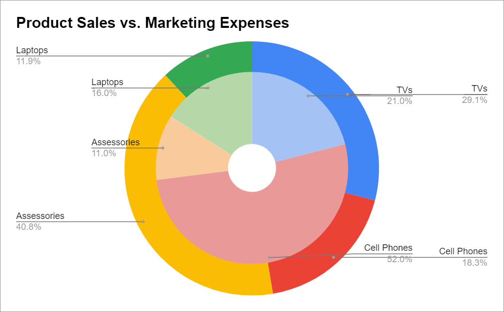
What makes these charts particularly powerful is their ability to maintain visual connections between parent and child data points. You might also hear them called sunburst charts, nested pie charts, or layered pie charts - they're all referring to the same concept. The key distinction from alternatives like treemaps or stacked columns is the intuitive circular hierarchy that mirrors how we naturally think about categorical breakdowns.
I've found that multilayer pie charts excel when you need to show proportional relationships across multiple levels simultaneously. For instance, when analyzing company revenue, you can display total revenue in the center, break it down by product categories in the first ring, and then show individual products in the outer ring. This creates an immediate visual understanding of both the big picture and the details.
Pro Tip: When deciding whether to use a multilayer pie chart, I always consider whether my data has a natural hierarchy with no more than 3-4 levels. Beyond that, the visualization can become cluttered. For rapid prototyping of different hierarchical approaches, I leverage PageOn.ai's AI chart generators to quickly test various visualization options.
Technical Architecture and Data Preparation
The foundation of any successful multilayer pie chart lies in properly structured data. I've learned through experience that your data must follow a strict hierarchical organization where every subcategory clearly belongs to a parent category. This parent-child relationship is non-negotiable - without it, the visualization will fail to convey meaningful insights.
Data Structure Flow
Here's how I organize hierarchical data for multilayer pie charts:
flowchart TD
                        A[Total Dataset] --> B[Level 1: Main Categories]
                        B --> C[Level 2: Subcategories]
                        C --> D[Level 3: Individual Items]
                        B --> E[Data Validation]
                        E --> F[Sum Consistency Check]
                        F --> G[Parent-Child Mapping]
                        G --> H[Ready for Visualization]
                        style A fill:#FF8000,color:#fff
                        style H fill:#66BB6A,color:#fff
One critical aspect I always emphasize is maintaining sum consistency across levels. Your subcategories must add up exactly to their parent categories. For example, if "Technology" shows $1 million in revenue, the sum of all technology subcategories must equal exactly $1 million. Any discrepancy will create visual inconsistencies that confuse viewers.
When preparing data, I typically organize it in columns where each column represents a hierarchical level. The first column contains the broadest categories, the second contains subcategories, and so on. I've found that keeping the data in the same order across all levels is crucial - all "Fall" data should come before "Winter" data, maintaining consistency throughout the structure.
Data Preparation Checklist:
- Verify hierarchical relationships are clearly defined
- Ensure subcategory sums equal parent category values
- Maintain consistent ordering across all levels
- Choose between sum vs. count aggregation methods
- Limit to 2-4 hierarchical levels for optimal clarity
For complex datasets, I use PageOn.ai's Deep Search capabilities to automatically pull relevant examples and validate my data structure against proven patterns. This helps me identify potential issues before they become visualization problems.
Implementation Across Different Platforms
Enterprise Solutions
In my work with enterprise platforms like FineReport and FusionCharts, I've discovered that these tools offer the most comprehensive multilayer pie chart capabilities. FineReport, for instance, provides native support for what they call "multilayer pie charts" with built-in drill-down functionality. You can configure the level quantity, set rotation controls, and even adjust the core radius to create donut-style variations.
FusionCharts takes a slightly different approach with their implementation. They allow for extensive customization of start and end angles, which I find particularly useful when I want to emphasize certain segments. The gradual color controls - from light to deep gradients - help establish visual hierarchy automatically.
Spreadsheet-Based Approaches
Creating multilayer pie charts in Excel or Google Sheets requires more creativity. I've developed a technique using multiple donut charts layered on top of each other. The process involves creating a base pie chart as the background, then overlaying progressively smaller donut charts for each additional level.
Implementation Complexity by Platform
Comparing the effort required across different platforms:
In Google Sheets, I use ARRAYFORMULA and QUERY functions to create dynamic data updates. The formula-driven approach means that changes to the source data automatically update all chart layers. However, color coordination remains manual - each slice needs individual attention to maintain visual consistency across layers.
Custom Development Options
For maximum flexibility, I turn to JavaScript libraries. D3.js offers sunburst partitions that provide complete control over every aspect of the visualization. While the learning curve is steeper, the ability to create exactly what I envision makes it worthwhile for complex projects. Libraries like Chart.js are beginning to add multilayer support, though it's still limited compared to dedicated solutions.
Power BI users face unique challenges since there's no native multilayer pie chart. I've successfully created workarounds using layered visuals, but it requires careful positioning and often sacrifices interactivity. For those exploring different data visualization charts, understanding these platform limitations is crucial for choosing the right tool.
Design Excellence and Visual Optimization
Great multilayer pie charts aren't just about displaying data - they're about creating an intuitive visual experience. I've learned that color strategy is perhaps the most critical design element. I use gradual gradients from light to deep shades within each category family. This creates natural visual groupings that help viewers understand relationships without conscious effort.

Label positioning requires careful consideration at each level. For outer rings, I implement traction lines (leader lines) that connect labels to their segments, preventing overlap and maintaining readability. Inner rings work better with internal labels, but only when the segments are large enough to accommodate text without crowding.
Interactive Elements That Matter:
- Click-to-drill: Allow users to explore deeper levels by clicking segments
- Hover tooltips: Display detailed values and percentages on mouseover
- Rotatable segments: Enable manual rotation for better label visibility
- Zoom controls: Essential for mobile interfaces with limited screen space
Mobile responsiveness presents unique challenges for multilayer pie charts. I've found that limiting mobile versions to two levels maximum ensures usability on smaller screens. Touch targets need to be larger than desktop hover areas, and I often implement a tap-to-reveal strategy for detailed information rather than trying to display everything at once.
To rapidly iterate on design concepts, I use PageOn.ai's Vibe Creation feature to transform rough ideas into polished visuals. This helps me experiment with different color schemes and layouts before committing to final implementation. Understanding the differences between pie vs donut charts also influences my design decisions for the center area.
Real-World Applications and Use Cases
Business Intelligence Scenarios
I've implemented multilayer pie charts across numerous business contexts, and certain use cases consistently deliver exceptional value. Revenue breakdown analysis is perhaps the most common application. Imagine visualizing total company revenue in the center, breaking it down by regions in the first ring, product categories in the second, and individual products in the outer ring. This creates an immediate understanding of revenue distribution that would require multiple separate charts otherwise.
Organizational Hierarchy Visualization
A symmetrical multilayer chart showing company structure:
flowchart TD
                        CEO[CEO] --> DEPT1[Operations]
                        CEO --> DEPT2[Technology]
                        CEO --> DEPT3[Marketing]
                        DEPT1 --> T1[Team A]
                        DEPT1 --> T2[Team B]
                        DEPT2 --> T3[Development]
                        DEPT2 --> T4[Infrastructure]
                        DEPT3 --> T5[Digital]
                        DEPT3 --> T6[Traditional]
                        style CEO fill:#FF8000,color:#fff
                        style DEPT1 fill:#42A5F5,color:#fff
                        style DEPT2 fill:#66BB6A,color:#fff
                        style DEPT3 fill:#AB47BC,color:#fff
Marketing campaign performance analysis has become one of my favorite applications. Using the Adwords example I mentioned earlier, I can show total clicks in the center, campaign types in the first ring (Design, Development, Marketing), and specific ad groups in the outer ring. This immediately reveals which campaigns and ad groups drive the most engagement, enabling quick strategic decisions.
Geographic sales data with regional subdivisions works exceptionally well with multilayer pie charts. I start with global sales in the center, break down by continents, then countries, and finally by cities or districts. This hierarchical geographic view helps identify market opportunities and performance gaps at every level.
Data Analysis Best Practices
Through trial and error, I've established clear guidelines for optimal multilayer pie chart usage. First, I limit each level to no more than 10 segments. Beyond this, the chart becomes visually cluttered and loses its effectiveness. When dealing with many categories, I group smaller ones into an "Other" segment that users can drill into for details.
Important Limitation: Multilayer pie charts currently cannot handle negative values effectively. The visualization treats negative numbers as positive, which can mislead viewers. For datasets with negative values, I recommend alternative visualizations like waterfall charts or grouped bar charts.
Proportion visibility is crucial - segments with very similar sizes (differences less than 5%) are difficult to distinguish visually. In these cases, I rely heavily on interactive tooltips and data labels to communicate exact values. I also carefully consider whether to display sums, averages, or counts based on what provides the most meaningful insight for the specific use case.
Advanced Techniques and Customization
Once you've mastered the basics, advanced techniques can elevate your multilayer pie charts from good to exceptional. I've developed several specialized approaches for different scenarios. Symmetrical multilayer charts, where all segments at each level have equal size regardless of their values, are perfect for organizational charts or process flows where hierarchy matters more than proportions.

Custom drill-down navigation patterns can significantly enhance user experience. Instead of the standard click-to-expand approach, I've implemented breadcrumb-style navigation that allows users to jump between any levels directly. This is particularly useful when users need to compare subcategories across different parent categories.
Performance Metrics Across Techniques
Comparing rendering performance for different customization approaches:
Adding annotation layers has become one of my signature techniques. I overlay contextual information directly on the chart - trend indicators, year-over-year comparisons, or important thresholds. These annotations provide additional context without requiring users to reference external legends or documentation.
Export considerations often get overlooked but are crucial for professional presentations. I ensure that interactive elements have static alternatives for PDF exports, maintain consistent colors across different export formats, and include data tables as appendices for accessibility compliance.
For complex requirements, I utilize PageOn.ai's Agentic capabilities to transform specifications into refined visual outputs. The platform's AI pie chart generators help me quickly prototype advanced features before implementing them in production systems.
Common Challenges and Solutions
Technical Hurdles
Browser compatibility remains one of my biggest technical challenges. Complex SVG overlays that work perfectly in Chrome might render incorrectly in Safari or Edge. I've learned to test extensively across browsers and maintain fallback options. For critical business applications, I often provide a simplified version for older browsers while delivering the full experience to modern ones.
Performance optimization for large datasets requires careful attention. When dealing with thousands of data points across multiple levels, rendering can become sluggish. I implement data aggregation strategies, loading data on-demand as users drill down rather than rendering everything upfront. Virtual scrolling techniques for legends and lazy loading for tooltip data also help maintain smooth performance.
Critical Issues to Avoid:
- Never exceed 4 hierarchical levels - cognitive overload occurs
- Avoid similar colors for adjacent segments - causes confusion
- Don't mix percentage and absolute values without clear labeling
- Never use 3D effects - they distort proportions and reduce clarity
Design Pitfalls to Avoid
Over-segmentation is perhaps the most common mistake I see. Just because you can show 20 subcategories doesn't mean you should. I follow the "7±2 rule" - humans can effectively process 5-9 items at once. When I have more categories, I group smaller ones or provide filtering options to focus on specific subsets.
Poor color contrast between adjacent segments makes charts difficult to read, especially for colorblind users. I always test my color schemes with accessibility tools and maintain a minimum contrast ratio of 3:1 between adjacent segments. Using patterns or textures in addition to colors provides an extra layer of differentiation.
Inconsistent labeling strategies across levels confuse viewers. If I use percentages at one level, I maintain that approach throughout. Switching between value types or label formats breaks the visual flow and forces users to constantly reorient themselves. When comparing to simpler alternatives like horizontal bar charts, consistency becomes even more critical for maintaining the multilayer pie chart's advantage.
Future-Proofing Your Multilayer Visualizations
The future of multilayer pie charts is evolving rapidly with emerging standards in hierarchical data visualization. I'm seeing a shift toward more interactive, AI-assisted generation where systems can automatically determine optimal level configurations based on data characteristics. WebGL-based rendering is becoming more common, enabling smooth animations and transitions even with complex datasets.

Real-time data integration is transforming how we think about these visualizations. I'm implementing WebSocket connections that update chart segments as data changes, creating living dashboards that reflect current business states. This requires careful consideration of animation strategies to avoid disorienting users while keeping them informed of changes.
Accessibility improvements are becoming mandatory rather than optional. Screen reader support for complex hierarchical visualizations requires thoughtful implementation of ARIA labels and keyboard navigation patterns. I'm developing standardized approaches that allow users to navigate through levels using arrow keys and hear contextual descriptions of data relationships.
Emerging Trends to Watch:
- AI-powered automatic hierarchy detection from flat datasets
- Voice-controlled navigation for hands-free exploration
- Augmented reality overlays for spatial data representation
- Collaborative annotation features for team analysis
- Predictive highlighting based on user behavior patterns
Building adaptable visualization templates has become essential for maintaining consistency while allowing flexibility. I create modular systems using PageOn.ai's AI Blocks that can be quickly reconfigured for different data structures. This approach ensures that as requirements change, my visualizations can evolve without starting from scratch.
The integration of machine learning for pattern detection within multilayer pie charts opens exciting possibilities. Imagine charts that automatically highlight anomalies, suggest optimal drill-down paths based on user goals, or predict which segments users are most likely to explore next. These intelligent enhancements will transform multilayer pie charts from static displays into dynamic analytical tools.
Transform Your Visual Expressions with PageOn.ai
Ready to create stunning multilayer pie charts and other advanced visualizations? PageOn.ai's intelligent design tools and AI-powered features make it easier than ever to transform complex hierarchical data into clear, impactful visual stories.
Start Creating with PageOn.ai TodayBringing It All Together
Multilayer pie charts represent a powerful yet underutilized tool in the data visualization arsenal. Through my journey of mastering these complex visualizations, I've discovered that success lies not just in technical implementation but in understanding when and how to apply them effectively. The key is matching the visualization to your data's natural hierarchy while maintaining clarity and user engagement.
As we move forward, the boundaries between traditional static charts and interactive analytical tools continue to blur. Multilayer pie charts are evolving from simple hierarchical displays into sophisticated interfaces for data exploration. By staying current with emerging techniques and tools, we can create visualizations that not only inform but inspire action.
Whether you're using enterprise platforms, spreadsheet solutions, or custom code, remember that the goal is always clear communication of complex relationships. With the techniques and insights I've shared, you're now equipped to create multilayer pie charts that transform hierarchical data into compelling visual narratives. The future of data visualization is bright, and multilayer pie charts will undoubtedly play a crucial role in how we understand and interact with complex information structures.
You Might Also Like
Creating Memorable Experiences That Sell Themselves | Experience Design Guide
Discover how to craft memorable customer experiences that drive organic growth. Learn the psychology, storytelling techniques, and visual design strategies that transform customers into advocates.
Vibe Coding: Transforming Ideas into Working Software Through Natural Language
Discover how vibe coding revolutionizes software development by using natural language to create working code. Learn the mechanics, workflow, and future of this AI-powered approach.
Mastering Presentation Efficiency: Build Impactful Decks by Reusing Slides
Learn how to save time and create better presentations by reusing slides. Discover PowerPoint's built-in reuse features, strategic approaches, and how PageOn.ai enhances your workflow.
Building Powerful Real-World AI Applications with PostgreSQL and Claude | PageOn.ai
Learn how to build sophisticated AI applications by integrating PostgreSQL and Claude AI. Discover architecture patterns, implementation techniques, and optimization strategies for production use.