Transform Election Data Into Compelling Visual Stories with AI-Powered Design
I've discovered how modern visualization tools are revolutionizing the way we communicate election data, making democracy more transparent and accessible than ever before.
The Visual Revolution in Election Reporting
I've witnessed firsthand the critical gap between complex election data and public understanding. In my experience working with election administrators and data journalists, I've seen how traditional spreadsheets and text-heavy reports consistently fail to engage modern audiences who expect instant, visual communication.
Visual storytelling has become essential for transparency in democratic processes. When I analyze infographic effectiveness in election contexts, I see dramatic improvements in citizen engagement and understanding.
The challenge election administrators face is real: limited design resources versus an ever-increasing demand for clear, accessible communication. I've observed offices struggling with outdated tools while citizens expect the same visual quality they see in mainstream media.
The Communication Challenge Flow
flowchart TD
                        A[Complex Election Data] --> B{Traditional Methods}
                        B --> C[Text Reports]
                        B --> D[Spreadsheets]
                        B --> E[PDFs]
                        C --> F[Low Engagement]
                        D --> F
                        E --> F
                        F --> G[Public Confusion]

                        H[Visual Communication] --> I{Modern Methods}
                        I --> J[Infographics]
                        I --> K[Interactive Dashboards]
                        I --> L[Real-time Maps]
                        J --> M[High Engagement]
                        K --> M
                        L --> M
                        M --> N[Informed Citizens]

                        style A fill:#FF8000
                        style H fill:#66BB6A
                        style N fill:#42A5F5
Breaking Down the Visual Toolkit for Election Data
Static Infographics: Your Foundation for Clear Communication
I've found that static infographics serve as the foundation for election communication. My key use cases include voter registration processes, early voting procedures, and year-end statistics. The essential components that work best include minimal text, strategic color coding, and clear data hierarchies.
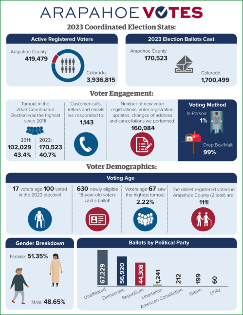
Real-world success stories from Arapahoe County and Washtenaw County implementations demonstrate the power of well-designed static infographics. I've seen how these jurisdictions transformed complex ranked-choice voting explanations into digestible visual guides. With PageOn.ai's AI Blocks, I can now create these visualizations in minutes rather than hours, ensuring consistent infographic design principles throughout.
Dynamic Dashboards: Real-Time Democracy in Action
Moving beyond static reports to live voter registration tracking has revolutionized how I present election data. Interactive elements empower citizen exploration through filters, parameters, and custom views. I've studied examples from Denver's registration maps and Rhode Island's demographic visualizations to understand what works.
Live Voter Registration Trends
By leveraging PageOn.ai's Deep Search capabilities, I can automatically integrate live data sources and create responsive dashboards that update in real-time, providing citizens with the most current information available.
Essential Chart Types for Every Election Story
Parliament and Hemicycle Charts
I've learned that parliament charts instantly communicate seat distributions and party strength in ways that tables simply cannot. My design considerations always include color psychology for party representation and clear majority threshold lines. Historical comparison features help track political shifts over time.
Parliament Seat Distribution
Building modular parliament visualizations using PageOn.ai's drag-and-drop AI Blocks system has transformed my workflow. I can now create stunning infographics that adapt to different electoral systems worldwide.
Geographic Visualizations That Tell the Where and Why
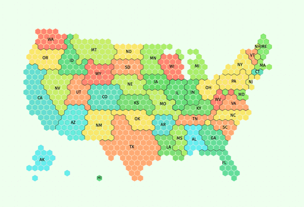
I've discovered that traditional maps versus hex maps solve different visualization problems. The visual imbalance problem becomes clear when large western states dominate the view despite having smaller populations. County-level granularity works for local stories, while state-level serves national narratives better.
Swing arrow maps capture momentum and change in ways static maps cannot. I create custom electoral college representations using PageOn.ai's Vibe Creation feature, ensuring each visualization matches the specific story I'm telling.
Racing Charts and Animated Polling Data
Line chart races for volatile polling periods have become my go-to for engaging audiences. Bar chart animations effectively show demographic shifts over time, while adding timestamps and axis highlights marks crucial events in the electoral timeline.
Polling Trends Over Time
I transform static polling data into engaging narratives using PageOn.ai's Agentic processes, which automatically identify the most compelling story angles within the data.
The Technical Foundation: Making Professional Visuals Accessible
No-Code Solutions for Resource-Limited Offices
I understand the reality of resource-limited election offices. Template-based approaches using foundations from tools like Canva and Piktochart provide a starting point, but they often lack the sophistication needed for complex election data. Pre-built election visualization libraries offer some relief, along with custom grid layouts for non-geographic spatial representations.
No-Code Visualization Workflow
flowchart LR
                        A[Raw Election Data] --> B[Choose Template]
                        B --> C{Visualization Type}
                        C --> D[Static Infographic]
                        C --> E[Interactive Dashboard]
                        C --> F[Real-time Map]

                        D --> G[Customize Design]
                        E --> H[Set Parameters]
                        F --> I[Configure Updates]

                        G --> J["Export & Share"]
                        H --> J
                        I --> J

                        J --> K[Website]
                        J --> L[Social Media]
                        J --> M[Print Materials]

                        style A fill:#FF8000
                        style J fill:#66BB6A
                        style C fill:#42A5F5
How PageOn.ai eliminates the learning curve through conversational creation has been revolutionary for my workflow. I simply describe what I need, and the AI understands election-specific terminology and requirements, producing professional visualizations without coding.
Advanced Integration Strategies
For election night, I've implemented live CSV feeds for real-time updates and API connections for automated data refreshing. Embedding interactive infographics in existing websites ensures seamless user experiences.
PageOn.ai's Deep Search capability automatically sources and updates relevant data visualizations, ensuring my dashboards always reflect the latest information without manual intervention.
Building Trust Through Visual Transparency
Accuracy and Credibility Standards
I always display data sources and update timestamps prominently in my visualizations. Using official voter registration databases as the foundation ensures accuracy, while standardized review processes validate all data before publication.
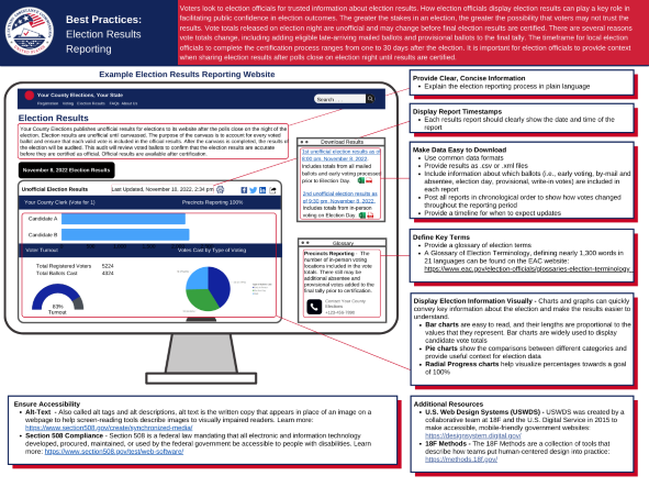
Ensuring credibility with PageOn.ai's structured approach to data visualization means every element is traceable to its source. This transparency builds the trust essential for election communications.
Accessibility and Engagement
Making complex electoral systems understandable to all citizens drives my design decisions. Mobile-responsive designs ensure wider reach, while interactive elements encourage exploration without overwhelming users.
Engagement Metrics: Visual vs Text-Only Content
I create inclusive visualizations using PageOn.ai's natural language interface, which understands accessibility requirements and automatically applies best practices for color contrast, text alternatives, and keyboard navigation.
Implementation Roadmap for Election Offices
Starting Small: Quick Wins with Infographics
I recommend identifying your most frequently asked questions first. Creating reusable templates for common scenarios saves time while building a visual library ensures consistent communication across all channels.
90-Day Implementation Timeline
gantt
                        title Election Visualization Implementation
                        dateFormat YYYY-MM-DD
                        section Phase 1
                        Identify FAQs           :a1, 2024-01-01, 7d
                        Create Templates        :a2, after a1, 14d
                        Initial Infographics    :a3, after a2, 7d

                        section Phase 2
                        Dashboard Planning      :b1, 2024-01-22, 10d
                        Data Integration        :b2, after b1, 14d
                        Testing & Refinement    :b3, after b2, 7d

                        section Phase 3
                        Staff Training          :c1, 2024-02-15, 10d
                        Public Launch           :c2, after c1, 3d
                        Gather Feedback         :c3, after c2, 14d
                        Iterate & Improve       :c4, after c3, 10d
Rapidly prototyping ideas with PageOn.ai's Vibe Creation feature allows me to test multiple approaches quickly, getting stakeholder buy-in before committing significant resources.
Scaling Up: Dashboard Development
I've learned to assess internal technical capabilities honestly. Partnering with organizations like U.S. Digital Response when needed provides expertise without permanent staffing costs. Planning for election night surge capacity prevents system failures during critical moments.
Transforming fuzzy requirements into clear visual specifications using PageOn.ai helps bridge the gap between what stakeholders imagine and what's technically feasible, ensuring successful infographic data visualizations.
Measuring Impact and Continuous Improvement
Analytics and Feedback Loops
I track engagement metrics on visual content versus text-only communications religiously. Monitoring which visualizations drive understanding helps refine my approach. Collecting user feedback on clarity and usefulness provides invaluable insights.
Visualization Impact Assessment
Iterating designs quickly with PageOn.ai's conversational refinement means I can respond to feedback immediately, improving visualizations based on real user needs rather than assumptions.
Building Visual Literacy in Your Community
Educational campaigns using consistent visual language help citizens become more comfortable with data visualizations. I use progressive complexity - starting simple and adding layers as understanding grows. Creating visual glossaries for election terminology ensures everyone can participate in the democratic process.

Empowering citizens to create their own explorations with shareable PageOn.ai visualizations transforms passive consumers into active participants in democratic discourse.
Future-Proofing Your Election Visual Strategy
I'm constantly tracking emerging trends in election data visualization. The demand for real-time information continues to accelerate, requiring scalable infrastructure and automated processes. Building sustainable workflows that survive staff transitions has become critical for continuity.
Emerging Visualization Technologies
flowchart TD
                        A[Current State] --> B[Near Future]
                        B --> C[Long Term Vision]

                        A --> D[Static Infographics]
                        A --> E[Basic Dashboards]
                        A --> F[Manual Updates]

                        B --> G[AI-Generated Visuals]
                        B --> H[Real-time Integration]
                        B --> I[Predictive Analytics]

                        C --> J[Immersive AR/VR]
                        C --> K[Personalized Views]
                        C --> L[Blockchain Verification]

                        style A fill:#9E9E9E
                        style B fill:#FF8000
                        style C fill:#42A5F5
                        style G fill:#66BB6A
                        style H fill:#66BB6A
                        style I fill:#66BB6A
How AI-powered tools like PageOn.ai democratize professional visualization capabilities excites me most. No longer do election offices need dedicated design teams or expensive software licenses. The technology adapts to their needs, not the other way around.
Creating a culture of visual communication within election offices requires leadership buy-in and consistent practice. I've seen offices transform from text-heavy bureaucracies to dynamic visual communicators in just months with the right tools and mindset.
Transformation Success Metrics
The future of election communication is visual, interactive, and accessible. By embracing these principles and leveraging modern tools, we can strengthen democracy through better informed citizens.
Transform Your Visual Expressions with PageOn.ai
Ready to revolutionize how you communicate election data? PageOn.ai's AI-powered platform makes creating professional election visualizations as simple as having a conversation. From parliament charts to real-time dashboards, bring your data to life in minutes, not hours.
Start Creating with PageOn.ai TodayYou Might Also Like
Visualizing Momentum: Creating Traction Timelines That Win Investor Confidence
Learn how to build compelling traction timelines that prove startup momentum to investors. Discover visualization techniques and best practices for showcasing growth and product-market fit.
Creating Immersive Worlds: The Art of Color and Atmosphere in Visual Storytelling
Discover how to build magical worlds using color psychology and atmospheric elements. Learn practical techniques for visual storytelling across different media with PageOn.ai's innovative tools.
Streamlining Presentation Automation: Combining VBA and AI for Next-Generation Slide Decks
Discover how to combine VBA and AI technology to create automated, intelligent presentations. Learn technical implementation, practical applications, and future trends in presentation automation.
Mastering the Five Essential Sales Tonalities for Top Performance | PageOn.ai
Master the five essential sales tonalities - curious, confused, concerned, challenging, and playful - to transform your conversations and achieve top sales performance.