Transforming Environmental Data into Compelling Visual Stories
Understanding the Power of Environmental Infographics
In our rapidly changing world, I've discovered that environmental infographics have become essential tools for communicating urgent ecological challenges. These powerful visual narratives bridge the gap between complex scientific data and public understanding, inspiring action for our planet's future.
Understanding the Power of Environmental Infographics
When I first began exploring environmental communication, I realized that raw data alone rarely moves people to action. Environmental infographics serve as powerful visual tools that merge critical ecological data with captivating design elements, transforming abstract concepts into compelling narratives that resonate with diverse audiences.
These visual tools have become indispensable for educators, activists, and communicators who need to convey complex environmental messages effectively. I've seen firsthand how a well-designed infographic can make the difference between passive awareness and active engagement.
The growing demand for environmental visual content has led platforms like Venngage to offer comprehensive template libraries, with over 4,700 different environmental templates available. This explosion in resources reflects our collective need to communicate environmental urgency more effectively.
Key Environmental Topics I Frequently Visualize:
- Climate change impacts and greenhouse gas emissions
- Biodiversity loss and species conservation
- Renewable energy sources and adoption rates
- Recycling methods and waste reduction strategies
- Pollution effects on ecosystems and human health
What excites me most about modern tools is how PageOn.ai's Vibe Creation feature can transform abstract environmental concepts into accessible visual narratives. By simply describing the environmental story I want to tell, the platform generates professional visualizations that would have taken hours to create manually.
Core Components of Effective Environmental Infographics
Through years of creating environmental visualizations, I've identified essential design elements that make these infographics truly effective. The foundation starts with eco-friendly color palettes – think deep greens, ocean blues, and earth tones that immediately connect viewers to nature.
Eco-Friendly Color Palette
I've analyzed successful examples from platforms like Easel.ly and Piktochart that showcase environmental advocacy. These platforms demonstrate how infographic data visualizations enhance understanding of complex ecological systems by breaking them down into digestible visual chunks.

Clear typography plays a crucial role – I always opt for clean, readable fonts that don't distract from the data. The integration of charts, graphics, and visual storytelling elements fosters deeper environmental appreciation by making abstract concepts tangible.
What I find particularly powerful about PageOn.ai's AI Blocks is how they structure environmental data like LEGO pieces. Each block represents a different data point or concept, allowing me to build comprehensive visual stories piece by piece, ensuring maximum clarity and impact.
Mapping Complex Environmental Systems and Processes
Visualizing Climate and Ecological Cycles
One of my most challenging yet rewarding tasks is illustrating greenhouse gas emission flows across different sectors. I create visual maps that show how emissions travel from sources like transportation, industry, and agriculture into our atmosphere.
Greenhouse Gas Emission Flow
flowchart TD
                        A[Transportation] --> E[Atmosphere]
                        B[Industry] --> E
                        C[Agriculture] --> E
                        D[Energy Production] --> E
                        E --> F[Global Warming]
                        E --> G[Ocean Acidification]
                        E --> H[Extreme Weather]
I've also mapped the global mercury cycle and its devastating impact on water quality. These visualizations reveal how mercury travels from industrial sources through atmospheric deposition into our water systems, eventually accumulating in fish and entering our food chain.
Nutrient cycles in nature, particularly nitrogen and phosphorus flows through agricultural systems, present another fascinating visualization challenge. I use PageOn.ai's Deep Search feature to integrate relevant climate data visualizations directly into my workflow, ensuring accuracy while maintaining visual appeal.
Breaking Down Environmental Challenges
When I structure visual representations of plastic pollution pathways, I trace the journey from production facilities to ocean accumulation. This comprehensive approach helps viewers understand that plastic pollution isn't just about littering – it's a systemic issue requiring systemic solutions.
Global Plastic Waste Distribution
I create clear hierarchies showing deforestation impacts, air pollution sources, and water contamination chains. Each visualization builds upon the previous one, creating a comprehensive picture of environmental challenges. Design process flows for recycling systems, renewable energy adoption, and conservation efforts help audiences understand not just the problems, but also the solutions.
By applying PageOn.ai's Agentic capabilities, I can transform these complex environmental processes into polished visual realities that resonate with both technical and general audiences.
Real-World Impact Through Visual Environmental Narratives
I've witnessed firsthand how successful environmental campaigns leverage infographics to drive change. Greenpeace's ocean conservation campaigns, for instance, use powerful visual narratives that have mobilized millions worldwide. Their tuna fishing infographics transformed abstract overfishing statistics into compelling stories about ocean ecosystem collapse.
Case studies reveal how visual data has driven policy changes and public awareness. When the European Environment Agency reported that 85% of European bathing sites achieved excellent water quality, they didn't just publish numbers – they created interactive visual monitoring reports that citizens could understand and act upon.
Marine Litter Watch Success Story:
The Marine Litter Watch program demonstrates the power of citizen science combined with infographics. Volunteers collect data on beach litter, which is then transformed into compelling visualizations showing pollution hotspots, seasonal variations, and the most common types of marine debris. These infographics have influenced policy decisions across Europe.
What excites me about PageOn.ai's capabilities is how it can craft compelling narratives around these real environmental success stories, making it easier for smaller organizations to create professional-grade visualizations that rival those of major environmental groups.
Creating Action-Oriented Environmental Visuals
Designing for Behavioral Change
My approach to developing infographics that connect individual actions to environmental outcomes focuses on making the abstract personal. When I show someone their carbon footprint, I don't just present numbers – I visualize it as tangible comparisons they can relate to.
Daily Actions Carbon Impact Comparison
I create visual guides for water conservation and sustainable lifestyle choices that people can actually implement. Building comparison charts showing impact differences between conventional and eco-friendly alternatives helps viewers make informed decisions. For instance, showing that switching to LED bulbs saves enough energy to power a laptop for 3 months makes the benefit tangible.
Utilizing PageOn.ai's conversational creation process, I can quickly generate behavior-change focused visuals by simply describing what I want to achieve. The platform understands context and automatically suggests relevant data points and visualization styles.
Educational and Advocacy Applications
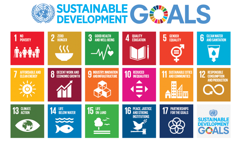
When designing classroom-ready materials, I link environmental topics directly to UN Sustainable Development Goals. This connection helps students understand how local actions contribute to global objectives. My infographic design principles ensure maximum engagement across age groups.
I've created shareable social media infographics that have inspired thousands to take environmental action. The key is making them visually striking while keeping the message clear and actionable. Corporate sustainability reports benefit from clear visual impact metrics that stakeholders can quickly understand and appreciate.
For organizations looking to enhance their environmental communication, integrating these visual strategies with tools like PageOn.ai democratizes access to professional-quality environmental visualizations.
Future Directions in Environmental Visual Communication
As I explore emerging trends in environmental data visualization, I'm particularly excited about real-time pollution monitoring displays. Imagine infographics that update automatically as air quality changes, providing citizens with immediate, actionable information about their environment.
Future of Environmental Data Visualization
flowchart LR
                        A[IoT Sensors] --> B[Real-time Data]
                        B --> C[AI Processing]
                        C --> D[Dynamic Infographics]
                        D --> E[Public Dashboards]
                        D --> F[Mobile Apps]
                        D --> G[Policy Insights]
                        E --> H[Citizen Action]
                        F --> H
                        G --> I[Government Response]
The role of AI in generating dynamic environmental infographics is transforming our field. These systems can now process vast amounts of environmental data and automatically create visualizations that highlight the most critical trends and anomalies.
Citizen science combined with satellite observations creates unprecedented opportunities for improved environmental monitoring. I've seen communities use simple smartphone apps to contribute data that, when visualized collectively, reveals pollution patterns invisible to traditional monitoring systems.
The Democratization of Environmental Visualization:
What truly excites me is how data visualizations are driving environmental decision-making at all levels. PageOn.ai's potential in democratizing environmental data visualization means grassroots movements and small organizations can now create professional visualizations that were once only possible for well-funded institutions.
Looking ahead, I envision a world where every environmental dataset automatically generates clear, compelling visualizations. Where aquatic ecosystem visual vibes answer key and similar educational resources become interactive, adaptive learning tools that respond to student needs in real-time.
The future of environmental communication lies not just in better tools, but in making these tools accessible to everyone who has a story to tell about our planet. With platforms like PageOn.ai leading the way, we're entering an era where anyone can become an effective environmental communicator through the power of visual storytelling.
Transform Your Environmental Data Today
Ready to create compelling environmental infographics that inspire action? PageOn.ai makes it simple to transform complex ecological data into stunning visual stories that resonate with your audience.
Start Creating with PageOn.ai TodayYou Might Also Like
Creating Dynamic LLM Comparison Presentations with Model Context Protocol | Visual Guide
Learn how to build effective LLM comparison presentations using Model Context Protocol. Explore visualization techniques, decision frameworks, and implementation roadmaps with PageOn.ai.
Achieving Visual Balance in Educational Interface Design | Expert Guide
Discover how to create harmonious educational interfaces through visual balance principles. Learn spatial organization, color dynamics, and typography techniques to enhance learning experiences.
Optimizing Websites for AI Agent Interaction: The Ultimate Guide
Learn how to prepare your website for AI agents and assistants. Discover technical foundations, content optimization strategies, and task completion enhancements for the AI revolution.
Tracking Presentation Engagement: Transform Your Impact With Built-in Analytics
Discover how built-in analytics transforms presentation engagement. Learn to track audience behavior, implement data-driven strategies, and maximize your presentation impact.