Transform Student Learning: Making Complex Ideas Visual with Infographics
Unlock the power of visual learning with proven infographic strategies that boost student retention from 20% to 80%
The Power of Visual Learning in Education
When I first discovered the transformative power of infographics in education, I was amazed by a simple statistic: students retain 80% of what they see and do, compared to just 20% of what they read. This isn't just a number—it's a game-changer for how we approach teaching and learning in the modern classroom.
Student Retention Rates by Learning Method

The science behind visual processing reveals why infographics are so powerful. Our brains process visual information 60,000 times faster than text, and 90% of information transmitted to the brain is visual. When we combine this with PageOn.ai's philosophy of "turning fuzzy thoughts into clear visuals," we're not just following a trend—we're aligning with how our minds naturally work.
Key Insight from Research
According to recent educational studies on visual learning, students display higher levels of critical thinking, pattern recognition, and analytical skills when paired with visual learning compared to traditional text-based methods.
I've seen firsthand how addressing diverse learning styles through visual-first approaches transforms classroom dynamics. Visual learners obviously thrive, but what's remarkable is how kinesthetic and auditory learners also benefit when complex concepts are broken down into digestible visual chunks. It's about creating multiple pathways to understanding, ensuring no student is left behind.
Essential Infographic Types for Student Success
Through my experience working with educators, I've identified four core infographic types that consistently deliver results in the classroom. Each serves a unique purpose in making complex information accessible and memorable for students.
Infographic Types and Their Educational Impact
flowchart TD
                        A[Educational Infographics] --> B[Timeline Infographics]
                        A --> C[Process Infographics]
                        A --> D[Comparison Infographics]
                        A --> E[Statistical Infographics]

                        B --> F[History Events]
                        B --> G[Literature Sequences]
                        B --> H[Scientific Discoveries]

                        C --> I[Lab Procedures]
                        C --> J[Math Problem-Solving]
                        C --> K[Essay Writing]

                        D --> L[Literature Analysis]
                        D --> M[Scientific Concepts]
                        D --> N[Historical Events]

                        E --> O[Data Stories]
                        E --> P[Research Findings]
                        E --> Q[Survey Results]

                        style A fill:#FF8000,stroke:#333,stroke-width:2px
                        style B fill:#66BB6A,stroke:#333,stroke-width:2px
                        style C fill:#42A5F5,stroke:#333,stroke-width:2px
                        style D fill:#AB47BC,stroke:#333,stroke-width:2px
                        style E fill:#FFA726,stroke:#333,stroke-width:2px
Timeline Infographics
Perfect for history, literature, and scientific discoveries. I love using PageOn.ai's AI Blocks to build chronological narratives that help students understand cause and effect relationships. Whether it's mapping the events of World War II or tracking character development in a novel, timelines make sequences memorable.
Process & How-To Infographics
Breaking down complex procedures step-by-step has never been easier. From lab procedures to math problem-solving frameworks, these infographics transform intimidating processes into manageable chunks. Students particularly appreciate visual guides for essay writing structures.
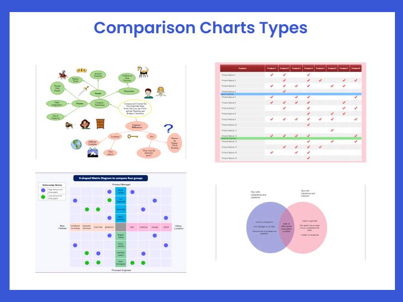
Comparison Infographics
Analyzing similarities and differences becomes intuitive with side-by-side visual comparisons. I've used these for everything from comparing photosynthesis and cellular respiration to contrasting character motivations in literature.
Statistical Infographics
Transform boring numbers into engaging visual stories. When students see data represented through creative charts and icons, statistics suddenly become relevant and interesting. It's amazing how a well-designed graph can spark curiosity about climate change or population dynamics.
Creating Educational Infographics That Actually Work
Content Planning & Structure
The biggest mistake I see educators make is starting with aesthetics rather than learning objectives. Beautiful infographics that don't teach effectively are just decoration. I always begin by asking: What should students know or be able to do after viewing this infographic?
The "Chunk and Sequence" Method
- Identify core concepts: Break down your topic into 3-5 main ideas
- Establish hierarchy: Determine which information is primary vs. supporting
- Create logical flow: Arrange content in a sequence that builds understanding
- Add visual anchors: Assign icons or images to each concept for memory retention
- Test and refine: Have a colleague or student review for clarity
Using PageOn.ai's Vibe Creation feature to transform lesson plans into visual narratives has revolutionized my workflow. I can input my learning objectives and key concepts, and the AI helps structure them into a coherent visual story that resonates with students.
Design Principles for Student Engagement
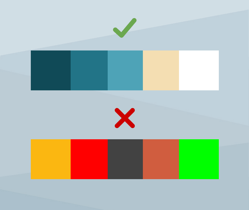
Color Psychology in Educational Contexts
Typography Guidelines
- • Use maximum 2-3 font families
- • Ensure 14pt minimum for body text
- • Create clear hierarchy with size variations
- • Maintain 1.5x line spacing for readability
Icon Selection Tips
- • Choose consistent icon styles
- • Ensure icons reinforce concepts
- • Use universal symbols when possible
- • Test icon recognition with students
The key to successful educational infographics lies in balancing text and visuals for optimal comprehension. I follow the 40-60 rule: no more than 40% text, at least 60% visual elements. This ensures students aren't overwhelmed while still receiving necessary information. For more advanced techniques, explore infographic design principles that can elevate your educational materials.
Practical Applications Across Subjects
STEM Education
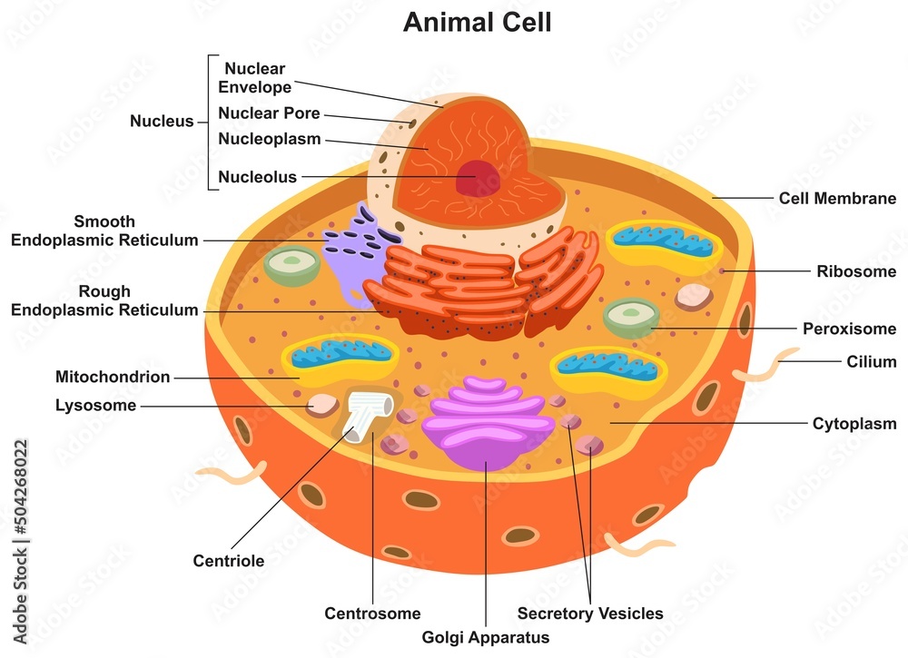
In STEM subjects, infographics transform abstract concepts into tangible understanding. I've witnessed students finally grasp the water cycle when presented as an interactive circular infographic, or understand chemical bonding through visual molecular representations.
The Scientific Method Visualized
flowchart LR
                        A[Question] --> B[Research]
                        B --> C[Hypothesis]
                        C --> D[Experiment]
                        D --> E[Data Collection]
                        E --> F[Analysis]
                        F --> G{Results Support Hypothesis?}
                        G -->|Yes| H[Draw Conclusions]
                        G -->|No| I[Revise Hypothesis]
                        I --> D
                        H --> J[Communicate Results]

                        style A fill:#FFE082,stroke:#333,stroke-width:2px
                        style C fill:#81C784,stroke:#333,stroke-width:2px
                        style D fill:#64B5F6,stroke:#333,stroke-width:2px
                        style F fill:#BA68C8,stroke:#333,stroke-width:2px
                        style H fill:#FF8A65,stroke:#333,stroke-width:2px
Mathematical concepts particularly benefit from infographic data visualizations. When students can see fractions as pie charts or algebra as balanced scales, abstract mathematics becomes concrete. Using PageOn.ai's Deep Search feature, I can quickly find and integrate relevant scientific diagrams that align with curriculum standards.
Humanities & Social Studies
The humanities come alive through visual storytelling. Historical timelines showing cause-and-effect relationships help students understand how events unfold and influence each other. Geographic data presented through interactive maps makes global concepts locally relevant.
Literature Analysis
- • Character relationship maps
- • Plot structure diagrams
- • Theme comparison charts
- • Symbolism visual guides
Social Issues Visualization
- • Demographic data presentations
- • Economic trend analysis
- • Cultural comparison infographics
- • Current events timelines
I've found that when students create their own infographics about historical events or literary themes, they develop deeper understanding and critical thinking skills. It's not just about consuming visual information—it's about learning to communicate complex ideas visually themselves.
Interactive Elements That Boost Learning
Static infographics are powerful, but interactive infographics take student engagement to another level. When learners can click, explore, and manipulate visual information, they become active participants in their education rather than passive recipients.
Interactive Learning Feature Effectiveness
Creating Clickable Learning Experiences
I love creating infographics with clickable hotspots that reveal additional information. For instance, a map of ancient Rome where students can click on different buildings to learn about their functions, or a human body diagram where clicking on organs reveals their systems and functions.
Using PageOn.ai's Agentic features, I can generate personalized learning paths where the infographic adapts based on student interactions, providing customized explanations and follow-up questions based on their exploration patterns.

Embedded Quizzes
Self-assessment tools within infographics help students check understanding immediately
Response-Based Content
Infographics that change based on student input create personalized learning experiences
Progress Tracking
Visual progress bars and achievement badges motivate continued exploration
Implementation Strategies for Educators
Classroom Integration
Successfully integrating infographics into your teaching practice doesn't happen overnight. I've developed a systematic approach that helps educators gradually incorporate visual learning tools while maintaining curriculum alignment and assessment standards.
Infographics as Lesson Starters
Begin each unit with a comprehensive infographic that provides an overview of key concepts. This visual roadmap helps students understand where they're headed and how different topics connect. I've found this particularly effective for complex units where students might otherwise feel overwhelmed.
- Display the infographic and have students identify what they already know
- Use it to generate questions they want answered
- Return to it throughout the unit to track progress
- Have students annotate it with new learning
Student-created infographics serve as powerful assessment tools. When learners synthesize information into visual formats, they demonstrate deep understanding. For tips on helping students create compelling visuals, check out these student presentations visual ideas that save time while maximizing impact.
Digital Learning Environments
LMS Platform Optimization
Ensure your infographics work seamlessly across different learning management systems:
- ✓ Export in multiple formats (PNG, PDF, HTML5)
- ✓ Optimize file sizes for quick loading
- ✓ Test on various devices before deployment
- ✓ Include downloadable versions for offline study
Accessibility Considerations
Making infographics accessible ensures all students can benefit:
- ✓ Provide detailed alt text descriptions
- ✓ Ensure sufficient color contrast (4.5:1 minimum)
- ✓ Include text-based alternatives
- ✓ Test with screen readers
Leveraging PageOn.ai's AI Blocks for quick content adaptation has been a game-changer in my digital classroom. I can rapidly modify infographics for different learning levels, translate them for ESL students, or create simplified versions for students with learning differences—all while maintaining visual consistency and educational effectiveness.
Real-World Success Stories
The impact of infographic-based learning isn't just theoretical—I've witnessed remarkable transformations in classrooms across the country. These success stories demonstrate the tangible benefits of visual learning approaches.
Case Study: Riverside Middle School
After implementing infographic-based lessons in their 7th-grade science curriculum, Riverside Middle School saw a 43% increase in student engagement metrics and a 28% improvement in standardized test scores. Teachers reported that students were more eager to participate in discussions and showed better retention of complex scientific concepts.
Student Performance Before and After Infographic Implementation
Student Testimonial
"Before we started using infographics, I struggled to remember all the steps in cellular respiration. Now, I can visualize the entire process in my mind during tests. It's like having a mental map that guides me through complex topics." - Sarah, 8th Grade Student
Teachers using PageOn.ai's educational templates report saving an average of 5 hours per week on content creation while producing higher-quality visual materials. The platform's ability to quickly generate curriculum-aligned infographics has allowed educators to focus more on instruction and student interaction rather than design work.
Tools and Resources for Getting Started
Design Platforms Comparison
Choosing the right tool for creating educational infographics can make the difference between a frustrating experience and an enjoyable creative process. I've tested numerous platforms, and here's my honest assessment of what works best for educators.
| Platform | Best For | Price | Key Features |
|---|---|---|---|
| PageOn.ai | AI-powered educational content | Free tier available | AI Blocks, Deep Search, Vibe Creation |
| Canva | Quick, template-based designs | Free/Premium | Extensive templates, drag-and-drop |
| Piktochart | Data visualization | Free/Premium | Chart tools, education templates |
| Adobe Illustrator | Professional custom designs | Subscription | Full design control, vector graphics |
PageOn.ai stands out for educational content creation because it understands the unique needs of teachers and students. The AI-powered features help you create stunning infographics that are not just visually appealing but pedagogically sound. The Deep Search feature is particularly valuable for finding curriculum-aligned visual elements quickly.
Asset Libraries and Resources
Free Educational Icons
- • The Noun Project - Academic icon sets
- • Flaticon - Education category
- • Icons8 - School and learning icons
- • Freepik - Vector educational graphics
Copyright-Free Images
- • Unsplash - High-quality educational photos
- • Pexels - Diverse classroom imagery
- • Pixabay - Science and nature photos
- • Wikimedia Commons - Historical images
Building Your Asset Library
I recommend creating a organized digital library of reusable assets. Start with these categories:
- Subject-specific icons (math symbols, science equipment, historical figures)
- Universal educational elements (arrows, checkmarks, lightbulbs)
- Color palettes for different subjects or moods
- Template layouts that work well for your teaching style
- Student work examples (with permission) for inspiration
Measuring Impact and Iteration
Creating beautiful infographics is just the beginning. To truly transform education, we need to measure their effectiveness and continuously improve based on student outcomes. I've developed a systematic approach to tracking and optimizing visual learning materials.
Key Metrics for Educational Infographic Success
flowchart TD
                        A[Infographic Metrics] --> B[Engagement Metrics]
                        A --> C[Learning Outcomes]
                        A --> D[Accessibility Metrics]

                        B --> E[Time on Task]
                        B --> F[Interaction Rate]
                        B --> G[Completion Rate]

                        C --> H[Quiz Scores]
                        C --> I[Concept Retention]
                        C --> J[Application Skills]

                        D --> K[Load Time]
                        D --> L[Device Compatibility]
                        D --> M[Screen Reader Success]

                        style A fill:#FF8000,stroke:#333,stroke-width:2px
                        style B fill:#42A5F5,stroke:#333,stroke-width:2px
                        style C fill:#66BB6A,stroke:#333,stroke-width:2px
                        style D fill:#AB47BC,stroke:#333,stroke-width:2px
A/B Testing Different Styles
I regularly test different infographic approaches with parallel class sections to identify what resonates best:
Version A: Text-Heavy
- • More detailed explanations
- • Fewer visual elements
- • Traditional layout
Version B: Visual-First
- • Minimal text
- • Rich visual metaphors
- • Interactive elements
Using analytics from PageOn.ai, I can track how students interact with different infographic elements, which sections they spend the most time on, and where they might be getting confused. This data-driven approach has helped me refine my visual teaching materials to better serve student needs.
Continuous Improvement Cycle
- Deploy infographic in classroom setting
- Collect engagement and performance data
- Gather student and peer feedback
- Identify areas for improvement
- Iterate design based on insights
- Re-deploy and measure impact
The most successful educational infographics evolve over time. By treating each visual as a living document that can be refined based on student needs and curriculum changes, we create resources that remain relevant and effective year after year. For inspiration, explore these best infographic examples that demonstrate excellence in educational design.
Future of Visual Learning
As we look ahead, the convergence of AI, augmented reality, and personalized learning promises to revolutionize how we use infographics in education. I'm particularly excited about the possibilities that PageOn.ai's Agentic technology brings to educational content creation.
Emerging Technologies in Educational Infographics
AI-Powered Personalization
Imagine infographics that automatically adjust complexity based on individual student comprehension levels. AI will analyze learning patterns and create custom visual explanations tailored to each student's needs, ensuring no one is left behind while keeping advanced learners challenged.
Augmented Reality Integration
AR will bring infographics into the physical world. Students will be able to point their devices at printed infographics and see 3D models, animations, and interactive elements overlay the static image, creating immersive learning experiences that bridge digital and physical realms.
Preparing Students for a Visual-First World
The ability to communicate through visuals is becoming essential in nearly every profession. By teaching with infographics and encouraging students to create their own, we're developing critical 21st-century skills:
- ✓ Visual literacy and interpretation
- ✓ Data visualization competency
- ✓ Design thinking and creativity
- ✓ Digital communication skills
- ✓ Information synthesis and curation
PageOn.ai's commitment to making complex ideas visually accessible aligns perfectly with education's future needs. As their Agentic technology evolves, I envision classrooms where AI assistants help students transform their thoughts into professional infographics instantly, removing technical barriers and allowing focus on content and creativity. The future of education is visual, interactive, and personalized—and we're just getting started.
Transform Your Visual Expressions with PageOn.ai
Ready to revolutionize how your students learn? PageOn.ai's powerful AI-driven platform makes creating educational infographics effortless. From turning lesson plans into stunning visuals to generating personalized learning materials, discover how easy it is to boost student engagement and retention.
Start Creating with PageOn.ai TodayYour Journey to Visual Learning Excellence
Throughout this guide, I've shared my experiences and insights on transforming education through infographics. The evidence is clear: visual learning isn't just a nice-to-have—it's essential for modern education. Students who learn with infographics show improved retention, deeper understanding, and greater enthusiasm for learning.
The journey from text-heavy lessons to visually rich learning experiences might seem daunting, but remember that every expert was once a beginner. Start small with one infographic for your next lesson. Use the tools and techniques I've shared, leverage platforms like PageOn.ai that simplify the creation process, and most importantly, involve your students in the journey.
Next Steps for Educators
- Choose one topic from your curriculum that students typically struggle with
- Identify the key concepts that need visual explanation
- Select an appropriate infographic type (timeline, process, comparison, or statistical)
- Create your first educational infographic using PageOn.ai or another platform
- Test it with your students and gather feedback
- Iterate based on results and expand to other topics
As we prepare students for a world where visual communication is paramount, infographics serve as both a teaching tool and a life skill. By embracing visual learning today, we're not just improving test scores—we're equipping students with the ability to understand, create, and share complex ideas in ways that resonate in our increasingly visual world. The transformation starts with you, one infographic at a time.
You Might Also Like
Navigating the MCP Ecosystem: Transform Your AI Development Strategy
Explore how the rapidly growing MCP ecosystem is revolutionizing AI development, with market projections reaching $10.3B by 2025 and how to implement your MCP strategy.
Crafting Indonesia's Story: Visual Narratives That Captivate Global Audiences
Discover how to create compelling visual narratives about Indonesia that engage global audiences. Learn strategies for showcasing Indonesia's cultural diversity, geography, and economic potential.
Mark Cuban's NBA Transformation: From Worst to Champions Through Direct Sales
Discover how Mark Cuban revolutionized the Dallas Mavericks using direct sales principles, transforming the NBA's worst franchise into champions through customer-focused strategies.
Transform Your Presentations: Mastering Slide Enhancements for Maximum Impact
Learn how to elevate your presentations with effective slide enhancements, formatting techniques, and visual communication strategies that captivate audiences and deliver powerful messages.