Transform Excel Line Charts: Adding Average Lines That Tell Your Data's Story
I've discovered that adding average lines to Excel charts transforms raw data into instant insights. Let me show you how to create professional visualizations that communicate your data's story at a glance.
Why Average Lines Matter in Data Visualization
I've spent countless hours staring at Excel line charts, trying to quickly identify whether my data points are performing above or below expectations. That's when I discovered the power of average lines – they instantly transform complex data into clear performance benchmarks.
The Challenge: When presenting monthly sales data or quality metrics, stakeholders need to immediately understand whether values exceed or fall below expectations. Raw line charts don't provide this instant context.
Average lines solve this by creating a visual benchmark that makes data interpretation instantaneous. Whether you're tracking sales performance, monitoring quality control, or analyzing financial trends, these reference lines turn numbers into narratives.
What's even more exciting is how modern tools like PageOn.ai can transform these static Excel charts into dynamic visual stories. Through features like Vibe Creation for natural chart explanations and AI Blocks for building interactive presentations, we can now create data visualization in Excel that truly engages our audience.
Understanding the Fundamentals of Average Lines in Excel Charts
What Average Lines Represent
In my experience, average lines serve as powerful visual anchors in data visualization. They represent the central tendency of your dataset, providing an immediate reference point for comparison. Unlike static benchmarks that remain fixed, dynamic averages adjust as your data changes, offering real-time performance insights.
When to Use Average Lines
- • Performance tracking against benchmarks
- • Identifying outliers and anomalies
- • Comparing actual vs. expected values
- • Visualizing central tendency over time
When to Use Other Lines
- • Trendlines for directional analysis
- • Target lines for fixed goals
- • Moving averages for smoothing
- • Control limits for quality charts
Common Scenarios Requiring Average Lines
Here's a visualization of typical scenarios where average lines add value:
Technical Considerations
Before adding average lines, I always ensure my data structure is properly organized. Here are the key technical requirements:
- Data must be in contiguous ranges for accurate calculations
- Choose between AVERAGE, AVERAGEIF, and AVERAGEIFS based on your needs
- Consider using absolute cell references ($B$2:$B$24) for formula consistency
- Plan for dynamic data ranges using structured references or OFFSET functions
Understanding how to calculate sample mean in Excel correctly is crucial for creating accurate average lines that truly represent your data's central tendency.
Step-by-Step Methods for Adding Average Lines
The Helper Column Approach (Simplest Method)
I've found this method to be the most straightforward for beginners. According to comprehensive Excel charting guides, the helper column approach requires minimal technical knowledge while delivering professional results.
Step 1: Create the Average Column
=AVERAGE($B$2:$B$24)
Copy this formula down your helper column. The absolute references ensure consistency.
Process Flow for Helper Column Method
flowchart LR
                        A[Original Data] --> B[Add Helper Column]
                        B --> C[Insert AVERAGE Formula]
                        C --> D[Select All Data]
                        D --> E[Insert Combo Chart]
                        E --> F[Format Average as Line]
                        F --> G[Customize Appearance]
The Combo Chart Method (Most Flexible)
This approach offers maximum control over your visualization. I use it when I need precise positioning or multiple reference lines.
Setup Requirements
- • Prepare X and Y value pairs
- • Create separate data series
- • Define chart boundaries
- • Plan axis configuration
Implementation Steps
- • Insert initial line chart
- • Add average series via Select Data
- • Switch to combo chart type
- • Configure secondary axis if needed

Dynamic Average Lines with Formulas
For interactive dashboards, I implement dynamic average lines that respond to user input. This technique transforms static charts into engaging analytical tools.
Interactive Formula Structure
=IFERROR(INDEX($A$2:$A$7, $D$5, 1), "")
=IFERROR(MATCH($E$1,$A$2:$A$7,0), 0)
These formulas enable scroll bar controls and automatic positioning updates.
Creating effective line graphs to visualize trends becomes significantly more powerful when you add these dynamic elements that respond to user interaction.
Visualizing Complex Data Patterns with PageOn.ai
Beyond Basic Charts: Creating Visual Stories
I've discovered that transforming Excel average lines into comprehensive data narratives requires more than just technical skills. PageOn.ai's Deep Search feature has revolutionized how I find and integrate relevant industry benchmarks, automatically placing them alongside my charts for instant context.
Vibe Creation Features
Convert technical chart data into clear visual insights through natural conversation:
- • Automatic narrative generation
- • Context-aware explanations
- • Multi-language support
- • Stakeholder-specific messaging
AI Blocks Capabilities
Structure multi-chart comparisons with drag-and-drop simplicity:
- • Visual layout optimization
- • Automatic chart alignment
- • Interactive annotations
- • Real-time collaboration
Enhancing Chart Communication
Making average lines meaningful to stakeholders requires more than just adding a horizontal line to your chart. I use PageOn.ai to generate automatic annotations that explain variance from average, creating visual callouts for significant deviations that catch the viewer's attention immediately.
Interactive dashboard showing deviation analysis:
The collaborative chart interpretation capabilities are particularly powerful. PageOn.ai's conversational interface allows me to explain chart patterns naturally, building interactive dashboards that respond to viewer questions without requiring them to understand Excel formulas or chart mechanics.
Advanced Techniques and Best Practices
Multiple Average Lines and Segmented Analysis
I often need to display multiple reference lines to provide comprehensive context. Adding median lines alongside mean values reveals data distribution patterns that a single average line might miss.
Implementing Multiple Reference Lines
| Line Type | Formula | Visual Style |
|---|---|---|
| Mean | =AVERAGE(range) | Solid line |
| Median | =MEDIAN(range) | Dashed line |
| Moving Average | =AVERAGE(OFFSET(...)) | Dotted line |
| Conditional Average | =AVERAGEIF(criteria) | Colored line |
Professional Formatting and Design Principles
Visual hierarchy in multi-line charts requires careful consideration. I ensure primary data maintains prominence while reference lines provide subtle context.
Color Psychology
Green for positive benchmarks, red for limits, gray for neutral references
Line Hierarchy
Thicker lines for data, thinner for references, varied dash patterns
Annotations
Value labels at endpoints, descriptive text for context

When working with horizontal bar charts, these same principles apply but require adjusting for the different orientation and reading patterns.
Troubleshooting Common Challenges
Data and Formula Issues
I've encountered numerous formula errors when creating average lines. The most common is the dreaded #DIV/0! error, which occurs when calculating averages for empty data ranges.
Common Error Solutions
// Prevent #DIV/0! errors
=IFERROR(AVERAGE(B2:B24), "No Data")

// Handle empty cells
=AVERAGEIF(B2:B24, "<>0")

// Dynamic range adjustment
=AVERAGE(OFFSET(B2,0,0,COUNTA(B:B)-1,1))
Visual and Formatting Problems
Average lines not extending to the full chart width is a frustrating issue I frequently help colleagues resolve. The solution involves adjusting axis positioning settings.
Troubleshooting Decision Tree
flowchart TD
                        A[Average Line Issue] --> B{Line Visible?}
                        B -->|No| C[Check Data Series]
                        B -->|Yes| D{Correct Position?}
                        C --> E[Verify Formula Range]
                        C --> F[Check Chart Type]
                        D -->|No| G[Adjust Axis Settings]
                        D -->|Yes| H{Full Width?}
                        H -->|No| I[Set Axis to On Tick Marks]
                        H -->|Yes| J[Success!]
                        G --> K[Format Axis Options]
                        I --> L[Add Helper Rows]
Quick Fixes
- • Right-click axis → Format Axis → On tick marks
- • Add empty rows before/after data
- • Use X-Y scatter plot for precise control
- • Check series order in Select Data
Prevention Tips
- • Always use structured references
- • Test with sample data first
- • Document formula logic
- • Save chart templates
Real-World Applications and Case Studies
Business Performance Dashboards
In my consulting work, I've implemented average lines in countless business dashboards. Monthly sales tracking with rolling averages provides immediate insight into performance trends while accounting for seasonal variations.
Quality Control Chart with Specification Limits:
Financial Analysis Visualizations
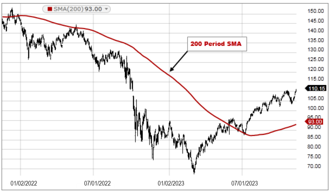
Stock price charts with moving averages represent one of the most common applications I encounter. The 50-day and 200-day moving average lines help identify support and resistance levels critical for investment decisions.
Budget Variance Analysis Components
Data Elements
- • Actual spending by period
- • Budgeted amounts
- • Rolling 3-month average
- • Year-to-date average
Visual Indicators
- • Green zones for under budget
- • Red zones for over budget
- • Trend arrows at data points
- • Percentage variance labels
Creating a bar chart in Excel with average lines works similarly, though the orientation changes how we perceive the benchmark comparisons.
Integrating Excel Charts into Modern Workflows with PageOn.ai
I've transformed my entire approach to data visualization by integrating Excel charts with PageOn.ai's powerful visual tools. What once took hours of manual formatting now happens in minutes, with results that are far more engaging and interactive.
Transforming Static Charts into Dynamic Presentations
My workflow now involves exporting Excel charts and enhancing them with PageOn.ai's visual tools. The platform's ability to create interactive explanations that adapt to viewer needs has revolutionized how I present data to stakeholders.
- ▸ Export and Enhance: Take your Excel charts beyond static images with interactive layers and annotations
- ▸ Adaptive Narratives: Create explanations that change based on viewer expertise and interests
- ▸ Real-time Updates: Connect to live data sources for always-current visualizations
Building Comprehensive Data Stories
Beyond single charts, I now combine multiple Excel visualizations using AI Blocks to create cohesive narratives that connect data points across different dimensions. This approach helps stakeholders understand not just what the data shows, but why it matters.
Traditional Approach
- • Manual chart creation
- • Static presentations
- • Limited interactivity
- • Excel expertise required
- • Time-consuming updates
PageOn.ai Enhanced
- • AI-assisted visualization
- • Dynamic, responsive content
- • Natural language interaction
- • No technical barriers
- • Automatic synchronization
Future-Proofing Your Skills
The shift from manual chart creation to AI-assisted visualization isn't just about efficiency – it's about focusing on insight generation rather than technical implementation. I now spend my time analyzing what the data means rather than wrestling with formatting options.
Key Takeaway:
Master the fundamentals of Excel charting, but embrace AI tools like PageOn.ai to amplify your impact. The combination of solid technical knowledge and modern visualization platforms creates truly compelling data stories that drive decision-making.
As data visualization continues to evolve, the ability to seamlessly blend traditional Excel skills with cutting-edge AI tools becomes increasingly valuable. PageOn.ai bridges this gap, allowing us to maintain the precision of Excel while gaining the engagement power of interactive, AI-enhanced presentations.
Transform Your Visual Expressions with PageOn.ai
You've learned how to add average lines to Excel charts. Now take your data visualization to the next level with PageOn.ai's AI-powered tools. Create stunning, interactive presentations that make complex data instantly understandable.
Start Creating with PageOn.ai TodayYou Might Also Like
Transforming Raw Data into Compelling Business Stories | Data Storytelling Guide
Learn how to transform raw data into powerful business narratives through effective data storytelling techniques. Discover visualization methods and narrative structures that drive decision-making.
Transform ChatGPT Prompts into Professional PowerPoint Slides | Ultimate Guide
Learn how to transform ChatGPT prompts into stunning PowerPoint presentations with our comprehensive guide. Discover expert techniques, tools, and workflows for AI-powered slides.
Breaking ChatGPT Premium Limits: Chrome Extension Integration Guide
Discover how to overcome ChatGPT Premium limitations using Chrome extensions. Learn about top extensions, implementation guides, and advanced integration techniques for unrestricted AI assistance.
Navigating the MCP Ecosystem: Transform Your AI Development Strategy
Explore how the rapidly growing MCP ecosystem is revolutionizing AI development, with market projections reaching $10.3B by 2025 and how to implement your MCP strategy.