Mastering Excel Pie Charts: Transform Raw Data into Percentage-Perfect Visual Stories
Why Pie Charts Still Matter in Data Presentation
I've discovered that despite all the modern visualization tools available, pie charts remain one of the most powerful ways to show proportional relationships. When you need to communicate part-to-whole comparisons at a glance, nothing beats a well-crafted pie chart with clear percentage labels.
Core Fundamentals: Setting Up Your Data for Pie Chart Success
I've learned through years of creating Excel visualizations that the foundation of any great pie chart lies in properly structured data. Your dataset needs to follow specific requirements: a single data series with non-zero, non-overlapping values that represent meaningful categories.
The Seven-Slice Rule: Research consistently shows that limiting your pie chart to seven or fewer categories significantly improves comprehension. When I work with larger datasets, I group smaller categories into an "Other" slice to maintain clarity.

Before diving into chart creation, I always ensure my data has clear category labels in one column and numerical values in another. This simple structure prevents countless formatting headaches later. When preparing percentage-based comparisons, I find that using PageOn.ai's Deep Search feature helps me discover relevant industry benchmarks, giving my visualizations valuable context that resonates with stakeholders.
Data Structure Requirements
Step-by-Step Creation Process: From Spreadsheet to Visual
Basic Pie Chart Creation
I'll walk you through the exact process I use to create professional pie charts in Excel. First, I select my data range, including column headers for automatic title generation. This small detail saves time and ensures consistency across multiple charts.
- Select your data range: Click and drag to highlight both your categories and values
- Navigate to Insert tab: Find the Charts group in Excel's ribbon interface
- Choose your pie chart type: Select between 2D (for clarity), 3D (for emphasis), or doughnut (for nested data)
Pie Chart Creation Workflow
flowchart LR
                        A[Select Data] --> B[Insert Tab]
                        B --> C[Choose Pie Chart]
                        C --> D[2D Pie]
                        C --> E[3D Pie]
                        C --> F[Doughnut]
                        D --> G[Add Labels]
                        E --> G
                        F --> G
                        G --> H[Format Labels]
                        H --> I[Final Chart]
Adding and Formatting Data Labels
Here's where the magic happens. I've discovered that the key to displaying both values and percentages lies in understanding Excel's Format Data Labels pane. Let me share my proven approach:
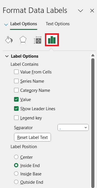
My Label Configuration Process:
- • Right-click on any pie slice and select "Add Data Labels"
- • Right-click the labels and choose "Format Data Labels"
- • Check both "Value" and "Percentage" checkboxes
- • Set separator to "New Line" for cleaner appearance
- • Choose "Outside End" for label position when space allows
According to detailed Excel documentation, this dual-display approach helps viewers understand both absolute numbers and proportions simultaneously, making your data story more complete.
Advanced Labeling Techniques: Beyond Basic Percentages
The Concatenation Method for Complex Labels
I've developed a powerful technique using helper cells that gives me complete control over label formatting. This method has saved me countless hours when creating reports that require specific formatting standards.
=A2&" ("&ROUND(B2/SUM($B$2:$B$6)*100,1)&"%)"
# Result: "Sales (38.4%)"
This formula combines the category name, value, and calculated percentage into a single, professionally formatted label. I often enhance this further by adding thousands separators and currency symbols when working with financial data.
Label Formatting Comparison
Custom Number Formatting Solutions
I've encountered Excel's limitation where custom formatting applies only to percentages when both values and percentages are displayed. My workaround involves creating conditional formatting patterns that adapt to your data scale:
| Data Range | Format Code | Display Result |
|---|---|---|
| < 1,000 | 0 | 456 |
| 1,000 - 999,999 | 0,"K" | 45K |
| ≥ 1,000,000 | 0,,"M" | 2.5M |
When working with data visualization in Excel, these formatting techniques become essential for creating professional, publication-ready charts.
Professional Presentation Enhancements
Visual Refinements
I've refined my approach to label positioning through countless presentations. The key is choosing positions that enhance readability without cluttering your visualization:

Label Position Options
- • Center: Best for large slices
- • Inside End: Cleaner appearance
- • Outside End: Maximum readability
- • Best Fit: Excel's automatic choice
Explosion Technique
- • Select individual slice
- • Drag outward or use Format pane
- • 10-15% explosion for emphasis
- • Avoid overuse to maintain professionalism
Color and Accessibility Considerations
I always ensure my pie charts are accessible to all viewers. This means using color combinations that work for colorblind users and maintaining sufficient contrast ratios. I've found that making category names bold and matching them to their slice colors significantly reduces cognitive load for viewers.
When creating cohesive color schemes, I leverage PageOn.ai's Vibe Creation feature to generate palettes that align perfectly with brand guidelines while maintaining accessibility standards. This ensures my visualizations are both beautiful and inclusive.
Dynamic Data Visualization Strategies
I've revolutionized my workflow by using the "Values From Cells" feature to create dynamic labels that update automatically. This approach eliminates manual updates and reduces errors in recurring reports.
Dynamic Label Update Flow
flowchart TD
                        A[Source Data Changes] --> B[Helper Cells Recalculate]
                        B --> C[Percentages Update]
                        B --> D[Formatted Labels Update]
                        C --> E[Chart Labels Refresh]
                        D --> E
                        E --> F[Final Visualization]
                        F --> G[No Manual Intervention Needed]
My percentage calculation formula automatically adjusts when data changes:
=B2/SUM($B$2:$B$6)*100
This dynamic approach mirrors the drill-down capabilities found in modern dashboard tools. When stakeholders ask for different views of the data, I can quickly adjust the underlying calculations without recreating the entire chart.
By combining these techniques with PageOn.ai's Agentic features, I transform complex datasets into clear visual narratives that tell compelling stories. The AI helps identify the most important patterns and suggests optimal ways to highlight them visually.
Common Pitfalls and Professional Solutions
Technical Limitations
Through years of experience, I've encountered and overcome numerous Excel limitations. Understanding these constraints helps you choose the right approach from the start:
Key Limitations to Remember:
- • Percentage checkboxes only appear for pie and donut charts, not bar charts
- • Excel pie charts support only single data series
- • Concatenated labels have all-or-nothing formatting restrictions
- • Custom number formats apply to percentages only when both values are shown
Best Practices from Industry Examples
I've analyzed countless professional implementations and identified patterns that consistently deliver results:
Use Case Success Rates
When presenting survey results with Likert scale data, I always ensure percentages add up to exactly 100%. For project management dashboards showing task completion, I integrate insights from PageOn.ai's Deep Search to provide context about industry-standard completion rates.
Alternative Approaches and When to Use Them
I've learned that pie charts aren't always the best choice. Understanding when to use alternatives can dramatically improve your data communication:
| Scenario | Recommended Chart | Why It Works Better |
|---|---|---|
| More than 7 categories | Bar chart in Excel | Easier comparison of many values |
| Time-based percentages | Stacked area chart | Shows trends over time |
| Nested categories | Sunburst or Treemap | Displays hierarchy clearly |
| Small percentage differences | Bar of Pie chart | Highlights minor segments |

When deciding between pie vs donut charts, I consider whether the center space could display summary statistics. Donut charts excel when you need to show a key metric like total value in the center.
For complex percentage systems with multiple levels, I use PageOn.ai's AI Blocks to create clearer structural representations that guide viewers through the data hierarchy naturally.
Automation and Efficiency Tips
I've streamlined my pie chart creation process to take minutes instead of hours. Here are my top automation strategies:
Template Creation
I maintain a library of pre-configured templates with:
- • Standard color schemes
- • Percentage formatting rules
- • Helper cell formulas
- • Label positioning presets
Macro Automation
My custom macros handle:
- • Standardized label formatting
- • Automatic percentage calculations
- • Color scheme application
- • Export to presentation formats
For even greater efficiency, I've started using AI pie chart generators that understand natural language commands. Instead of clicking through menus, I simply describe what I want, and the AI creates the perfect visualization.
' VBA Macro for Quick Percentage Labels
Sub AddPercentageLabels()
ActiveChart.SetElement (msoElementDataLabelShow)
ActiveChart.SeriesCollection(1).DataLabels.ShowPercentage = True
ActiveChart.SeriesCollection(1).DataLabels.ShowValue = True
ActiveChart.SeriesCollection(1).DataLabels.Separator = vbNewLine
End Sub
When you need to calculate percent error in Excel for your data validation, these automated approaches ensure consistency across all your visualizations.
From Fuzzy Numbers to Clear Insights
Throughout this guide, I've shared the techniques that have transformed my Excel pie charts from basic graphics into powerful communication tools. The key is choosing the right labeling method for your specific use case—whether that's using Excel's built-in percentage option for simple charts or leveraging concatenation formulas for complex, customized labels.
Key Takeaways:
- ✓ Structure your data properly before creating any chart
- ✓ Use the Format Data Labels pane to display both values and percentages
- ✓ Create helper cells with concatenation for advanced formatting control
- ✓ Consider accessibility in your color and label choices
- ✓ Automate repetitive tasks with templates and macros
- ✓ Know when to choose alternatives to pie charts
I've found that combining Excel's technical capabilities with PageOn.ai's visual structuring tools creates the most impactful data stories. The AI helps me identify patterns I might miss and suggests visualization approaches that resonate with my specific audience.
Your next step is to experiment with these techniques on your own data. Start with the basic percentage display, then gradually incorporate more advanced methods as you become comfortable. Remember, the goal isn't just to display numbers—it's to transform data into insights that drive decisions.
Transform Your Visual Expressions with PageOn.ai
Ready to take your data visualization beyond Excel? PageOn.ai's intelligent features help you create stunning visual stories that communicate complex percentage relationships with clarity and impact. From AI-powered chart generation to dynamic visual blocks, discover how to make your data truly speak.
Start Creating with PageOn.ai TodayYou Might Also Like
The AI-Powered Pitch Deck Revolution: A Three-Step Framework for Success
Discover the three-step process for creating compelling AI-powered pitch decks that captivate investors. Learn how to clarify your vision, structure your pitch, and refine for maximum impact.
Vibe Coding: Transforming Ideas into Working Software Through Natural Language
Discover how vibe coding revolutionizes software development by using natural language to create working code. Learn the mechanics, workflow, and future of this AI-powered approach.
Mastering Element Alignment for Professional Learning Layouts | Visual Design Guide
Learn how to create visually engaging professional learning materials through strategic element alignment techniques that enhance information retention and learner engagement.
Mastering Your First AI-Powered PowerPoint Automation Workflow | Complete Guide
Learn how to set up your first PowerPoint automation workflow with AI tools. Step-by-step guide covering Power Automate, Microsoft Copilot, and advanced techniques for efficient presentations.