From Figma Frustration to Visual Clarity: Mastering Pie Charts with Modern Design Tools
Discover How to Transform Complex Data into Beautiful Visualizations
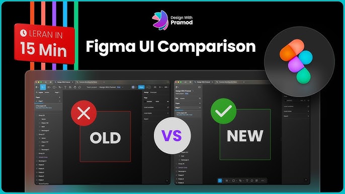
As someone who's spent countless hours wrestling with Figma's arc tool, I understand the frustration of creating pixel-perfect pie charts. Today, I'm sharing my journey from manual sweep adjustments to discovering revolutionary AI-powered visualization tools that have transformed how I approach data design.
The Designer's Dilemma: Why Figma Pie Charts Feel Like Square Pegs
I remember my first attempt at creating a pie chart in Figma. What should have been a simple task turned into a 30-minute ordeal of watching Nick Babich's tutorial on repeat, trying to understand why my arc tool wasn't cooperating. If you've been there, you're not alone – over 102,000 designers have turned to plugins like Figpie just to escape this frustration.
The manual sweep and ratio adjustments that Figma requires aren't just time-consuming – they're mathematically demanding. When you need to create a chart showing 67% versus 33% distribution, you're essentially becoming a human protractor, calculating angles and hoping your visual estimation matches the data. It's no wonder that designers are flooding YouTube for tutorials and community forums seeking "semi-dynamic" solutions.
What strikes me most is the gap between what we need – dynamic, data-driven visualizations – and what traditional design tools offer. Static mockups simply don't cut it anymore. We're living in an era where data changes by the minute, and our visualization tools need to keep pace. This is where PageOn.ai's Agentic approach revolutionizes the game, transforming how we think about creating data visualization charts entirely.
Breaking Down the Figma Pie Chart Workflow
The Traditional Arc Method
Let me walk you through the traditional Figma approach – the one I've mastered after countless hours of practice. You start with the ellipse tool, then discover that hidden arc control that feels like finding a secret door in a video game. The real challenge begins when you need to master sweep angles for precise slice sizes. Creating a 55%, 25%, 20% distribution means calculating exact angles and manually adjusting each slice.
Traditional Figma Pie Chart Creation Process
flowchart LR
                        A[Create Ellipse] --> B[Find Arc Control]
                        B --> C[Calculate Percentages]
                        C --> D[Adjust Sweep Angles]
                        D --> E["Position at 12 o'clock"]
                        E --> F[Apply Colors]
                        F --> G[Add Labels Manually]
                        G --> H[Export Static Image]

                        style A fill:#FF8000,stroke:#333,stroke-width:2px
                        style H fill:#66BB6A,stroke:#333,stroke-width:2px
There's a reason why the design community follows the "12 o'clock position rule" for the largest slice – it's about cognitive scanning patterns. Our eyes naturally start at the top and move clockwise, so placing your most important data there improves comprehension. But achieving this in Figma requires rotating your entire chart and recalculating all positions.
Plugin Ecosystem Limitations
I've tested nearly every pie chart plugin in Figma's ecosystem. Figpie promises "beautiful pie charts for free," and with 102,000 users, it's clearly filling a need. But here's the catch – the output is still static. Graham Paterson's Slices plugin has 3,000 dedicated users despite its 9-segment restriction, which users openly complain about in the comments.
The community feedback tells the real story. "9 restrictions are too few" isn't just a complaint – it's a cry for tools that match real-world complexity. Despite 924,390 collective plugin installations for chart-related tools, designers still find themselves exporting to Excel or wrestling with Google Sheets for dynamic updates. We deserve better.
The Data Visualization Revolution: Beyond Static Circles
Here's where things get exciting. Imagine transforming fuzzy percentage concepts into clear visual stories without touching a single arc control. PageOn.ai's AI Blocks feature has completely changed my approach to data visualization. Instead of manual arc manipulation, I now use conversational chart creation – literally describing what I want and watching it materialize.
Dynamic Data Visualization Example
Compare traditional static methods with modern dynamic approaches:
The shift from manual arc manipulation to voice-to-visual commands eliminates the need for protractor-level precision. When I need to create a pie chart showing market share distribution, I simply describe it: "Create a pie chart with 45% for Product A in blue, 30% for Product B in green, and 25% for Product C in orange." The Deep Search feature even pulls in relevant data automatically from my research, creating contextually accurate visualizations.
What truly amazes me is the LEGO-like approach to building charts. Drag, drop, and dynamically adjust without redrawing – it's the workflow we've always dreamed of. The comparison between pie vs donut charts becomes a simple toggle rather than a complete redesign.
Real-World Applications: From Social Media to Boardrooms
Quick-Turn Social Media Graphics
Remember that Reddit post about creating dynamic charts for stock-related social media content? That's exactly the challenge I face weekly. Creating Instagram-ready pie charts shouldn't require a design degree. With PageOn.ai's Vibe Creation feature, I can match brand aesthetics instantly – no more color-picking from brand guidelines or manually adjusting every element.
The beauty lies in adaptation. Different social platforms require different approaches – what works on LinkedIn might fail on Instagram Stories. I've learned to leverage format-specific optimizations, creating square formats for Instagram, horizontal layouts for Twitter, and vertical designs for TikTok, all from the same data set.
Professional Presentations That Pop
Moving beyond FigJam's static pie chart maker template has revolutionized my presentation game. While Figma's prototype mode attempts interactivity, PageOn.ai perfects it. I can now create presentations where data updates live during the meeting – imagine showing quarterly results that reflect real-time changes as new data comes in.
The integration of live data updates without Excel exports or Google Sheets workarounds has saved me countless hours. Last week, I presented market analysis to stakeholders, and when someone asked "What if we adjust for seasonal variations?", I could modify the visualization on the spot. That's the power of truly dynamic visualization tools.
The Technical Edge: Smart Features for Smarter Charts
Let's talk about accessibility – something often overlooked in the rush to create beautiful charts. High contrast colors aren't just about aesthetics; they're about ensuring everyone can understand your data. I follow the "seven slice rule" religiously because cognitive science shows that's our limit for processing distinct segments effectively.
The Seven Slice Rule in Action
Optimal pie chart design with clear visual hierarchy:
Animation possibilities have expanded beyond static slices to dynamic reveals. I can now create charts that tell a story, revealing data points sequentially to guide viewer attention. The power of AI pie chart generators isn't just in speed – it's in intelligence. They understand context, suggest optimal layouts, and even recommend when a pie chart might not be the best choice for your data.
Comparing traditional methods with PageOn.ai's Plan-Search-Act methodology reveals a fundamental shift in approach. Instead of thinking "How do I make this chart?", I now think "What story does this data tell?" The tool handles the technical execution while I focus on the narrative.
Practical Implementation Guide
For Design Teams
Transitioning from Figma-dependent workflows to flexible visual creation requires a mindset shift. I've helped teams move from tool-specific skills to idea-focused creation, and the transformation is remarkable. Start by setting up reusable chart templates that aren't locked to any specific platform – think of them as design systems for data visualization.
Team Implementation Strategy
flowchart TD
                        A[Assess Current Workflow] --> B[Identify Pain Points]
                        B --> C[Introduce AI Tools]
                        C --> D[Create Template Library]
                        D --> E[Train on Voice Commands]
                        E --> F[Establish Best Practices]
                        F --> G[Measure Time Savings]
                        G --> H[Iterate and Optimize]

                        style A fill:#FF8000,stroke:#333,stroke-width:2px
                        style D fill:#42A5F5,stroke:#333,stroke-width:2px
                        style H fill:#66BB6A,stroke:#333,stroke-width:2px
The collaborative features surpass Figma's community-driven approach by enabling real-time data collaboration, not just design collaboration. Training designers to think in "visual conversations" means teaching them to describe what they want to achieve rather than how to achieve it technically.
For Content Creators
Speed is everything in content creation. Voice commands versus manual percentage calculations? There's no contest. I can now batch create variations for A/B testing without rebuilding from scratch – just describe the variations and let the AI handle the execution.
Integrating charts seamlessly with other content blocks has become second nature. Whether I'm creating a blog post, social media campaign, or presentation, maintaining brand consistency across multiple chart types happens automatically. The system remembers my preferences and applies them intelligently.
The Future of Visual Data Storytelling
The fact that 102,000 Figpie users exist signals a massive unmet need in the design community. We're not just looking for better tools; we're seeking a fundamental shift in how we approach data visualization. The evolution from tool-specific skills to idea-focused creation mirrors the broader transformation in digital design.
Future of Data Visualization Capabilities
Comparing current vs. future visualization capabilities:
PageOn.ai's approach mirrors the shift from coding websites to visual builders – remember when we all had to know HTML to create a simple webpage? We're witnessing the same democratization in data visualization. Soon, chart creation will be as simple as describing your data, and the days of YouTube tutorial dependencies will be a distant memory.
I'm preparing for a world where visual storytelling isn't limited by technical skills. Where ideas flow directly into visuals without the friction of tool mastery. Where data speaks clearly to everyone, regardless of their design background. This isn't just about making better pie charts – it's about making information universally accessible and compelling.
The journey from Figma frustration to visual clarity has taught me that the best tools are the ones that disappear, leaving only the story you want to tell. As we move forward, the question isn't whether you can create a pie chart – it's what story your data is waiting to reveal.
Transform Your Visual Expressions with PageOn.ai
Stop wrestling with arc tools and manual calculations. Join thousands of creators who've discovered the power of AI-driven visualization. Create stunning pie charts, dynamic dashboards, and compelling data stories in minutes, not hours.
Start Creating with PageOn.ai TodayYou Might Also Like
Redefining Developer & Designer Roles in the Age of Intent-Based Creation | PageOn.ai
Explore how intent-based creation is transforming developer and designer collaboration, blurring traditional boundaries, and creating new hybrid roles like intent engineers in the modern tech landscape.
Vibe Coding: Transforming Ideas into Working Software Through Natural Language
Discover how vibe coding revolutionizes software development by using natural language to create working code. Learn the mechanics, workflow, and future of this AI-powered approach.
The Art of Visual Hierarchy: Elevating UX Design Through Strategic Emphasis
Learn how to create powerful visual impact in UX design through strategic emphasis techniques. Discover principles of visual hierarchy that drive user behavior and boost engagement.
Typography Evolution: From Cave Paintings to Digital Fonts | Visual Journey
Explore typography's rich evolution from ancient cave paintings to modern digital fonts. Discover how visual communication has transformed across centuries and shaped design.