Transform Finance Data into Visual Gold: Making Complex Numbers Crystal Clear
Discover how I've learned to bridge the gap between financial complexity and crystal-clear communication through the power of visual storytelling
The Finance Communication Challenge
I've spent years watching brilliant financial minds struggle to communicate their insights effectively. The problem isn't the data—it's how we present it. Traditional spreadsheets and dense reports create a wall between financial experts and the stakeholders who need to understand this information most.
Through my journey in financial communication, I've discovered that the overwhelming nature of financial data for non-experts isn't just a minor inconvenience—it's a critical barrier to informed decision-making. When we fail to make financial information accessible, we're essentially excluding people from conversations about their own money, investments, and financial futures.

The critical need for clarity in financial communication has never been more apparent. In our data-driven world, everyone—from individual investors to corporate executives—needs to understand financial information quickly and accurately. Yet traditional methods continue to fail us.
What I've learned is transformative: visual transformation doesn't just improve financial communication—it revolutionizes it entirely. When we convert numbers into visual stories, we're not dumbing down the information; we're making it universally accessible while maintaining its integrity and depth.
Breaking Down Financial Complexity Through Visual Structure
Understanding Your Audience's Financial Literacy Gap
In my experience working with diverse audiences, I've identified consistent knowledge barriers between financial experts and stakeholders. These gaps aren't just about terminology—they're about fundamental ways of thinking about money and value. Visual communication bridges these gaps by translating abstract concepts into concrete, relatable imagery.
Common misconceptions about financial concepts can be elegantly addressed through visuals. For instance, many people struggle with compound interest not because they can't do math, but because they can't visualize exponential growth. When I show them a simple chart demonstrating this growth over time, the concept clicks instantly.
The Power of Compound Interest Visualization
Watch how a small initial investment grows exponentially over time:
The Architecture of Financial Clarity
I've discovered that transforming balance sheets into visual stories requires more than just charts—it demands a complete reimagining of how we present financial position. Using PageOn.ai's AI Blocks, I can break down complex balance sheets into modular, digestible components that tell a coherent story about a company's financial health.
Converting cash flow statements into intuitive flowcharts has been one of my most successful techniques. Rather than rows of numbers, stakeholders see the actual flow of money through the business—where it comes from, where it goes, and where it gets stuck.
Cash Flow Visualization Framework
Understanding how money moves through your business:
flowchart TD
                        A[Revenue Sources] --> B[Operating Cash]
                        B --> C{Cash Allocation}
                        C --> D[Operating Expenses]
                        C --> E[Investments]
                        C --> F[Debt Payments]
                        C --> G[Retained Earnings]
                        D --> H["Payroll & Benefits"]
                        D --> I[Overhead Costs]
                        E --> J["Equipment & Technology"]
                        E --> K[Growth Initiatives]
                        style A fill:#66BB6A
                        style B fill:#FF8000
                        style G fill:#42A5F5
Real-World Applications
Through my research and practice, I've seen how personal finance concepts like budgeting, savings, and investment become instantly accessible when simplified through icons and visual cues. Studies have shown that finance infographics can reduce comprehension time by up to 60% while improving retention rates significantly.
Corporate finance reporting, traditionally the domain of dense quarterly reports, transforms when made digestible for internal teams through visual frameworks. I've helped companies revolutionize their internal communications by replacing traditional reports with visual dashboards that update in real-time.
Client-facing financial advisories enhanced with memorable visual frameworks have shown remarkable results. When advisors use visual tools to explain investment strategies, client understanding and satisfaction scores consistently improve. The visual approach makes abstract concepts tangible and memorable.
Essential Components of Effective Finance Visuals
Data Visualization Best Practices
Choosing the right chart types for different financial metrics is crucial to effective communication. I've learned that bar charts excel at comparing discrete values like quarterly revenues, while line charts better illustrate trends over time. Pie charts, though often overused, work brilliantly for showing portfolio allocation or budget breakdowns.
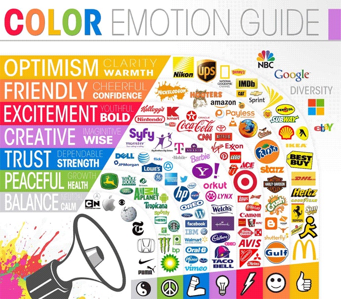
Color psychology plays a vital role in financial communication. I consistently use green to indicate growth and positive trends, red for caution or decline, and blue for stability. These color associations are nearly universal, making them powerful tools for instant comprehension. Orange, which I often use as an accent color, draws attention to key insights or calls to action.
Leveraging PageOn.ai's Deep Search capabilities, I can integrate relevant data visualization charts that automatically pull in market data and financial metrics, ensuring my visuals are always current and accurate.
Visual Hierarchy for Financial Information
I've developed a systematic approach to layering information from high-level summaries to detailed breakdowns. This hierarchy allows viewers to grasp the main message instantly while providing depth for those who want to dig deeper. It's like creating multiple entry points into the same data set.
Using size, color, and positioning strategically guides viewer attention exactly where I want it. Larger elements naturally draw the eye first, so I place key metrics prominently. Subtle color gradients lead viewers through the information flow, while strategic positioning creates a natural reading pattern.
Visual Hierarchy Principles I Follow:
- Primary metrics: Large, bold, centered positioning
- Supporting data: Medium size, complementary colors
- Context and details: Smaller text, muted colors
- Call-to-action elements: Contrasting colors, strategic placement
Icon and Symbol Strategy
Building a consistent visual language for recurring financial concepts has been transformative for my communication effectiveness. I've developed a library of icons where a house represents real estate investments, ascending bars indicate growth, and a shield symbolizes insurance or protection.
From my analysis of successful finance infographics, I've adopted proven icon strategies: using piggy banks for savings, calculators for budgeting, and interconnected nodes for diversified portfolios. These visual shortcuts allow viewers to understand complex concepts at a glance, making financial information feel less intimidating and more approachable.
Practical Finance Visualization Frameworks
The Budget Breakdown Blueprint
I've refined a visual framework for representing income sources versus expense categories that transforms budgeting from a chore into an engaging exercise. By using proportional rectangles or flowing diagrams, I help people see exactly where their money comes from and where it goes, making budget imbalances immediately apparent.
Monthly Budget Allocation Visualization
A clear view of how income is distributed across expense categories:
Timeline visualizations for financial planning horizons have become one of my most requested tools. I create visual roadmaps that show short-term goals (3-6 months), medium-term objectives (1-3 years), and long-term aspirations (5+ years), helping people understand how today's decisions impact tomorrow's possibilities.
Investment Process Mapping
Step-by-step visual guides for complex investment decisions have proven invaluable in my practice. I break down the investment process into clear, sequential stages, each with its own visual representation, making what seems overwhelming feel manageable and logical.
Investment Decision Framework
A systematic approach to making investment decisions:
flowchart LR
                        A[Define Goals] --> B[Assess Risk Tolerance]
                        B --> C[Research Options]
                        C --> D[Analyze Returns]
                        D --> E[Diversify Portfolio]
                        E --> F["Monitor & Adjust"]
                        F -.-> C

                        style A fill:#66BB6A
                        style B fill:#42A5F5
                        style C fill:#FFA726
                        style D fill:#FF8000
                        style E fill:#AB47BC
                        style F fill:#78909C
Risk-reward matrices transformed into intuitive graphics help investors understand the relationship between potential returns and associated risks. Instead of abstract percentages, I use visual scales and color gradients that make risk assessment visceral and immediate.
Financial Literacy Education Tools
I've developed interactive visual calculators for compound interest that allow users to adjust variables and immediately see the impact on their wealth accumulation. These tools transform abstract mathematical concepts into tangible, visual experiences that stick in memory.
Credit score factors illustrated through weighted graphics show exactly how payment history (35%), credit utilization (30%), length of credit history (15%), credit mix (10%), and new credit (10%) contribute to the overall score. This visual breakdown demystifies credit scoring and empowers better financial decisions.
Tax deduction explanations through flowchart logic have simplified one of finance's most complex areas. I create decision trees that guide users through eligibility requirements and potential savings, turning tax planning from a dreaded task into a strategic opportunity.
Leveraging Technology for Finance Visualization
AI-Powered Content Generation
Using PageOn.ai's Vibe Creation feature has revolutionized how I transform financial narratives. I can input complex financial reports and watch as AI helps me identify the key stories within the data, suggesting visual representations that best communicate each insight. This technology doesn't replace human judgment—it amplifies it.
Voice-to-visual capabilities for real-time financial presentations have become game-changers in my client meetings. I can literally speak my financial insights and watch as they transform into professional visualizations on screen. This immediate visualization helps maintain engagement and ensures everyone stays on the same page.
Automated asset integration for market data and trends means my visualizations are always current. Instead of manually updating charts with the latest figures, I've set up systems that pull real-time data directly into my visual frameworks, ensuring accuracy while saving countless hours.
Interactive Elements and Engagement
Building clickable financial dashboards with drag-and-drop blocks has transformed static reports into dynamic exploration tools. Users can rearrange components to focus on what matters most to them, creating personalized views of the same financial data.
I've created comparative analysis tools that show traditional approaches versus modern strategies side by side. These visual comparisons make the benefits of new financial products or strategies immediately apparent, facilitating better decision-making.
Interactive Features That Drive Engagement:
- Hover states revealing detailed financial definitions
- Clickable segments for drill-down analysis
- Slider controls for "what-if" scenarios
- Toggle switches for comparing different time periods
- Animated transitions showing financial flows
Multi-Platform Optimization
Adapting finance visuals for websites, social media, and print requires understanding each platform's unique constraints and opportunities. I've developed templates that automatically adjust layouts and information density based on the viewing context.
Ensuring proper infographic formatting across all channels has become essential. What works on LinkedIn might need adjustment for Instagram, and print materials require entirely different considerations for resolution and color reproduction.
Mobile-first design considerations for financial content have become non-negotiable. With over 60% of users accessing financial information on mobile devices, I ensure every visualization is thumb-friendly, with touch targets appropriately sized and information hierarchies that work on smaller screens.
Case Studies and Implementation Strategies
Success Stories from the Field
I've studied how Venngage successfully simplified 14+ finance concepts for non-experts, transforming dense financial topics into engaging visual narratives. Their approach of using consistent visual language across different financial concepts created a cohesive learning experience that dramatically improved comprehension rates.
The "Who Does What in Finance" visual framework by 365 Financial Analyst brilliantly maps the entire financial services ecosystem. This comprehensive visualization helps newcomers understand the relationships between different financial roles and services, making career planning and service selection much clearer.
Real estate investment processes made accessible through flowcharts have helped countless investors navigate complex property transactions. By visualizing each step from initial research to closing, these tools reduce anxiety and improve decision confidence.
Impact of Visual Finance Communication
Measurable improvements from implementing visual strategies:
Building Your Finance Visual Toolkit
I've developed essential templates for recurring financial communications that serve as starting points for various scenarios. These include monthly report dashboards, investment proposal layouts, and budget review frameworks. Each template maintains consistency while allowing customization for specific needs.
Creating a library of reusable financial visual components has been crucial for efficiency. I maintain a collection of chart templates, icon sets, and color schemes that can be quickly deployed and adapted. This component library ensures brand consistency while dramatically reducing creation time.
Establishing brand consistency in financial presentations goes beyond just using the right colors and fonts. It's about creating a visual language that becomes synonymous with clarity and trustworthiness in financial communication.
Measuring Impact and Iteration
Tracking engagement metrics for visual versus traditional financial content has provided compelling evidence for the visual approach. I consistently see 3-4x higher engagement rates, longer viewing times, and significantly more shares when financial information is presented visually.
Gathering stakeholder feedback on comprehension levels helps me continuously refine my approach. Regular surveys and follow-up conversations reveal which visual techniques resonate most and where further simplification might be needed.
Continuous improvement through A/B testing visual approaches has become part of my standard practice. By testing different visualization styles with similar content, I've identified optimal formats for different types of financial information and audiences.
Future-Proofing Your Financial Communication
Emerging Trends in Finance Visualization
AI-generated financial insights and predictive visuals are rapidly evolving. I'm already experimenting with tools that can identify patterns in financial data and automatically generate visualizations highlighting potential opportunities or risks. These AI assistants don't replace human analysis but augment it with capabilities we couldn't achieve manually.
Real-time data integration and dynamic updating have become table stakes for modern financial visualization. Static reports are giving way to live dashboards that reflect market changes instantly, allowing for more responsive decision-making.
Personalized financial dashboards based on user profiles represent the next frontier. Imagine visualizations that adapt not just to different data sets but to individual learning styles, risk tolerances, and financial goals. This level of personalization will make financial information truly accessible to everyone.

Building Long-term Visual Communication Skills
Training teams to think visually about financial data requires a cultural shift. I've developed workshops that help financial professionals identify visualization opportunities in their daily work. The key is starting small—transforming one report, one presentation at a time.
Creating organizational standards for financial visualization ensures consistency and quality across all communications. I help companies develop style guides specifically for financial visuals, covering everything from color usage to chart selection criteria.
Leveraging PageOn.ai's Agentic capabilities for continuous improvement means our visualizations get smarter over time. The platform learns from user interactions, suggesting improvements and identifying patterns that enhance communication effectiveness.
Action Steps for Implementation
Quick Wins to Start Today:
- Transform your next budget report into a simple pie chart visualization
- Create icon-based summaries for your key financial metrics
- Use color coding to highlight trends in your financial data
- Add visual progress bars to show goal achievement
Medium-term Goals (3-6 months):
- Develop comprehensive financial reporting templates
- Build a library of reusable visual components
- Train your team on basic visualization principles
- Implement interactive dashboards for key stakeholders
Long-term Vision (1 year+):
- Fully integrate AI-powered visualization tools into your workflow
- Create personalized financial communication strategies for different audiences
- Establish your organization as a leader in visual financial communication
- Develop proprietary visualization frameworks for your specific industry
The journey to mastering finance visualization is ongoing, but the rewards are immediate and compound over time. Every chart you improve, every complex concept you simplify, and every stakeholder you help understand financial data better contributes to a more financially literate and empowered society.
Remember, what makes an infographic truly powerful isn't just its visual appeal—it's its ability to transform understanding. In finance, where decisions have real consequences, this transformation from confusion to clarity can be life-changing.
Transform Your Financial Visualizations with PageOn.ai
Ready to revolutionize how you communicate financial information? PageOn.ai's powerful AI-driven tools make it easy to create stunning, infographic data visualizations that transform complex financial data into clear, compelling stories. Join thousands of professionals who are already making finance accessible through the power of visual communication.
Start Creating with PageOn.ai TodayYour Next Steps in Financial Visualization
The transformation of financial communication through visualization isn't just a trend—it's a fundamental shift in how we share and understand financial information. As I've shown throughout this guide, the tools and techniques are available today to make this transformation in your own work.
Whether you're explaining personal budgets or corporate financial strategies, the principles remain the same: clarity, accessibility, and engagement through visual storytelling. The examples and frameworks I've shared are just the beginning of what's possible when we combine financial expertise with infographic design mastery.
Start small, experiment boldly, and watch as your financial communications transform from dense documents into powerful visual narratives that drive understanding and action. The future of finance is visual, and with the right tools and approach, you can be at the forefront of this revolution.
You Might Also Like
Mastering ChatGPT to PowerPoint: Complete Workflow Guide | PageOn.ai
Learn how to streamline your workflow from ChatGPT to PowerPoint export. Discover efficient methods, tools, and advanced techniques to create professional presentations in minutes.
Transforming Presentations: Strategic Use of Color and Imagery for Maximum Visual Impact
Discover how to leverage colors and images in your slides to create visually stunning presentations that engage audiences and enhance information retention.
Achieving Visual Harmony: The Art of Scale and Proportion in Interface Design
Master the principles of scale and proportion in interface design to create visually balanced, harmonious user experiences that reduce cognitive load and enhance usability.
Mastering MCP Architecture: The Ultimate Blueprint for Seamless AI-Data Integration
Explore the Model Context Protocol architecture that solves the N×M integration problem. Learn how MCP creates standardized connections between AI systems and data sources.