Transforming Food Data into Visual Stories That Resonate
Discover how I've learned to create compelling food infographics that make complex nutritional information digestible and turn culinary data into engaging visual narratives that inspire action.
The Power of Food Infographics
When I first started exploring infographic design, I quickly realized that food-related content presents unique opportunities and challenges. Food infographics have become essential communication tools across nutrition education, culinary marketing, and health awareness campaigns. They transform what could be dry nutritional data into appetizing visual stories that people actually want to engage with.

The challenge I've encountered repeatedly is making food data both visually appealing and informative. We're dealing with content that needs to stimulate appetite while conveying important information about nutrition, preparation, or food systems. Visual storytelling becomes crucial here – it's about transforming complex nutritional information into digestible content that resonates with diverse audiences.
What excites me most is how modern tools are revolutionizing this space. With PageOn.ai's Vibe Creation feature, I can instantly generate food-themed visual narratives from simple descriptions. This means I can focus on the story I want to tell rather than getting bogged down in technical design details.
The Food Infographic Impact Journey
Here's how I've seen food infographics create meaningful engagement:
flowchart LR
                        A[Complex Food Data] --> B[Visual Design]
                        B --> C[Engaging Infographic]
                        C --> D[Audience Understanding]
                        D --> E[Behavior Change]
                        E --> F[Health Outcomes]

                        style A fill:#FFE5CC
                        style C fill:#FFB366
                        style F fill:#66BB6A
Essential Components of Effective Food Infographics
Visual Hierarchy and Food Photography Integration
In my experience creating food infographics, I've learned that balancing real food imagery with illustrated icons and graphics is an art form. The key is creating visual symmetry through column layouts and structured designs that guide the eye naturally through the information.
Color psychology plays a massive role in food visualization. I use fresh greens to convey health and vitality, warm oranges and reds for comfort foods, and cool blues sparingly (since they can suppress appetite). With PageOn.ai's AI Blocks, I can transform food photography concepts into structured layouts that maintain this delicate balance.
Popular Food Data Visualization Techniques
Based on my analysis of successful food infographics:
Data Visualization Techniques for Food Content
I've found that certain visualization techniques work particularly well for food content. Pie charts are perfect for showing food proportions and nutritional breakdowns – there's something intuitive about a "slice" of data representing a portion of food. Timeline infographics excel at showing cooking processes and food history, while flowcharts make recipe instructions and food pairing guides crystal clear.

Area charts have become my go-to for ingredient ratios and portion control visualizations. They provide that proportional understanding that's so crucial when we're talking about balanced diets or recipe modifications.
Design Strategies for Different Food Infographic Types
Recipe and Cooking Infographics
Creating recipe infographics has taught me the importance of numbered step-by-step visual instructions. I always ensure each step is clearly delineated with consistent iconography and measurement visualizations. Cooking time timelines and temperature guides become essential elements that prevent kitchen disasters.
One technique I love is utilizing PageOn.ai's Deep Search to automatically integrate relevant cooking visuals and measurement graphics. This saves hours of hunting for the perfect icons while ensuring consistency across the entire infographic.
Recipe Infographic Structure
flowchart TD
                        A[Recipe Title] --> B[Ingredients List]
                        B --> C["Prep Time & Servings"]
                        C --> D[Step 1: Preparation]
                        D --> E[Step 2: Cooking]
                        E --> F[Step 3: Plating]
                        F --> G[Nutritional Info]

                        style A fill:#FF8000
                        style B fill:#FFE5CC
                        style G fill:#66BB6A
Nutritional and Health-Focused Designs
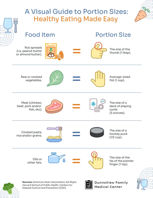
When I design health-focused food infographics, I prioritize clarity and accessibility. MyPlate guidelines and food pyramid visualizations remain powerful tools for general nutrition education. I create calorie comparison charts that don't shame but inform, and portion size guides that use relatable visual references.
Food safety protocols and storage recommendations require special attention to visual hierarchy. I use color coding (red for danger, green for safe) and clear iconography to ensure these critical messages aren't missed. Creating health benefit showcases with illustrated food icons helps make the connection between specific foods and their nutritional advantages immediately apparent.
Educational and Awareness Content
Educational food infographics offer opportunities to address broader issues. I've created food waste reduction strategies that use shocking statistics paired with actionable tips. Seasonal produce guides help people eat locally and sustainably, while cultural food tradition visualizations celebrate diversity in cuisine.
With PageOn.ai's Agentic process, I can generate comprehensive educational layouts that automatically incorporate relevant data points, ensuring my infographic design is both informative and visually compelling.
Color Palettes and Typography for Food Visuals
I've learned that matching color schemes to food categories creates instant recognition. Greens for vegetables, warm golden tones for baked goods, and rich reds for meats tap into our existing food associations. For social media engagement, I use bright, bold colors that pop against white backgrounds – these consistently get higher engagement rates.
Color Psychology Impact on Food Perception
Typography in food infographics requires careful balance. I choose fonts that complement food imagery without overwhelming it – clean sans-serifs for modern, health-focused content, and warmer serif fonts for traditional or comfort food themes. The key is ensuring readability while maintaining the desired emotional tone.
Building cohesive color stories has become much easier with PageOn.ai's intelligent design suggestions. The platform understands color relationships and can suggest palettes that enhance the food story I'm trying to tell, whether it's fresh and healthy or indulgent and comforting.
Practical Applications and Distribution Strategies
Restaurant and Food Service Implementation
In my work with restaurants, I've discovered that digital menu boards and ordering guides benefit immensely from infographic principles. Clear allergen awareness visuals and dietary restriction icons have become non-negotiable elements. One of my favorite innovations is creating "Choose Your Own Adventure" menu flowcharts that guide customers to their perfect meal based on preferences.
With PageOn.ai's Vibe Creation, I can transform static menu concepts into interactive visual experiences that engage diners and increase order values. The ability to quickly iterate on designs means restaurants can test different approaches and find what resonates with their specific clientele.
Educational and Healthcare Settings
School nutrition programs have unique requirements. I create breakfast and lunch program guides that appeal to students while meeting administrative needs for clarity and compliance. Patient nutrition education materials require even more careful consideration – they must be accessible to diverse literacy levels while conveying critical health information.

Community food system explanations and climate-conscious eating infographics often include QR codes linking to additional resources. This hybrid approach allows for simple, impactful visuals while providing depth for those who want to learn more.
Social Media and Marketing Optimization
Platform-specific sizing has become crucial for food infographic success. I maintain templates for Instagram posts, Pinterest pins, and Facebook shares, each optimized for maximum engagement. Creating shareable food fact cards has proven particularly effective – bite-sized information that's perfect for social sharing.
Trending topic mashups, like visualizing successful leaders' breakfast habits, tap into multiple interest areas and expand reach. I also maintain holiday and seasonal food content calendars to ensure timely, relevant content throughout the year.
Advanced Techniques and Creative Approaches
Interactive Elements and User Engagement
Mind maps for wine varieties and food relationships create exploratory experiences that users love to navigate. I've found that comparison infographics for ingredient substitutions solve real problems for home cooks dealing with allergies or dietary restrictions. Food hack compilations and kitchen cheat sheets become saved references that people return to repeatedly.
Wine and Food Pairing Relationships
mindmap
                        root((Wine Pairings))
                            Red Wines
                                Cabernet
                                    Steak
                                    Aged Cheese
                                Pinot Noir
                                    Salmon
                                    Mushrooms
                            White Wines
                                Chardonnay
                                    Chicken
                                    Cream Sauces
                                Sauvignon Blanc
                                    Salads
                                    Seafood
                            Sparkling
                                Champagne
                                    Oysters
                                    Celebrations
Leveraging PageOn.ai's AI Blocks to create modular, updateable food content has revolutionized my workflow. I can build comprehensive guides that clients can easily modify as menus change or new nutritional information becomes available.
Cultural and Global Food Perspectives
Celebrating cultural diversity through food infographics requires sensitivity and authenticity. I research thoroughly and often collaborate with cultural consultants to ensure accuracy. Hispanic heritage food traditions, international cuisine ingredient guides, and food festival promotional materials all benefit from this careful approach.

Beer and food pairing infographics have become surprisingly popular, tapping into the craft beverage movement while providing practical dining guidance.
Sustainability and Future Food Trends
Plant-forward diet benefits visualization has become increasingly important as more people consider environmental impacts. I create food system complexity breakdowns that help people understand where their food comes from and its environmental footprint. Farm-to-table journey illustrations connect consumers with producers in meaningful ways.
Using PageOn.ai's comprehensive search and visualization capabilities, I can generate forward-thinking food narratives that incorporate the latest research on sustainable eating and future food technologies. These data visualizations help shape conversations about our food future.
Best Practices and Common Pitfalls
Through years of creating food infographics, I've learned crucial lessons about what works and what doesn't. The most common mistake I see is information overload, especially in longer infographics. Just because you have the space doesn't mean you should fill it with every possible detail. White space is your friend – it gives the eye places to rest and makes the important information stand out.
Common Food Infographic Pitfalls
Maintaining consistency in iconography styles is another critical factor. I've seen beautiful infographics ruined by mixing flat icons with hand-drawn illustrations or realistic images. Choose a style and stick with it throughout the entire piece. This consistency creates visual harmony that makes the information easier to process.
Creating eye-catching headers requires special attention. Your header is often what determines whether someone will engage with your infographic or scroll past it. I spend considerable time crafting headers that immediately communicate value while being visually striking.

Balancing minimalist design with necessary detail is an ongoing challenge. While minimalism can be powerful, food infographics often need to convey specific measurements, temperatures, or nutritional values. I've found that using progressive disclosure – showing essential information first with options to reveal more detail – works exceptionally well.
Hand-drawn elements can add authenticity and warmth to food infographics, especially for artisanal or homemade food topics. However, they require more time and skill to execute well. When I use them, I ensure they're professionally done and enhance rather than distract from the message.
With PageOn.ai's structured approach, I can transform these best practices into actionable visual guides. The platform helps me create stunning infographics that avoid common pitfalls while maintaining professional standards. This systematic approach to infographic data visualizations ensures consistency and quality across all my food-related visual content.
Transform Your Food Stories with PageOn.ai
Ready to create food infographics that captivate audiences and drive engagement? PageOn.ai's powerful visualization tools make it simple to transform your culinary data into compelling visual narratives that inspire action and understanding.
Start Creating with PageOn.ai TodayYou Might Also Like
Mastering Visual Flow: How Morph Transitions Transform Presentations | PageOn.ai
Discover how Morph transitions create dynamic, seamless visual connections between slides, enhancing audience engagement and transforming ordinary presentations into memorable experiences.
Navigating the MCP Ecosystem: Transform Your AI Development Strategy
Explore how the rapidly growing MCP ecosystem is revolutionizing AI development, with market projections reaching $10.3B by 2025 and how to implement your MCP strategy.
Five Core Primitives That Power Modern AI Connectivity - Visual Guide
Explore the fundamental building blocks enabling modern AI systems to communicate: memory stores, context management, tool APIs, data movement, and agent coordination primitives visualized.
Revolutionizing Slides: The Power of AI Presentation Tools | PageOn.ai
Discover how AI presentation tools are transforming slide creation, saving hours of work while enhancing design quality. Learn how PageOn.ai can help visualize your ideas instantly.