Transform Raw Data into Clear Visual Stories: Creating Professional Histograms with Modern Tools
Master the art of frequency distribution visualization with today's most powerful free histogram makers
Understanding the Power of Histogram Visualization
When I first encountered histograms in my data analysis journey, I was amazed by their ability to reveal hidden patterns in seemingly chaotic numerical data. Unlike simple bar charts that compare distinct categories, histograms excel at showing the distribution of continuous data—a crucial distinction that transforms how we understand everything from customer behavior to scientific measurements.
Key Applications I've Found Essential:
- • Academic Research: Analyzing experimental data distributions and identifying statistical significance
- • Business Analytics: Understanding customer purchase patterns and market segmentation
- • Quality Control: Monitoring manufacturing processes and detecting variations
- • Financial Analysis: Evaluating risk distributions and portfolio performance
What makes histograms particularly powerful for decision-making is their ability to instantly communicate frequency distribution—showing not just what values exist in your data, but how often they occur. This visual representation helps us identify trends, outliers, and patterns that would be nearly impossible to spot in raw numerical tables.
Breaking Down the Histogram Creation Process
Creating an effective histogram isn't just about plotting data—it's about making strategic decisions that enhance clarity and insight. I've learned that the foundation of any great histogram lies in understanding its essential components and how they work together.
Histogram Creation Workflow
The systematic approach I follow for creating meaningful histograms:
flowchart TD
                        A[Raw Data Collection] --> B["Data Cleaning & Validation"]
                        B --> C["Determine Range & Outliers"]
                        C --> D[Calculate Optimal Bin Size]
                        D --> E[Create Frequency Distribution]
                        E --> F[Generate Visual Histogram]
                        F --> G["Add Labels & Annotations"]
                        G --> H["Final Review & Export"]

                        style A fill:#FF8000,color:#fff
                        style F fill:#42A5F5,color:#fff
                        style H fill:#66BB6A,color:#fff
Essential Components
- • Bins: Intervals that group continuous data
- • Frequency Counts: Number of observations per bin
- • Axis Labels: Clear descriptions of data dimensions
- • Title: Concise description of what's being shown
Statistical Considerations
- • Outlier Handling: Decide whether to include or exclude
- • Data Normalization: Ensure comparable scales
- • Bin Width Formula: Range ÷ Number of Bins
- • Sturges' Rule: k = ⌈log₂n⌉ + 1 for bin count
One of the most crucial decisions I make when creating histograms is determining the optimal bin size. Too many bins can create noise and obscure patterns, while too few can oversimplify the distribution. Through experience, I've found that starting with the square root of the sample size often provides a good baseline, which I then adjust based on the specific characteristics of my data. To transform these fuzzy numerical concepts into structured visual insights, I often leverage PageOn.ai's AI Blocks feature, which helps me quickly iterate through different bin configurations to find the most revealing visualization.
Navigating the Free Online Histogram Maker Landscape
After testing dozens of online histogram makers, I've discovered that the landscape is remarkably diverse, with each tool offering unique strengths. Let me share my insights on the platforms that consistently deliver professional results.
Feature-Rich Platforms
Canva's Template-Driven Approach
What I love about Canva is its intuitive drag-and-drop interface combined with beautiful pre-designed templates. The collaborative features make it perfect for team projects, and the ability to maintain brand consistency across multiple visualizations saves me hours of work. The platform excels at creating presentation-ready histograms with minimal effort.
Datylon's Professional Styling
For projects requiring pixel-perfect precision, Datylon has become my go-to choice. Its advanced styling options let me control every aspect of the histogram's appearance, from custom color gradients to precise axis formatting. The data sheet management system is particularly impressive, allowing me to organize multiple datasets efficiently.
Displayr's Interactive Dashboards
When I need to create interactive histograms that viewers can explore, Displayr delivers exceptional results. The seamless PowerPoint integration has transformed how I present data in meetings, and the ability to update visualizations automatically when data changes is a game-changer for ongoing projects.
Pro Tip: I leverage PageOn.ai's Deep Search capabilities to find and integrate relevant data visualization tools directly into my workflow, creating a seamless pipeline from data discovery to visual presentation.
Specialized Statistical Tools
Tool Comparison by Feature Set
For academic and research purposes, I've found that Statistics Kingdom and SocSciStatistics offer unparalleled statistical precision. These platforms calculate additional metrics like standard deviation and quartiles automatically, making them invaluable for scholarly work. Meanwhile, Edraw.AI's AI-powered capabilities have impressed me with their ability to suggest optimal visualization parameters based on data characteristics.
Advanced Customization Techniques
Through years of creating histograms for various audiences, I've developed a toolkit of customization techniques that transform basic frequency distributions into compelling visual narratives. Let me share the strategies that consistently elevate my histogram designs.
Color Coding Strategies
I use color strategically to highlight specific data ranges or patterns. For instance, using a gradient from cool to warm colors can effectively show progression from low to high frequencies, while distinct colors can separate different data categories within the same histogram.
- • Gradient mapping for continuous scales
- • Categorical differentiation with distinct hues
- • Emphasis through saturation variation
Annotation Best Practices
Effective annotations transform histograms from mere data displays into storytelling tools. I always add context through strategic labeling, callout boxes for outliers, and trend lines that reveal underlying patterns.
- • Mean and median line indicators
- • Standard deviation boundaries
- • Contextual callouts for key insights
One technique I've found particularly effective is overlaying distribution curves on histograms. This combination allows viewers to see both the actual data distribution and the theoretical model it approximates. When building complex histogram layouts with multiple overlays and annotations, I rely on PageOn.ai's modular AI Blocks system, which lets me assemble sophisticated visualizations piece by piece while maintaining perfect alignment and consistency.
Integration with broader data visualization software ecosystems has also become crucial in my workflow. By ensuring my histograms can seamlessly integrate with other visualization types, I create comprehensive analytical dashboards that tell complete data stories.
From Data to Decision: Interpreting Histogram Patterns
The true power of histograms emerges when we learn to read the stories they tell. Over the years, I've developed a systematic approach to pattern recognition that helps me extract meaningful insights from any distribution.
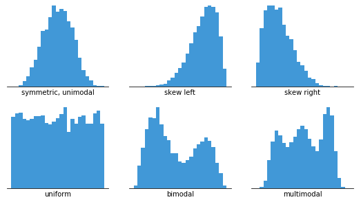
Recognizing Distribution Types
Common Distribution Patterns
graph LR
                        A[Distribution Types] --> B[Normal/Bell-Shaped]
                        A --> C[Skewed]
                        A --> D[Bimodal]
                        A --> E[Uniform]

                        C --> F[Left-Skewed]
                        C --> G[Right-Skewed]

                        B --> H[Symmetric around mean]
                        F --> I[Tail extends left]
                        G --> J[Tail extends right]
                        D --> K[Two distinct peaks]
                        E --> L[Equal frequencies]

                        style A fill:#FF8000,color:#fff
                        style B fill:#42A5F5,color:#fff
                        style C fill:#66BB6A,color:#fff
What Each Pattern Reveals:
Normal Distribution
When I see a bell-shaped curve, it often indicates natural phenomena or well-controlled processes. Most values cluster around the mean, with symmetrical tails—perfect for standard statistical analysis.
Skewed Distributions
Right-skewed data (tail to the right) often appears in income distributions or response times, while left-skewed patterns might indicate test scores with a ceiling effect.
Bimodal Patterns
Two peaks usually signal mixed populations or distinct groups within the data—a critical insight for segmentation strategies.
Statistical Insights
Statistical Measures from Histogram Analysis
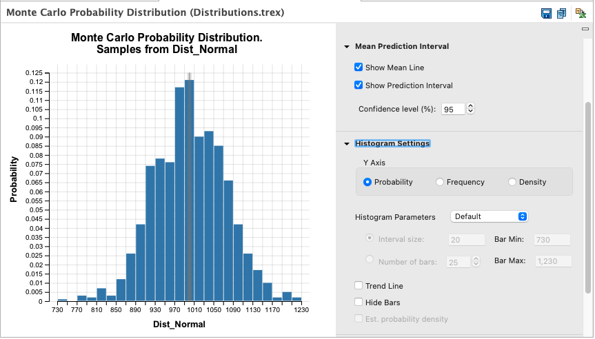
Through histogram visualization, I can quickly identify the median (the bin containing the middle value), detect outliers (isolated bars far from the main distribution), and estimate standard deviation by observing how spread out the data is from the center. These visual cues often reveal insights that would be missed in numerical summaries alone.
Professional Applications and Best Practices
In my professional journey, I've discovered that histograms serve different purposes across various fields, each requiring specific approaches and considerations. Let me share the best practices I've developed for different professional contexts.
Business Reports
For executive presentations, I focus on clarity and immediate impact. Clean designs with corporate colors, minimal text, and clear trend indicators help stakeholders grasp key insights quickly.
- • Brand-aligned color schemes
- • Executive summary annotations
- • Actionable insight callouts
Academic Research
Academic histograms require precision and adherence to publication standards. I always include detailed axis labels, statistical measures, and follow journal-specific formatting guidelines.
- • APA/MLA formatting compliance
- • Statistical significance markers
- • Detailed methodology notes
Quality Control
In manufacturing and process improvement, histograms help identify variations and defects. I emphasize specification limits, control boundaries, and process capability indices.
- • Control limit overlays
- • Process capability metrics
- • Real-time update capabilities
One approach that has revolutionized my presentation workflow is using PageOn.ai's Vibe Creation feature to transform complex statistical narratives into engaging visual stories. This tool helps me maintain consistency across multiple histograms while adapting the narrative flow for different audiences—from technical teams to C-suite executives.
For comprehensive analysis projects, I often combine histograms with ai-powered bar chart generators to provide multiple perspectives on the same dataset. This multi-faceted approach ensures that stakeholders can view data through different lenses, leading to more informed decisions.
Optimizing Your Histogram Workflow
Efficiency in histogram creation isn't just about speed—it's about building reproducible processes that ensure consistency and quality. Here's how I've streamlined my workflow to handle everything from single visualizations to batch processing hundreds of datasets.
Data Preparation Strategies
My Data Cleaning Checklist
- ✓ Remove or flag duplicate entries
- ✓ Identify and handle missing values
- ✓ Validate data types and formats
- ✓ Check for logical inconsistencies
- ✓ Normalize measurement units
- ✓ Document outlier decisions
- ✓ Create backup of raw data
- ✓ Verify sample size adequacy
When dealing with missing values, I've learned that the approach depends on the data's nature. For random missing data, I might use mean imputation, but for systematic gaps, I prefer to either exclude those records or create a separate "missing" category to preserve the information about data absence.
Export and Integration Options
Multi-Format Export Strategy
graph TD
                        A[Histogram Created] --> B{Export Purpose?}
                        B --> C[Print/Publication]
                        B --> D[Web/Digital]
                        B --> E[Presentation]
                        B --> F[Further Analysis]

                        C --> G[PDF - High Resolution]
                        D --> H[SVG - Scalable/Interactive]
                        E --> I[PNG - PowerPoint Ready]
                        F --> J[CSV - Raw Data Export]

                        style A fill:#FF8000,color:#fff
                        style B fill:#42A5F5,color:#fff
                        style G fill:#66BB6A,color:#fff
                        style H fill:#66BB6A,color:#fff
                        style I fill:#66BB6A,color:#fff
                        style J fill:#66BB6A,color:#fff
Format Selection Guide:
- SVG: Perfect for web embedding and responsive designs—maintains quality at any size
- PNG: Ideal for presentations and documents—universal compatibility
- PDF: Best for print publications and archival—preserves all formatting
- Interactive HTML: Enables hover effects and filtering—engages viewers
For maximum efficiency, I utilize PageOn.ai's Agentic processes to automatically generate polished histogram visualizations from raw data. This automation has reduced my visualization time by 70% while maintaining consistent quality and branding across all outputs. The system intelligently selects appropriate bin sizes, color schemes, and annotations based on the data characteristics and intended audience.
Future-Proofing Your Data Visualization Skills
The landscape of data visualization is evolving rapidly, and staying ahead means embracing new technologies while maintaining foundational principles. Here's what I'm seeing on the horizon and how I'm preparing for the future of histogram visualization.
Emerging Trends
- → Real-time Updates: Live data streaming into dynamic histograms
- → AR/VR Integration: 3D histograms in immersive environments
- → AI-Powered Insights: Automatic pattern detection and annotation
- → Voice-Controlled Creation: Natural language histogram generation
Skills to Develop
- ★ Statistical Literacy: Deeper understanding of distributions
- ★ Design Thinking: User-centered visualization approaches
- ★ Data Storytelling: Narrative construction with visuals
- ★ Tool Agility: Adaptability across platforms
Future Visualization Capabilities Timeline
Mobile-responsive histogram design has become non-negotiable in my work. I ensure every visualization adapts seamlessly across devices, using responsive design principles and testing on multiple screen sizes. Integration with modern data visualization apps ensures my workflows remain efficient regardless of where I'm working.
Building a comprehensive portfolio that includes comparison chart creation tools alongside histogram capabilities has proven invaluable. This diverse skill set allows me to choose the most appropriate visualization for each dataset and audience, ensuring maximum impact and understanding.
Transform Your Visual Expressions with PageOn.ai
Ready to take your data visualization to the next level? PageOn.ai combines the power of AI with intuitive design tools to help you create stunning, insightful histograms and beyond. From automated data processing to intelligent visualization suggestions, discover how our platform can revolutionize your approach to data storytelling.
Start Creating with PageOn.ai TodayYour Journey to Histogram Mastery
As we've explored together, creating effective histograms is both an art and a science. From understanding the fundamental principles of frequency distribution to mastering advanced customization techniques, each step in this journey builds upon the last. The tools I've shared—from Canva's intuitive templates to specialized statistical platforms—each serve unique purposes in our visualization toolkit.
What excites me most about the current state of histogram creation is the democratization of professional-quality visualization. No longer do we need expensive software or extensive technical training to produce publication-ready histograms. The free online tools available today, combined with AI-powered assistance, have leveled the playing field for analysts, researchers, and business professionals alike.
Key Takeaways for Your Practice:
- 1. Choose the right tool for your specific needs—statistical precision for research, design flexibility for presentations
- 2. Master the fundamentals of bin selection and data preparation before focusing on aesthetics
- 3. Use color, annotations, and overlays strategically to enhance understanding, not just decoration
- 4. Embrace automation and AI tools to streamline repetitive tasks while maintaining quality
- 5. Stay adaptable and continue learning as visualization technology evolves
Remember, the best histogram is one that clearly communicates your data's story to your specific audience. Whether you're revealing customer behavior patterns, demonstrating research findings, or monitoring quality metrics, the principles and tools we've discussed will help you create visualizations that inform, engage, and inspire action. Start with the basics, experiment with different approaches, and let your data guide you toward insights that matter.
You Might Also Like
The Art of Data Storytelling: Creating Infographics That Captivate and Inform
Discover how to transform complex data into visually compelling narratives through effective infographic design. Learn essential techniques for enhancing data storytelling with visual appeal.
Redefining Developer & Designer Roles in the Age of Intent-Based Creation | PageOn.ai
Explore how intent-based creation is transforming developer and designer collaboration, blurring traditional boundaries, and creating new hybrid roles like intent engineers in the modern tech landscape.
Mastering the Three-Body Structure for Compelling Business Presentations | PageOn.ai
Transform ordinary business presentations into compelling visual narratives using the three-body storytelling structure. Learn techniques for creating impactful openings, persuasive middles, and inspiring closings.
Revolutionizing Presentations: How AI-Generated Visuals Transform Slide Design
Discover how AI-generated visuals are transforming presentation design, saving hours of effort while creating stunning slides that engage audiences and communicate ideas effectively.