Transforming Raw Data into Visual Clarity: A Complete Guide to Google Sheets Histograms
Master the Art of Data Distribution Visualization
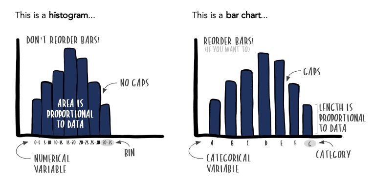
As someone who's spent countless hours analyzing data patterns, I've discovered that histograms are one of the most powerful yet underutilized tools in Google Sheets. Unlike simple bar charts that compare categories, histograms reveal the hidden stories within your numerical data distributions. Whether you're analyzing test scores, customer behavior, or quality metrics, I'll show you how to transform raw numbers into compelling visual insights that drive better decisions.
Why Histograms Matter for Data Distribution Analysis
When I first started working with data visualization, I often confused histograms with bar charts. It wasn't until I needed to analyze customer wait times that I truly understood the power of histograms. While bar charts vs histograms might look similar, they serve fundamentally different purposes.
Histograms excel at revealing the shape of your data distribution – whether it's normally distributed, skewed, or has multiple peaks. I've found them invaluable for identifying outliers, understanding frequency patterns, and making data-driven decisions. From analyzing test scores to monitoring quality control metrics, histograms transform raw numbers into visual stories that anyone can understand.
Key Insight: Histograms show continuous numerical data in bins or buckets, revealing distribution patterns that simple averages can't capture. This makes them perfect for understanding the "shape" of your data.
What excites me most is how modern tools like PageOn.ai's AI Blocks can transform static histogram data into interactive visual narratives. Imagine your histogram not just showing data, but telling the complete story behind those distributions with automated insights and annotations.
Setting Up Your Data Foundation
I've learned that successful histogram creation starts with proper data preparation. Unlike complex visualizations that require multiple columns, histograms in Google Sheets need just one thing: a single column of numerical values. It's beautifully simple, yet the insights can be profound.
Data Preparation Workflow
flowchart LR
                        A[Raw Data] --> B[Clean Data]
                        B --> C[Single Column]
                        C --> D[Choose Method]
                        D --> E[Quick Stats]
                        D --> F[Chart Builder]
                        E --> G[Instant View]
                        F --> H[Customizable]
Essential Data Requirements
- One column of numerical data (no text values)
- Data doesn't need to be sorted
- Remove any blank cells or non-numeric entries
- Consider your data range for meaningful bin sizes
Understanding bins and buckets is crucial. Google Sheets automatically groups your data into ranges (bins), but I've found that customizing these ranges often reveals more meaningful patterns. For instance, when analyzing test scores, bins of 10 points (60-69, 70-79, etc.) are more intuitive than arbitrary computer-generated ranges.
Pro Tip: Quick vs. Regular Method
I use the Quick Column Stats method for rapid exploration during analysis sessions. But when I need to present data in Excel or Google Sheets professionally, the Chart Builder method offers the customization and embedding options essential for reports and dashboards.
Creating Your First Histogram: Step-by-Step Process
The Quick Method: Column Stats Approach
When I need to quickly understand data distribution during exploratory analysis, the Column Stats method is my go-to approach. Here's my streamlined process:
- Select your data column - Click on the column header containing your numerical data
- Navigate to Data > Column stats - This opens the statistics panel
- Click Distribution - Instantly view your histogram
- Use arrow keys - Quickly compare distributions across different columns
Limitation Alert: While incredibly fast, Column Stats histograms can't be customized or embedded in presentations. I use them for quick analysis but switch to the Chart Builder for client-facing work.
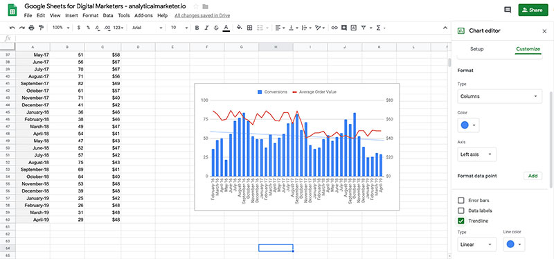
The Professional Method: Chart Builder Approach
For presentations and reports, I always use the Chart Builder method. It takes a few more clicks but offers complete control over the final visualization:
Step-by-Step Chart Builder Process
- Select only your numerical data column (not the header)
- Go to Insert > Chart
- In Chart Editor, select "Histogram chart" from the Chart type dropdown
- Google Sheets automatically creates bins and displays your distribution
- Customize using the Chart Editor's extensive options
- Publish for interactive web embedding when needed
What I love about this method is the ability to fine-tune every aspect. When creating visualizations for stakeholder presentations, these customization options make the difference between a basic chart and a compelling data story.
Customizing Your Histogram for Maximum Impact
Bin Size Optimization
I've found that bin size can completely change how your data story is perceived. Too many bins create noise; too few hide important patterns. Here's my approach to finding the sweet spot:
Impact of Different Bin Sizes
My Bin Size Guidelines
- Test Scores (0-100): Use bins of 10 for grade ranges
- Ages: 5-year ranges for adults, single years for children
- Income Data: $10,000 or $25,000 intervals depending on range
- Time Data: Hours for daily, days for monthly patterns
Visual Enhancement Options
Beyond bins, I focus on making histograms visually compelling and easy to interpret. Here are my essential customizations:
Chart Styling
- • Background colors for context
- • Border styles for clarity
- • Font consistency with brand
- • Shadow effects for depth
Information Architecture
- • Descriptive titles and subtitles
- • Clear axis labels with units
- • Item dividers for granularity
- • Color coding for categories
When I discovered PageOn.ai's drag-and-drop AI Blocks, it revolutionized how I create professional histogram layouts. Instead of manually adjusting every element, I can focus on the data story while the AI handles the visual optimization.
Advanced Histogram Techniques
Working with Frequency Tables
Sometimes I receive pre-aggregated data like "18-24: 177 responses" instead of raw values. Here's how I transform this into meaningful histograms:
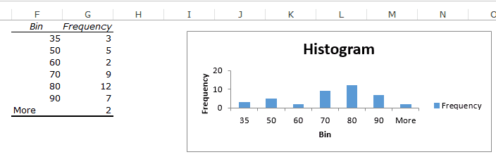
The FREQUENCY() Formula Approach
=FREQUENCY(data_range, bins_range)

Example:
Data: A2:A100 (test scores)
Bins: C2:C6 (0, 20, 40, 60, 80)
Formula: =FREQUENCY(A2:A100, C2:C6)
This approach gives me complete control over bin boundaries and lets me create custom distributions that match my analysis needs perfectly. I particularly use this when presenting data with Excel or Google Sheets to non-technical stakeholders who need specific, meaningful ranges.
Multi-Series Histograms
Comparing distributions across multiple datasets reveals insights that single histograms miss. Here's my process for creating compelling multi-series visualizations:
- Select both data columns simultaneously
- Insert histogram chart - Google Sheets automatically creates series
- Adjust series colors for clear differentiation
- Add legend with descriptive labels
- Consider transparency for overlapping distributions
Advanced Tip: When using PageOn.ai's Agentic features, I can auto-generate comparative insights between series, highlighting statistical differences and practical implications without manual analysis.
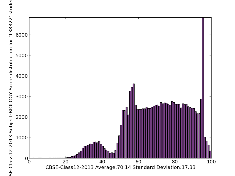
Understanding Distribution Patterns
After creating hundreds of histograms, I've learned that recognizing distribution patterns is like reading a language. Each shape tells a unique story about your data:
Common Distribution Patterns
Normal Distribution
The classic bell curve indicates:
- • Most values cluster around the mean
- • Symmetrical spread on both sides
- • Common in natural phenomena
- • Example: Height, test scores
Bimodal Distribution
Two distinct peaks suggest:
- • Two different groups in data
- • Mixed populations
- • Potential segmentation opportunity
- • Example: Customer age groups
I've found that bimodal distributions often hide the most interesting insights. For instance, when analyzing apartment rental prices, two peaks might indicate studio/1-bedroom versus 2-bedroom markets – a crucial distinction for real estate decisions.
Pattern Recognition Tip: Outliers appearing as isolated bars far from the main distribution often warrant investigation. They might represent data errors, exceptional cases, or emerging trends worth monitoring.
Transforming these pattern insights into clear visual stories becomes effortless with PageOn.ai. The platform automatically detects distribution types and suggests the most effective ways to communicate their implications to your audience.
Practical Applications and Use Cases
Business Analytics
In my consulting work, I've applied histograms across diverse business scenarios. Each application revealed patterns that transformed decision-making:
Business Analytics Workflow
flowchart TD
                        A[Business Data] --> B{Analysis Type}
                        B --> C[Customer Behavior]
                        B --> D[Sales Patterns]
                        B --> E[Quality Control]
                        B --> F[Performance Metrics]
                        C --> G[Peak Hours Analysis]
                        D --> H[Revenue Distribution]
                        E --> I[Defect Rates]
                        F --> J[Employee KPIs]
                        G --> K[Optimize Staffing]
                        H --> L[Focus Areas]
                        I --> M[Process Improvement]
                        J --> N[Training Needs]
Real-World Example: Restaurant Analytics
I helped a restaurant chain analyze customer visit patterns using histograms. The data revealed:
- Bimodal distribution: Lunch rush (11:30-1:00) and dinner peak (6:00-8:00)
- Valley period: 2:00-5:00 PM with minimal traffic
- Solution: Introduced happy hour promotions during valley periods
- Result: 23% increase in afternoon revenue within two months
Educational and Research Applications
Educational institutions particularly benefit from histogram analysis. I've worked with schools to transform raw test scores into actionable insights:
Test Score Analysis
Histograms reveal:
- • Grade distribution patterns
- • Achievement gaps
- • Curriculum effectiveness
- • Student support needs
Research Data Visualization
Applications include:
- • Survey response distributions
- • Experimental measurements
- • Population studies
- • Statistical validation
Troubleshooting Common Histogram Challenges
Over the years, I've encountered nearly every histogram challenge imaginable. Here are solutions to the most common issues:
Challenge 1: Text-Based Interval Data
Problem: Data comes as "18-24", "25-29" age ranges instead of raw numbers.
My Solution:
- Create a helper column with midpoint values (e.g., 21 for "18-24")
- Use these numerical values for the histogram
- Manually label axes with original ranges
- Consider using a column chart if intervals are unequal
Challenge 2: Handling Outliers
Problem: Extreme values compress the main distribution.
My Approach:
- Use outlier percentile settings (typically 0-5%)
- Create separate visualizations for outliers
- Consider log scale for highly skewed data
- Add annotations explaining outlier treatment
Creating Relative Frequency Histograms
Sometimes percentages communicate better than raw counts. Here's my method for creating relative frequency histograms:
Step 1: Calculate frequencies using FREQUENCY()
Step 2: Sum all frequencies
Step 3: Divide each frequency by total
Step 4: Format as percentages
Step 5: Create column chart (not histogram)
Step 6: Label as "Relative Frequency (%)"
What I love about PageOn.ai is its ability to automatically detect data anomalies and suggest the most appropriate visualization approach. It's like having a data visualization expert looking over your shoulder, catching issues before they become problems.
Integration and Presentation Strategies
Creating a histogram is just the beginning. The real value comes from integrating it effectively into your broader data story. Here's how I maximize histogram impact:
Embedding in Reports and Presentations
Static Embedding
- • Download as PNG/SVG for documents
- • Maintain consistent color schemes
- • Add captions explaining key insights
- • Include data source citations
Interactive Embedding
- • Publish chart and get embed code
- • Use iframe for web integration
- • Enable hover tooltips for details
- • Allow zoom and pan features
Creating Interactive Dashboards
I combine histograms with other visualizations to tell complete data stories. My typical dashboard includes:
Dashboard Component Mix
Integration Best Practice: I always ensure histograms complement other visualizations. For example, pairing a histogram showing score distribution with a line chart showing trends over time provides both snapshot and trajectory insights.
Data Storytelling Best Practices
The most powerful histograms don't just show data – they tell stories. My framework for effective data storytelling:
- Start with context: What question does this histogram answer?
- Highlight the pattern: What distribution shape do we see?
- Explain implications: What does this mean for decision-making?
- Suggest actions: What should stakeholders do with this insight?
- Acknowledge limitations: What caveats should viewers consider?
Leveraging PageOn.ai's Deep Search capability has transformed how I enrich histogram context. The platform automatically pulls in relevant industry benchmarks and comparative data, turning a simple distribution chart into a comprehensive analytical narrative.
Transform Your Visual Expressions with PageOn.ai
Ready to take your histogram visualizations to the next level? PageOn.ai's AI-powered platform transforms static charts into dynamic, interactive visual narratives that engage and inform your audience like never before. From automated insights to intelligent data enrichment, discover how our tools can revolutionize your data storytelling.
Start Creating with PageOn.ai TodayFrom Data Points to Decision Points
As we've explored together, histograms are far more than simple bar charts – they're windows into the soul of your data. Through my journey from struggling with text-based intervals to creating sophisticated multi-series visualizations, I've learned that mastering histograms in Google Sheets opens doors to deeper analytical insights.
Key Takeaways for Effective Histogram Creation
- Choose the right method: Quick Stats for exploration, Chart Builder for presentation
- Optimize bin sizes to reveal meaningful patterns, not create noise
- Recognize distribution shapes – each tells a unique story
- Handle challenges like text intervals and outliers with proven techniques
- Integrate histograms into broader narratives for maximum impact
When Histograms Provide the Most Value
I've found histograms most valuable when you need to:
Understand Distribution
See how values spread across ranges
Identify Patterns
Spot peaks, valleys, and outliers
Make Decisions
Base actions on distribution insights
Moving Beyond Basic Visualization
The future of data visualization in Excel and Google Sheets isn't just about creating charts – it's about transforming data into actionable intelligence. With tools like PageOn.ai, we can now:
- Automatically detect and explain distribution patterns
- Generate contextual insights without manual analysis
- Create interactive narratives that adapt to viewer questions
- Connect histogram insights to broader business implications
- Build AI-powered dashboards that learn from user interactions
Your Next Steps
Now that you've mastered histogram creation, consider exploring:
- Box plots for comparing distributions across categories
- Violin plots for combining histograms with density curves
- Heat maps for two-dimensional distribution analysis
- Predictive analytics to forecast future distributions
- Machine learning for automated pattern detection
Remember, every histogram you create is an opportunity to uncover hidden insights. Whether you're analyzing test scores, optimizing business processes, or conducting research, the techniques we've explored will help you transform raw numbers into compelling visual stories.
The journey from data points to decision points starts with a single histogram. Armed with these techniques and tools like PageOn.ai, you're ready to unlock the full potential of your data. What distribution patterns will you discover today?
You Might Also Like
Mastering the Three-Body Structure for Compelling Business Presentations | PageOn.ai
Transform ordinary business presentations into compelling visual narratives using the three-body storytelling structure. Learn techniques for creating impactful openings, persuasive middles, and inspiring closings.
Mastering Element Alignment for Professional Learning Layouts | Visual Design Guide
Learn how to create visually engaging professional learning materials through strategic element alignment techniques that enhance information retention and learner engagement.
The Ultimate Design Tools & Workflow Ecosystem for Creative Professionals
Discover essential design tools and optimized workflows for creative professionals. Learn how to build a cohesive ecosystem of visual tools that streamline ideation, feedback, and asset management.
Step-by-Step MCP Server Configuration for Free PowerPoint Presentations | PageOn.ai
Learn how to set up and configure an MCP server for creating free PowerPoint presentations using AI assistants like ChatGPT and Claude with this comprehensive guide.