Demystifying Histograms: From Data Chaos to Visual Clarity
Master the Art of Data Distribution Visualization
I've spent years working with data visualization, and I can tell you that histograms are one of the most powerful yet misunderstood tools in our analytical arsenal. Today, I'm going to share everything you need to know to transform raw numbers into compelling visual stories.
Understanding the Foundation: What Makes a Histogram Unique
When I first encountered histograms in my data analysis journey, I was struck by their elegant simplicity. A histogram is a specialized graphical representation designed specifically for continuous numerical data distribution. Unlike many other charts, histograms excel at revealing the underlying patterns in large datasets that would otherwise remain hidden in spreadsheets.
Key Insight:
The fundamental distinction between histograms and bar charts vs histograms lies in the type of data they represent. While bar charts display discrete categories with spaces between bars, histograms group continuous data into "bins" or ranges with no gaps between bars.
The Historical Context
Karl Pearson, the founder of mathematical statistics, first introduced the term "histogram" in 1892 during his lectures at University College London. The etymology is fascinating – it derives from the Greek word "histos" meaning "mast" or "something set upright," referring to the vertical bars in the graph. This wasn't just a new term; it represented a revolutionary way of visualizing frequency distributions.
Core Purpose and Power
In my experience, histograms serve several critical purposes:
- Revealing distribution patterns in large datasets
- Identifying outliers and anomalies at a glance
- Understanding data concentration and spread
- Making data-driven decisions based on visual evidence
When working with modern tools like PageOn.ai's AI Blocks, I've found that building histogram structures becomes effortless. The platform's Vibe Creation feature can transform raw frequency tables into compelling visual insights, making the entire process intuitive even for those new to data visualization.
Anatomy of a Histogram: Essential Components and Construction
Building Blocks and Structure
Understanding the anatomy of a histogram is crucial for both creating and interpreting these powerful visualizations. Let me break down each component:
X-Axis (Horizontal)
Represents continuous data ranges or bin intervals. This is where we define our value categories, such as age ranges, income brackets, or measurement intervals.
Y-Axis (Vertical)
Displays frequency, count, or relative frequency. This shows how many data points fall within each bin, giving us the distribution pattern.
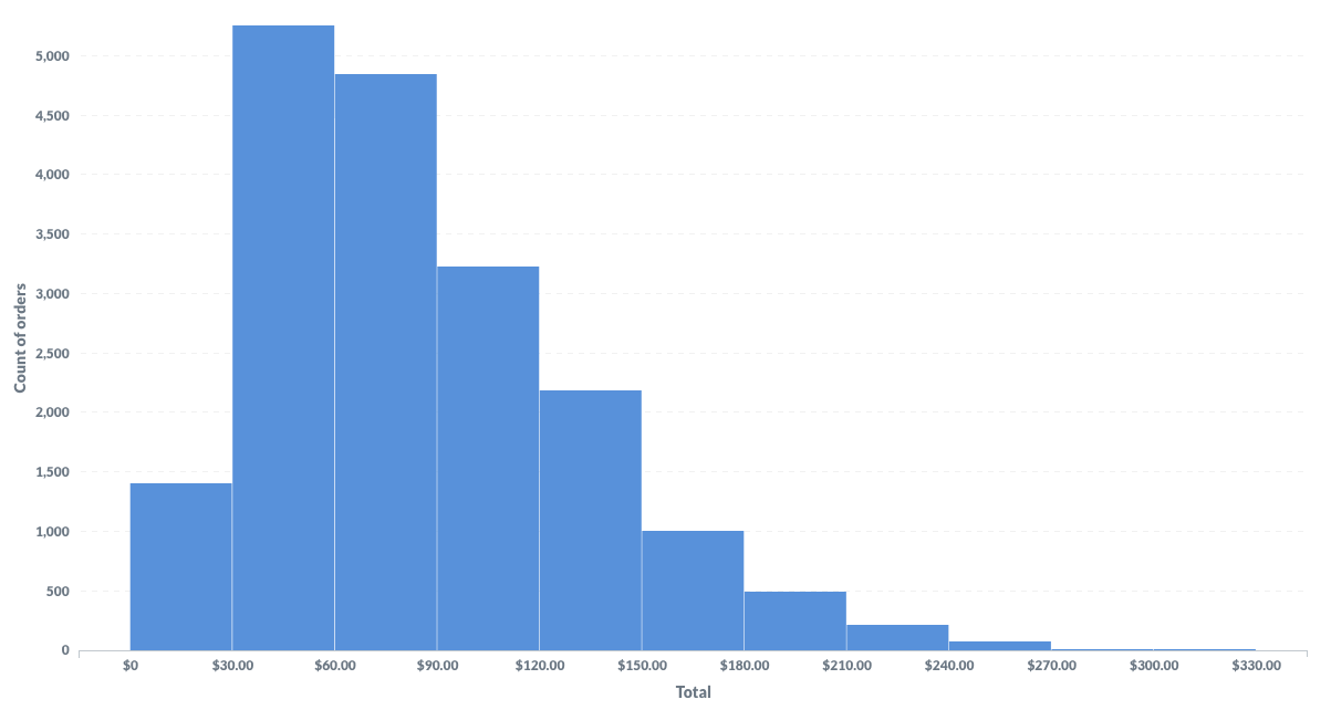
Sample Age Distribution Histogram
The following histogram shows the age distribution in a sample population:
Understanding Bins: The Foundation of Data Grouping
Bins are perhaps the most critical aspect of histogram construction. I've learned that choosing the right bin width can make the difference between revealing insights and obscuring them. Here are the key considerations:
Optimal Bin Selection Methods
- Sturges's Rule: k = ⌈log₂n + 1⌉ (good for normal distributions)
- Scott's Rule: Bin width = 3.5σ/n^(1/3) (minimizes integrated mean squared error)
- Freedman-Diaconis Rule: Bin width = 2×IQR/n^(1/3) (robust to outliers)
Step-by-Step Creation Process
Let me walk you through my process for creating effective histograms:
- Data Collection and Organization: Gather your continuous numerical data and ensure it's clean and complete.
- Determine Bin Ranges: Use one of the optimal bin selection methods or adjust based on your specific needs.
- Calculate Frequencies: Count how many data points fall within each bin range.
- Plot the Histogram: Draw rectangles with heights proportional to frequencies, ensuring no gaps between bars.
- Add Context: Include clear titles, axis labels, and any necessary annotations.
When using PageOn.ai's Deep Search feature, I can integrate relevant data visualization charts automatically, and the drag-and-drop functionality makes adjusting bin configurations dynamic and intuitive.
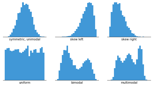
Interpreting Histogram Patterns: Reading the Data Story
Over the years, I've learned that histograms tell stories through their shapes. Each distribution pattern reveals something unique about your data, and recognizing these patterns is essential for meaningful analysis.
Common Distribution Patterns
Below is a visualization of the most common histogram distribution patterns:
flowchart TD
                        A[Histogram Shapes] --> B[Normal/Bell-Shaped]
                        A --> C[Skewed]
                        A --> D[Bimodal]
                        A --> E[Uniform]

                        B --> B1[Symmetric around mean]
                        B --> B2[Most common in nature]

                        C --> C1[Right-Skewed]
                        C --> C2[Left-Skewed]
                        C1 --> C3[Tail extends right]
                        C2 --> C4[Tail extends left]

                        D --> D1[Two distinct peaks]
                        D --> D2[Mixed populations]

                        E --> E1[Consistent frequencies]
                        E --> E2[Equal probability]
Normal (Bell-Shaped) Distribution
Symmetric distribution around the mean, forming a bell curve. This is what we often see in natural phenomena like heights, test scores when properly designed, or measurement errors.
Example: Adult heights in a population
Right-Skewed Distribution
Data concentrated on the left with a long tail extending right. Common in income distributions, where most people earn moderate amounts but a few earn significantly more.
Example: Household income in most countries
Left-Skewed Distribution
Data concentrated on the right with a tail extending left. Often seen in test scores where the test is relatively easy for the population.
Example: Easy exam scores
Bimodal Distribution
Two distinct peaks indicating mixed populations or two different processes. This often signals that you're looking at combined data from two different groups.
Example: Customer ages at a family restaurant
Identifying Outliers and Anomalies
In my analysis work, I've found that histograms excel at revealing outliers – those data points that sit far from the main distribution. These outliers appear as isolated bars or small groups of bars separated from the main body of the histogram. They might indicate:
- Data entry errors that need correction
- Exceptional cases worthy of further investigation
- Natural boundaries in your data
- System limits or measurement constraints
Using PageOn.ai's Agentic processes, I can create compelling visual narratives that highlight these key patterns, making it easier for stakeholders to understand the significance of data distributions.
Practical Applications Across Industries
Throughout my career, I've seen histograms transform decision-making across various industries. Let me share some of the most impactful applications I've encountered.
Business and Finance Applications
Customer Demographics Analysis
I've helped retail companies use age distribution histograms to optimize their product offerings. By visualizing customer age ranges, they could identify their core demographic and adjust inventory accordingly.
Customer Age Distribution Example
Quality Control in Manufacturing
Manufacturing plants use histograms to monitor product specifications. When I worked with a automotive parts manufacturer, histograms helped identify when machines needed calibration by showing shifts in measurement distributions.
Sales Performance Analysis
Sales teams benefit from histograms showing deal size distributions. This helps identify the sweet spot for pricing and reveals opportunities for upselling or downselling strategies.
Scientific and Educational Uses
In scientific research and education, histograms are indispensable tools for data analysis and presentation.
Real-World Scientific Applications
- Meteorology: Rainfall distribution analysis for flood prediction and water resource management
- Medicine: Patient age distributions for treatment efficacy studies
- Education: Test score distributions to evaluate teaching methods and identify struggling students
- Environmental Science: Species population distributions for conservation efforts

When working with discipline-specific data, I've found that PageOn.ai's asset library provides excellent templates that can be customized for various scientific and educational contexts, making professional-grade visualizations accessible to researchers and educators alike.
Digital Tools and Modern Implementation
The digital revolution has transformed how we create and interact with histograms. Let me guide you through the modern tools and techniques I use regularly.
Software Solutions Overview
Excel Histogram Creation
Excel remains one of the most accessible tools for creating histograms. Simply select your data, navigate to Insert > Insert Statistic Chart > Histogram. The software automatically determines bins, though you can customize them.
Learn more about creating a bar chart in Excel for comparison.
Online Histogram Makers
Web-based tools like Canva offer drag-and-drop histogram creation with beautiful templates. These are perfect for presentations and reports where visual appeal is crucial.
Upload CSV or XLSX files and get instant visualizations.
Programming Approaches
For more advanced analysis, I often turn to programming languages. Here's a comparison of popular options:
| Tool | Best For | Key Features |
|---|---|---|
| Python (matplotlib/seaborn) | Data science, research | Highly customizable, extensive libraries |
| R (ggplot2) | Statistical analysis | Publication-ready graphics, statistical functions |
| JavaScript (Chart.js, D3.js) | Web applications | Interactive, responsive, embeddable |
Best Practices for Digital Histograms
Through years of creating digital histograms, I've developed these essential best practices:
- Choose Appropriate Scales: Always start your y-axis at zero to avoid misleading representations.
- Add Data Labels: Include frequency counts above bars for precise interpretation.
- Implement Dynamic Features: Use interactive tooltips and zoom capabilities for detailed exploration.
- Ensure Accessibility: Include clear legends, alt text, and colorblind-friendly palettes.
- Optimize for Different Devices: Test your histograms on various screen sizes.
For those working with complex statistical software outputs, PageOn.ai's conversion tools can transform these into accessible visuals. The platform's data visualization graph tools make it easy to create professional histograms without extensive technical knowledge.
Advanced Considerations and Optimization
As we dive deeper into histogram analysis, I want to share some advanced techniques that have significantly improved my data visualization work.
Types of Histograms for Different Purposes
Histogram Variations and Their Applications
flowchart LR
                        A[Histogram Types] --> B[Frequency]
                        A --> C[Relative Frequency]
                        A --> D[Cumulative]
                        A --> E[Probability]

                        B --> B1[Shows absolute counts]
                        C --> C1[Shows proportions]
                        D --> D1[Shows running totals]
                        E --> E1[Shows likelihood]

                        style A fill:#FF8000,stroke:#333,stroke-width:2px
                        style B fill:#42A5F5,stroke:#333,stroke-width:2px
                        style C fill:#66BB6A,stroke:#333,stroke-width:2px
                        style D fill:#FFA726,stroke:#333,stroke-width:2px
                        style E fill:#AB47BC,stroke:#333,stroke-width:2px
Variable Bin Width Strategies
Sometimes, equal bin widths don't tell the whole story. I've successfully used variable bin widths when dealing with:
- Sparse data with large gaps
- Data with natural boundaries at irregular intervals
- Logarithmic scales for wide-ranging values
- Equiprobable bins for statistical testing
Cross-Validation for Optimal Bins
One advanced technique I regularly employ is cross-validation to determine the optimal number of bins. This involves minimizing the integrated mean squared error between the histogram and the true underlying distribution.
Comparing Multiple Histograms
Overlaying histograms helps identify trends across different datasets:
Integration with Other Visualizations
Histograms become even more powerful when combined with other statistical visualizations. I often pair them with:
Box Plots
Overlaying box plots on histograms provides quartile information and clearly identifies outliers.
Kernel Density Plots
Smooth curves that estimate the probability density function, offering a continuous view of the distribution.
Using PageOn.ai's Plan-Search-Act framework, I can optimize histogram presentations for specific audiences, ensuring the right level of detail and complexity for each stakeholder group. This is particularly useful when creating horizontal bar charts as complementary visualizations.
Common Pitfalls and Solutions
Throughout my career, I've encountered numerous histogram mistakes that can lead to misinterpretation. Let me share the most common pitfalls and how to avoid them.
Critical Mistake #1: Improper Binning
Too few bins can hide important patterns, while too many can create noise that obscures the underlying distribution.
Solution: Start with standard rules (Sturges's, Scott's) and adjust based on your data's characteristics. Always test multiple bin widths to ensure you're not missing important patterns.
Critical Mistake #2: Non-Zero Baseline
Starting the y-axis at a value other than zero can dramatically exaggerate differences between bins.
Solution: Always start your frequency axis at zero. If you must truncate for clarity, clearly indicate this with a break in the axis.
Balancing Detail vs. Clarity
One of the most challenging aspects of histogram creation is finding the sweet spot between showing enough detail and maintaining clarity. Here's my approach:
- Start with your audience: Technical audiences can handle more bins and detail than general audiences.
- Consider the data volume: Larger datasets can support more bins without becoming noisy.
- Test different configurations: Create multiple versions and get feedback from stakeholders.
- Use interactive features: Allow users to adjust bin width dynamically when possible.
Addressing Data Gaps and Incomplete Datasets
Incomplete data is a reality in most real-world scenarios. Here's how I handle common issues:
- Missing values: Clearly document how missing data was handled (excluded, imputed, etc.)
- Outliers: Consider creating separate bins for extreme values or using a broken axis
- Uneven sampling: Use relative frequency histograms to normalize for different sample sizes
- Time-based gaps: Indicate periods of no data collection visually
Maintaining Consistency Across Multiple Histograms
When comparing multiple histograms, consistency is crucial for accurate interpretation. I always ensure:
Visual Consistency
- • Same bin widths across all histograms
- • Identical axis scales when possible
- • Consistent color schemes
- • Uniform labeling conventions
Statistical Consistency
- • Same binning algorithm applied
- • Consistent handling of outliers
- • Uniform data preprocessing
- • Clear documentation of methods
By transforming potential visualization errors into learning opportunities using PageOn.ai's intelligent suggestions, I've been able to continuously improve my histogram creation skills and help others avoid common mistakes.
Transform Your Data Visualization Journey with PageOn.ai
Ready to create stunning histograms and other data visualizations that tell compelling stories? PageOn.ai's AI-powered tools make it effortless to transform complex data into clear, actionable insights.
Start Creating with PageOn.ai TodayBringing It All Together
As we've explored throughout this guide, histograms are far more than simple bar charts – they're powerful tools for understanding data distribution and uncovering hidden patterns. From my experience working with diverse datasets across industries, I can confidently say that mastering histogram creation and interpretation is an essential skill for anyone working with data.
The journey from raw data to meaningful insights doesn't have to be complicated. Whether you're using Excel for quick analysis, programming languages for complex datasets, or modern tools like PageOn.ai for professional visualizations, the principles remain the same: choose appropriate bins, maintain consistency, and always keep your audience in mind.
Key Takeaways
- ✓ Histograms reveal distribution patterns that tables and simple statistics cannot
- ✓ Proper bin selection is crucial for accurate data representation
- ✓ Different distribution shapes tell unique stories about your data
- ✓ Modern tools make histogram creation accessible to everyone
- ✓ Combining histograms with other visualizations enhances understanding
Remember, the goal isn't just to create a histogram – it's to communicate insights effectively. With the techniques and tools we've discussed, you're now equipped to transform any dataset into a clear, compelling visual story. Start with your next dataset, apply these principles, and watch as patterns emerge from what once seemed like random numbers.
Happy visualizing! The world of data is waiting for your insights.
You Might Also Like
Mastering Your First AI-Powered PowerPoint Automation Workflow | Complete Guide
Learn how to set up your first PowerPoint automation workflow with AI tools. Step-by-step guide covering Power Automate, Microsoft Copilot, and advanced techniques for efficient presentations.
Transforming Raw Data into Compelling Business Stories | Data Storytelling Guide
Learn how to transform raw data into powerful business narratives through effective data storytelling techniques. Discover visualization methods and narrative structures that drive decision-making.
Harnessing Creative Tension: Strategic Conflict in Experience Design | PageOn.ai
Discover how to intentionally use conflict as a creative catalyst in experience design. Learn techniques for implementing productive tension that transforms friction into innovative solutions.
Five Core Primitives That Power Modern AI Connectivity - Visual Guide
Explore the fundamental building blocks enabling modern AI systems to communicate: memory stores, context management, tool APIs, data movement, and agent coordination primitives visualized.