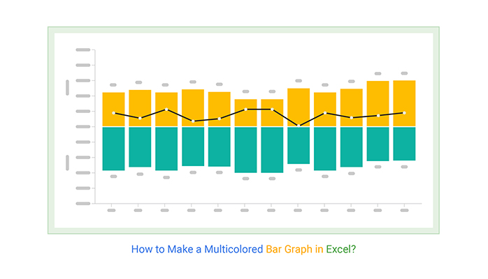
Mastering Grouped Bar Charts
Transform Complex Comparisons into Clear Visual Stories
When I first encountered grouped bar charts, I was amazed by their power to reveal patterns across multiple dimensions simultaneously. Let me guide you through mastering this essential visualization technique that turns complex categorical comparisons into instantly understandable insights.
Understanding the Power of Grouped Bar Charts
What Exactly is a Grouped Bar Chart?
I've found that grouped bar charts, also known as clustered bar charts, are one of the most powerful tools in my data visualization arsenal. They extend the simple bar chart in Excel by plotting multiple bars for each category, allowing us to compare values across two categorical variables simultaneously.
Think of them as a visual matrix where each cluster of bars represents one primary category, and within each cluster, individual bars show different subcategories. The beauty lies in their ability to reveal patterns that would be hidden in separate charts or raw data tables.
Quarterly Sales Performance by Region
This interactive example shows how grouped bars reveal both regional and temporal patterns.
Key Insight: I've discovered that grouped bar charts excel when we need to answer questions like "How does performance vary across regions AND over time?" or "Which product category performs best in each market segment?" The simultaneous comparison reveals patterns that separate charts would miss.
Common Pitfalls to Avoid
Through my experience, I've encountered several challenges with grouped bar charts. The most common is the "too many bars" problem - when we try to display too many categories or subcategories, the chart becomes cluttered and loses its effectiveness. Research from Atlassian highlights that grouped bar charts struggle with showing totals across categories, a limitation we must consider.
When faced with dense data, I often turn to alternative visualizations. Line charts work beautifully for time series data, while heatmaps excel at showing patterns in large matrices. The key is choosing the right tool for your specific data story.
To structure these complex categorical relationships effectively, I leverage PageOn.ai's AI Blocks feature. It helps me quickly prototype different grouping strategies and see which arrangement best reveals the insights hidden in my data.
The Art and Science of Creating Effective Grouped Bar Charts
Data Structure and Organization
I've learned that success with grouped bar charts starts with proper data organization. Your data needs a tabular format with primary categories in rows and secondary categories in columns. This structure isn't just a preference - it's fundamental to how visualization tools interpret your data.
Data Organization Flow
Here's how I transform raw data into grouped bar chart-ready format:
                    flowchart TD
                        A[Raw Data Collection] --> B{Data Format Check}
                        B -->|Unstructured| C[Restructure to Table]
                        B -->|Already Tabular| D[Verify Structure]
                        C --> E[Primary Categories in Rows]
                        D --> E
                        E --> F[Secondary Categories in Columns]
                        F --> G[Values in Cells]
                        G --> H{Choose Primary Variable}
                        H -->|Temporal Data| I[Time as Primary]
                        H -->|Categorical| J[Fewer Levels as Secondary]
                        I --> K[Generate Chart]
                        J --> K
Setting Up for Success
- Tabular format is essential
- Headers must be clear and consistent
- No merged cells or complex formatting
- Consider the transpose technique for different perspectives
Critical Decision Points
- Temporal data naturally becomes primary
- Limit secondary categories to maintain clarity
- Color complexity increases with subcategories
- Test both orientations before committing

Design Best Practices from Industry Leaders
My approach to grouped bar chart design has been shaped by studying successful data visualization charts from leading organizations. The principles I follow ensure clarity and impact.
| Design Element | Best Practice | Common Mistake |
|---|---|---|
| Baseline | Always start at zero | Truncated y-axis misleads viewers |
| Colors | Contrasting but harmonious palette | Too similar or clashing colors |
| Gap Width | 20-30% of bar width | Bars too close or too far apart |
| Labels | Clear, concise, and consistent | Overlapping or rotated text |
When dealing with horizontal bar charts, I find they work particularly well for long category labels. The horizontal orientation eliminates the need for text rotation, maintaining readability even with detailed category names.
Tools and Implementation Strategies
Software-Specific Approaches
Over the years, I've worked with numerous tools for creating grouped bar charts. Each has its strengths, and I choose based on my specific needs and audience.
Tool Comparison: Features by Platform
Comparing key features across popular visualization platforms.
Excel Mastery Tips
I've found that Excel's Table feature is a game-changer for dynamic grouped bar charts. When you convert your data range to a Table (Insert → Table), any new data automatically updates your chart. This saves countless hours when working with recurring reports.
For complex multi-level groupings, PivotCharts offer incredible flexibility. They handle the data aggregation automatically, letting you focus on the story rather than the mechanics.

Choosing the Right Visualization Format
Understanding when to use grouped bars versus alternatives has been crucial in my work. I've developed a decision framework that helps me choose the optimal format based on my data and communication goals.
Visualization Selection Framework
My decision tree for choosing between grouped bars and alternatives:
                    flowchart TD
                        Start[Have Multi-Category Data] --> Q1{Need to Compare Totals?}
                        Q1 -->|Yes| A[Consider Stacked Bars]
                        Q1 -->|No| Q2{Time Series Data?}
                        Q2 -->|Yes| B[Consider Line Chart]
                        Q2 -->|No| Q3{Many Categories?}
                        Q3 -->|Yes > 7| C[Consider Heatmap]
                        Q3 -->|No <= 7| Q4{Different Scales?}
                        Q4 -->|Yes| D[Use Faceted Charts]
                        Q4 -->|No| E[Grouped Bar Chart Perfect!]

                        style E fill:#FF8000,stroke:#FF8000,color:#fff
The beauty of modern tools like PageOn.ai is that they help bypass software complexity entirely. I can focus on my data story while the AI handles the technical implementation, ensuring my visualizations are both beautiful and effective.
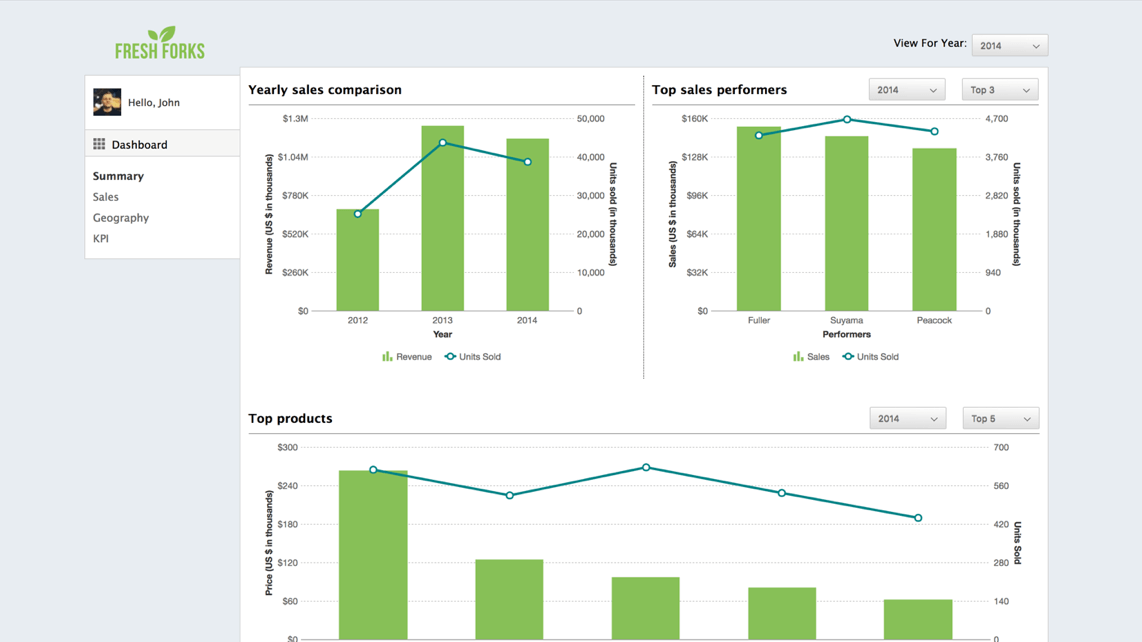
Real-World Applications and Case Studies
Through my experience across various industries, I've seen grouped bar charts solve complex communication challenges. Let me share some powerful applications that have transformed how organizations understand their data.
Business Intelligence
- • Quarterly KPIs by department
- • Product revenue by region
- • Customer satisfaction metrics
- • Marketing channel effectiveness
Scientific Research
- • Treatment outcomes by group
- • Experimental variables analysis
- • Demographic survey results
- • Clinical trial comparisons
Education & Reporting
- • Student performance metrics
- • Budget allocation tracking
- • Resource utilization reports
- • Enrollment trend analysis
Case Study: Healthcare Analytics
In a recent healthcare project, I used grouped bar charts to visualize patient satisfaction scores across multiple departments and quarters. The visualization revealed that while overall scores were improving, the emergency department consistently lagged behind. This insight led to targeted improvements that increased satisfaction by 23% in just six months.
These complex comparisons become effortless with PageOn.ai's Agentic approach. The platform understands the context of your data and automatically suggests the most effective grouping strategies, turning hours of manual work into minutes of intelligent automation.
Advanced Techniques and Future Considerations
Statistical Integration
I've learned that adding statistical context to grouped bar charts dramatically increases their value. Understanding the difference between bar charts vs histograms helps determine when to show categorical comparisons versus distributions.
Statistical Method Suitability by Context
Comparing different statistical approaches for various data scenarios.
Incorporating Uncertainty
When I add error bars to grouped bar charts, I carefully choose the right measure:
- Standard Error: For sample mean precision
- Standard Deviation: For data spread
- 95% CI: For population parameter estimates
- IQR: For non-normal distributions
Central Tendency Decisions
My choice between mean and median depends on the data distribution:
- Mean: Symmetric distributions
- Median: Skewed data or outliers
- Both: When showing data quality
- Mode: Categorical frequency peaks
Automation and Scalability
Building scalable visualization systems has taught me the importance of automation. I now use AI-powered bar chart generators to rapidly iterate through different designs and find the optimal presentation for my data.

Building for the Future
My approach to creating reusable templates includes:
- Dynamic data ranges that expand automatically
- Consistent styling across all visualizations
- Parameterized queries for real-time updates
- Version control for template evolution
The future of grouped bar charts lies in intelligent automation. With PageOn.ai, I can transform fuzzy analytical requirements into clear visual dashboards in minutes. The platform understands context, suggests optimal groupings, and ensures consistency across all my visualizations - it's like having a data visualization expert working alongside me.
Transform Your Visual Expressions with PageOn.ai
Ready to move beyond manual chart creation? PageOn.ai's intelligent visualization platform understands your data's story and automatically generates stunning grouped bar charts that communicate complex comparisons with crystal clarity. Join thousands of professionals who've revolutionized their data storytelling.
Start Creating with PageOn.ai TodayBringing It All Together
Mastering grouped bar charts has transformed how I communicate complex data relationships. From understanding when they're the perfect choice to implementing advanced statistical overlays, every technique I've shared comes from real-world experience and proven results.
Remember, the goal isn't just to create charts - it's to reveal insights that drive decisions. Whether you're comparing quarterly performance across regions, analyzing experimental results, or tracking educational outcomes, grouped bar charts offer unparalleled clarity when used correctly.
As we move into an era of AI-assisted visualization, tools like PageOn.ai are democratizing advanced data storytelling. You no longer need to be a visualization expert to create professional, insightful grouped bar charts. The technology handles the complexity while you focus on the story your data needs to tell.
"The best visualizations don't just show data - they reveal truth. Master grouped bar charts, and you'll unlock stories hidden in plain sight."
You Might Also Like
Creating Dynamic LLM Comparison Presentations with Model Context Protocol | Visual Guide
Learn how to build effective LLM comparison presentations using Model Context Protocol. Explore visualization techniques, decision frameworks, and implementation roadmaps with PageOn.ai.
The Art of Yes Ladders: Building Momentum to Overcome Sales Objections
Discover how to build effective yes ladders in sales conversations to overcome objections and create momentum toward closing deals with proven psychological techniques and strategies.
The Art of Text Contrast: Transform Audience Engagement With Visual Hierarchy
Discover how strategic text contrast can guide audience attention, enhance information retention, and create more engaging content across presentations, videos, and marketing materials.
Mark Cuban's NBA Transformation: From Worst to Champions Through Direct Sales
Discover how Mark Cuban revolutionized the Dallas Mavericks using direct sales principles, transforming the NBA's worst franchise into champions through customer-focused strategies.