Breaking Down Histogram Examples: From Data to Visual Clarity
Transform Raw Numbers into Meaningful Patterns
In my journey through data analysis, I've discovered that histograms are the unsung heroes of data visualization. They transform overwhelming datasets into clear, actionable insights that drive decision-making across industries.
Why Histograms Matter in Modern Data Analysis
When I first encountered histograms in my data analysis journey, I was amazed by their power to reveal hidden patterns. In today's data-rich environment, we're constantly bombarded with numbers that seem meaningless until we visualize them properly. Histograms transform these raw numbers into meaningful patterns that tell compelling stories.
I've seen histograms become essential in countless real-world scenarios. In educational settings, they reveal student performance patterns that help teachers identify learning gaps. In business analytics, they uncover customer behavior trends that drive strategic decisions. Manufacturing processes rely on them for quality control, ensuring products meet specifications consistently.
What makes histograms particularly powerful is their ability to handle large datasets without becoming cluttered. Unlike other data visualization charts, histograms maintain clarity even when displaying thousands of data points. By leveraging PageOn.ai's AI Blocks, I can structure these complex histogram concepts visually, making them accessible to stakeholders at all levels.
Core Components and Anatomy of Effective Histograms
Understanding the anatomy of a histogram is crucial for both creating and interpreting them effectively. I've learned that each component plays a vital role in conveying information accurately.
Essential Elements That Make Histograms Work
- Title and Axis Labels: These create the context for interpretation. I always ensure my titles are descriptive and my axes clearly labeled with units.
- Bins/Class Intervals: The foundation of data grouping. Choosing the right bin size can make or break your histogram's effectiveness.
- Frequency Representation: Bar heights show how many data points fall within each bin, providing immediate visual impact.
- Scale Considerations: Proper scaling ensures accurate representation without distortion.
Histogram Structure Breakdown
flowchart TD
                        A[Histogram Components] --> B[Title]
                        A --> C[Axes]
                        A --> D[Bars]
                        A --> E[Scale]

                        C --> F[X-Axis: Bins/Intervals]
                        C --> G[Y-Axis: Frequency]

                        D --> H[Height = Frequency]
                        D --> I[Width = Bin Size]
                        D --> J[No Gaps Between Bars]

                        E --> K[Consistent Units]
                        E --> L[Zero Baseline]
Common Pitfalls in Histogram Construction
Through my experience, I've encountered numerous histogram construction mistakes that can mislead viewers. The most common issue is improper bin selection - too many bins create noise, while too few hide important patterns. I've found that starting with Sturges' rule (k = 1 + 3.322 × log(n)) provides a good baseline for bin count.
Gap problems between bars often confuse histograms with bar charts. Remember: histogram bars must touch because they represent continuous data ranges. When using PageOn.ai's Deep Search, I can quickly find relevant histogram templates that avoid these common pitfalls.
Real-World Applications Across Industries
Education Sector Examples
In my work with educational institutions, I've seen how histograms transform test score analysis. Consider a typical exam score distribution where we group scores into ranges like 0-20, 20-40, 40-60, 60-80, and 80-100. These visualizations immediately reveal whether the assessment was appropriately challenging and where students need additional support.
Student Test Score Distribution
Bimodal distributions in education often indicate mixed populations - perhaps different learning styles or preparation levels. I use PageOn.ai's drag-and-drop blocks to visualize these educational data patterns, making them accessible to educators who may not have statistical backgrounds.
Business and Customer Analytics
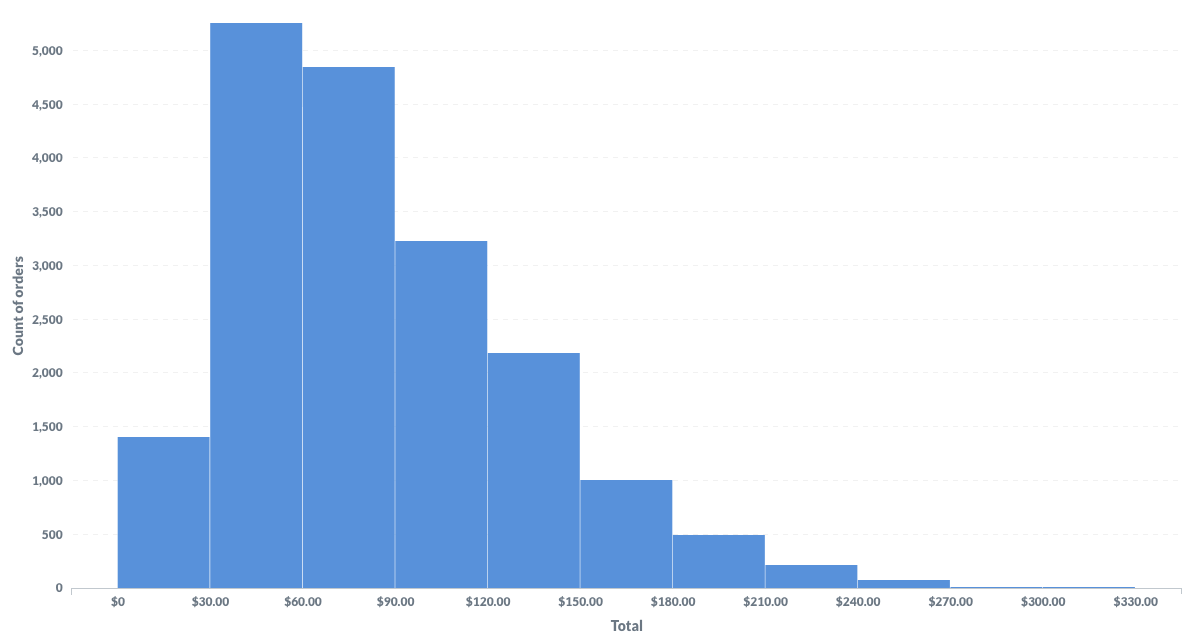
Customer wait time analysis has become one of my most requested histogram applications. I recently analyzed a dataset showing wait times ranging from 2 to 12 minutes, with most customers waiting 6-8 minutes. This histogram revealed opportunities to optimize staffing during peak hours.

Age demographic distributions help businesses understand their market segments. I've created histograms showing customer age ranges that revealed unexpected purchasing patterns - like discovering that 50-70 year-olds were the highest purchasers in what was thought to be a youth-oriented product line. With PageOn.ai's Vibe Creation, I transform these business metrics into clear visual stories that drive strategic decisions.
Healthcare and Scientific Research
Healthcare applications of histograms have profound impacts on patient care. I've worked with hospitals to analyze newborn weight distributions, where the typical range of 6.5-8.5 pounds helps identify babies needing special attention. These visualizations enable quick identification of outliers that might require intervention.
Treatment response time analysis through histograms helps optimize emergency department workflows. By visualizing response patterns, we can identify bottlenecks and improve patient outcomes. PageOn.ai's visual structuring capabilities help me create compelling medical data narratives that resonate with both clinical staff and administrators.
Types of Histogram Distributions and Their Meanings
Normal (Bell-Shaped) Distributions
The normal distribution is perhaps the most recognizable histogram shape. I often encounter it when analyzing natural phenomena or large sample sizes. For instance, park visitor patterns typically show a bell curve with peak times around midday. This symmetrical pattern tells us that the process is stable and predictable.
Normal Distribution Example
Skewed Distributions
Skewed distributions reveal asymmetric patterns in data. Right-skewed distributions, which I frequently see in customer wait times and wage data, have a long tail extending to the right. This indicates that while most values cluster on the lower end, there are occasional extreme high values.
Left-skewed patterns appear in scenarios like study hours or product failure times. Most students study moderate to high hours, with few studying very little. Understanding skewness helps identify process constraints and natural limits. I use PageOn.ai to illustrate these skewness concepts clearly, making them intuitive for non-technical audiences.
Special Distribution Patterns
Bimodal distributions fascinate me because they often reveal hidden subgroups. When I see two distinct peaks, I know we're looking at mixed populations. This could be two different customer segments, two manufacturing processes, or two teaching methods producing different outcomes.
Distribution Pattern Recognition
flowchart LR
                        A[Distribution Types] --> B[Normal]
                        A --> C[Skewed]
                        A --> D[Special]

                        B --> B1[Symmetric]
                        B --> B2[Bell-shaped]
                        B --> B3[Mean = Median]

                        C --> C1[Right-Skewed]
                        C --> C2[Left-Skewed]
                        C1 --> C3[Long right tail]
                        C2 --> C4[Long left tail]

                        D --> D1[Bimodal]
                        D --> D2[Uniform]
                        D --> D3[Truncated]
                        D1 --> D4[Two peaks]
                        D2 --> D5[Equal frequencies]
                        D3 --> D6[Cut-off pattern]
Uniform distributions show equal frequencies across all bins, suggesting random or evenly distributed processes. Truncated distributions, often seen in quality control, indicate that data has been filtered or limited. Using PageOn.ai's modular block system, I can combine these distribution examples to create comprehensive visual guides.
Creating Histograms: From Manual to Digital Methods
Excel-Based Histogram Creation
Excel remains my go-to tool for quick histogram creation. The process is straightforward: enter your data, access the Data Analysis Toolpak, and select Histogram. The key is proper bin setup - I typically start with 5-10 bins and adjust based on the data distribution.
- Enter data in a single column
- Define bin ranges in an adjacent column
- Navigate to Data > Data Analysis > Histogram
- Select input and bin ranges
- Choose output location and chart output
- Adjust gap width to 0% for proper histogram appearance
Common Excel challenges include the default gap between bars (making it look like a bar chart) and automatic bin selection that may not suit your data. I document these Excel processes visually with PageOn.ai's screen capture integration, creating step-by-step guides for team members.
Statistical Software Approaches
For more sophisticated analysis, I turn to programming languages. Python with Matplotlib offers incredible flexibility:
                        import matplotlib.pyplot as plt

                        import numpy as np


                        data = np.random.normal(100, 15, 1000)

                        plt.hist(data, bins=30, edgecolor='black')

                        plt.xlabel('Value')

                        plt.ylabel('Frequency')

                        plt.title('Sample Histogram')

                        plt.show()
R programming provides excellent statistical capabilities, while Tableau excels at interactive visualizations. Each tool has its strengths - I choose based on the audience and analysis requirements. PageOn.ai's Deep Search helps me find and integrate code examples and outputs seamlessly.
Best Practices for Digital Creation
Through years of creating histograms, I've developed a set of best practices. Start with bin sizes that divide evenly into round numbers: 1, 2, 2.5, 4, or 5. These create interpretable boundaries that viewers can easily understand.
Handle missing data explicitly - either exclude it or create a separate category. Always use a zero baseline to avoid distorting the visual representation. With PageOn.ai, I transform these technical specifications into visual guides that ensure consistent, professional histogram creation across teams.
Histogram vs. Other Visualization Methods
When to Choose Histograms Over Alternatives
Understanding when to use histograms versus other visualizations is crucial for effective data communication. The fundamental distinction lies in data type: histograms excel with continuous numerical data, while bar charts vs histograms comparison shows that bar charts better serve categorical data.
| Aspect | Histogram | Bar Chart |
|---|---|---|
| Data Type | Continuous numerical | Categorical or discrete |
| Bar Spacing | No gaps (touching) | Gaps between bars |
| Order | Must follow numerical sequence | Can be reordered |
| Purpose | Show distribution patterns | Compare categories |
Histograms shine when analyzing large datasets where individual data points would create visual clutter. They're essential for understanding distribution shapes, identifying outliers, and assessing data normality. I create comparison matrices using PageOn.ai's structured layouts to help teams choose the right visualization method.
Complementary Visualization Techniques
While histograms are powerful, combining them with other visualizations creates comprehensive data stories. Frequency polygons, created by connecting histogram midpoints, show distribution shapes more clearly when comparing multiple datasets.
Box plots complement histograms by providing statistical summaries - median, quartiles, and outliers - in a compact format. When I need to compare distributions across multiple groups, box plots often prove more efficient than side-by-side histograms.
Scatter plots serve different purposes but can reveal relationships between variables that histograms alone might miss. By combining multiple data visualization examples using PageOn.ai, I create comprehensive analytical dashboards that provide multiple perspectives on the same dataset.
Advanced Applications and Interpretations
Statistical Analysis Through Histograms
Histograms serve as powerful diagnostic tools in statistical analysis. I use them to identify outliers - those isolated bars at distribution extremes that might indicate measurement errors or special cases requiring investigation. In quality control applications, histograms reveal whether processes operate within specification limits.
Statistical Analysis Process
flowchart TD
                        A[Collect Data] --> B[Create Histogram]
                        B --> C{Assess Distribution}

                        C --> D[Check Normality]
                        C --> E[Identify Outliers]
                        C --> F[Detect Multimodality]

                        D --> G[Apply Parametric Tests]
                        D --> H[Transform Data if Needed]

                        E --> I[Investigate Causes]
                        E --> J[Remove or Adjust]

                        F --> K[Segment Analysis]
                        F --> L[Mixed Population Study]

                        G --> M[Statistical Inference]
                        H --> M
                        J --> M
                        L --> M
Assessing data normality through histograms guides statistical test selection. When I see a bell-shaped distribution, I know parametric tests are appropriate. Multimodal distributions suggest mixed populations requiring separate analyses. Six Sigma practitioners rely heavily on histograms for process capability studies. PageOn.ai's Agentic processes help me build comprehensive statistical interpretation guides.
Time-Series Histogram Analysis
Tracking distribution changes over time reveals process evolution. I create monthly histograms to monitor customer satisfaction scores, watching how distributions shift in response to service improvements. Seasonal patterns become visible when comparing histograms across different time periods.
Distribution Changes Over Time
Process improvement monitoring becomes visual through histogram evolution. After implementing changes, I track how distributions shift toward desired outcomes. This temporal analysis, visualized through PageOn.ai's timeline features, provides compelling evidence of improvement initiatives' effectiveness.
Common Mistakes and How to Avoid Them
Technical Errors
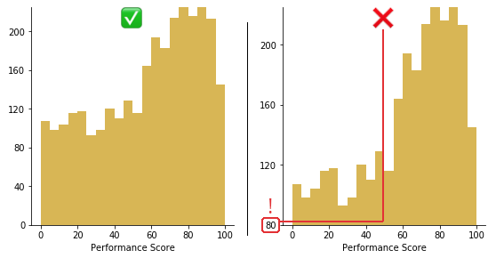
The most damaging technical error I encounter is using non-zero baselines. This distorts perception dramatically - a small difference can appear massive when the y-axis starts at 50 instead of 0. I always verify that my histograms maintain zero baselines to ensure honest data representation.
Inappropriate bin width selection ranks as the second most common mistake. Too many bins create a jagged, noisy appearance that obscures patterns. Too few bins oversimplify, hiding important distribution features. I start with the square root rule (number of bins ≈ √n) and adjust based on the data's characteristics.
Using histograms for non-continuous data represents a fundamental misunderstanding. When someone shows me a histogram of product categories or customer types, I gently redirect them to bar charts. PageOn.ai helps me create error-prevention checklists that teams can reference during visualization creation.
Interpretation Pitfalls
Misreading skewed distributions leads to incorrect conclusions. I've seen analysts assume right-skewed income data is "wrong" when it actually reflects economic reality - most people earn moderate incomes with few high earners creating the tail.
- Overlooking multimodal patterns: Missing secondary peaks that indicate subgroups
- Confusing frequency with probability: Forgetting to normalize when making probability statements
- Ignoring sample size effects: Small samples may not represent true distributions
- Assuming causation from distribution shapes: Correlation doesn't imply causation
I design interpretation guides using PageOn.ai's visual blocks, creating reference materials that help teams avoid these common pitfalls and extract accurate insights from their histograms.
Industry-Specific Histogram Examples
Finance and Banking
In financial services, I use histograms to analyze income distributions, revealing wealth inequality patterns and identifying target market segments. Transaction volume patterns help detect fraud - unusual distributions often signal suspicious activity.
Risk assessment visualizations through histograms show portfolio exposure distributions, helping managers maintain balanced risk profiles. With PageOn.ai, I structure these financial data stories into compelling presentations for stakeholders.
Manufacturing and Quality Control
Manufacturing relies heavily on histograms for statistical process control. Product measurement distributions reveal whether processes stay within specification limits. When I see a histogram shifting toward specification boundaries, it signals the need for process adjustment before defects occur.
Process capability studies use histograms to visualize how well processes meet customer requirements. Cp and Cpk indices become intuitive when overlaid on histogram distributions. I document these quality processes using PageOn.ai's workflow features, creating training materials for quality teams.
Scientific Research
Scientific research depends on histograms for experimental result analysis. Population studies use them to understand demographic distributions, while environmental data analysis reveals pollution patterns and climate trends.
I help researchers present findings clearly by transforming complex statistical distributions into accessible visualizations. PageOn.ai's academic templates ensure these presentations meet publication standards while remaining comprehensible to broader audiences.
Future of Histogram Visualization
Interactive and Dynamic Histograms
The future of histograms lies in interactivity. Real-time data updates allow viewers to watch distributions evolve as new data arrives. User-adjustable bin sizes let analysts explore different granularities without creating multiple static charts.
Drill-down capabilities transform histograms into exploration tools. Clicking a bar reveals the underlying data points, enabling detailed investigation. I explore these advanced data visualization techniques with PageOn.ai to create next-generation analytical tools.
Integration with Modern Analytics
Machine learning enhances histogram analysis through automated pattern recognition. Algorithms identify distribution types, detect anomalies, and suggest optimal bin sizes. Predictive modeling uses historical histogram patterns to forecast future distributions.
Automated insight generation transforms histograms from passive displays to active analytical partners. AI-powered systems highlight significant patterns, compare distributions, and recommend actions. PageOn.ai helps me transform these complex analytics into understandable visuals that drive decision-making.
Practical Implementation Guide
Quick-Start Templates
I've developed template collections for common histogram applications. Education assessment histograms come pre-configured with appropriate grade ranges. Business KPI distributions include standard performance metrics. Scientific data analysis formats follow publication guidelines.
These templates, accessible through PageOn.ai's Deep Search, accelerate histogram creation while ensuring consistency across organizations. Teams can focus on analysis rather than formatting.
Step-by-Step Creation Process
- Data Preparation: Clean data, remove errors, handle missing values explicitly
- Determine Range: Find minimum and maximum values, consider outliers
- Select Bin Strategy: Start with square root rule, adjust based on distribution
- Choose Visualization Tool: Match tool capabilities to analysis requirements
- Create Initial Histogram: Generate first version with default settings
- Refine and Adjust: Optimize bin sizes, add labels, ensure zero baseline
- Add Context: Include title, axis labels, data source, sample size
- Validate Interpretation: Verify patterns match domain knowledge
- Document and Share: Create accompanying narrative, explain key findings
I document entire workflows using PageOn.ai's process mapping capabilities, ensuring reproducible and auditable histogram creation processes.
Transform Your Visual Expressions with PageOn.ai
Ready to elevate your histogram visualizations? PageOn.ai empowers you to create stunning, interactive data stories that captivate audiences and drive insights. Our AI-powered platform transforms complex distributions into clear, compelling narratives that inspire action.
Start Creating with PageOn.ai TodayConclusion: Mastering Histogram Communication
Through this comprehensive exploration of histogram examples, I've shared the insights that have made histograms indispensable in my data analysis toolkit. From understanding basic components to implementing advanced statistical applications, histograms offer unparalleled clarity in visualizing data distributions.
The key to effective histogram usage lies in matching the right type to your specific data story. Whether you're analyzing student performance, optimizing business processes, or conducting scientific research, histograms reveal patterns that numbers alone cannot convey.
Remember these critical takeaways: maintain zero baselines, choose appropriate bin sizes, distinguish between histograms and bar charts, and always consider your audience when designing visualizations. Resources for continued learning are abundant - explore more bar chart in Excel techniques to expand your visualization repertoire.
With PageOn.ai, you can transform histogram insights into actionable presentations that resonate with stakeholders. The platform's AI-powered features help you create professional, engaging visualizations that communicate complex distributions clearly. As you implement histogram analysis in your work, remember that the goal isn't just to display data - it's to tell stories that inspire understanding and drive decisions.
You Might Also Like
Mastering the Three-Body Structure for Compelling Business Presentations | PageOn.ai
Transform ordinary business presentations into compelling visual narratives using the three-body storytelling structure. Learn techniques for creating impactful openings, persuasive middles, and inspiring closings.
Streamlining Presentation Preparation: Efficient Copy-Pasting Techniques & Smart Integration
Discover advanced copy-paste techniques and AI-powered alternatives to transform your presentation workflow. Learn how to save time and maintain consistency across slides.
Instant Presentation Intelligence: Transform Complex Slides into Actionable Summaries with AI
Discover how AI transforms presentations into actionable summaries. Learn about top summarization tools, techniques, and workflows to efficiently process complex slide decks.
The Art of Data Storytelling: Creating Infographics That Captivate and Inform
Discover how to transform complex data into visually compelling narratives through effective infographic design. Learn essential techniques for enhancing data storytelling with visual appeal.