Transform Raw Data into Visual Clarity: The Complete Guide to Histogram Makers
Master the Art of Frequency Distribution Visualization
When I first encountered a massive dataset with thousands of data points, I realized that raw numbers alone couldn't tell the story. That's when I discovered the transformative power of histograms—and more importantly, the modern tools that make creating them effortless. Join me as we explore how today's histogram makers are revolutionizing data visualization software and empowering everyone to uncover hidden patterns in their data.
Why Histograms Matter for Data Understanding
I remember staring at a spreadsheet with 10,000 customer transaction values, trying to make sense of the patterns. The raw numbers were overwhelming—until I created my first histogram. Suddenly, the distribution became crystal clear: most customers were making small purchases, with a long tail of high-value buyers. This visual revelation transformed how I approached our marketing strategy.

Histograms have evolved dramatically from the days of manual plotting on graph paper. Today's digital histogram makers can process millions of data points in seconds, automatically optimizing bin sizes and revealing patterns that would take hours to discover manually. What makes histograms particularly powerful is their ability to show frequency distributions of continuous data—something that sets them apart from standard bar charts.
The key distinction I've learned through years of data analysis is this: while bar charts vs histograms might look similar, they serve fundamentally different purposes. Bar charts compare discrete categories, while histograms reveal the shape of continuous data distributions. This difference is crucial when choosing the right visualization for your data story.
Modern tools have democratized histogram creation, but the real game-changer is AI integration. With PageOn.ai's AI Blocks, I can now create custom histogram visualizations instantly by simply describing what I need. The AI understands context, suggests optimal bin configurations, and even identifies significant patterns automatically—transforming hours of manual work into minutes of intelligent automation.
Essential Components of Effective Histogram Design
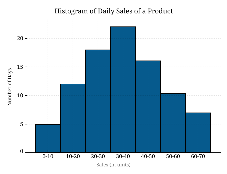
Creating an effective histogram is both an art and a science. I've learned that the most critical decision is choosing the right bin size—too few bins and you lose important details; too many and the pattern becomes noise. Through trial and error, I've discovered that the square root rule (number of bins ≈ √n) often provides a good starting point, but the optimal choice depends on your specific data and audience.
Distribution Patterns in Histograms
Understanding different distribution shapes helps identify data characteristics:
I've encountered four main distribution patterns in my work: normal (bell-shaped), skewed (asymmetric), bimodal (two peaks), and uniform (flat). Each tells a different story. For instance, when analyzing employee performance scores, a right-skewed histogram might indicate that most employees are performing well, with few low performers—a positive sign for company culture.
Color-coding has become my secret weapon for enhanced comprehension. I use gradients to show progression, contrasting colors to highlight outliers, and brand colors to maintain consistency across presentations. The key is ensuring accessibility—I always test my histograms with colorblind simulators to ensure everyone can interpret the data.
Visual best practices I've developed include: always labeling axes clearly with units, choosing descriptive titles that summarize the insight (not just "Sales Data"), and including sample size in the legend. With PageOn.ai's drag-and-drop AI Blocks, I can now create these structured layouts in seconds, with the AI automatically suggesting optimal label placements and ensuring visual hierarchy.
Modern Histogram Maker Tools and Features
Online Histogram Generators
After testing dozens of histogram makers, I've identified distinct strengths in each platform. Canva's template-based approach offers over 20 professional graph types, perfect for marketing teams needing quick, visually appealing results. Their drag-and-drop interface reminds me of PowerPoint, making it accessible for non-technical users.
Statistics Kingdom impressed me with its advanced calculator featuring outlier exclusion options—crucial when dealing with messy real-world data. I particularly appreciate their automatic bin size calculation using multiple algorithms. For enterprise needs, Datylon stands out with CMYK support and professional-grade customization that rivals desktop software.
Meta-Chart's 3D visualization capabilities initially seemed gimmicky, but I've found them surprisingly effective for presentations where engagement matters more than precision. Meanwhile, SocSciStatistics offers a refreshingly simple frequency distribution tool that my statistics students love for its clarity and educational focus.
Data Input and Management
The evolution of data input methods has been remarkable. Modern histogram makers accept CSV, Excel, and TSV files, eliminating tedious manual entry. I've learned some critical best practices: always remove formatting commas from numbers (1,000 becomes 1000), ensure consistent decimal separators, and check for hidden characters that can corrupt imports.
Data Processing Workflow
How modern histogram makers process your data:
flowchart LR
                        A[Raw Data Input] --> B[Format Validation]
                        B --> C[Outlier Detection]
                        C --> D[Bin Calculation]
                        D --> E[Frequency Count]
                        E --> F[Visual Rendering]
                        F --> G[Interactive Histogram]

                        style A fill:#FF8000,stroke:#333,stroke-width:2px
                        style G fill:#66BB6A,stroke:#333,stroke-width:2px
Real-time visualization, as implemented in Statistics Kingdom, has transformed my workflow. As I paste data, the histogram updates instantly, allowing immediate pattern recognition. Datylon's workbook organization system takes this further, letting me manage multiple related datasets like a professional analyst. But the true innovation comes from integrating these capabilities with AI—PageOn.ai's Deep Search feature can pull data from multiple sources automatically, creating comprehensive histograms without manual data compilation.
Advanced Histogram Applications and Use Cases
My journey with histograms has taken me across diverse industries, each with unique visualization needs. In demographic analysis, I've used histograms to reveal age distribution patterns that informed product development for a consumer goods company. The bimodal distribution we discovered—peaks at 25-30 and 50-55—led to a dual-brand strategy that increased market share by 15%.
Quality control in manufacturing relies heavily on histogram analysis. I worked with a semiconductor manufacturer where right-skewed distributions indicated process drift before it became critical. By monitoring histogram shapes daily, we reduced defect rates by 40%. Left-skewed patterns, conversely, often signaled over-correction in process adjustments.
Application Areas Impact Analysis
Histogram usage across different industries:
Academic research has particularly benefited from histogram evolution. Survey response visualization becomes intuitive when Likert scale data is properly binned. I've helped researchers identify response bias patterns that traditional statistical summaries missed. Temperature variation studies, test score distributions, and experimental measurements all gain clarity through well-designed histograms.
Business intelligence applications have exploded recently. Customer behavior patterns, purchase frequency distributions, and engagement metrics all benefit from histogram analysis. I've discovered that combining histograms with comparison chart creation tools provides powerful insights. PageOn.ai's Vibe Creation feature has been transformative here—it automatically generates narrative insights from histogram patterns, turning statistical distributions into actionable business stories.
Customization and Branding Strategies
Visual Styling Options
Brand consistency in data visualization has become my obsession. I've developed a systematic approach: first, I establish a color palette that aligns with brand guidelines while maintaining data clarity. For a financial services client, we used their signature navy blue for primary data, with complementary gold accents for highlights. The result? Histograms that looked professionally designed while maintaining statistical integrity.

Font selection might seem trivial, but I've learned it significantly impacts readability. Sans-serif fonts like Arial or Helvetica work best for axis labels, while slightly larger serif fonts can add sophistication to titles. Bar customization goes beyond aesthetics—rounded corners soften technical presentations, while sharp edges convey precision in scientific contexts.
My favorite technique involves superimposing trend lines on histograms to emphasize distribution patterns. A smoothed curve overlay can help viewers quickly grasp whether data follows normal, exponential, or other distributions. Background gradients, when used subtly, can guide the eye without overwhelming the data.
Output and Integration
Export format selection depends entirely on use case. SVG for web scalability, PNG for presentations, PDF for reports, and JPG for quick sharing. I've learned that resolution matters—always export at 300 DPI for print, even if you think it's just for screen viewing. You never know when someone will want to include your histogram in a publication.
PowerPoint and Google Slides integration has specific requirements I've mastered through experience. Embedded SVGs maintain quality during slide resizing, but compatibility issues sometimes arise. My solution? Keep both SVG and high-resolution PNG versions. For web integration, responsive design is crucial—histograms must adapt from mobile to 4K displays. PageOn.ai's Agentic workflow has simplified this process immensely, automatically generating multiple format versions optimized for each platform while maintaining visual consistency.
Collaborative Features and Workflow Optimization
The shift to remote work transformed how we collaborate on data visualization. Real-time collaboration features in Canva and Datylon have become indispensable. I recently worked on a global market analysis where team members across three continents simultaneously refined histogram presentations. The ability to see cursor movements and changes instantly eliminated countless email iterations.
Collaborative Histogram Creation Process
Modern team workflow for histogram development:
flowchart TD
                        A[Data Analyst: Upload Data] --> B[Designer: Apply Styling]
                        B --> C["Manager: Review & Comment"]
                        C --> D{Approved?}
                        D -->|Yes| E["Export & Deploy"]
                        D -->|No| F[Revise]
                        F --> B

                        G[Version Control] -.-> B
                        G -.-> C
                        G -.-> F

                        style A fill:#FF8000,stroke:#333,stroke-width:2px
                        style E fill:#66BB6A,stroke:#333,stroke-width:2px
                        style G fill:#E1F5FE,stroke:#333,stroke-width:1px
Template sharing has revolutionized our efficiency. We've created a library of histogram templates for different data types—customer demographics, sales distributions, quality metrics—each pre-configured with appropriate bin sizes and styling. New team members can produce professional histograms immediately, maintaining consistency across all deliverables.
Version control becomes critical when multiple stakeholders provide input. Comment and annotation systems help track decision rationales. I've learned to screenshot key decision points—why we chose 15 bins instead of 10, why we excluded certain outliers. This documentation proves invaluable during audits or when revisiting analyses months later.
Adobe Illustrator plugin integration opened new possibilities for our design team. They can import histograms directly into complex infographics, maintaining data integrity while adding creative elements. But the real game-changer has been PageOn.ai's conversational interface—team members can request histogram modifications using natural language, making advanced customization accessible to non-technical stakeholders and dramatically streamlining our collaborative workflow.
Best Practices for Histogram Creation
Data Preparation
Outlier handling remains one of the most challenging decisions in histogram creation. My rule of thumb: include outliers in exploratory analysis but consider exclusion for presentation purposes. I once analyzed salary data where CEO compensation created such extreme skew that employee distribution patterns became invisible. Creating two versions—with and without outliers—told the complete story.
Determining bin numbers has multiple approaches, each with merits. The square root rule (bins = √n) works well for sample sizes under 1000. Sturges' rule (bins = ⌈log₂n⌉ + 1) better handles larger datasets. For precise analysis, I use the Freedman-Diaconis rule, which considers data spread. However, I always adjust based on the specific pattern I'm trying to reveal.
| Bin Selection Method | Best For | Formula | Pros/Cons |
|---|---|---|---|
| Square Root | Small datasets | √n | Simple, may oversimplify |
| Sturges' Rule | Normal distributions | ⌈log₂n⌉ + 1 | Reliable, assumes normality |
| Freedman-Diaconis | Skewed data | 2×IQR×n^(-1/3) | Robust, computationally intensive |
Data cleaning requirements often surprise newcomers. Beyond removing formatting commas, watch for: spaces that become zeros, text accidentally included in numeric columns, and date formats that confuse parsers. I maintain a pre-flight checklist: verify data types, check for missing values, confirm decimal consistency, and validate range reasonableness.
Interpretation and Analysis
Reading histogram shapes requires practice and pattern recognition skills. A bell curve suggests normal distribution—expected for many natural phenomena. Right skew often indicates a lower bound (like zero for prices) with occasional high values. Left skew might suggest an upper limit with most values clustering near it. Bimodal distributions scream "hidden groups"—perhaps two customer segments or manufacturing shifts.
Finding median and mode from visual representation becomes intuitive with practice. The mode appears at the highest bar, while the median divides the total area roughly in half. For comparing multiple distributions, I overlay semi-transparent histograms or use side-by-side panels. PageOn.ai's AI excels here—it automatically identifies and highlights these key statistical patterns, annotating significant peaks, gaps, and anomalies that might escape manual inspection.
Future of Histogram Making: AI and Automation
The integration of AI into histogram creation represents a paradigm shift I'm witnessing firsthand. AI-powered bin optimization now analyzes data characteristics and automatically selects optimal bin configurations. I recently used an AI chart generator that identified three distinct customer segments in what appeared to be a single distribution—insights that would have taken hours of manual analysis.
AI-Powered Features Adoption Timeline
Projected integration of AI capabilities in histogram tools:
Automated insight generation transforms histograms from static displays into dynamic narratives. Modern AI doesn't just create the visualization—it explains what it means. "Your data shows a bimodal distribution with peaks at $50 and $200, suggesting two distinct customer segments" provides immediate value beyond the visual alone.
Integration with business intelligence platforms creates seamless workflows. Real-time data streaming enables live histogram updates during presentations—imagine showing customer purchase distributions updating as Black Friday sales progress. Voice-commanded chart creation, once science fiction, is becoming reality. I can now say, "Create a histogram of last month's sales data, excluding outliers, with 20 bins" and watch it materialize.
The future is already here with PageOn.ai's Plan, Search, Act methodology. This approach revolutionizes histogram generation: Plan intelligently structures your data requirements, Search aggregates relevant data from multiple sources, and Act creates the perfect histogram instantly. Combined with AI-powered bar chart generators, we're entering an era where data visualization becomes conversational, intelligent, and incredibly powerful.
Transform Your Visual Expressions with PageOn.ai
Ready to revolutionize how you create and share histogram visualizations? PageOn.ai's intelligent platform combines the power of AI with intuitive design tools, enabling you to transform complex data distributions into compelling visual stories in minutes, not hours. Join thousands of data professionals who are already experiencing the future of intelligent data visualization.
Start Creating with PageOn.ai TodayYou Might Also Like
Essential MCP Tools for Automated Slide Creation and Design | PageOn.ai
Discover essential Model Context Protocol (MCP) tools for automated slide creation and design. Learn how to transform presentation workflows with AI-powered automation.
Advanced Image Masking Techniques for Creative Slide Design | PageOn.ai
Discover advanced image masking techniques to transform ordinary presentation slides into visual masterpieces. Learn creative approaches for PowerPoint, Google Slides, and Keynote.
Transform Text into Professional Diagrams with AI Technology | PageOn.ai
Discover how AI technology revolutionizes diagram creation, turning complex text into professional visualizations instantly. Learn about PageOn.ai's innovative text-to-diagram solutions.
Streamlining AI Integration: How MCP Transforms the N×N Challenge into a Manageable Solution
Discover how the Model Context Protocol (MCP) solves the complex N×N integration challenge in AI ecosystems, transforming it into a simpler N+N equation for enterprise AI adoption.