Mastering Horizontal Bar Charts: From Data Chaos to Visual Clarity
I've discovered that horizontal bar charts are one of the most underutilized yet powerful tools in data visualization. When wielded correctly, they transform overwhelming categorical data into stories that speak volumes at a glance.
Understanding the Foundation
When I first encountered horizontal bar charts in my data visualization journey, I was struck by their elegant simplicity. A horizontal bar chart is essentially a graphical representation where rectangular bars extend horizontally from a baseline, with their lengths proportional to the values they represent. What makes them unique is their orientation – categories are displayed along the vertical axis while values stretch across the horizontal axis.

The core components I've learned to master include the scale (which determines the relationship between bar length and actual values), clear axis labels that provide context, and well-defined data categories. Each bar's length directly correlates to the data magnitude it represents – a beautifully simple concept that our brains process almost instantaneously.
Pro Tip: I've found that using PageOn.ai's AI Blocks feature allows me to instantly visualize these basic structures, helping my team grasp complex data relationships within seconds rather than minutes.
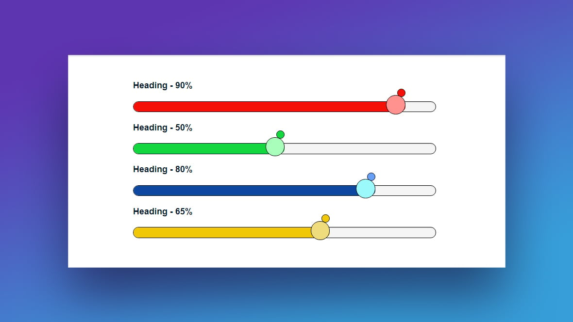
Basic Horizontal Bar Chart Example
Strategic Applications and Use Cases
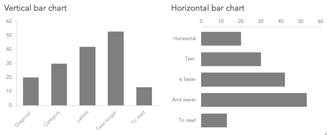
Through my experience analyzing various datasets, I've identified specific scenarios where horizontal bar charts become not just useful, but essential. The most obvious advantage emerges when dealing with long category labels. I remember struggling with a vertical bar chart displaying "Northwestern Regional Sales Department Q4 Performance" – the text was either unreadably small or awkwardly rotated. Switching to a horizontal orientation solved this instantly.
Perfect For:
- • Long category names or labels
- • Ranking comparisons (top 10 lists)
- • Survey response visualizations
- • Mobile-first designs
Less Ideal For:
- • Time series data
- • Sequential progressions
- • Age or date ranges
- • Continuous data distributions
I've discovered that nominal variables – those without inherent order like product categories, department names, or geographic regions – are particularly well-suited for horizontal bar charts. The horizontal format allows viewers to scan category names naturally from top to bottom while comparing values from left to right.
Mobile viewing has become another critical consideration in my design process. Horizontal bar charts naturally fit smartphone screens, allowing users to scroll vertically through categories while maintaining full visibility of each bar's length. With PageOn.ai's Vibe Creation feature, I can transform complex categorical data into clear, mobile-optimized narratives that resonate with modern audiences.
Building Effective Horizontal Bar Charts
Data Preparation and Structure
My approach to building effective horizontal bar charts always begins with meticulous data preparation. I organize categorical variables systematically, ensuring each category has a clear, concise label and corresponding value. The data structure I typically use follows a simple two-column format: categories and their values.
Data Flow Process
                    flowchart LR
                        A[Raw Data] --> B[Clean & Organize]
                        B --> C[Define Categories]
                        C --> D[Calculate Values]
                        D --> E[Set Scale]
                        E --> F[Create Chart]
                        F --> G[Apply Styling]
                        G --> H[Add Labels]
                        H --> I[Final Visualization]
                        style A fill:#FFE5CC
                        style I fill:#CCFFCC
                        style E fill:#FF8000,color:#fff
When determining scales, I follow a simple principle: make the relationship between bar length and value intuitive. For instance, if dealing with percentages, I ensure the scale runs from 0% to 100%. For counts, I might use increments like "1 unit = 10 items" to keep the visualization clean and readable.
Design Best Practices
My Golden Rules for Horizontal Bar Charts:
- 1. The 50% Rule: I maintain bar spacing at 50% of bar width for optimal readability
- 2. Zero Baseline: Always start axes at zero to avoid misrepresentation
- 3. Purposeful Color: Use color to highlight, not decorate
- 4. Flat Design: Avoid 3D effects that distort perception
- 5. Clear Hierarchy: Sort bars logically (largest to smallest or alphabetically)
Well-Designed vs. Poor Design
I've learned that integrating best practices becomes seamless when using PageOn.ai's Deep Search feature. It provides relevant visual examples from successful implementations, helping me avoid common mistakes while discovering innovative approaches I might not have considered.
Advanced Variations and Techniques
Grouped and Clustered Horizontal Bars
When I need to compare multiple data series within categories, grouped horizontal bar charts become my go-to solution. I recently used this approach to visualize gender differences in department participation rates, placing male and female participation bars side by side for each department. The horizontal orientation made it easy to read department names while comparing the two data series.
Grouped Horizontal Bar Example
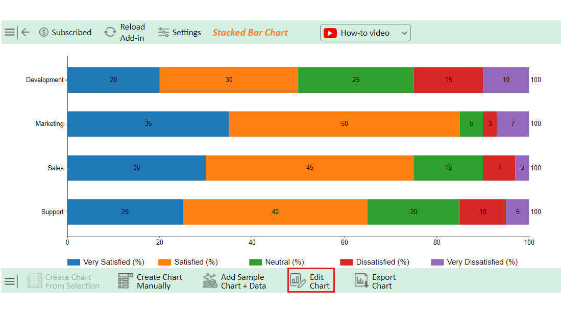
Stacked and 100% Stacked Formats
Stacked horizontal bar charts have revolutionized how I display parts-to-whole relationships. Instead of using multiple charts, I can show both individual components and totals in a single visualization. The 100% stacked variation is particularly powerful for comparing proportions across categories when absolute values vary significantly.
Diverging Bar Charts
I use these for data with positive and negative values, like profit/loss statements or satisfaction surveys with agree/disagree scales. The bars extend in opposite directions from a central baseline.
Variable-Width Bars
Advanced technique where bar width represents an additional dimension. I've used this to show both market share (width) and growth rate (length) simultaneously.
Building these complex variations becomes intuitive with PageOn.ai's modular AI Blocks system. I can experiment with different formats quickly, testing which visualization best tells my data's story without getting bogged down in technical implementation details.
Technical Implementation Across Platforms
Software-Specific Approaches
Throughout my career, I've implemented horizontal bar charts across various platforms, each with its unique approach. In Excel, I've learned to create bar charts efficiently by selecting my data range and choosing "Bar Chart" from the Insert menu – it's that simple, yet many overlook the formatting options that make the difference between amateur and professional visualizations.
Platform-Specific Tips I've Learned:
Switch row/column data, adjust axis formatting, and use custom number formats for clean labels.
Set indexAxis: 'y' in options to create horizontal bars programmatically.
Use the clustered bar chart visual and leverage conditional formatting for dynamic coloring.
Drag dimensions to Rows and measures to Columns, then select the horizontal bars mark type.
Data Labeling and Annotations
Effective labeling transforms good charts into great ones. I position value labels at the end of bars for easy reading, ensuring they don't overlap with adjacent bars. For dense datasets, I've learned to use selective labeling – showing only the top and bottom values or using interactive tooltips for details.
// Chart.js implementation for horizontal bar with custom labels
const config = {
    type: 'bar',
    data: {
        labels: ['Category A', 'Category B', 'Category C'],
        datasets: [{
            data: [75, 60, 45],
            backgroundColor: '#FF8000'
        }]
    },
    options: {
        indexAxis: 'y',
        plugins: {
            datalabels: {
                anchor: 'end',
                align: 'right',
                formatter: (value) => value + '%'
            }
        }
    }
};
The key to successful implementation lies in understanding that each platform has its strengths. I choose my tools based on the audience and purpose – Excel for quick business reports, Chart.js for web applications, and specialized BI tools for interactive dashboards.
Choosing Between Horizontal and Vertical Orientations
Decision Framework Based on Data Type
One of the most frequent questions I encounter is: "Should this be horizontal or vertical?" My decision framework has evolved through years of trial and refinement. The fundamental principle I follow is matching the chart orientation to the nature of the data and how readers naturally process that information type.
| Data Type | Horizontal | Vertical | My Recommendation |
|---|---|---|---|
| Nominal Variables | ✓ Excellent | Acceptable | Horizontal for clarity |
| Time Series | Poor | ✓ Excellent | Always vertical |
| Rankings | ✓ Excellent | Good | Horizontal preferred |
| Age Ranges | Confusing | ✓ Natural | Vertical for progression |
Practical Examples and Comparisons
Let me share specific examples from my portfolio. When visualizing ice cream flavor preferences (chocolate, vanilla, strawberry), I use horizontal bars because these are nominal categories with no inherent order. However, when showing sales growth over months (January through December), I always choose vertical columns because time naturally flows left to right in Western cultures.
Cultural Consideration: I've learned that reading patterns matter. In right-to-left languages, some of my orientation choices might need reversal. Always consider your primary audience's cultural context.
PageOn.ai's Agentic processes have been invaluable in making these orientation decisions. The AI analyzes my data characteristics and suggests the optimal orientation based on data type, label length, and intended message, removing guesswork from the equation.
Common Pitfalls and Solutions
Design Mistakes to Avoid
I've made plenty of mistakes in my journey with horizontal bar charts, and I've seen countless others repeated across organizations. The most egregious error I encounter is the truncated axis – starting the scale at a value other than zero. This distorts the visual comparison, making small differences appear massive.
❌ Common Mistakes
- • Truncated axes misleading viewers
- • Too many categories (>15) causing clutter
- • Inconsistent scales across multiple charts
- • Poor color choices reducing accessibility
- • 3D effects distorting perception
✓ Best Solutions
- • Always start at zero baseline
- • Group or filter to 10-12 categories max
- • Maintain consistent scales for comparison
- • Use colorblind-friendly palettes
- • Keep designs flat and clean
Optimization Strategies
My optimization approach focuses on maximizing impact while maintaining clarity. I sort bars strategically – largest to smallest for emphasis on top performers, or alphabetically when readers need to find specific categories quickly. For datasets with many categories, I group similar items or create an "Other" category for the smallest values.
Optimization Decision Tree
                    flowchart TD
                        A[Too Many Categories?] -->|Yes| B[Group Similar Items]
                        A -->|No| C[Check Label Length]
                        B --> D[Create 'Other' Category]
                        C -->|Too Long| E[Use Horizontal]
                        C -->|Short| F[Consider Vertical]
                        D --> G[Apply Smart Sorting]
                        E --> G
                        F --> G
                        G --> H[Test with Users]
                        H --> I[Refine and Deploy]
                        style A fill:#FFE5CC
                        style I fill:#CCFFCC
                        style G fill:#FF8000,color:#fff
One innovative solution I've adopted is the lollipop chart – essentially a horizontal bar chart where bars are replaced with lines and dots. This creates a cleaner look when dealing with many categories while maintaining the same information density.
When I encounter problematic charts, PageOn.ai's intelligent refinement capabilities help transform them into polished visualizations. The AI identifies common issues and suggests corrections, turning potential disasters into professional presentations.
Real-World Applications and Case Studies
Business and Analytics
In my consulting work, I've deployed horizontal bar charts across diverse business contexts. For a retail client's sales performance dashboard, I created a dynamic horizontal bar chart showing top-performing products. The horizontal format allowed product names to be fully visible while bars extended to show revenue figures, updated in real-time from their POS system.
Customer Satisfaction Survey Results
Market share comparisons have been another powerful application. I created a quarterly report for a tech company showing their market position against competitors. The horizontal bars made it easy to see at a glance who led in each product category, with our client's bars highlighted in their brand color.
Education and Research
In educational settings, I've found horizontal bar charts invaluable for displaying student performance metrics. For a university client, I designed a system showing course completion rates across different programs. The horizontal format accommodated long program names while clearly showing completion percentages.
Research Applications I've Implemented:
- • Demographic distribution studies with clear age/gender breakdowns
- • Scientific data comparisons across multiple experimental conditions
- • Survey response analysis with Likert scale visualizations
- • Resource allocation displays for grant proposals
By combining PageOn.ai's Deep Search with specific datasets, I create compelling case study visuals that not only present data but tell stories. The AI helps identify patterns and suggests visualization improvements that enhance the narrative impact of research findings.
Future Trends and Interactive Elements
The future of horizontal bar charts excites me immensely. I'm seeing a shift toward responsive designs that adapt not just to screen size but to user context. Imagine charts that reorganize themselves based on what the viewer focuses on, highlighting relevant comparisons automatically.

Emerging Trends
- • Real-time data integration with live updates
- • Voice-controlled chart exploration
- • AR/VR data visualization experiences
- • Predictive highlighting based on user behavior
Accessibility Advances
- • Sonification for vision-impaired users
- • Automatic alt-text generation
- • High-contrast mode switching
- • Keyboard-only navigation support
Animation and transitions are becoming more sophisticated. I now create charts where bars grow smoothly when data updates, drawing attention to changes without jarring the viewer. Micro-interactions – like bars slightly expanding on hover – add polish that elevates the user experience.
AI-powered bar chart generators are revolutionizing how we approach visualization. Instead of manually configuring every aspect, I can describe what I want to show, and AI suggests optimal chart configurations, color schemes, and even identifies potential insights I might have missed.
With PageOn.ai's evolving capabilities, I stay ahead of these visualization trends. The platform continuously updates with new features and techniques, ensuring my charts remain cutting-edge and impactful. As we move toward more intelligent, adaptive visualizations, tools like PageOn.ai become not just helpful but essential for maintaining competitive advantage in data communication.
Transform Your Visual Expressions with PageOn.ai
Ready to create horizontal bar charts that captivate and communicate? PageOn.ai's intelligent visualization platform transforms your raw data into compelling visual stories. With AI-powered suggestions, instant formatting, and professional templates, you'll create charts that not only inform but inspire action.
Start Creating with PageOn.ai TodayMy Final Thoughts
Throughout this journey exploring horizontal bar charts, I've shared the techniques and insights that have transformed my approach to data visualization. From understanding when to choose horizontal orientation to mastering advanced variations, these charts have become indispensable tools in my visualization toolkit.
The key takeaway I want to leave you with is this: horizontal bar charts aren't just sideways column charts. They're strategic choices that can dramatically improve how your audience understands and acts on data. When you match the chart type to your data's nature and your audience's needs, magic happens.
As you embark on creating your own horizontal bar charts, remember that tools like PageOn.ai exist to amplify your capabilities, not replace your judgment. Combine the technical knowledge I've shared with the power of AI-assisted design, and you'll create visualizations that don't just display data – they tell stories, drive decisions, and inspire action. The difference between bar charts and histograms might seem subtle, but mastering these nuances is what separates good visualizations from great ones.
You Might Also Like
The Ultimate Design Tools & Workflow Ecosystem for Creative Professionals
Discover essential design tools and optimized workflows for creative professionals. Learn how to build a cohesive ecosystem of visual tools that streamline ideation, feedback, and asset management.
Crafting Indonesia's Story: Visual Narratives That Captivate Global Audiences
Discover how to create compelling visual narratives about Indonesia that engage global audiences. Learn strategies for showcasing Indonesia's cultural diversity, geography, and economic potential.
Redefining Developer & Designer Roles in the Age of Intent-Based Creation | PageOn.ai
Explore how intent-based creation is transforming developer and designer collaboration, blurring traditional boundaries, and creating new hybrid roles like intent engineers in the modern tech landscape.
Print vs Digital Design: Navigating Today's Hybrid Market Landscape
Explore the evolving relationship between print and digital design disciplines, with insights on market trends, strategic applications, and essential skills for cross-disciplinary designers.