Transform Word's Pie Chart Puzzle into Visual Clarity with Modern Solutions
Master the Art of Creating Stunning Pie Charts in Microsoft Word
I've spent countless hours wrestling with Word's chart features, and I'm here to share not just the traditional methods, but also the game-changing alternatives that will revolutionize how you create pie charts. Whether you're battling Excel pop-ups or seeking modern aesthetics, this guide will transform your data visualization journey.
Understanding the Traditional Word Pie Chart Challenge
When I first attempted to create a pie chart in Microsoft Word, I discovered what many users call a "double-edged sword." The built-in chart feature promises simplicity but delivers complexity wrapped in outdated aesthetics.
The Multi-Step Navigation Maze:
- Navigate through Insert → Chart → Pie menu structure
- Excel opens automatically, adding unexpected complexity layers
- Default templates often produce what users describe as "old ugly charts"
My research through Microsoft's official documentation and community forums reveals consistent frustrations. Users report "Unable to create pie chart" errors in Word 365, confusion between old OLE object methods and newer chart tools, and a time-consuming process that feels more like software gymnastics than creative expression.
User Frustration Levels with Word Charts
The disconnect between intent and execution becomes painfully clear: we want quick visual representation of simple data, but Word forces us through multiple software interfaces, resulting in charts that often require extensive reformatting to look professional.
The Step-by-Step Reality: Breaking Down Word's Pie Chart Process
Let me walk you through the actual workflow I follow when creating a pie chart in Word - it's more complex than you might expect.
Word Pie Chart Creation Workflow
flowchart TD
                        A[Position Cursor] --> B[Click Insert Tab]
                        B --> C[Select Chart Button]
                        C --> D[Choose Pie Chart Type]
                        D --> E[Excel Opens Automatically]
                        E --> F[Replace Sample Data]
                        F --> G[Adjust Data Range]
                        G --> H[Close Excel]
                        H --> I[Format in Word]
                        I --> J[Add Chart Elements]
                        J --> K[Apply Styles]
                        K --> L[Final Adjustments]

                        style A fill:#FF8000,stroke:#333,stroke-width:2px
                        style E fill:#FFB366,stroke:#333,stroke-width:2px
                        style L fill:#66BB6A,stroke:#333,stroke-width:2px
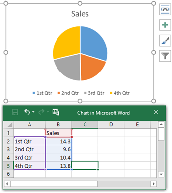
Initial Chart Insertion Workflow
- Position your cursor in the document where you want the chart
- Navigate to Insert tab → Chart button → Select Pie option
- Excel spreadsheet opens with placeholder data (automatic but disruptive)
- Replace sample data with actual information while managing two windows
Data Management Complexities
I've found that managing data becomes particularly frustrating when:
- You must adjust blue borders in Excel to define data range
- Changes require reopening Excel through Chart Design → Edit Data
- Formatting resets can occur after data updates (a common troubleshooting nightmare)
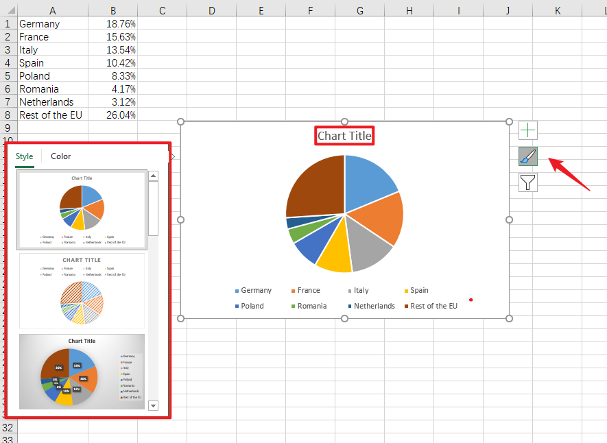
Customization Maze Navigation
Every customization requires multiple clicks through various menus:
- Chart Elements button (+): For adding titles, labels, legends
- Chart Styles gallery: Pre-set appearances (often limited and dated)
- Format Data Series pane: Colors, effects, shadows - each requiring navigation
- Data labels positioning: Inside, outside, or callouts - manual adjustment needed
Visual Enhancement Techniques and Workarounds
Making Word Charts Less "Ugly" (Community Solutions)
Through trial and error, I've discovered several techniques to improve Word's default chart aesthetics:
Style-First Approach
Apply modern Chart Styles before adding data to prevent rework. This simple change saves hours of reformatting.
- Choose style immediately after insertion
- Prevents style reset issues
- Maintains consistency
Clean Design Tips
Use data callouts instead of traditional legends for a cleaner, more modern appearance.
- Explode key pie slices for emphasis
- Remove default borders
- Use subtle shadows sparingly
Alternative Approaches Discovered by Users
Comparison of Chart Creation Methods
Boardmix Method
Create charts in specialized tools, then import as images. This offers interactive features Word lacks and provides modern aesthetics without Word's limitations.
VizGPT Solution
Generate charts externally, download, and import to Word. This eliminates the Excel intermediary step and allows natural language chart creation.
EdrawMax Approach
Design in dedicated software, export as .DOCX. This maintains editability while bypassing Word's chart engine entirely.
Modern Solutions: Where PageOn.ai Transforms the Experience
Here's where I get excited - imagine eliminating the Excel detour entirely. With PageOn.ai, I can simply describe what I want and watch it materialize.
Voice to Visual: The New Paradigm
Instead of navigating menus, I simply say or type:
"Create a pie chart showing department budgets: Marketing 30%, Sales 25%, R&D 20%, Operations 15%, HR 10%"
PageOn.ai's Vibe Creation instantly generates the visual - no spreadsheet navigation required. The Insert → Chart → Pie → Excel data entry maze becomes obsolete.
From Fuzzy Data Concepts to Clear Visuals
Traditional Word Approach
- Structure data in Excel format
- Navigate multiple menus
- Manually adjust every element
- Hope formatting doesn't reset
PageOn.ai Approach
- Describe your intent naturally
- AI interprets and structures data
- Drag AI Blocks to adjust visually
- Consistent professional results
What truly impresses me is how PageOn.ai's Deep Search automatically finds modern chart templates and color schemes. There's no need to navigate Chart Styles galleries or Format panes - the Agentic processes ensure consistency with your document theme automatically.
For those exploring AI pie chart generators, PageOn.ai stands out by understanding context and intent, not just data points.
Addressing Common Pain Points with Smart Alternatives
The "Pie Chart Won't Appear" Issue (Word 365)
Common Problem:
Search results show users encountering blank spaces instead of charts. The traditional fixes are time-consuming:
- Repair Office installation
- Check for updates
- Reinstall Microsoft 365
PageOn.ai Alternative:
Generate the chart independently and insert as a high-quality visual. No software repairs needed - just pure creation.
Data Update Nightmares
Traditional vs. Modern Update Process
flowchart LR
                        subgraph Traditional[Traditional Word Process]
                            T1[Open Chart] --> T2[Edit Data]
                            T2 --> T3[Excel Opens]
                            T3 --> T4[Update Values]
                            T4 --> T5[Close Excel]
                            T5 --> T6[Formatting Lost?]
                            T6 --> T7[Reformat Chart]
                        end

                        subgraph Modern[PageOn.ai Process]
                            M1[Tell AI Changes] --> M2[Regenerates]
                            M2 --> M3[Style Maintained]
                        end

                        style T6 fill:#FF6B6B,stroke:#333,stroke-width:2px
                        style M3 fill:#66BB6A,stroke:#333,stroke-width:2px
Word users consistently report charts not updating properly and formatting being lost after edits. You must save charts as templates to preserve custom styling - an extra step that shouldn't be necessary. With PageOn.ai, I simply tell the AI about changes, and it regenerates while maintaining the style.
The Percentage vs. Value Label Dilemma
| Task | Word Process | PageOn.ai Process |
|---|---|---|
| Add percentages | Chart Elements → Data Labels → More Options → Check percentage box | "Add percentages to the pie chart" |
| Change label position | Right-click each label → Format Data Labels → Position | "Move labels outside the pie slices" |
| Add both values and percentages | Multiple checkbox selections in Format pane | "Show both percentages and actual values" |
The difference is stark - PageOn.ai understands context and intent, transforming complex menu navigation into simple conversational requests.
Practical Implementation Strategies
Quick Win Scenarios
Meeting Preparation
Transform quarterly sales data into visuals in seconds
Report Enhancement
Convert boring data tables into engaging pie charts
Presentation Materials
Generate consistent chart styles across documents
Integration with Existing Workflows

I've developed several strategies for seamlessly integrating modern chart creation into existing workflows:
- Prototype First: Create charts in PageOn.ai, export as images for Word insertion
- Template Library: Build a collection of chart templates once, reuse across projects
- Voice Workflow: Use AI to create charts from text descriptions for rapid iteration
- Smart Selection: Leverage understanding of pie vs donut charts for optimal visualization
Advanced Techniques
For those ready to move beyond basic pie charts, consider these advanced approaches:
- Combine pie charts with other data visualization charts for comprehensive dashboards
- Create interactive elements that engage viewers beyond static images
- Use color psychology to enhance data storytelling
- Implement accessibility features for inclusive presentations
The Future of Document Visualization
As I look ahead, the evolution of document visualization excites me. We're moving beyond static charts toward a future where data comes alive through intelligent, interactive visual expressions.
Evolution of Chart Creation Technology
Beyond Static Charts
Interactive Elements
Charts that respond to user interaction, revealing deeper insights on demand
Real-time Updates
Data visualizations that refresh automatically without manual intervention
Voice Control
Create and modify charts through natural conversation
The Convergence of Creation and Conversation
What excites me most is how we're eliminating the friction between thought and visualization:
- No more switching between Word and Excel - unified creation experiences
- Natural language replaces menu navigation - speak your vision into existence
- Visual thinking supported by intelligent tools - AI understands context and intent
PageOn.ai's Role in This Evolution
PageOn.ai isn't just solving today's problems - it's pioneering tomorrow's solutions:
- Bridges the gap between intention and visualization
- Removes technical barriers to professional chart creation
- Transforms "how do I make a pie chart in Word" from a technical challenge to a creative opportunity

The journey from Word's complex chart creation process to AI-powered visualization represents more than technological advancement - it's a fundamental shift in how we express ideas visually. Whether you're creating an org chart in Microsoft Word or crafting data stories, the future belongs to tools that understand not just data, but intent.
Transform Your Visual Expressions with PageOn.ai
Stop wrestling with Word's outdated chart tools. Experience the future of data visualization where your ideas transform into stunning visuals through simple conversation. Join thousands who've discovered the power of AI-driven chart creation.
Start Creating with PageOn.ai TodayYour Next Steps
I've shared my journey through the maze of Word's pie chart creation, from traditional struggles to modern solutions. The choice is yours: continue navigating complex menus and managing Excel pop-ups, or embrace the future where visualization is as simple as describing what you want to see.
Remember, every great presentation, report, or document deserves visuals that match the quality of your ideas. Don't let technical limitations constrain your creative expression. Whether you're a student preparing a thesis, a professional crafting reports, or an educator creating materials, the tools you choose shape the impact of your message.
The question isn't just "how do I make a pie chart in Word?" anymore - it's "how can I transform my data into compelling visual stories that resonate with my audience?" With PageOn.ai, that transformation is just a conversation away.
You Might Also Like
The Art of Yes Ladders: Building Momentum to Overcome Sales Objections
Discover how to build effective yes ladders in sales conversations to overcome objections and create momentum toward closing deals with proven psychological techniques and strategies.
Print vs Digital Design: Navigating Today's Hybrid Market Landscape
Explore the evolving relationship between print and digital design disciplines, with insights on market trends, strategic applications, and essential skills for cross-disciplinary designers.
Creating Dynamic Picture Backgrounds in PowerPoint: Transform Your Presentations
Learn how to create stunning dynamic picture backgrounds in PowerPoint presentations to boost engagement, improve retention, and enhance visual appeal with step-by-step techniques.
The Art of Visual Hierarchy: Elevating UX Design Through Strategic Emphasis
Learn how to create powerful visual impact in UX design through strategic emphasis techniques. Discover principles of visual hierarchy that drive user behavior and boost engagement.