Mastering Excel Line Charts: From Basic Setup to Advanced Customization
I've spent years working with Excel charts, and I'm here to share everything I've learned about creating compelling line charts that transform raw data into meaningful insights. Whether you're tracking sales trends or analyzing performance metrics, this guide will elevate your data visualization skills.
Why Line Charts Matter in Excel
When I first started working with Excel, I quickly realized that choosing the right chart type can make or break your data presentation. Line charts have become my go-to visualization tool for tracking trends over time, and there's a good reason why they're so popular in business analytics.
Unlike scatter plots that show relationships between two variables, or bar charts in Excel that compare discrete categories, line charts excel at displaying continuous data changes. I've found them particularly effective for financial analysis, where tracking monthly revenue or quarterly performance becomes visually intuitive.
Key Insight:
Line charts work best when your horizontal axis represents time or another continuous variable. I always recommend them for showing trends in data at equal intervals, like daily sales figures or monthly website traffic.
The fundamental distinction I've learned through experience is this: use line charts when you need to emphasize the flow and direction of change, not just individual data points. They're perfect for answering questions like "How has our performance changed over the last quarter?" or "What's the trend in customer satisfaction scores?"
Creating Your First Line Chart: The Foundation
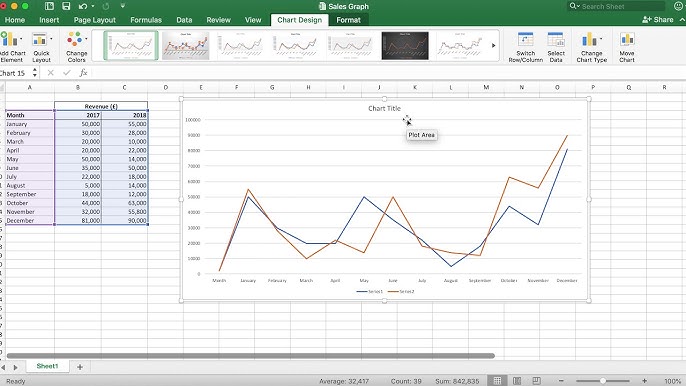
I remember my first attempt at creating a line chart in Excel – it seemed daunting until I discovered the simple process that I now use every day. Let me walk you through the foundation that will serve you well in all your charting endeavors.
Data Setup Best Practices
The secret to a great line chart starts before you even click the Insert button. I've learned that organizing your data properly saves hours of frustration later. Here's my tried-and-tested approach:
- Place your time-based data (dates, months, years) in the first column
- Arrange your values in adjacent columns for each data series
- Include clear, descriptive headers for each column
- Ensure consistent data formatting throughout
Sample Data Structure Visualization
Quick Creation Methods
Over the years, I've discovered several shortcuts that make chart creation incredibly efficient. My favorite is the ALT + F1 shortcut – it instantly creates a chart from your selected data. But for more control, I recommend using the Insert tab's Recommended Charts feature, which analyzes your data and suggests the most appropriate visualization.
When working with line graphs to visualize trends, I often use Excel's Combo chart feature. This powerful tool lets me combine different chart types in one visualization – perfect for showing actual values as columns with a trend line overlay.
Adding Lines to Existing Charts: Advanced Techniques
One of the most powerful techniques I've mastered is adding reference lines to existing charts. Whether it's an average line, benchmark, or target, these additions transform simple charts into powerful analytical tools.
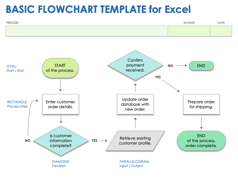
The Select Data Source Method
I frequently use this method when I need to add complex data series to my charts. Here's my step-by-step approach that works every time:
Adding Data Series Workflow
flowchart TD
                        A[Right-click Chart] --> B[Select Data Source]
                        B --> C[Click Add Button]
                        C --> D[Name Your Series]
                        D --> E[Select Data Range]
                        E --> F[Choose Chart Type]
                        F --> G[Format Line Properties]
                        G --> H[Finalize Chart]
The beauty of this approach is its flexibility. I can add multiple data series, modify existing ones, or completely restructure my chart without starting from scratch. This has saved me countless hours when preparing quarterly reports or updating dashboards.
Customizing Line Properties
The visual impact of your line chart depends heavily on how you customize the lines themselves. I've developed a systematic approach to line formatting that ensures clarity and professional appearance:
Line Styles
- • Solid for primary data
- • Dashed for projections
- • Dotted for benchmarks
Color Strategy
- • Brand colors for main series
- • Complementary for comparisons
- • Gray for reference lines
When working with multiple data series, I always ensure each line is visually distinct. This might mean varying the line thickness, adding markers at data points, or using different patterns. The goal is instant recognition without needing to constantly reference the legend.
Professional Formatting and Customization
After years of creating presentations for executives and stakeholders, I've learned that the difference between a good chart and a great one lies in the details. Professional formatting isn't just about aesthetics – it's about maximizing clarity and impact.
Advanced Formatting Techniques
One technique I frequently employ is extending lines to the chart edges. This creates a cleaner, more professional appearance that I've found particularly effective in formal reports. Here's how I approach comprehensive chart formatting:
Professional Chart Formatting Example
I've discovered that using secondary axes effectively can transform confusing multi-scale data into clear insights. When dealing with different units (like revenue in millions and percentage growth), a secondary axis prevents the smaller values from being visually lost.
Interactive Elements with PageOn.ai Integration
While Excel provides powerful charting capabilities, I've recently discovered how PageOn.ai's Vibe Creation feature can transform static Excel charts into dynamic visual narratives. The platform's AI Blocks allow me to combine multiple chart types and data visualizations seamlessly, creating presentations that truly engage my audience.
What excites me most is PageOn.ai's Deep Search functionality, which automatically finds and integrates relevant data points into my line charts. This has revolutionized how I approach data visualization charts, allowing me to create interactive presentations that go far beyond traditional Excel limitations.
Specialized Line Chart Applications
Throughout my career, I've developed specialized techniques for different business scenarios. Each application requires a unique approach to maximize the chart's effectiveness.
Target and Benchmark Lines
Adding target lines has become essential in my performance tracking charts. I've perfected a technique using the paste special function that allows for variable targets across different periods. This is particularly useful when goals change quarterly or when comparing against industry benchmarks.
| Line Type | Best Use Case | Implementation Method |
|---|---|---|
| Average Line | Performance baseline | AVERAGE function + combo chart |
| Target Line | Goal tracking | Static values + line overlay |
| Trendline | Future projections | Built-in trendline feature |
| Moving Average | Smoothing volatility | Calculated field + secondary series |
Time Series Analysis
Working with time series data requires special attention to axis configuration. I've learned that Excel's date axis feature is incredibly powerful when properly configured. It automatically handles irregular time intervals and maintains chronological order even when data isn't sorted.
Time Series Configuration Process
flowchart LR
                        A[Raw Time Data] --> B[Format as Date]
                        B --> C[Create Line Chart]
                        C --> D[Configure Date Axis]
                        D --> E[Set Base Units]
                        E --> F[Apply Scaling]
                        F --> G[Add Seasonal Markers]
For seasonal adjustments, I often create a secondary data series that shows the seasonal pattern. This helps stakeholders understand whether changes are due to seasonal factors or genuine performance improvements. It's a technique that has proven invaluable in retail and e-commerce analytics.
Troubleshooting Common Issues and Best Practices
Over the years, I've encountered virtually every Excel charting issue imaginable. Let me share the solutions that have saved me countless hours of frustration.
Data Management Solutions
The most common issue I see is charts not updating when data changes. My solution? Always use dynamic named ranges or Excel tables. This ensures your charts automatically expand as you add new data points. Here are my top troubleshooting tips:
Common Issues & Quick Fixes:
- Missing data points: Check for hidden rows or filtered data
- Wrong axis labels: Verify the Switch Row/Column setting
- Lines not connecting: Look for empty cells or text in numeric columns
- Chart won't update: Ensure data source references are correct
When dealing with large datasets, I've found that creating templates saves enormous amounts of time. I maintain a library of chart templates for different scenarios – monthly reports, quarterly reviews, and annual summaries. Each template includes pre-configured formatting, colors, and even dummy data for testing.
Visual Optimization with PageOn.ai
While Excel provides the foundation for data visualization, I've discovered that PageOn.ai's Agentic process can transform complex Excel data into clear, engaging visual stories that surpass traditional data visualization in Excel limitations.
The platform's ability to automatically generate professional layouts that highlight key trends and insights has revolutionized my workflow. When I need to integrate multiple data sources seamlessly, PageOn.ai's Deep Search functionality finds and connects relevant information, creating presentation-ready visuals that would take hours to produce manually in Excel.
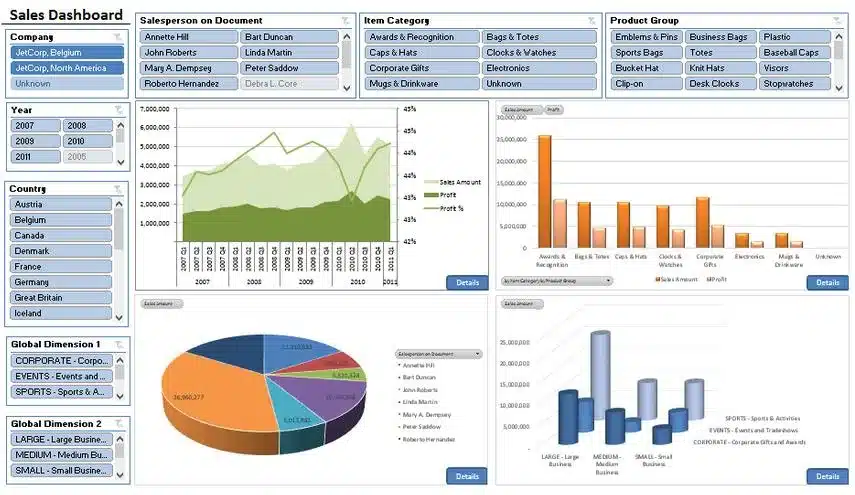
Best Practice: Multi-Series Comparison
Transform Your Visual Expressions with PageOn.ai
Ready to take your Excel charts beyond static visualizations? PageOn.ai empowers you to create dynamic, interactive presentations that bring your data to life. Our AI-powered platform transforms complex spreadsheets into compelling visual narratives that engage and inspire.
Start Creating with PageOn.ai TodayYou Might Also Like
Crafting Emotionally Resonant Digital Experiences: AI-Powered Vibe Design
Explore how AI-powered vibe design is transforming digital interfaces from functional to emotionally resonant experiences. Learn techniques for creating interfaces that connect with users on a deeper level.
The AI-Powered Pitch Deck Revolution: A Three-Step Framework for Success
Discover the three-step process for creating compelling AI-powered pitch decks that captivate investors. Learn how to clarify your vision, structure your pitch, and refine for maximum impact.
Typography Evolution: From Cave Paintings to Digital Fonts | Visual Journey
Explore typography's rich evolution from ancient cave paintings to modern digital fonts. Discover how visual communication has transformed across centuries and shaped design.
The Creative Edge: Harnessing Templates and Icons for Impactful Visual Design
Discover how to leverage the power of templates and icons in design to boost creativity, not restrict it. Learn best practices for iconic communication and template customization.