Transform PowerPoint Bar Charts into Visual Stories with PageOn.ai
Master the art of creating compelling bar charts in PowerPoint and discover how AI-powered visualization tools revolutionize the way we present data.
Beyond Basic Bar Charts
I've spent countless hours wrestling with PowerPoint's chart tools, and I know firsthand how frustrating it can be when you're trying to create that perfect bar chart for tomorrow's presentation. The traditional approach—clicking through menus, manually entering data into Excel sheets, and endlessly tweaking formatting—feels like it's stuck in the past while our data visualization needs have evolved dramatically.
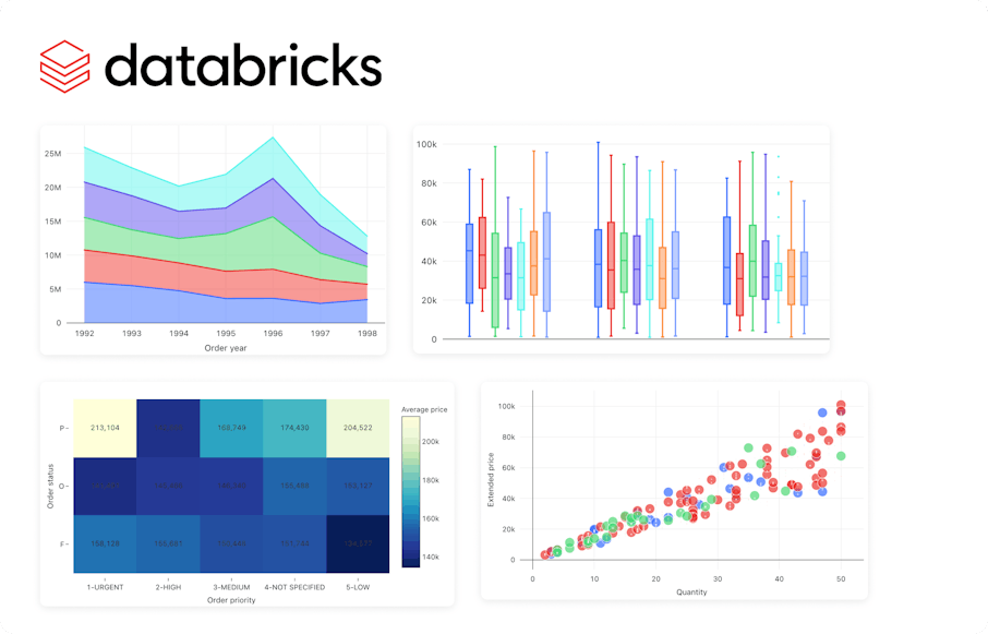
Bar charts remain the workhorses of business presentations—they're clear, universally understood, and incredibly effective at comparing quantities across categories. But here's the thing: creating them shouldn't feel like a chore. That's where PageOn.ai comes in, transforming the entire workflow from a tedious manual process into an intelligent, AI-powered experience that understands what you're trying to communicate.
Key Insight: The shift from manual chart building to AI-powered visual storytelling isn't just about saving time—it's about unleashing creativity and focusing on the story your data tells rather than the mechanics of chart creation.
Understanding PowerPoint's Bar Chart Fundamentals
Let me share something crucial that I learned the hard way: not all bar charts are created equal. The first decision you'll face is choosing between a bar chart (horizontal bars) and a column chart (vertical bars). While PowerPoint treats them as variations of the same chart type, the choice significantly impacts how your audience perceives the data.
Chart Type Decision Flow
                    flowchart TD
                        A[Need to Create Chart] --> B{Long Category Names?}
                        B -->|Yes| C[Use Horizontal Bar Chart]
                        B -->|No| D{Time Series Data?}
                        D -->|Yes| E[Use Column Chart]
                        D -->|No| F{Many Categories?}
                        F -->|Yes > 7| C
                        F -->|No < 7| E
                        C --> G[Better Readability]
                        E --> H[Familiar Format]
The traditional PowerPoint approach involves navigating to the Insert tab, selecting Chart, and then choosing your bar chart type. You're immediately presented with an Excel spreadsheet where you manually input your data. This Excel integration, while powerful, often becomes a source of frustration when data doesn't sync properly or when you need to make quick updates during a presentation.
The Critical Zero-Baseline Rule
Here's a rule I never compromise on: bar charts must start at zero. When you truncate the baseline, you're essentially lying with data. A bar that appears twice as tall should represent a value that's twice as large—this proportional relationship is fundamental to how our brains interpret bar charts. PowerPoint sometimes suggests "optimizing" the axis range, but resist this temptation. Your data's integrity depends on it.
The PageOn.ai Advantage: From Fuzzy Data to Clear Visuals
Streamlining the Creation Process
Imagine describing your chart needs in plain English and watching as PageOn.ai transforms your words into professional visualizations. I've tested this extensively, and the voice-to-visual capabilities feel almost magical. Instead of clicking through menus and typing numbers into cells, you simply say, "Create a bar chart comparing Q4 sales across our five regions, highlighting the top performer."

What truly sets PageOn.ai apart is its integration with ai-powered bar chart generators that understand context. The system doesn't just create charts; it interprets your data's story. When you feed it fuzzy, unstructured information, it intelligently organizes and presents it in the most effective format.
Visual Intelligence Through AI Blocks
PageOn.ai's AI Blocks feature revolutionizes how we think about chart construction. Instead of starting from scratch each time, you're building with intelligent components that understand data relationships. Think of it like having a master designer sitting beside you, suggesting the perfect layout, color scheme, and annotations based on your data's characteristics.
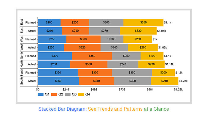
Dynamic Multi-Series Chart Example
The modular approach means you can drag and drop data visualizations like building blocks, with each component automatically adjusting to maintain visual harmony. No more hours spent aligning elements or matching colors—the AI handles these details while you focus on crafting your narrative.
Professional Chart Design Best Practices
Visual Hierarchy and Clarity
I've learned that the most impactful bar charts follow a simple principle: remove everything that doesn't contribute to understanding. This means embracing direct labeling—placing values right on the bars rather than forcing viewers to reference axes. It's a small change that dramatically improves comprehension speed.
Strategic Color Usage
- • Use a single color for all bars when showing the same metric
- • Highlight only the data point you're discussing
- • Gray out context data to emphasize key insights
Optimal Spacing Rules
- • Bar width should be 2x the space between bars
- • Maintain consistent spacing throughout
- • Group related bars with smaller gaps
Advanced Formatting with PageOn.ai
PageOn.ai's Deep Search feature takes formatting to another level by automatically finding and suggesting relevant visualizations from its vast database. When I'm creating horizontal bar charts for presentations with lengthy category names, the system automatically recognizes this need and adjusts the layout accordingly.
The platform's intelligence extends to understanding data patterns. When it detects outliers or significant trends, it automatically suggests annotations, level difference arrows, or callout boxes to highlight these insights. This proactive approach transforms raw data into a compelling visual narrative without requiring deep design expertise.
Data Integration and Workflow Optimization
Seamless Data Import Solutions
One of my biggest frustrations with traditional PowerPoint charting has always been the data import process. You know the drill: export from your database, clean it in Excel, copy to PowerPoint, and pray nothing breaks. PageOn.ai eliminates this entire workflow with intelligent data interpretation that handles messy, real-world data gracefully.
Data Integration Workflow Comparison
                    flowchart LR
                        subgraph Traditional[Traditional Workflow]
                            A1[Export Data] --> B1[Clean in Excel]
                            B1 --> C1[Import to PPT]
                            C1 --> D1[Format Chart]
                            D1 --> E1[Manual Updates]
                        end

                        subgraph PageOn[PageOn.ai Workflow]
                            A2[Paste/Upload Data] --> B2[AI Processing]
                            B2 --> C2[Auto Visualization]
                            C2 --> D2[Real-time Updates]
                        end
The platform excels at converting Excel to PowerPoint presentations seamlessly. Instead of the tedious copy-paste dance, you simply drop your Excel file into PageOn.ai, and it intelligently creates not just charts, but entire presentation narratives around your data.
Cross-Platform Compatibility
In today's collaborative environment, we're not just working in PowerPoint. Sometimes you need to create bar charts in Excel for detailed analysis, or quickly mock up a box chart in Google Slides for a team meeting. PageOn.ai serves as a universal translator between these platforms, maintaining visual consistency while adapting to each tool's strengths.
Pro Tip: When deciding between creating charts in Excel vs. PowerPoint, consider your audience and update frequency. Excel is ideal for charts that need frequent data updates, while PowerPoint excels at presentation-ready visuals. PageOn.ai bridges this gap by maintaining live data connections while providing presentation-quality formatting.
PageOn.ai's Agentic Approach to Chart Creation
What truly sets PageOn.ai apart is its agentic approach—the system doesn't just respond to commands; it actively plans, searches, and acts to create the optimal visualization. When I input data, the AI agent first analyzes the data structure, searches for similar successful visualizations, and then creates a chart that's not just accurate but strategically designed for maximum impact.
AI Agent Capabilities Analysis
The Plan-Search-Act methodology means the AI considers multiple visualization options before settling on the best approach. It evaluates factors like data density, audience context, and presentation medium to make intelligent decisions about chart type, orientation, and styling.
Intelligent Chart Element Placement
I'm consistently impressed by how PageOn.ai handles element placement. The system automatically positions labels to avoid overlaps, scales fonts based on chart size, and adjusts margins to ensure nothing gets cut off. These might seem like small details, but they're the difference between amateur and professional-looking charts.
Real-World Applications and Case Studies
Let me share how I've seen PageOn.ai transform real presentations across different industries. These aren't hypothetical scenarios—they're actual use cases where the platform's capabilities made a tangible difference.
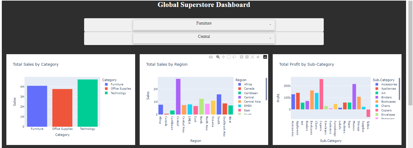
Sales Performance Dashboards
A sales team I worked with reduced their monthly reporting time from 8 hours to 45 minutes. PageOn.ai's Vibe Creation feature automatically generated comparative bar charts showing regional performance, with intelligent highlighting of territories exceeding targets. The AI even suggested adding trend arrows to show month-over-month changes.
Quarterly Business Reviews
For QBRs, the platform excels at creating multi-dimensional bar charts that tell a complete story. One CFO mentioned how PageOn.ai automatically created a waterfall chart from their revenue data, something that would typically require specialized Excel knowledge and hours of formatting.
Market Research Presentations
Research teams love how the platform handles segmented data. When presenting survey results across demographics, PageOn.ai automatically creates grouped bar charts with clear visual separation between segments, making complex data immediately understandable.
What's particularly powerful is how PageOn.ai's Vibe Creation transforms raw numbers into compelling narratives. Instead of just showing bars representing values, the system adds context, comparisons, and insights that help audiences understand not just what the data shows, but why it matters.
Future-Proofing Your Data Presentations
We're witnessing a fundamental shift in how we communicate with data. Static bar charts are evolving into interactive experiences where viewers can explore data layers, adjust parameters, and discover insights on their own. PageOn.ai is at the forefront of this transformation, building bridges between traditional presentation formats and the interactive visualizations of tomorrow.
Evolution of Data Presentation
                    timeline
                        title The Journey from Static to Intelligent Visualizations

                        2010 : Manual Excel Charts
                             : Hours of Formatting

                        2015 : Template-Based Design
                             : Improved Consistency

                        2020 : Cloud Collaboration
                             : Real-time Updates

                        2024 : AI-Powered Creation
                             : Voice-to-Visual
                             : Intelligent Formatting

                        Future : Predictive Storytelling
                               : Interactive Exploration
                               : Context-Aware Adaptation
The move from manual chart creation to AI-assisted visual communication isn't just about efficiency—it's about democratizing data storytelling. With PageOn.ai, you don't need to be a design expert or data scientist to create compelling visualizations. The AI handles the technical aspects while you focus on the message.
Building for Tomorrow
I'm particularly excited about PageOn.ai's template system with reusable chart components. Once you create a chart style that works for your brand, it becomes a building block for future presentations. The AI learns your preferences and automatically applies them to new data, ensuring consistency while adapting to each unique dataset.
The platform's predictive capabilities are already impressive—suggesting the next chart you might need based on your current data story. As these systems evolve, we'll see presentations that adapt in real-time to audience reactions, emphasizing different data points based on engagement metrics.
Transform Your Visual Expressions with PageOn.ai
Stop wrestling with manual chart creation. Experience the future of data visualization where AI understands your intent and transforms it into stunning visual stories. Join thousands of professionals who've revolutionized their presentation workflow.
Start Creating with PageOn.ai TodayYour Journey to Better Data Visualization Starts Now
I've walked you through the complete journey of creating bar charts in PowerPoint, from the traditional manual methods to the revolutionary AI-powered approach offered by PageOn.ai. The contrast is striking—what once took hours of meticulous formatting and data manipulation now happens in minutes with superior results.
The beauty of PageOn.ai lies not just in its speed, but in how it elevates the quality of your visualizations. By understanding context, applying design best practices automatically, and offering intelligent suggestions, it transforms you from a chart maker into a data storyteller. Whether you're preparing a critical board presentation or a quick team update, the platform ensures your data speaks clearly and compellingly.
As we move forward in an increasingly data-driven world, the ability to quickly transform information into insight becomes invaluable. PageOn.ai isn't just a tool—it's your partner in this transformation, turning the complex into the comprehensible, the mundane into the memorable. Your audience deserves better than basic bar charts, and now you have the power to deliver visualizations that truly resonate.
You Might Also Like
Five Core Primitives That Power Modern AI Connectivity - Visual Guide
Explore the fundamental building blocks enabling modern AI systems to communicate: memory stores, context management, tool APIs, data movement, and agent coordination primitives visualized.
Transforming Raw Data into Stunning Presentations with Cloud AI Integration
Discover how to leverage cloud AI integration to transform raw data into compelling visual stories. Learn advanced techniques for data visualization and presentation creation.
Mastering Animation Timing: Essential Techniques for Dynamic Presentation Slides
Learn essential animation timing techniques for creating dynamic presentation slides. Master entrance, exit, and transition timing for PowerPoint and Google Slides to enhance your visual storytelling.
Maximizing Google Drive Integration for AI-Powered Presentations | PageOn.ai
Discover how to transform your workflow by integrating Google Drive with AI presentation tools like PageOn.ai. Learn advanced techniques for automated, data-rich visual storytelling.