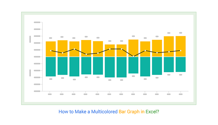
Transform Your Word Data into Professional Bar Charts: A Complete Visual Guide
I've discovered that creating compelling bar charts in Microsoft Word doesn't have to be a struggle. Whether you're preparing reports, presentations, or academic papers, I'll guide you through every method to transform your data into visual stories that captivate and inform.
Getting Started: From Blank Page to Visual Impact
When I first started creating bar charts in Word, I was overwhelmed by the options. Now, I understand that the key to success lies in choosing the right approach for your specific needs. Let me share what I've learned about transforming raw data into compelling visual narratives.
Understanding When Bar Charts Enhance Your Documents
I've found that bar charts excel when comparing discrete categories or showing changes over time. Whether you're presenting quarterly sales figures, survey results, or project milestones, the visual impact of well-designed bars immediately communicates patterns that tables of numbers simply can't match.
Key Differences: Built-in vs. Excel Integration
In my experience, Word offers two primary paths for chart creation. The built-in charting tool provides quick results with automatic Excel integration, while manual creation using shapes offers complete control over every visual element. I'll guide you through both approaches so you can choose what works best for your workflow.
Chart Type Effectiveness Comparison
Understanding which chart type works best for your data
The Traditional Path: Word's Native Chart Creation
I remember my first successful bar chart in Word - it took me just minutes once I understood the workflow. Let me walk you through the exact steps I use every time, along with the tips that have saved me countless hours of frustration.
Accessing the Chart Tools
The journey begins in Word's Insert tab. I always position my cursor exactly where I want the chart to appear before starting - this saves repositioning time later. Click the Chart button in the Illustrations group, and you'll see the Insert Chart dialog that becomes your command center for visualization.
Chart Creation Workflow
My step-by-step process for creating professional bar charts
                    flowchart TD
                        A[Position Cursor in Document] --> B[Insert Tab → Chart]
                        B --> C[Select Bar Chart Type]
                        C --> D[Choose Specific Style]
                        D --> E[Excel Window Opens]
                        E --> F[Enter Your Data]
                        F --> G[Adjust Data Range]
                        G --> H[Close Excel]
                        H --> I[Chart Updates in Word]
                        I --> J[Apply Formatting]
                        J --> K[Add Chart Elements]
                        K --> L[Final Positioning]

Working with the Excel Data Window
Here's where many users encounter their first challenge. When you select a bar chart, Excel automatically opens with sample data. I've learned to immediately save this Excel file separately - it's saved me from data loss more times than I can count. Replace the sample data with your actual information, being careful to maintain the structure of categories in the first column and data series in subsequent columns.
Critical Tip: Before closing the Excel window, I always drag the blue data range border to encompass exactly the data I need. This prevents Word from including empty cells that can distort your chart's appearance.
According to comprehensive tutorials from WikiHow, one of the most common issues users face is the Excel window disappearing unexpectedly after system updates. I've experienced this myself, and the solution is simpler than you might think - just click on your chart and select "Edit Data" from the Chart Design tab.
Crafting Charts Without Excel Dependencies
Sometimes I need complete control over my visualizations, or I'm working on a system without Excel. That's when I turn to Word's drawing tools to create custom bar charts from scratch. This method takes more time but offers unlimited creative freedom.
Building with Shapes and SmartArt
I start by inserting rectangles from the Shapes menu, using Word's ruler and gridlines to ensure precise measurements. Each bar becomes a canvas for creativity - I can apply gradients, textures, or even images as fills. The key is maintaining consistency across all bars while making each data point visually distinct.
For more complex arrangements, I've found that PageOn.ai's AI Blocks feature can structure these visual elements automatically, maintaining perfect alignment and proportions that would take hours to achieve manually. This approach bridges the gap between manual control and automated efficiency.
Manual vs. Automated Creation Time
Comparing time investment for different chart creation methods
Advanced Customization and Professional Polish
Once I've created the basic chart, the real magic happens in customization. I've spent years perfecting my approach to chart formatting, and I'm excited to share the techniques that transform ordinary bar charts into professional visualizations that command attention.
Chart Design Mastery
The Chart Design tab becomes my creative playground. I typically start with Word's pre-built styles as a foundation, then customize from there. The style galleries offer excellent starting points, but I've learned that the real power lies in understanding how to modify these templates to match specific branding requirements or presentation themes.

When working with data visualization charts, I've discovered that consistency is paramount. Every element - from font sizes to color gradients - should work together to tell a cohesive story. I maintain a personal style guide that ensures all my charts share a professional, unified appearance.
Fine-Tuning Chart Elements
The details make the difference. I spend considerable time perfecting data labels, ensuring they're positioned for maximum readability without cluttering the visual space. For financial data, I format numbers with currency symbols and thousands separators. For percentages, I ensure decimal places are consistent throughout.
Essential Formatting Checklist
- ✓ Chart title: Clear, descriptive, and properly sized
- ✓ Axis labels: Readable font size with appropriate units
- ✓ Data labels: Strategically positioned (inside/outside bars)
- ✓ Colors: Consistent palette with sufficient contrast
- ✓ Legend: Positioned without obscuring data
- ✓ Effects: Subtle shadows or 3D used sparingly
Data Management and Dynamic Updates
I've learned the hard way that proper data management can make or break your charting workflow. Whether you're updating quarterly reports or maintaining live dashboards, understanding how Word handles chart data relationships is crucial for efficiency.
Editing Without Starting Over
One of my favorite discoveries was learning that I could edit chart data without recreating the entire visualization. Simply right-click on the chart and select "Edit Data" - the Excel window reappears with all your original information intact. This feature has saved me countless hours when clients request last-minute data updates.
Data Update Decision Tree
Choosing the right approach for data modifications
                    flowchart TD
                        A[Need to Update Chart Data] --> B{Type of Update?}
                        B -->|Minor Values| C[Edit Data in Excel]
                        B -->|Add Series| D[Edit Data + Adjust Range]
                        B -->|Change Type| E[Change Chart Type]
                        B -->|Complete Overhaul| F[Create New Chart]
                        C --> G[Chart Updates Automatically]
                        D --> G
                        E --> H[Preserve Formatting with Templates]
                        F --> I[Apply Saved Template]
                        H --> J[Final Chart]
                        G --> J
                        I --> J
For complex datasets, I leverage PageOn.ai's Deep Search capability to automatically integrate relevant data visualizations. This feature pulls in contextual information that enriches my charts with industry benchmarks or comparative data, adding layers of insight I wouldn't have discovered manually.
Link vs. Embed: Making the Right Choice
Understanding when to link versus embed charts has revolutionized my workflow. Linked charts update automatically when the source Excel file changes - perfect for reports that pull from regularly updated databases. Embedded charts, on the other hand, remain static and travel with the document, ideal for archived reports or when sharing files externally.
Layout Integration and Document Flow
A beautifully designed chart loses its impact if it disrupts document flow. I've developed a systematic approach to integrating charts that enhances rather than interrupts the reading experience. Let me share my techniques for seamless visual integration.
Positioning and Text Wrapping
The Layout Options button that appears when you select a chart is your gateway to professional positioning. I typically use "Square" wrapping for charts that should sit alongside text, allowing content to flow naturally around the visualization. For full-width impact pieces, "In Line with Text" ensures the chart commands its own space without awkward text gaps.
When working with horizontal bar charts in limited spaces, I've found they often work better than vertical bars for long category names. The horizontal orientation allows text to remain readable without rotation, particularly important for mobile viewing.
Mobile and Cross-Platform Considerations
In today's multi-device world, I always test my charts on different screen sizes. Word's responsive features help, but I've learned to design with mobile in mind from the start. This means larger fonts, higher contrast colors, and simpler designs that remain legible even on small screens.
Desktop Optimization
- • Detailed data labels
- • Multiple data series
- • Subtle gradients and effects
- • Comprehensive legends
Mobile Optimization
- • Simplified data presentation
- • Larger touch targets
- • High contrast colors
- • Minimal text rotation
Troubleshooting Common Challenges
Over the years, I've encountered virtually every chart-related issue Word can throw at you. The good news? Most problems have simple solutions once you know where to look. Let me guide you through the most common challenges and their fixes.
The Disappearing Excel Window Mystery
This is perhaps the most frustrating issue I've faced - and based on Microsoft's support forums, I'm not alone. After system updates, the Excel data window sometimes refuses to appear when editing charts. My solution: Click on the chart, navigate to Chart Design > Edit Data, and select "Edit Data in Excel" from the dropdown. This forces Excel to open in a separate window where you can make your changes.
Critical Recovery Tip: If your chart appears as a static image and won't respond to editing commands, try copying it to a new document. Often, this refreshes the object connection and restores full functionality.
Charts Not Updating After Data Changes
I've discovered that Word sometimes needs a nudge to refresh chart displays. Right-clicking the chart and selecting "Refresh Data" usually solves this. For stubborn cases, I save the document, close it completely, then reopen - this forces Word to rebuild all object connections.
Quick Fix Reference Guide
| Problem | Solution |
|---|---|
| Excel window won't open | Chart Design → Edit Data → Edit Data in Excel |
| Chart appears as image | Copy to new document or convert to Microsoft Graph object |
| Lost formatting after update | Save as template before updating data |
| Chart won't resize properly | Reset aspect ratio in Format → Size options |
| Data labels overlapping | Format Data Labels → Position → Best Fit |
Beyond Basic Bars: Professional Enhancements
Once you've mastered the fundamentals, it's time to explore advanced features that elevate your charts from good to exceptional. I've spent years discovering these professional techniques, and they've become essential tools in my visualization toolkit.
Adding Analytical Depth with Trendlines
Trendlines transform static bar charts into predictive tools. I often add linear or polynomial trendlines to show underlying patterns in my data. Right-click on a data series, select "Add Trendline," and experiment with different types. For presentations, I extend the trendline forward to show projected values, adding a powerful forecasting element to my visualizations.
Enhancement Features Impact Analysis
Measuring the effectiveness of various chart enhancements
Combining with Other Visualizations
My most impactful documents often combine bar charts with complementary visualizations. I might pair a bar chart showing departmental performance with an org chart in Microsoft Word to provide context about team structures. This multi-layered approach creates comprehensive visual narratives that engage readers on multiple levels.
For instant professional results, I've started using AI-powered bar chart generators that analyze my data and suggest optimal visualization approaches. These tools have revolutionized my workflow, especially when dealing with complex datasets that require sophisticated visual treatment.
PageOn.ai's Vibe Creation feature has become invaluable for transforming complex datasets into clear visual narratives. It automatically identifies patterns in my data and suggests the most effective visualization combinations, saving hours of manual experimentation while ensuring professional results.
Best Practices and Time-Saving Workflows
After years of creating bar charts in Word, I've developed workflows that maximize efficiency while maintaining quality. These practices have become second nature, and they'll transform how you approach data visualization in your documents.
The Word vs. Excel Decision Matrix
I've learned that choosing the right tool from the start saves significant time. For simple, static charts that won't need frequent updates, I create directly in Word. For complex, data-heavy visualizations that require regular refreshing, I build in Excel first, then link to Word. This decision at the outset prevents costly rework later.
My Pre-Creation Checklist
- 1. Define the story your data needs to tell
- 2. Verify data accuracy and completeness
- 3. Choose appropriate chart type for data structure
- 4. Consider audience and presentation context
- 5. Plan for future updates and maintenance
Time-Saving Shortcuts
- → Alt + F1: Create default chart instantly
- → F11: Create chart in new sheet
- → Ctrl + 1: Format selected element
- → Right-click: Access all context options
- → Ctrl + C/V: Copy formatting between charts
Building Your Personal Template Library
One of my best productivity investments was creating a library of chart templates. Whenever I design a particularly effective chart, I save it as a template. Now, I can apply consistent, professional formatting to new data in seconds rather than minutes. This library has become invaluable for maintaining brand consistency across all my documents.
For those looking to accelerate their visualization workflow even further, PageOn.ai's Agentic processes can transform raw data into polished visual presentations automatically. The system learns from your preferences and applies them consistently, essentially creating an intelligent template system that adapts to your specific needs.
Final Quality Checklist Before Publishing
Data Integrity
- ☐ All values accurately represented
- ☐ Source data properly cited
- ☐ Time periods clearly defined
- ☐ Units of measurement specified
Visual Excellence
- ☐ Colors accessible and meaningful
- ☐ Text readable at all sizes
- ☐ Layout balanced and uncluttered
- ☐ Style consistent with document
Transform Your Visual Expressions with PageOn.ai
Why struggle with manual chart creation when AI can transform your data into stunning visualizations instantly? PageOn.ai's intelligent visualization engine understands your data's story and presents it with unprecedented clarity and impact.
Start Creating with PageOn.ai TodayYour Journey to Chart Mastery
Creating professional bar charts in Word is both an art and a science. Through this guide, I've shared the techniques that have transformed my approach to data visualization. From basic chart insertion to advanced customization and troubleshooting, you now have the complete toolkit for creating compelling visual narratives.
Remember, the best chart is one that clearly communicates your message while respecting your audience's time and attention. Whether you choose Word's native tools, manual creation with shapes, or leverage AI-powered solutions like PageOn.ai, the principles remain the same: clarity, consistency, and purposeful design.
As you embark on your own chart creation journey, I encourage you to experiment with different approaches. Start with the basics, gradually incorporate advanced features, and don't be afraid to push the boundaries of what's possible. With practice and the right tools, you'll find that creating stunning bar charts becomes second nature.
Final Thought: The future of data visualization is here. While mastering traditional techniques remains valuable, embracing AI-powered tools like PageOn.ai can exponentially increase your productivity and the impact of your visual communications. Why not explore how these innovative solutions can transform your workflow today?
You Might Also Like
Streamlining AI Integration: How MCP Transforms the N×N Challenge into a Manageable Solution
Discover how the Model Context Protocol (MCP) solves the complex N×N integration challenge in AI ecosystems, transforming it into a simpler N+N equation for enterprise AI adoption.
Google Gemini Evolution: From Basic to Advanced Reasoning Models | Visual Timeline
Explore the complete visual evolution timeline of Google Gemini AI, from its foundation to revolutionary reasoning capabilities. See how Gemini transformed from basic to advanced models.
Advanced Shape Effects for Professional Slide Design | Transform Your Presentations
Discover professional slide design techniques using advanced shape effects. Learn strategic implementation, customization, and optimization to create stunning presentations that engage audiences.
The Critical Human Element: Mastering AI Tool Selection for Impactful Presentations
Discover how to leverage human judgment when selecting AI presentation tools. Learn to balance automation with creativity for truly impactful, connection-driven presentations.