Mastering Dot-Only Line Charts: From Technical Setup to Visual Storytelling
Transform Your Data Points into Powerful Visual Narratives
Understanding the Dot-Only Line Chart Concept
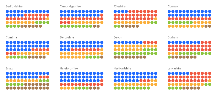
When I first encountered dot-only line charts, I was struck by their elegant simplicity. Unlike traditional line charts that connect every data point with continuous lines, dot-only charts strategically display individual data points as isolated markers. This approach fundamentally changes how we perceive and interpret data patterns.

The key distinction lies in the visual emphasis. While traditional line charts guide our eyes along a continuous path, dot-only charts force us to consider each data point individually. This makes them particularly powerful for:
- Sparse datasets where connecting lines might imply false continuity
- Irregular time intervals that don't follow consistent patterns
- Missing data scenarios where gaps need clear visual representation
- Highlighting individual measurements rather than trends
Pro Tip: I've found that PageOn.ai's AI Blocks feature excels at instantly structuring dot chart concepts from verbal descriptions. Simply describe your data characteristics, and the platform generates appropriate visualization templates that you can customize further.
Interactive Dot Chart Example
Hover over the dots to see individual data values without connecting lines:
Technical Implementation Across Platforms
Through my experience implementing dot-only charts across various platforms, I've discovered that each tool offers unique approaches and challenges. Let me share the most effective techniques I've developed for the major visualization platforms.
Tableau Approach: The Dual-Axis Method
In Tableau, creating dot-only charts requires a clever dual-axis technique that I've refined over numerous projects. The process involves layering two visualizations to achieve the desired effect.
Tableau Implementation Flow
flowchart TD
                        A[Start with Line Chart] --> B[Drag Measure to Rows]
                        B --> C[Create Dual Axis]
                        C --> D[Change Mark Type to Circle]
                        D --> E[Synchronize Axes]
                        E --> F[Hide Line Marks]
                        F --> G[Customize Dot Properties]
                        G --> H[Add Direct Labels]

                        style A fill:#FF8000,stroke:#333,stroke-width:2px,color:#fff
                        style G fill:#42A5F5,stroke:#333,stroke-width:2px,color:#fff
                        style H fill:#66BB6A,stroke:#333,stroke-width:2px,color:#fff
Step-by-Step Tableau Instructions:
- Create your initial line chart with continuous date on columns
- Drag the same measure to rows again to create a second axis
- Right-click the second axis and select "Dual Axis"
- Change the mark type of the second measure to "Circle"
- Right-click the axis and select "Synchronize Axis"
- Remove the line by setting its opacity to 0% or changing to "None"
- Adjust circle size, color, and add labels as needed
Chart.js and Web-Based Solutions
For web implementations, I've found Chart.js to be incredibly flexible. The key is understanding the showLine: false property, which I discovered after troubleshooting numerous rendering issues.
const config = {
    type: 'line',
    data: {
        labels: ['Jan', 'Feb', 'Mar', 'Apr', 'May'],
        datasets: [{
            label: 'Data Points',
            data: [65, 72, null, 68, 75],
            showLine: false,  // Critical property for dots only
            spanGaps: false,  // Prevents connecting across gaps
            pointRadius: 8,
            pointHoverRadius: 10,
            backgroundColor: '#FF8000'
        }]
    },
    options: {
        responsive: true,
        maintainAspectRatio: false
    }
};
I've learned that the spanGaps property is crucial when dealing with missing data. Setting it to false ensures that dots remain isolated even when data points are missing.
Technical Note: When transforming complex code implementations into visual documentation, I use PageOn.ai's Vibe Creation feature to generate flowcharts that clearly illustrate the logic flow, making technical concepts accessible to broader audiences.
Excel and Traditional Spreadsheet Methods

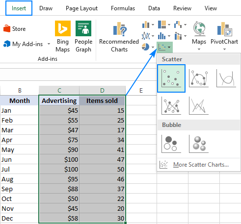
In Excel, I achieve dot-only charts by leveraging scatter plots with specific formatting. The process involves:
- Selecting your data and inserting a scatter plot
- Right-clicking the series and selecting "Format Data Series"
- Under "Line," choosing "No line"
- Under "Marker Options," customizing size, fill, and border
- Adding data labels for key points using the "Add Data Labels" option
Design Principles for Effective Dot Charts
Over years of creating data visualizations, I've developed a set of design principles specifically for dot charts that ensure clarity and impact. These principles guide every decision from color selection to label placement.
Visual Hierarchy Through Dot Styling
Data Density Guidelines
- • Maximum 5-7 series for clarity
- • Use color grouping for related series
- • Apply transparency for overlapping points
- • Consider small multiples for complex data
Direct Labeling Strategies
- • Label only critical data points
- • Position labels to avoid overlap
- • Use leader lines for clarity
- • Match label colors to dot colors
I've discovered that the most effective dot charts use a combination of size, color, and opacity to create visual hierarchy. Primary data points should command attention through larger size and saturated colors, while contextual information can be represented with smaller, more transparent dots.
Design Innovation: PageOn.ai's Agentic capabilities have revolutionized my design process. I can describe my data characteristics and desired emphasis, and the platform automatically generates multiple design variations, each optimized for different aspects of the data story.
Advanced Visualization Strategies
Handling Missing or Irregular Data
One of the most challenging aspects I face when creating dot charts is effectively communicating data gaps and irregularities. Through extensive experimentation, I've developed three primary approaches that each serve different analytical needs.
Missing Data Visualization Strategies
flowchart LR
                        A[Missing Data] --> B{Analysis Need}
                        B --> C[Emphasize Gaps]
                        B --> D[Show Uncertainty]
                        B --> E[Maintain Flow]

                        C --> F[Leave Empty Space]
                        D --> G[Dotted Connections]
                        E --> H[Interpolated Values]

                        F --> I[Best for: Quality Control]
                        G --> J[Best for: Predictions]
                        H --> K[Best for: Trends]

                        style A fill:#FF8000,stroke:#333,stroke-width:2px,color:#fff
                        style B fill:#42A5F5,stroke:#333,stroke-width:2px,color:#fff
                        style I fill:#66BB6A,stroke:#333,stroke-width:2px,color:#fff
                        style J fill:#66BB6A,stroke:#333,stroke-width:2px,color:#fff
                        style K fill:#66BB6A,stroke:#333,stroke-width:2px,color:#fff

Three Approaches to Missing Data:
1. Gaps in Visualization
I leave empty spaces where data is missing, making gaps immediately apparent. This approach works best for quality control scenarios where missing measurements indicate potential issues.
2. Dotted Line Connections
I use dotted or dashed lines to connect dots across gaps, signaling uncertainty while maintaining visual continuity. This method excels when showing projected or estimated values.
3. Isolated Dots
I display only the actual data points as isolated dots, making no assumptions about missing values. This pure approach ensures complete data integrity.
Combining Dots with Other Chart Elements
I've found tremendous value in creating hybrid visualizations that combine dots with other chart elements. This approach allows me to layer multiple dimensions of information without overwhelming the viewer.
Hybrid Visualization: Dots + Area Chart
Interactive Prototyping: I use PageOn.ai's drag-and-drop AI Blocks to rapidly test different missing data representations. This interactive approach lets me see how various strategies affect the overall narrative before committing to a final design.
Real-World Applications and Case Studies
Throughout my career, I've implemented dot-only charts across diverse industries and use cases. Each application has taught me valuable lessons about when and how to leverage this visualization technique for maximum impact.
📈 Financial Markets
Use Case: Stock price gaps during non-trading hours
I use dots to show opening and closing prices without implying continuous trading. This accurately represents market reality where prices can gap significantly between sessions.
🔬 Scientific Research
Use Case: Experimental observations with confidence intervals
Dots represent individual measurements while error bars show uncertainty. This combination clearly communicates both the data and its reliability.
🏭 Manufacturing QC
Use Case: Individual product measurements
Each dot represents a quality measurement, with color coding for pass/fail status. Patterns in dot clustering reveal process variations.
📊 Business KPIs
Use Case: Monthly performance metrics
Dots highlight actual achievements against targets, making it easy to spot when goals are met or missed without overemphasizing trends.

Case Study: Sensor Network Monitoring
In a recent IoT project, I faced the challenge of visualizing sensor readings that arrived at irregular intervals. Traditional line charts created misleading interpolations between readings that could be hours apart.
Solution Implementation:
- Used dots sized by data confidence (larger = more reliable)
- Color-coded by sensor status (green = normal, yellow = warning, red = alert)
- Added hover tooltips showing exact timestamps and values
- Implemented zoom controls for detailed time period analysis
The result was a clear visualization that accurately represented data availability and quality without creating false impressions of continuity. Operators could immediately identify sensor issues and data gaps while still understanding overall system performance.
Narrative Enhancement: I leverage PageOn.ai's Plan-Search-Act process to transform raw sensor data descriptions into polished visual narratives. The platform helps me identify the most compelling story angles and automatically generates supporting visualizations that reinforce key insights.
Optimization for Different Audiences
I've learned that the same data requires dramatically different presentation approaches depending on the audience. My dot chart designs adapt to meet the specific needs and expectations of technical teams versus executive stakeholders.
Technical Documentation Approach
// Sample implementation with detailed comments
// Initialize chart with technical specifications
const technicalChart = new Chart(ctx, {
    type: 'scatter',
    data: {
        datasets: [{
            label: 'Sensor Readings (±0.5% accuracy)',
            data: measurements.map(m => ({
                x: m.timestamp,
                y: m.value,
                // Store metadata for technical analysis
                metadata: {
                    sensorId: m.sensor,
                    calibration: m.cal_date,
                    uncertainty: m.error_margin
                }
            })),
            pointRadius: 4,
            pointHoverRadius: 6
        }]
    },
    options: {
        plugins: {
            tooltip: {
                callbacks: {
                    // Display technical details on hover
                    afterLabel: (context) => {
                        const meta = context.raw.metadata;
                        return [
                            `Sensor: ${meta.sensorId}`,
                            `Uncertainty: ±${meta.uncertainty}`,
                            `Last Cal: ${meta.calibration}`
                        ];
                    }
                }
            }
        }
    }
});
For technical audiences, I include comprehensive implementation details, code snippets, and reproducible examples. My documentation covers edge cases, performance considerations, and integration patterns that developers need.
Executive Presentation Approach

Simplification Strategies
- • Focus on key metrics only
- • Use intuitive color coding
- • Minimize technical jargon
- • Emphasize business impact
Storytelling Elements
- • Progressive reveal animations
- • Narrative annotations
- • Comparative benchmarks
- • Clear action items
For executives, I strip away technical complexity and focus on business implications. The dots become decision points, each representing an opportunity or challenge that requires strategic attention.
Documentation Revolution: PageOn.ai transforms my technical specifications into clear, visual tutorials automatically. I input complex requirements, and the platform generates step-by-step guides with annotated screenshots and interactive examples that both technical and non-technical audiences can understand.
Best Practices and Common Pitfalls
Through countless projects and iterations, I've identified critical best practices that ensure dot charts communicate effectively while avoiding common visualization pitfalls that can mislead or confuse viewers.
Dot Chart Design Evaluation Matrix
Avoiding Overplotting
One of the most common issues I encounter is overplotting - when too many dots overlap, obscuring patterns and making individual points indistinguishable. My strategies for managing dense datasets include:
- Transparency adjustment: I apply alpha values between 0.3-0.7 to reveal overlapping points
- Jittering: I add small random offsets to separate coincident points
- Binning: I aggregate dense regions into summary statistics
- Sampling: I display a representative subset for initial view, with details on demand
- Small multiples: I split data across multiple panels to reduce density per chart
Scale Considerations
Unlike bar charts that must start at zero, dot charts offer more flexibility in scale selection. I've developed these guidelines for optimal scale decisions:
❌ Common Mistakes
- • Forcing zero baseline when it adds no value
- • Inconsistent scales across related charts
- • Excessive axis range hiding important variations
- • No indication when axis doesn't start at zero
✅ Best Practices
- • Zoom to data range for trend visibility
- • Clearly mark axis breaks or non-zero starts
- • Maintain consistent scales for comparisons
- • Include reference lines for context
Color Accessibility

I always design with colorblind users in mind, ensuring my dot charts remain interpretable regardless of color perception. My approach includes:
- Using colorblind-safe palettes (I test with simulation tools)
- Incorporating shape variations for critical distinctions
- Adding texture or pattern fills when appropriate
- Ensuring sufficient contrast ratios (minimum 3:1 for large dots)
- Providing alternative encoding through size or position
Mobile Responsiveness
With increasing mobile consumption, I ensure my dot charts adapt gracefully to smaller screens:
Responsive Design Checklist:
- Increase minimum dot size to 44px touch targets on mobile
- Implement pan and zoom controls for detailed exploration
- Rotate axis labels to prevent overlap on narrow screens
- Prioritize essential data points, hiding secondary information
- Convert hover interactions to tap interactions on touch devices
Style Guide Creation: I use PageOn.ai's structured content blocks to create comprehensive style guides that document all these best practices. The platform helps me organize guidelines, generate visual examples, and maintain consistency across all my visualization projects.
Tools and Resources Comparison
After extensive experience with various visualization platforms, I've developed a comprehensive understanding of each tool's strengths and limitations for creating dot-only charts. Let me share my comparative analysis to help you choose the right tool for your needs.
| Tool | Ease of Use | Customization | Performance | Best For |
|---|---|---|---|---|
| Tableau | ⭐⭐⭐⭐ | ⭐⭐⭐⭐⭐ | ⭐⭐⭐⭐ | Business analytics, interactive dashboards |
| Power BI | ⭐⭐⭐⭐ | ⭐⭐⭐ | ⭐⭐⭐⭐ | Microsoft ecosystem integration |
| Chart.js | ⭐⭐⭐ | ⭐⭐⭐⭐⭐ | ⭐⭐⭐⭐⭐ | Web applications, custom implementations |
| D3.js | ⭐⭐ | ⭐⭐⭐⭐⭐ | ⭐⭐⭐⭐⭐ | Complex, unique visualizations |
| Excel | ⭐⭐⭐⭐⭐ | ⭐⭐ | ⭐⭐⭐ | Quick analysis, familiar interface |
| Plotly | ⭐⭐⭐ | ⭐⭐⭐⭐ | ⭐⭐⭐⭐ | Scientific computing, Python integration |
Open-Source Libraries for Advanced Features
I've compiled a list of specialized libraries that excel at specific aspects of dot chart creation:
📊 Visualization Libraries
- Apache ECharts: Excellent for large datasets
- Vega-Lite: Declarative grammar approach
- Recharts: React-friendly with good defaults
- Victory: Modular and composable components
🎨 Design Tools
- RAWGraphs: Visual interface for custom charts
- Datawrapper: Publication-ready charts
- Flourish: Animated and interactive stories
- Observable: Notebook-based exploration
Integration with Broader Visualization Strategies
Dot charts work best as part of a comprehensive visualization strategy. I often combine them with other chart types to create rich, multi-layered data stories. For exploring how dot charts complement line graphs to visualize trends, I've found that alternating between continuous lines and discrete dots can effectively highlight both patterns and anomalies.
When selecting the optimal visualization approach, I always consider the broader context of data visualization charts available. Each chart type serves a specific purpose, and understanding these distinctions ensures I choose the most effective representation for my data story.

My Tool Selection Framework
- Define the audience: Technical vs. executive vs. public
- Assess data characteristics: Volume, update frequency, complexity
- Determine interactivity needs: Static vs. explorable vs. real-time
- Consider deployment context: Web, mobile, print, presentation
- Evaluate team expertise: Available skills and learning curve
For those working with spreadsheet tools, understanding foundational concepts like creating a bar chart in Excel provides valuable context for more advanced dot chart implementations. The principles of data organization and formatting transfer directly to dot chart creation.
Transform Your Visual Expressions with PageOn.ai
Ready to revolutionize how you create and share dot charts and data visualizations? PageOn.ai's intelligent platform transforms complex data into stunning visual stories with unprecedented ease. From automatic chart generation to smart design suggestions, experience the future of data visualization today.
Start Creating with PageOn.ai TodayElevating Your Data Storytelling Journey
Throughout this comprehensive guide, I've shared my journey of mastering dot-only line charts—from understanding their fundamental purpose to implementing advanced visualization strategies across multiple platforms. These discrete data representations have proven invaluable in my work, offering clarity where continuous lines would mislead and precision where trends would obscure individual insights.
The power of dot charts lies not just in what they show, but in what they deliberately don't show. By removing the connecting lines, we force ourselves and our audiences to consider each data point on its merit, to recognize gaps and irregularities, and to draw more thoughtful conclusions about patterns and relationships.
As I continue to explore new visualization techniques, I'm constantly amazed by how tools like PageOn.ai are democratizing advanced data visualization. What once required hours of coding and design work can now be accomplished through intelligent automation and AI-assisted creation. Whether you're building technical documentation with complex implementation details or crafting executive presentations that drive strategic decisions, the ability to rapidly prototype and iterate on dot chart designs has become a game-changer.
For those interested in expanding their visualization toolkit beyond dot charts, exploring horizontal bar charts offers another powerful way to display categorical comparisons, while understanding how to create an org chart in Microsoft Word demonstrates the versatility of visualization tools across different contexts.
"The best visualizations aren't just about displaying data—they're about revealing insights that inspire action. Dot charts, in their elegant simplicity, remind us that sometimes less truly is more."
I encourage you to experiment with dot-only charts in your next project. Start simple, focus on clarity, and remember that every dot tells a story. With the right tools and techniques, you can transform scattered data points into compelling visual narratives that drive understanding and decision-making.
You Might Also Like
The Power of Three: Designing Intuitive User Experiences That Convert
Discover why three-step processes create perfect user experiences. Learn the psychological principles, implementation strategies, and future trends of the rule of three in UX design.
Optimizing Websites for AI Agent Interaction: The Ultimate Guide
Learn how to prepare your website for AI agents and assistants. Discover technical foundations, content optimization strategies, and task completion enhancements for the AI revolution.
Transform Your Google Slides: Advanced Techniques for Polished Presentations
Master advanced Google Slides techniques for professional presentations. Learn design fundamentals, visual enhancements, Slide Master, and interactive elements to create stunning slides.
Advanced Image Masking Techniques for Creative Slide Design | PageOn.ai
Discover advanced image masking techniques to transform ordinary presentation slides into visual masterpieces. Learn creative approaches for PowerPoint, Google Slides, and Keynote.