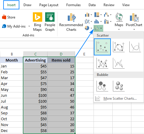
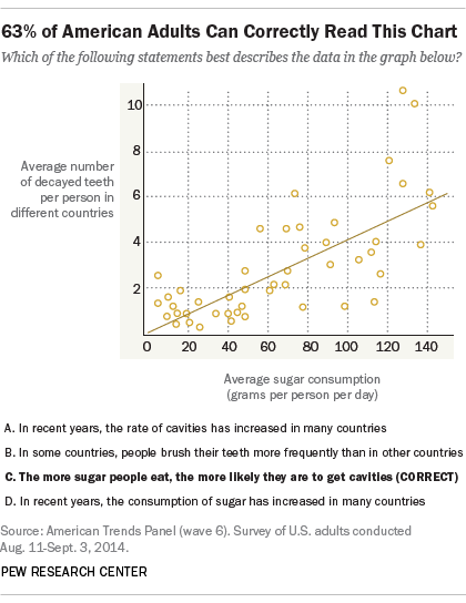
Scatter Plots Disguised as Line Charts: Creating Point-Based Visualizations Without Connected Lines
Understanding the Visual Paradox
I've discovered that one of the most common visualization challenges isn't about adding features—it's about removing them. When we need to display discrete data points without implying continuity, the traditional line chart becomes our enemy. Let me share how to transform your line charts into elegant point-based visualizations across different platforms.
Understanding the Visual Paradox
I've spent countless hours helping teams visualize their data, and one request keeps coming up: "Can we have a line chart without the line?" At first, this sounds contradictory, but it reveals a fundamental need in data visualization—sometimes we want the structure and familiarity of a line chart's layout without implying continuity between our data points.
The use cases are surprisingly common. When I'm displaying quarterly performance metrics, connecting the dots with a line might suggest a smooth transition that doesn't exist. Scientific measurements taken at irregular intervals, customer satisfaction scores across different touchpoints, or outlier detection in quality control—all these scenarios benefit from floating points rather than connected lines.
Traditional Line Chart vs. Point-Only Visualization
The challenge becomes even more complex when we consider the variety of platforms we work with. Excel users have one approach, Power BI requires different techniques, and web-based visualization tools each have their own quirks. I've watched talented analysts waste hours navigating through formatting menus, trying workarounds like setting line colors to white (which fails when overlapping with other elements) or hunting for that elusive "Show Markers Only" option that seems to move with every software update.
This relates to a broader principle in data visualization charts: our tools should adapt to our communication needs, not force us into predetermined patterns. When we need to emphasize individual data points rather than trends, the visualization should make that intention clear.
Traditional Software Solutions and Their Limitations
Excel's Marker-Only Approach
I remember my first attempt to create a point-only chart in Excel. The process seemed straightforward: create a line chart, then remove the line. But Excel doesn't make this obvious. Here's what I've learned through trial and error:
Excel Step-by-Step Process:
- Create your standard line chart with your data
- Right-click on the line and select "Format Data Series"
- Navigate to the Line section and set "No line"
- Switch to Marker Options and customize your point appearance
- Ensure your X-axis is set to "Categorical" if points aren't showing
The white line workaround that many suggest—setting the line color to match your background—creates more problems than it solves. I've seen presentations where these "invisible" white lines suddenly become visible when overlapping with colored columns or when the background changes. It's a band-aid solution that doesn't address the real need.

Power BI's Stroke Width Technique
Power BI users have discovered a more elegant solution, though it's still not intuitive. The key is understanding that Power BI treats the line and markers as separate elements:
Power BI Configuration:
- Critical: Set your X-axis to "Categorical" not "Continuous"
- Navigate to Format → Shapes → Stroke Width
- Set Stroke Width to 0 (zero)
- Adjust marker size and style as needed
- Watch out for NaN values that can break the entire visualization
I've encountered numerous cases where users couldn't find the "Show Marker" option because it only appears when the axis type is set correctly. This dependency isn't documented clearly, leading to frustration and wasted time. The evolution of these features across Power BI versions means that solutions from older forum posts might not work in your current version.
Platform Feature Availability Timeline
flowchart LR
                        A[Excel 2016] --> B[Basic Markers]
                        B --> C[Excel 2019]
                        C --> D[Improved Options]

                        E[Power BI 2018] --> F[Limited Control]
                        F --> G[Power BI 2020]
                        G --> H[Stroke Width = 0]

                        I[Tableau] --> J[Always Had It]

                        style A fill:#f9f9f9
                        style E fill:#f9f9f9
                        style I fill:#90EE90
Reimagining the Solution with AI-Powered Visual Design
Beyond Manual Formatting Struggles
I've calculated that the average user spends 15-20 minutes just trying to figure out how to remove lines from their charts. That's time that could be spent analyzing the data or crafting insights. Traditional tools force us into complex menu hierarchies where the terminology doesn't match our intent. We think "dots without lines" but the software wants us to understand "stroke width," "marker options," and "categorical axes."
This disconnect between user intent and software logic represents a fundamental problem in data visualization tools. We're forced to learn the software's language instead of the software understanding ours.
Natural Language to Visual Reality
Imagine if I could simply describe what I want: "Show quarterly sales as floating dots without connecting lines." With PageOn.ai's Vibe Creation feature, this natural language request becomes reality. The AI interprets my intent and generates the appropriate scatter plot visualization automatically, bypassing the need to understand stroke widths, marker settings, or categorical axes.
Examples of Natural Language Requests:
- "Display customer satisfaction scores as individual points, color-coded by region"
- "Show monthly revenue as dots, bigger dots for higher values"
- "Create a scatter plot of test results without any connecting lines"
- "Plot sensor readings as discrete points with timestamps"

The AI doesn't just remove lines—it understands the context of your data and suggests optimal point sizes, colors, and layouts. If you're showing outliers, it might automatically increase the contrast. For time-series data with irregular intervals, it adjusts the axis scaling appropriately. This intelligent assistance transforms visualization from a technical challenge into a creative process.
Building Complex Point-Based Visualizations
Combining Multiple Data Series
One of my most challenging projects involved combining horizontal bar charts with floating point markers to show both baseline performance and exceptional cases. Traditional tools make this incredibly difficult—you're essentially trying to merge two different chart types with different scaling requirements.
Hybrid Visualization: Bars with Point Overlays
Using PageOn.ai's AI Blocks, I can layer different visualization types seamlessly. The system understands that I want bars for one dataset and floating points for another, automatically handling the scaling and positioning. It's like having a visualization expert who instantly translates my intent into the perfect chart configuration.
Advanced Scatter Plot Variations
Beyond simple dots, point-based visualizations can convey multiple dimensions of data simultaneously:
Bubble Charts
Vary point sizes to represent a third dimension—revenue, importance, or frequency. PageOn.ai automatically scales bubbles proportionally while maintaining visual balance.
Color-Coded Clouds
Use color gradients to show categories, time progression, or performance levels. The AI suggests color schemes that are both aesthetically pleasing and accessible.
Time-Series Dots
Display periodic measurements without implying continuity. Perfect for monthly reports, quarterly reviews, or irregular sampling intervals.
Multi-Dimensional Points
Combine shape, size, and color to represent multiple variables in a single point. PageOn.ai's modular block system makes this complexity manageable.
Data Integration and Dynamic Updates
Pulling in Real-Time Data Points
Traditional visualization tools require manual data entry and chart updates—a process I've seen consume entire mornings when dealing with multiple data sources. Every new data point means reopening the file, updating the range, and hoping the formatting doesn't break.
With PageOn.ai's Deep Search capability, I can automatically find and integrate relevant data from multiple sources. The system maintains visual consistency while the underlying data changes, ensuring that my point-based visualizations always reflect the most current information.
Data Flow Architecture
flowchart TD
                        A[Data Sources] --> B[PageOn.ai Deep Search]
                        B --> C[Data Processing]
                        C --> D[Point Generation]
                        D --> E[Visual Update]
                        E --> F[Interactive Display]

                        G[Manual Entry] --> H[Excel/PowerBI]
                        H --> I[Format Settings]
                        I --> J[Static Output]

                        style A fill:#FFE5B4
                        style B fill:#FF8000
                        style C fill:#FF8000
                        style D fill:#FF8000
                        style E fill:#FF8000
                        style F fill:#90EE90
                        style G fill:#FFB6C1
                        style J fill:#FFB6C1
Creating Interactive Point Visualizations
Static points tell only part of the story. I've found that adding interactivity transforms point-based visualizations from simple charts into powerful analytical tools. Here's what becomes possible:
- Hover effects revealing detailed metrics for each point
- Click-through functionality to drill down into underlying data
- Dynamic filtering to show/hide specific point categories
- Time-based animations showing how points change over periods
PageOn.ai's Agentic capabilities go further by suggesting optimal interactivity based on your data type. For time-series points, it might recommend a playback feature. For categorical data, it could suggest filter buttons. The AI understands not just how to display points, but how users will want to explore them.
Best Practices for Point-Based Data Visualization
When to Choose Points Over Lines
Through years of creating visualizations, I've developed clear criteria for when points work better than lines. Understanding these principles helps you make informed decisions about your data presentation:
Choose Points When You Have:
✓ Discrete Measurements
Individual test results, survey responses, or periodic samples
✓ Non-Continuous Data
Quarterly reports, annual reviews, or irregular intervals
✓ Multiple Unrelated Series
Comparing different products, regions, or categories
✓ Outlier Emphasis
Quality control data, anomaly detection, or exceptional cases
Design Principles for Clarity
The effectiveness of point-based visualizations depends heavily on design choices. I've learned that line graphs ideas can often be adapted to point-based displays with better results.
Optimal Point Design by Data Density
PageOn.ai's AI automatically adjusts these parameters based on your data characteristics. It analyzes point density, value ranges, and categorical divisions to suggest optimal design choices. This eliminates the guesswork and ensures your visualizations are both beautiful and functional.

Practical Applications and Case Studies
Business Analytics Scenarios
In my consulting work, I've implemented point-based visualizations across diverse business contexts. Each scenario demonstrates why removing the line often clarifies rather than simplifies the message:
Quarterly Performance Indicators
Individual quarters stand alone—Q4 success doesn't guarantee Q1 performance. Points emphasize this independence while lines would falsely suggest momentum.
Customer Satisfaction Touchpoints
Each interaction (purchase, support, renewal) is discrete. Connecting them with lines implies a journey that may not reflect the actual customer experience.
Project Milestone Completions
Milestones are binary—complete or not. Points show achievement dates without implying progress between them.
With PageOn.ai's conversational interface, I can describe these scenarios in plain language and receive appropriately formatted visualizations. For instance, saying "Show customer satisfaction scores at purchase, first support contact, and renewal as separate points color-coded by outcome" produces exactly what I need without manual configuration.
Scientific and Research Applications
Research data often demands point-based visualization due to its discrete nature. I've worked with laboratories where connecting experimental data points would be scientifically misleading:
Research Visualization Needs:
- Experimental Measurements: Each test is independent; conditions may vary between points
- Outlier Detection: Anomalies need to stand out, not be smoothed by connecting lines
- Multi-Dimensional Data: Using point size, color, and shape to represent multiple variables simultaneously
- Confidence Intervals: Error bars on individual points without line-based assumptions

PageOn.ai's AI-powered structuring transforms complex research data into clear visual narratives. It understands scientific conventions and automatically applies appropriate statistical representations, making it invaluable for researchers who need to focus on analysis rather than formatting.
Future-Proofing Your Visualization Workflow
Moving Beyond Software-Specific Solutions
I've watched too many teams struggle when upgrading software versions or switching platforms. The stroke width trick that works in Power BI 2020 might not work in 2025. The Excel workaround you mastered becomes obsolete with the next update. This platform lock-in and version dependency creates a fragile visualization workflow.
The problem extends beyond just technical compatibility. When we learn software-specific solutions, we're not building transferable visualization skills. We're memorizing menu locations and button sequences that have no value outside that specific context. Learning how to create a bar chart in Excel doesn't help when you need to create the same visualization in Tableau or D3.js.
Evolution of Visualization Approaches
flowchart LR
                        A[Manual Formatting] --> B[Menu Navigation]
                        B --> C[Version-Specific Tricks]
                        C --> D[Platform Lock-in]

                        E[Natural Language] --> F[Intent Description]
                        F --> G[AI Interpretation]
                        G --> H[Universal Output]

                        D --> I[Fragile Workflow]
                        H --> J[Resilient System]

                        style A fill:#FFB6C1
                        style B fill:#FFB6C1
                        style C fill:#FFB6C1
                        style D fill:#FFB6C1
                        style I fill:#FF6B6B

                        style E fill:#90EE90
                        style F fill:#90EE90
                        style G fill:#90EE90
                        style H fill:#90EE90
                        style J fill:#4CAF50
Embracing Conversational Design
The future of data visualization isn't about memorizing more menu options—it's about expressing what we want to communicate. I've shifted from asking "How do I remove lines in Power BI?" to simply stating "Show these quarterly results as individual points."
This conversational approach with PageOn.ai fundamentally changes how I work. Instead of spending time formatting, I focus on what insights I want to highlight. The AI handles the technical implementation while I concentrate on the story my data tells. When I need to adjust the visualization, I describe the change rather than hunting through menus.
Building Your Visualization Library:
With PageOn.ai, I've created a library of reusable point-based visualization templates through simple descriptions:
- "Performance metrics as sized dots" → Instantly applicable to any metric dataset
- "Time-stamped events as colored points" → Reusable for any event tracking
- "Comparison scatter without connections" → Template for any comparative analysis
- "Outlier highlighting with emphasis points" → Ready for any anomaly detection
These templates aren't tied to any specific software version or platform. They represent visualization concepts that transcend tools. As AI-powered visualization evolves, these conceptual templates become more powerful, not obsolete.

The shift to conversational design isn't just about convenience—it's about democratizing data visualization. Team members who aren't "technical" can create sophisticated point-based visualizations by describing their needs. This breaks down the barrier between having data insights and being able to communicate them effectively.
Transform Your Visual Expressions with PageOn.ai
Stop wrestling with menu options and start creating. Whether you need scatter plots without lines, complex hybrid visualizations, or intelligent data presentations, PageOn.ai understands your intent and delivers professional results instantly. Join thousands who've discovered that great visualization isn't about knowing software—it's about communicating insights clearly.
Start Creating with PageOn.ai TodayYou Might Also Like
Strategic Contrast in E-Learning: Creating Visual Impact That Enhances Learning Outcomes
Discover how to leverage strategic contrast in e-learning design to reduce cognitive load, improve retention, and create visually impactful learning experiences that drive better outcomes.
Understanding Native Multimodality: The Key to Truly Intelligent AI Systems
Explore how native multimodality powers modern AI understanding by integrating text, visual, audio, and interactive elements to create more intuitive and powerful artificial intelligence systems.
Healing from Workplace Trauma While Planning Your Career Exit | Recovery Strategies
Discover effective strategies for healing from workplace trauma while planning your career exit. Learn to rebuild confidence, create support systems, and chart a path to psychological safety.
Tracking Presentation Engagement: Transform Your Impact With Built-in Analytics
Discover how built-in analytics transforms presentation engagement. Learn to track audience behavior, implement data-driven strategies, and maximize your presentation impact.