Transform Your Data into Visual Stories: The Complete Guide to PowerPoint Pie Charts
Master the art of creating compelling pie charts that captivate audiences and communicate data with clarity
Why Pie Charts Matter in Modern Presentations
In my years of creating presentations, I've discovered that pie charts possess a unique power to transform abstract percentages into instantly comprehensible visual stories. When I present quarterly sales distributions or budget allocations, a well-crafted pie chart can communicate what paragraphs of text cannot—the immediate, visceral understanding of proportional relationships.
The Psychology Behind Visual Data
Our brains process visual information 60,000 times faster than text. When I leverage this cognitive preference through pie charts, I'm not just presenting data—I'm creating an immediate emotional connection with the information. This psychological advantage makes pie charts indispensable for scenarios where quick comprehension and retention are crucial.
When Pie Charts Excel
- • Showing market share distributions
- • Illustrating budget allocations
- • Displaying survey response percentages
- • Visualizing time distribution
Common Pitfalls to Avoid
- ✗ Using for non-compositional data
- ✗ Including too many slices (>6)
- ✗ Applying misleading 3D effects
- ✗ Ignoring accessibility needs
Building Your Foundation: Creating Basic Pie Charts
When I first started creating pie charts in PowerPoint, I was amazed by the multiple entry points available. Let me walk you through the fundamental approaches that have become second nature in my workflow.
Pie Chart Creation Workflow
flowchart TD
                        A[Start PowerPoint] --> B{Choose Method}
                        B --> C[Insert Tab Method]
                        B --> D[Content Layout Method]
                        B --> E[SmartArt Alternative]
                        C --> F["Insert > Chart > Pie"]
                        D --> G["Select Title & Content Layout"]
                        E --> H["Insert > SmartArt > Cycle"]
                        F --> I[Enter Data in Spreadsheet]
                        G --> I
                        H --> J[Quick Visual Only]
                        I --> K[Customize Chart]
                        J --> K
                        K --> L[Final Pie Chart]
Step-by-Step: Your First Pie Chart
-
1
Access Chart Tools: Navigate to Insert > Chart > Pie
-
2
Select Style: Choose from 2D, 3D, or specialized pie formats
-
3
Enter Data: Use the embedded Excel-like spreadsheet
-
4
Customize: Apply colors, labels, and formatting
Pro Tip: Excel Integration
I've found that maintaining a master Excel file with all my presentation data saves countless hours. When I need to convert Excel to PowerPoint, I simply copy the relevant data range and paste it directly into PowerPoint's chart data window. This workflow ensures consistency across all my visualizations while maintaining a single source of truth for the data.
Advanced Customization: Making Your Pie Charts Stand Out
The difference between a basic pie chart and a professional visualization lies in the details. Through years of refinement, I've developed techniques that transform generic charts into branded, impactful visual stories.
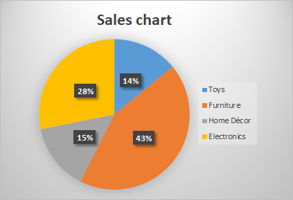
Market Share Distribution Example
Visual Enhancement Techniques
- • Apply gradient fills for depth
- • Use exploded slices strategically
- • Implement shadow effects subtly
- • Match brand color palettes
- • Add texture patterns for print
Data Label Best Practices
- • Show percentages, not just values
- • Position labels for readability
- • Use leader lines for small slices
- • Apply contrasting text colors
- • Include category names when needed
When working with complex shapes and custom designs, I often need to merge shapes in PowerPoint to create unique visual elements that complement my pie charts. This technique is particularly useful when creating custom legends or decorative elements.
Specialized Chart Types: Beyond the Basic Pie
PowerPoint offers several specialized pie chart variations that I've found invaluable for specific data scenarios. Let me share when and how to use these advanced chart types effectively.
| Chart Type | Best Use Case | Key Advantage |
|---|---|---|
| Pie of Pie | Datasets with minor subcategories | Maintains detail visibility |
| Bar of Pie | Highlighting small segments | Better comparison of small values |
| Doughnut | Modern, minimalist presentations | Center space for key metrics |
| 3D Pie | Executive presentations | Visual impact (use sparingly) |
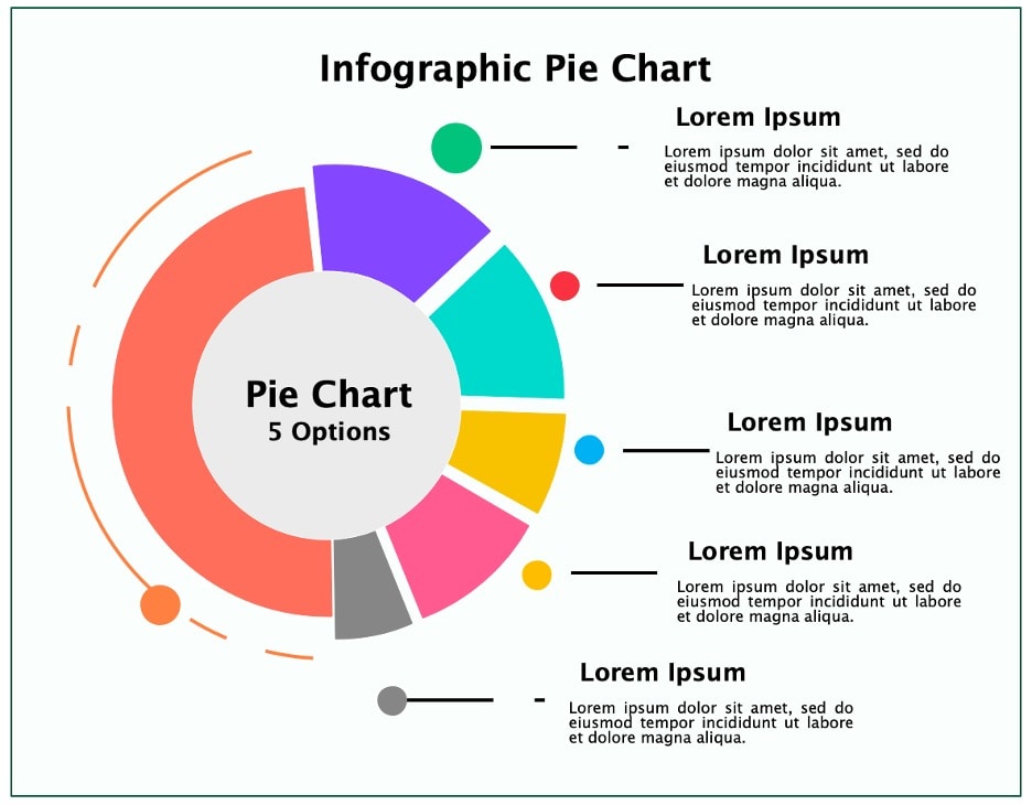
Doughnut Charts: A Modern Alternative
I've increasingly turned to doughnut charts for their clean, contemporary aesthetic. The center space provides a perfect location for displaying the total value or a key performance indicator. When comparing pie vs donut charts, I consider the audience and the need for additional context within the visualization.
Integration with PageOn.ai: Elevating Your Chart Creation Workflow
While PowerPoint provides robust chart creation tools, I've discovered that integrating AI-powered platforms like PageOn.ai dramatically accelerates my workflow. The ability to transform fuzzy thoughts into clear visuals has revolutionized how I approach data presentation.
AI-Enhanced Chart Creation Process
flowchart LR
                        A[Raw Data] --> B[PageOn.ai Input]
                        B --> C[Vibe Creation]
                        C --> D[AI Processing]
                        D --> E[Chart Generation]
                        E --> F[Refinement]
                        F --> G[Export to PPT]
                        G --> H[Final Presentation]
PageOn.ai Advantages
- ✓ Conversational data input through Vibe Creation
- ✓ Automatic chart type recommendations
- ✓ AI Blocks for complex visualizations
- ✓ Deep Search for benchmark data
- ✓ Seamless PowerPoint export
My Workflow Tips
When I use AI pie chart generators, I start by describing my data story conversationally. For example: "Show quarterly sales distribution with emphasis on Q4 growth." PageOn.ai interprets this and generates multiple visualization options, saving me hours of manual chart creation.
Real-World Example
Recently, I needed to create a complex presentation showing market segmentation across five regions with subcategories for each. Using PageOn.ai's Agentic processes, I described my requirements in plain language. The AI generated a comprehensive set of pie charts with consistent styling, proper labeling, and even suggested complementary visualizations. What would have taken me hours was completed in minutes, allowing me to focus on crafting the narrative around the data.
Accessibility and Best Practices
Creating accessible pie charts isn't just about compliance—it's about ensuring everyone in my audience can understand and engage with the data I'm presenting. These practices have become non-negotiable in my workflow.
Accessibility Checklist
Common Mistakes
- • Relying solely on color coding
- • Using too many slices (>6)
- • Applying distorting 3D effects
- • Omitting data labels
- • Ignoring logical slice ordering
Best Practices
- • Limit to 5-6 slices maximum
- • Order largest to smallest
- • Use consistent color schemes
- • Include percentage values
- • Provide context in titles

Animation and Presentation Techniques
Strategic animation transforms static charts into engaging narrative tools. I've learned that the key isn't just making things move—it's controlling information flow to support my story.
Animation Sequence Timeline
Advanced Animation Strategy
For complex presentations, I convert charts to SVG objects for granular control. This technique, similar to how I create circular arrows in PowerPoint, allows me to animate individual chart elements independently. The result? Presentations that feel more like interactive experiences than static slideshows.
My Animation Sequence:
- Title and context fade in (0.5s)
- Pie chart wheels in clockwise (1.5s)
- Data labels appear sequentially (0.8s)
- Key slice pulses for emphasis (0.3s)
- Supporting data fades in (1.0s)
Cross-Platform Considerations
In today's collaborative environment, I often need to ensure my pie charts maintain their integrity across different platforms and tools. Here's what I've learned about maintaining consistency.
Export Best Practices
- • Save as PDF for universal viewing
- • Embed fonts when sharing .pptx files
- • Export high-res images for web use
- • Maintain source files for editing
- • Test on different devices
Integration Tips
- • Link to Excel for live updates
- • Use platform-agnostic colors
- • Avoid proprietary effects
- • Include fallback options
- • Document data sources
Dashboard Integration
When creating comprehensive dashboards, I combine pie charts with other visualization types for complete data stories. Understanding the relationship between different chart types helps me choose the right combination for each dataset. Pie charts work exceptionally well alongside bar charts for detailed breakdowns and timeline visualizations for temporal context.

Mastering the Art of Visual Data Storytelling
Creating effective pie charts in PowerPoint extends far beyond simply inserting data into templates. Through my journey, I've learned that it requires understanding your audience, choosing appropriate visualization methods, and applying design principles that enhance comprehension.
By combining PowerPoint's native capabilities with modern tools like PageOn.ai's AI-powered visualization features, I can now transform raw numbers into compelling visual narratives that resonate with my audience and drive my message home. The AI assistance particularly shines when I need to quickly iterate through different visualization options or when working with complex, multi-layered datasets.
Key Takeaways
- ✓ Master both basic and advanced chart types for versatility
- ✓ Prioritize accessibility to reach all audience members
- ✓ Leverage AI tools to accelerate workflow and enhance creativity
- ✓ Use animation strategically to support your narrative
- ✓ Maintain consistency across platforms and formats
Whether you're presenting to executives, teaching students, or sharing insights with colleagues, mastering these techniques ensures your data tells its story with clarity, impact, and professional polish. The combination of traditional PowerPoint skills and modern AI capabilities creates a powerful toolkit for any presenter looking to make their data truly compelling.
Transform Your Visual Expressions with PageOn.ai
Ready to revolutionize how you create data visualizations? Experience the power of AI-driven chart creation that turns your ideas into stunning presentations in minutes.
Start Creating with PageOn.ai TodayYou Might Also Like
Mastering Content Rewriting: How Gemini's Smart Editing Transforms Your Workflow
Discover how to streamline content rewriting with Gemini's smart editing capabilities. Learn effective prompts, advanced techniques, and workflow optimization for maximum impact.
Mastering MCP Architecture: The Ultimate Blueprint for Seamless AI-Data Integration
Explore the Model Context Protocol architecture that solves the N×M integration problem. Learn how MCP creates standardized connections between AI systems and data sources.
The Critical Human Element: Mastering AI Tool Selection for Impactful Presentations
Discover how to leverage human judgment when selecting AI presentation tools. Learn to balance automation with creativity for truly impactful, connection-driven presentations.
Achieving Visual Harmony: The Art of Scale and Proportion in Interface Design
Master the principles of scale and proportion in interface design to create visually balanced, harmonious user experiences that reduce cognitive load and enhance usability.