Transform Google Sheets Data into Visual Stories: The Complete Column Chart Creation Guide
Master the Art of Data Visualization with Professional Column Charts
I've spent years helping teams transform their spreadsheet chaos into clear, compelling visual narratives. Today, I'm sharing my complete guide to creating column charts in Google Sheets that not only display data but tell stories that drive decisions. Whether you're tracking sales, comparing budgets, or presenting performance metrics, this guide will elevate your data visualization game.
Why Column Charts Matter for Data Communication
I remember the first time I presented raw spreadsheet data to my team—rows upon rows of numbers that made everyone's eyes glaze over. That's when I discovered the transformative power of column charts. They're not just pretty pictures; they're the bridge between complex data and instant understanding.
In my experience working with teams across various industries, column charts have become indispensable for scenarios like sales tracking, budget comparisons, performance metrics, and trend analysis. They transform abstract numbers into visual stories that stakeholders can grasp immediately.
What I love about PageOn.ai's philosophy of "turning fuzzy thoughts into clear visuals" is how perfectly it aligns with data visualization charts. When we approach column charts with this mindset, we're not just displaying data—we're crafting visual narratives that drive action.
💡 Pro Tip: Before creating any chart, I always ask myself: "What story does this data need to tell?" This simple question transforms routine reporting into strategic communication.
Understanding Column Charts: Foundation and Best Practices
Through years of creating visualizations, I've learned that choosing the right chart type is crucial. Column charts excel when you need to compare categories, show changes over time, or highlight differences between groups. Unlike horizontal bar charts, column charts work best when category names are short and when you're emphasizing vertical progression.
Column Chart vs. Other Chart Types
The key components I always focus on are axes (which must be clearly labeled), data series (keep them limited for clarity), labels (essential for context), and legends (when using multiple series). One common pitfall I see is overcrowding—trying to show too much data in a single chart. Remember, clarity trumps completeness.
When I'm planning complex visualizations, I often use PageOn.ai's AI Blocks feature to conceptualize the chart structure before diving into Google Sheets. This helps me think through the data relationships and ensure my visualization will effectively communicate the intended message.
Step-by-Step: Creating Your First Column Chart
Preparing Your Data
The foundation of any great chart is well-organized data. I've learned that spending an extra minute organizing your spreadsheet saves hours of frustration later. Here's my proven approach:
- Place category names in the first column (e.g., months, products, regions)
- Add clear, descriptive headers that will become your legend labels
- Ensure data is consistent—no mixed text and numbers in value columns
- Include headers when selecting your data range for automatic labeling
Chart Creation Process
Once your data is ready, creating the chart is surprisingly straightforward. I'll walk you through the exact process I use every time:
- Select your data range including headers (e.g., A1:C12)
- Navigate to Insert → Chart from the menu
- Google Sheets will suggest a chart type—often it's spot on, but we can change it
- In the Chart Editor, click the Chart Type dropdown
- Select "Column chart" from the options
- Use the Setup tab to verify your data ranges
- Switch to Customize tab for styling options
Chart Creation Workflow
                    flowchart LR
                        A[Organize Data] --> B[Select Range]
                        B --> C[Insert Chart]
                        C --> D[Choose Column Type]
                        D --> E[Customize Design]
                        E --> F[Add Labels & Titles]
                        style A fill:#FF8000,color:#fff
                        style F fill:#66BB6A,color:#fff
For training materials and documentation, I often use PageOn.ai's Vibe Creation feature to visualize this entire process, making it easier for team members to follow along and replicate the steps independently.
Mastering Chart Customization
Essential Modifications
The difference between a basic chart and a professional visualization lies in the details. I've developed a systematic approach to customization that transforms generic charts into branded, publication-ready visuals.
Chart Titles & Labels
- • Add descriptive titles that tell your data's story
- • Customize horizontal axis title (categories)
- • Set vertical axis title (values/metrics)
- • Adjust font size, style, and color for hierarchy
Data Series Formatting
- • Change bar colors to match brand guidelines
- • Add data labels for precise value display
- • Adjust bar width and spacing for clarity
- • Apply gradients or patterns for distinction
Advanced Styling Options
For presentations and reports, I go beyond basic formatting to create charts that truly stand out. Here are my favorite professional touches:
Professional Enhancement Checklist
Visual Refinements:
- ✓ Remove gridlines for cleaner appearance
- ✓ Set custom axis ranges (min/max values)
- ✓ Add subtle drop shadows to bars
- ✓ Use consistent color palette
Data Enhancements:
- ✓ Include trendlines to show patterns
- ✓ Add error bars for data ranges
- ✓ Position data labels strategically
- ✓ Create 3D effects sparingly
When working on branded presentations, I integrate design assets using PageOn.ai's Deep Search feature to maintain consistency across all visualizations. This ensures that every chart aligns with our visual identity guidelines.
Advanced Column Chart Techniques
Creating Stacked Column Charts
Stacked column charts have become my go-to solution when I need to show both totals and their component parts. They're particularly powerful for visualizing how different segments contribute to the whole over time.
Stacked vs. Standard Column Charts
When to Use Each Type:
Stacked Columns:
- • Show parts of a whole
- • Compare totals and composition
- • Track segment changes over time
- • Display cumulative values
Clustered Columns:
- • Direct value comparison
- • Individual performance tracking
- • Side-by-side analysis
- • Clear distinction between series
Working with Multiple Data Series
Managing multiple data series requires finesse. I've found that limiting yourself to 3-4 series maintains clarity while still providing comprehensive insights. When dealing with different scales, secondary axes become invaluable—though I use them sparingly to avoid confusion.
For complex data relationships, I leverage PageOn.ai's Agentic process to transform intricate datasets into clear, actionable visualizations. This approach helps identify the most important relationships to highlight in the chart.
Integration and Distribution
Embedding Charts in Documents
One of the most powerful features I use daily is the ability to embed live charts into Google Docs and Slides. This creates dynamic reports that update automatically when source data changes—a game-changer for recurring presentations.
Integration Options Comparison
| Method | Best For | Updates |
|---|---|---|
| Linked Chart | Live reports, dashboards | Automatic |
| Unlinked Chart | Static presentations | Manual |
| Image Export | External use, emails | None |
| Web Publish | Websites, public sharing | Real-time |
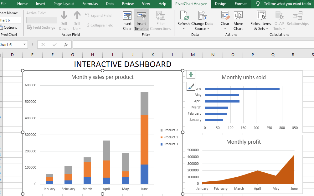
Creating Dashboards
I've built countless dashboards by combining multiple charts on dedicated sheets. The key is creating a visual hierarchy—your most important metrics should dominate the view, with supporting data providing context without overwhelming the viewer.
My workflow involves moving charts to their own sheets, arranging them strategically, and using consistent formatting throughout. This creates professional-looking dashboards that rival expensive BI tools, perfect for sharing with stakeholders who need quick insights.
Real-World Applications and Case Studies
Business Scenarios
Through my consulting work, I've implemented column charts across diverse business contexts. Let me share some specific examples that demonstrate their versatility:
Hotel Registration Tracking
For a hotel chain, I created monthly registration charts that revealed seasonal patterns. The visual clarity helped management optimize staffing and pricing strategies, resulting in a 15% revenue increase.
Sales Performance Visualization
A retail client needed to compare regional sales performance. Column charts made it immediately obvious which regions needed support, leading to targeted interventions that boosted underperforming areas by 20%.
Educational Uses
In educational settings, I've found column charts invaluable for tracking student performance, visualizing research data, and creating engaging teaching materials. Teachers particularly appreciate how quickly they can identify students who need additional support.
Student Performance Tracking
To enhance these presentations further, I often use PageOn.ai's visual storytelling capabilities to create comprehensive reports that combine charts with contextual explanations, making the data more accessible to parents and administrators.
Troubleshooting Common Issues
Over the years, I've encountered (and solved) virtually every column chart problem imaginable. Here are the most common issues and my proven solutions:
Problem: Data Not Displaying Correctly
Solution: Check that your data range includes headers and that numeric values aren't formatted as text. Use the Chart Editor's Setup tab to verify and adjust data ranges.
Problem: Labels Being Cut Off
Solution: Adjust the chart size by dragging corners, or change label positioning in Customize → Series → Data labels → Position to "Outside end."
Problem: Charts Not Updating with Data Changes
Solution: Ensure you're using dynamic ranges or include extra rows in your selection. For filtered data, check "Use hidden/filtered data" in the Chart Editor.
Problem: Mobile Viewing Issues
Solution: Create separate mobile-optimized versions with larger fonts, fewer data points, and vertical orientation for better readability on small screens.
When facing complex visualization challenges, I leverage PageOn.ai's AI-powered suggestions to quickly identify optimal solutions and alternative approaches that might not be immediately obvious.
Best Practices for Professional Results
Design Principles
Creating professional column charts goes beyond technical skills—it requires understanding design psychology. I've learned that color choices dramatically impact how viewers interpret data. For instance, using green for positive metrics and red for negative ones leverages universal associations.

Color Psychology
- • Blue: Trust, stability
- • Green: Growth, positive
- • Orange: Energy, attention
- • Gray: Neutral, baseline
Visual Hierarchy
- • Largest bars = most important
- • Bold colors = emphasis
- • Subtle colors = context
- • White space = clarity
Accessibility
- • High contrast ratios
- • Colorblind-safe palettes
- • Clear text labels
- • Pattern alternatives
Data Integrity
Maintaining data integrity is non-negotiable. I always start my vertical axis at zero unless there's a compelling reason not to—truncated axes can mislead viewers about the magnitude of differences. Clear labeling with units of measurement prevents misinterpretation.
To maintain consistency across all visualizations, I apply PageOn.ai's structured approach, ensuring that every chart follows the same design language and data presentation standards. This creates a cohesive visual narrative across entire presentations.
From Data to Decisions: Your Journey Forward
We've covered an incredible amount of ground together—from basic chart creation to advanced customization techniques that transform raw data into compelling visual stories. You now have the tools to create column charts that don't just display information but drive meaningful business decisions.
Key Techniques You've Mastered:
- ✓ Creating and formatting professional column charts
- ✓ Advanced customization for brand consistency
- ✓ Building stacked and multi-series visualizations
- ✓ Integrating charts into documents and presentations
- ✓ Troubleshooting common issues effectively
- ✓ Applying design best practices for clarity
Your next step is to explore other visualization types—perhaps diving into bar charts in Excel or exploring more advanced data visualization in Excel. Each new technique adds another tool to your visualization toolkit.
Remember, the best charts are those that tell a clear story. By combining Google Sheets' powerful charting capabilities with PageOn.ai's comprehensive visual presentation tools, you can create data narratives that resonate with any audience.
Ready to Take Your Visualizations Further?
Transform your data storytelling with PageOn.ai's powerful visualization tools. Create stunning, interactive presentations that bring your column charts to life.
Start Creating with PageOn.ai TodayAdditional Resources
Continue your learning journey with these carefully selected resources:
- → Google Sheets Chart Template Library for quick-start visualizations
- → Advanced formulas for dynamic chart data ranges
- → Color palette generators for consistent branding
- → Data visualization best practices documentation
Keep experimenting, keep learning, and most importantly, keep transforming your data into stories that inspire action. The world needs more clear communicators who can bridge the gap between complex data and human understanding.
You Might Also Like
Streamlining Presentation Automation: Combining VBA and AI for Next-Generation Slide Decks
Discover how to combine VBA and AI technology to create automated, intelligent presentations. Learn technical implementation, practical applications, and future trends in presentation automation.
Mastering Object Animations: Transform Static Slides into Engaging Visual Stories
Learn how to enhance your presentations with dynamic object animations. Discover techniques for entrance effects, motion paths, interactive elements, and more for PowerPoint and Google Slides.
Harnessing Creative Tension: Strategic Conflict in Experience Design | PageOn.ai
Discover how to intentionally use conflict as a creative catalyst in experience design. Learn techniques for implementing productive tension that transforms friction into innovative solutions.
Transforming Business Intelligence: How AI Bridges the Research-to-Insight Gap
Discover strategies for bridging the gap between AI research and business insights. Learn how to transform technical AI capabilities into actionable business intelligence using visualization tools.