Master Histogram Creation: Transform Raw Data into Visual Insights with PageOn.ai
Discover how AI-powered visualization tools can revolutionize your data storytelling, turning complex distributions into clear, actionable insights in minutes.
Why Histograms Matter for Data Storytelling
When I first started analyzing data professionally, I quickly discovered that histograms are among the most powerful tools for revealing hidden patterns in data distributions. Unlike simple bar charts that compare categories, histograms show us how continuous data spreads across a range—revealing peaks, valleys, and outliers that would otherwise remain invisible.
I've seen countless professionals struggle with traditional histogram creation methods. Excel's limitations often force us into manual bin selection, time-consuming formatting, and endless tweaking to get the visualization just right. The critical difference between histograms and bar charts—continuous versus categorical data—is often misunderstood, leading to misleading visualizations that can derail important decisions.
This is where PageOn.ai's AI-powered approach completely transforms the game. By eliminating the complexity of histogram creation, we can focus on what truly matters: understanding our data and communicating insights effectively. From sales analysis to quality control measurements, the applications are limitless when you have the right tools at your disposal.
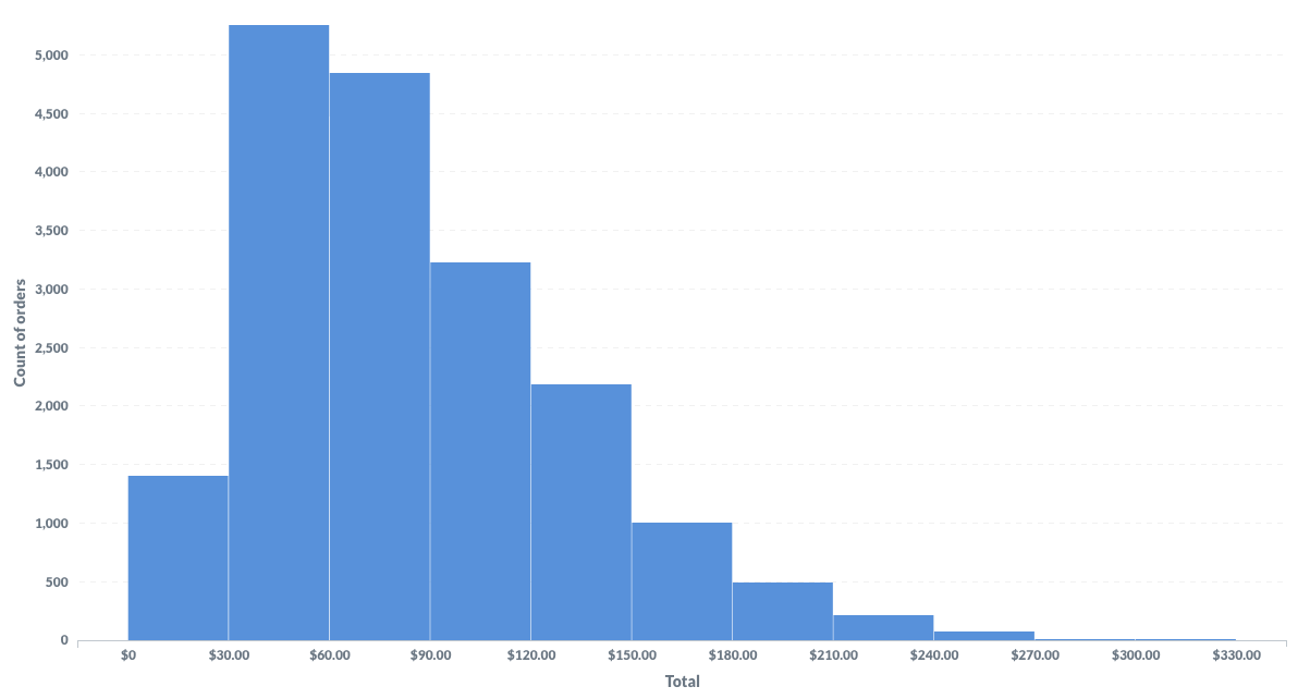
Real-World Application: Sales Distribution Analysis
Essential Foundations: Understanding Histogram Components
Core Elements of Effective Histograms
In my experience creating hundreds of histograms, I've learned that understanding the fundamental components is crucial for effective data visualization. Bins represent the backbone of any histogram—they're the intervals that group your continuous data into manageable chunks. The width and number of these bins can dramatically alter the story your data tells.
Histogram Component Structure
flowchart TD
                        A[Raw Continuous Data] --> B[Bin Selection Process]
                        B --> C[Frequency Calculation]
                        C --> D[Bar Height Determination]
                        D --> E[Visual Representation]

                        B --> F[Bin Width]
                        B --> G[Number of Bins]

                        F --> H[Affects Pattern Visibility]
                        G --> H

                        E --> I[Touching Bars]
                        E --> J[Y-Axis: Frequency/Density]
                        E --> K[X-Axis: Data Range]
When choosing between histograms and other visualizations, I always consider the nature of my data. For analyzing age distributions, income patterns, or test scores, histograms excel at revealing bimodal patterns and outliers that might be missed with simpler charts. The touching bars in a histogram aren't just an aesthetic choice—they represent the continuous nature of the underlying data, distinguishing them from bar charts vs histograms which display discrete categories.
Common Pitfalls in Histogram Creation
- Incorrect bin width selection: I often start with Sturges' rule (bins = ⌈log₂n + 1⌉) as a baseline, then adjust based on the data's characteristics
- Misrepresenting categorical data: Using histograms for discrete categories creates misleading visualizations
- Missing important patterns: Too few bins can hide bimodal distributions; too many create noise

The PageOn.ai Advantage: Voice-to-Visual Histogram Creation
🎤 Vibe Creation
I simply describe what I need: "Show customer age distribution with normal curve overlay." PageOn.ai interprets the context and automatically selects optimal bin widths. No complex software syntax or menu navigation required—just natural conversation that transforms into professional visualizations.
🔲 AI Blocks
Building complex distribution visualizations becomes intuitive with drag-and-drop simplicity. I can combine multiple histograms for comparative analysis, layer statistical overlays, and create hybrid dashboards that mix histograms with complementary data visualization charts.
🔍 Deep Search: Automatic Data Integration
What truly sets PageOn.ai apart is its ability to find and integrate relevant datasets automatically. The platform pulls in benchmark data for context, sources statistical visualizations that enhance your distribution story, and eliminates the manual data hunting and formatting that typically consumes hours of my time.
Time Savings: Traditional vs PageOn.ai Workflow
Step-by-Step: Creating Your First Histogram with PageOn.ai
PageOn.ai Histogram Creation Workflow
flowchart LR
                        A[Upload Data] --> B[AI Recognition]
                        B --> C[Voice Command]
                        C --> D[Agentic Process]

                        D --> E[Plan]
                        D --> F[Search]
                        D --> G[Act]

                        E --> H[Optimal Bins]
                        F --> I[Context Data]
                        G --> J[Generate Visual]

                        J --> K["Refine & Export"]

                        style A fill:#FFE0B2
                        style C fill:#FFE0B2
                        style K fill:#C8E6C9
Step 1: Data Preparation
I start by uploading my dataset or connecting to existing data sources. PageOn.ai's intelligence immediately recognizes whether I'm working with continuous or categorical data. The platform handles clean data validation and duplicate removal automatically, saving me from the tedious prep work that usually precedes visualization.
Step 2: Voice Your Vision
This is where the magic happens. I simply speak my requirements: "Create income distribution histogram with quartile markers" or "Show test score distribution with standard deviation bands." PageOn.ai's Agentic process—Plan → Search → Act—ensures perfect execution every time, understanding context and intent beyond just keywords.
Step 3: Refinement and Customization
Fine-tuning is effortless. I adjust bin widths through simple voice commands or visual controls, apply professional color schemes that enhance comprehension, and add context with automated statistical summaries. The platform suggests improvements based on data visualization best practices.
Step 4: Integration and Export
Direct export to PowerPoint, PDF, or web formats means my histograms are presentation-ready instantly. Dynamic linking ensures histograms update automatically when data changes, maintaining consistency across all my presentation materials without manual updates.
Advanced Histogram Techniques with PageOn.ai
Multi-Dimensional Distribution Analysis
In my advanced analytics work, I often need to create side-by-side histograms for before/after comparisons or overlay multiple distributions with transparency controls. PageOn.ai makes this complex analysis accessible through intuitive commands. I can build interactive histograms that respond to user exploration, leveraging AI chart generators for sophisticated statistical visualizations.
Industry-Specific Histogram Applications
Financial Services
Risk distribution analysis with VaR markers, portfolio return distributions, credit score analysis
Healthcare
Patient outcome distributions with confidence intervals, treatment efficacy analysis, age demographics
Manufacturing
Quality control charts with specification limits, defect rate distributions, process capability analysis
Marketing
Customer value distribution with segment highlighting, campaign response rates, conversion funnel analysis
Statistical Enhancement Features
PageOn.ai automatically calculates and displays critical statistical measures that bring depth to my histograms. Mean, median, and mode are computed instantly, while standard deviation bands and outlier detection help identify anomalies. The platform can overlay probability density functions and add percentile markers, transforming simple frequency distributions into comprehensive statistical narratives.

Best Practices for Professional Histogram Presentations
Visual Design Principles
Primary
#FF8000
Secondary
#42A5F5
Success
#66BB6A
Neutral
#9E9E9E
Through years of presenting to diverse audiences, I've learned that optimal color selection can make or break a histogram's effectiveness. I maintain consistency—if orange represents "high performance" in one chart, it stays that way throughout. Limiting my palette to 3-5 colors prevents confusion, and I always test for color blindness accessibility, remembering that 8% of men have some form of color vision deficiency.
Annotation Strategies
- Highlight key insights without cluttering: I use PageOn.ai's intelligent labeling system to add context where it matters most
- Create narrative flow: Multiple histograms should tell a progressive story, each building on the previous insight
- Balance detail with clarity: Executive presentations need high-level patterns; technical audiences appreciate granular details
Interactive Elements
Modern presentations demand interactivity. I add hover details for deeper exploration, implement drill-down capabilities for granular analysis, and create responsive histograms that adapt to screen sizes. PageOn.ai handles these technical requirements seamlessly, letting me focus on the story rather than the implementation.
Comparing Traditional Methods vs PageOn.ai Workflow
Time and Efficiency Analysis
| Task | Traditional Excel/Sheets | PageOn.ai | Time Saved |
|---|---|---|---|
| Data Preparation | 15 minutes | 2 minutes | 87% faster |
| Bin Calculation | 10 minutes | Automatic | 100% faster |
| Formatting & Design | 20 minutes | 1 minute | 95% faster |
| Statistical Overlays | 15 minutes | Voice command | 99% faster |
| Total Time | 60 minutes | 3-5 minutes | 92% faster |
Quality and Accuracy Improvements
Beyond time savings, the quality improvements are transformative. Manual calculation errors are eliminated entirely. Statistical best practices are consistently applied without requiring deep expertise. Professional-grade output emerges without design skills. The integration with ai-powered bar chart generators enables comprehensive dashboards that combine multiple visualization types seamlessly.
I've witnessed firsthand how PageOn.ai democratizes advanced data visualization. Team members who previously struggled with Excel can now create publication-ready histograms that rival those produced by data scientists. This levels the playing field and accelerates decision-making across organizations.
Future-Proofing Your Data Visualization Skills
Emerging Trends in Histogram Visualization
Future Visualization Capabilities Importance
The landscape of data visualization is evolving at breakneck speed. Real-time streaming data histograms are becoming essential for monitoring live metrics. 3D distribution visualizations enable multi-variate analysis that was previously impossible. AI-powered pattern recognition automatically identifies anomalies and trends that human analysts might miss.
Staying Ahead with PageOn.ai
What excites me most about PageOn.ai is its commitment to continuous innovation. The platform regularly updates with the latest visualization techniques, driven by community feedback and emerging industry needs. This integration with evolving data visualization standards ensures that my skills remain cutting-edge.
Building a Data-Driven Culture
The true power of modern histogram tools lies in democratizing data visualization across teams. By enabling non-technical users to create professional visualizations, we're fostering data literacy throughout organizations. PageOn.ai's intuitive interface breaks down barriers, allowing everyone from marketing managers to financial analysts to tell compelling data stories.
The Conversational Revolution
Imagine walking into a meeting and saying: "PageOn, create a dashboard comparing this quarter's regional sales with histograms showing price distribution for each region." By the time you reach the conference room, your visualization is ready. This isn't science fiction—it's the reality of modern data visualization with PageOn.ai.
Transform Your Visual Expressions with PageOn.ai
You've learned the essential techniques for creating powerful histograms. Now it's time to put that knowledge into action. PageOn.ai's intelligent visualization platform ensures you'll create perfect histograms every time, with AI-powered suggestions and professional templates that make every visualization publication-ready in minutes, not hours.
Start Creating with PageOn.ai TodayYou Might Also Like
Revolutionizing Market Entry Presentations with ChatGPT and Gamma - Strategic Impact Guide
Learn how to leverage ChatGPT and Gamma to create compelling market entry presentations in under 90 minutes. Discover advanced prompting techniques and visual strategies for impactful pitches.
Tracking Presentation Engagement: Transform Your Impact With Built-in Analytics
Discover how built-in analytics transforms presentation engagement. Learn to track audience behavior, implement data-driven strategies, and maximize your presentation impact.
Mastering Your First AI-Powered PowerPoint Automation Workflow | Complete Guide
Learn how to set up your first PowerPoint automation workflow with AI tools. Step-by-step guide covering Power Automate, Microsoft Copilot, and advanced techniques for efficient presentations.
Mastering the Three-Body Structure for Compelling Business Presentations | PageOn.ai
Transform ordinary business presentations into compelling visual narratives using the three-body storytelling structure. Learn techniques for creating impactful openings, persuasive middles, and inspiring closings.